


4_tattoos
-
Posts
5,086 -
Joined
-
Last visited
-
Days Won
1
Posts posted by 4_tattoos
-
-
bump
Looks like the archers have added orange helmets to their rotation. The other 3 look the same from the 2022 season. Although the Whipsnakes may have added a stripe to the top of their helmets.
-
5 hours ago, upperV03 said:
New England has looked good in white and red secondaries in the past and I really like the stylized sash. I hadn’t realized previously that the side/back hem stripe on New England’s shirt is a red/white/blue stripe:

Why the heck did Adidas create that armpit panel? Were teams required to make the armpits contrast from the rest of the shirt? Really seems like the armpit here coulda/shoulda been white instead of red.
-
 4
4
-
-
Am I seeing things or does St. Louis have a light silver stripe on their darker silver helmets?
-
8 hours ago, upperV03 said:
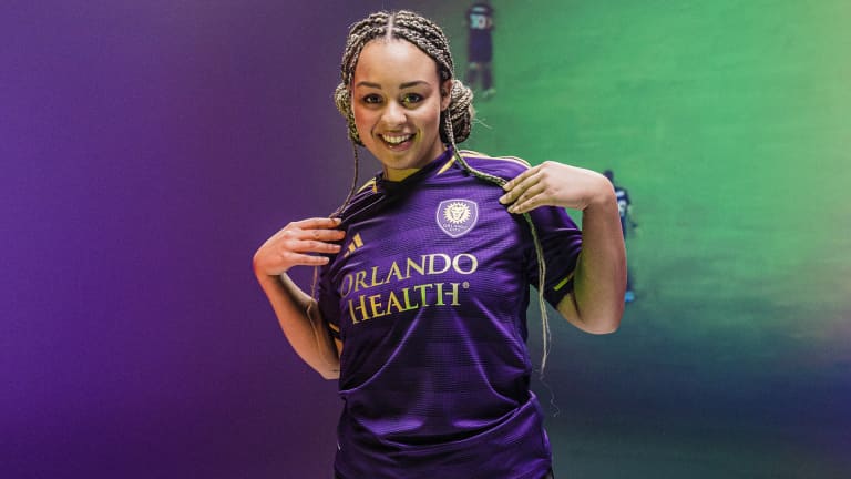
Still waiting on Orlando to officially reveal their new primaries,
-
On 2/17/2023 at 10:05 AM, kmccarthy27 said:
My Freshman year in High School I went to a high school in MD called Westlake HS and somehow adopted the Dolphins colors but they adopted the Wolverine mascot. So the first year of the school opening the opted everything Michigan just with a Teal, Orange and White color scheme. When I went back to visit some friends a couple of years later the Michigan stuff was relegated to JV and all the Varsity team branding went to Wisconsin with Teal, Orange and White.
Small world. My school played Westlake in our season opener my 9th and 10th grade years (1999 and 2000). Westlake's varsity football team was definitely a hybrid of the Miami Dolphins and Wisconsin Badgers from what I remember.
-
I went to Crossland High School in Temple Hills, MD. Home of the Cavaliers.
My introduction to CHS came when my older brother started going there. The football team at that time had a generic cavalier/musketeer/swashbuckler/fancy pirate decal on the helmets. My junior and senior years at CHS we had a University of Virginia crossed swords logo on our helmets with an old English C in place of the V. The year after I graduated the football team got new uniforms and began wearing a Chicago Cubs style C on the helmets. About 3 years after that the football team went to another variation of the UVA logo that I can only describe as imagining if a C was in the same font as the V in the UVA logo. It was actually my avatar on this board for several years. There were old team photos from the 70s and 80s in the coaches offices wear the team had the Buccaneer Bruce logo on the sleeves.
In the early 2010s the boys basketball had Buccaneer Bruce on their shorts. Prior to that the basketball teams wore the Cleveland Cavaliers sword logo (the one the resemble a cent sign) on a lot of stuff.
About 5 years ago the current principal wanted the school to have a unified identity, so an all purpose (academic and athletic) logo was created for the school. And yes, the football team has worn this on their helmets since 2018. Small print and hashtag included
-
1
-
-
While we're on the topic of stadiums. Is Chicago Fire going to inherit Soldier Field by default once the Bears move to the suburbs? Could Soldier Field end up getting renovated to be more practical for MLS use?
-
3 hours ago, PK22 said:
All they had to do was make some slight change to the stripes (so they can say its a new kit) and make the back verde with black lettering and it would have been a winner
Lost me at the end. White numbers/letters provide way better contrast and visibility on green than black would. If Austin went the route you suggested there would be the same issue making out the numbers & names on jerseys that Houston has been dealing with the last couple of seasons having black numbers on orange jerseys, Call me old fashioned but I prefer for the numbers on a uniform to standout.
I don't know what sort of change could have been made to the stripes that would have improved upon the previous jerseys. IMO if Austin was dead set on maintaining the stripe look, they could have pulled an Atlanta United move and color swapped parts of the jersey (although ATL abandoned model that with their previous set). Between the back, collar, cuffs, sleeves & shoulders (area surrounding the 3 Adidas stripes) Austin has 5 parts of their jerseys they could swap between green and black every 2 seasons without changing the stripes on the front. Maybe even 6 parts if you count the 3 Adidas shoulder stripes too. Unlike the numbers and NOB I'd be fine with that being black on green or vice versa.
-
I have a soft spot for Austin FC since they have the same colors as the youth club I played for as a kid. I was hoping they would move away from stripes with their new jerseys as stripes has been done to death in MLS and in the sport in general. Not only did they keep stripes on the new jerseys, but somehow they managed to take a simple design overboard. I didn't think it was possible for an article of clothing to be a try hard until I saw these earlier today. At least the back of the jersey is green now.
I really like Portland's new jerseys. Only small change I would have liked to see would be the Adidas stripes on the shoulders being gold instead of white. Don't remember which one of you guys said Portland should maintain plaid pattern as a permanent element on their primary jerseys going forward, but I co-sign on that 100%!!!
-
1
-
-
Hasn't there been two variations of midnight green Eagles uniforms? Think at some point the number outlines and pants stripes were changed during the McNabb era.
-
I figured a team connected to Brazil would likely be part of TST, but would not have expected it to be this...
-
The Seattle Sounders are playing on FS1 right now. For some odd reason I want to see them wear the reverse of their primary kits, blue/green/blue. I'm sure it would probably look bad, but I want to actually see it myself for confirmation.
-
42 minutes ago, MJWalker45 said:
Wrexham is submitting a team for TST, as well as visiting the United States with their full first team.
@MJWalker45 beat me to it
-
So, there's 2 more teams announced for TST....
-
The LA color swaps looks alright on both ends.
The orange and black FC Dallas swap looks like it could belong to a Texas Longhorns SBNation page.
Kansas City and Minnesota are rivals?
-
 1
1
-
 1
1
-
-
For some reason Kelce's yellow shoes and gloves are bothering me.
-
1
-
-
I didn't have a problem with players wearing different color shoes, but seeing team mates wear different color socks has really bugged the hell out of me all season. I think the NFL needs to tighten up on that next season. That's the sort of thing I haven't seen outside of youth football.
-
8
-
-
FWIW, The Soccer Tournament either had a test game recently, or will have a test game some time soon.
-
1 hour ago, PaleVermilion81 said:
Please don't change the Ravens. They're just fine. And Nike will make it so much worse.
Switching to the front facing raven logo on the helmets would be an upgrade in my book.
-
8
-
 4
4
-
-
Perry the pylon reminds me of Miss Minutes from Loki.
-
8
-
-
I
 ing hate the cherry blossoms! Easily THE most overrated tourist attraction in DC. And within the last year the Wizards, Nationals and now DC United found it necessary to make uniforms honoring those things. Such BS
-
1
-
2
-
-
The Soccer Tournament will have a USL era FC Cincinnati alumni team.
-
 1
1
-
-
South Dakota State has been wearing white helmets during this playoff run.
-
1
-
-
21 minutes ago, MJWalker45 said:
Probably. I can see them avoiding as much as possible until Precourt leaves that team.
Why would he leave? He ultimately got what he wanted in Austin FC and they've become good in a very short time. He's in a good spot with his club despite how anybody feels about the way things played out with his tenure in Columbus. No reason for him to abort ship. Plus he seems like the type that will live well into his mid-nineties just out of spite

He's not going anywhere


XFL 2023 Logos, Names and Uniforms
in Sports Logo News
Posted
The New York Guardians logo was a gargoyle. It appears now it's some kind of big cat.
I haven't paid much attention to the branding of XFL 3.0 until this weekend. Why does Seattle's dragon logo look worse now? It looks like a kid in 4th grade drew the new logo, and not a kid with artistic talent.