


MCM0313
-
Posts
4,427 -
Joined
-
Last visited
Posts posted by MCM0313
-
-
On 9/20/2019 at 8:07 AM, leopard88 said:
Middle row left reminds me a lot of this:
If only they had gone with that one, they would be the Minnesota Weagles and nobody would be complaining about how much the name Wild bothers them.
-
 3
3
-
-
7 hours ago, TLE23 said:
A random thought occurred to me regarding the horse-in-C logo: was the "C" in there intended to be a horseshoe? The shape is sort of unusual for a "C" but I never saw it be recognized as a horseshoe anywhere. Just my opinion.
It's possible that was something the designers had in the back of their minds.
-
2 hours ago, Eastport76 said:
Tokyo Yakult Swallows had neon green.
Make that like two shades darker and you have the Brewers' wheat gold.
-
1
-
-
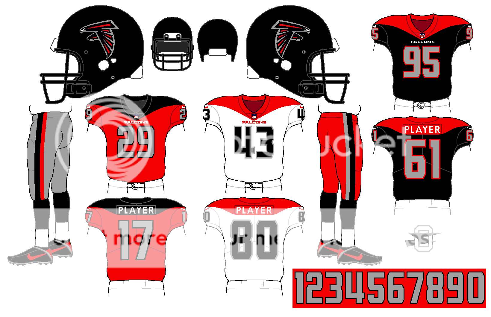
16 hours ago, oldschoolvikings said:
I was thinking about a splitting the difference... White numbers on the black, but I'm keeping the silver numbers on the red.
I do love a good biscuit.
That works.
-
15 hours ago, oldschoolvikings said:
I'm just going to keep recycling this Steelers' batwing template until it sticks somewhere...
14 hours ago, neo_prankster said:Nice!
However, on the red and black jerseys, I'd change the numbers to white.
7 hours ago, heavybassX said:Just change the numbers of the red/blacks jerseys to White and you have nailed something solid.
Ignore them. Keep the numbers silver. No risk it, no biscuit.
-
1
-
-
1 hour ago, Hat Boy said:
I didn't know there was a 0 or a 00 in baseball. That is still not baseball's craziest uni number:
That's a Padres shirt. I thought the bizarre 09 was only worn with the Marlins. Not doubting its authenticity. It's just so odd that it was ever allowed to be worn with one team, let alone two.
-
2
-
-
1 hour ago, Magic Dynasty said:
The Trail Blazers had this last year.
Enes Kanter: 00
Damian Lillard: 0
That's so cool...never realized a 0 and a 00 had ever been teammates, or that it was even allowed.
-
Here's one: I think the LA Clippers' 1990s jerseys were fine. Same for their logo. Yeah, the logo was pretty obviously based on the iconic logo of their better-known Southern California brethren. It still looked pretty good. Yeah, the color scheme was generic. Same for the jersey design. But I still thought they looked pretty good.
Were the uni changes in the early aughts an upgrade? Yes, of course. I'd still take the '90s set over that horrid black alt, and the '90s logo over the horrid current logo, though.
-
3
-
-
6 hours ago, joey joe joe jr. shabadoo said:
Maybe this was a pre season game?
Indeed. Elway probably said it looked like a college uniform and that was that.
-
1
-
-
5 hours ago, kimball said:
The hawk also needs to lay off the Red Bulls.
Yep. Silly bird, you have wings already!
-
1
-
-
17 hours ago, Ice_Cap said:
Grey facemasks are always the superior option, regardless of team.
I like grey facemasks a lot of the time but there are instances where color just looks better. The Dolphins should never have had a grey facemask in any instance - in fact I wish they still had aqua facemasks like before. The pre-1997 Buccaneers looked just fine with orange facemasks. The Chiefs' white facemasks look amazing, as do the Bengals' black masks, as did the old Browns' white masks - and I wouldn't want a grey one on a really modern uniform like those worn by the Jets, Broncos, Falcons, Eagles or Seahawks.
Most other teams would be fine going with grey facemasks, but I can't think of any team without a silver or grey helmet that absolutely NEEDS one.
-
4
-
-
7 hours ago, agentrygraphics said:
The center "stripes" of the Carolina Panthers helmet have never set right with me. There are no elements of those weird stripes anywhere else on the jersey through the course of the team's uniform history....and the fact that both "swipes" come so close to the main helmet decal near the back really irk me.
...and the 2 navy blue "spikes" on the old Titans helmet always bugged me as well...again...the spikes were nowhere else in the uniform.
Carolina's aren't as bad. They've always had similar slashes down the sides of their pants, and really the shoulder loops look kind of like a full-circle version of the helmet stripe too.
-
1
-
-
When teams (especially football) wear side panels that don't line up with pant striping. Actually, 90% of football side panels irritate me regardless of the alignment.
-
22
-
-
5 hours ago, AstroBull21 said:
He is Looey, because of his french-canadian heritage. The US city St. Louis is Loo-is.
French pronunciation is so stupid. #sorrynotsorry
-
13 minutes ago, M4One said:
And I will raise you Kerr as a Trail Blazer.
I remember Kerr with San Antonio, but had no clue he was ever a Trail Blazer.
-
On 4/6/2019 at 9:29 PM, DNAsports said:
This will forever break my heart. Adam Jones, after over a decade in Baltimore, now in a Diamondbacks jersey:
That turquoise numeral really pops off the dark grey.
-
2
-
-
1 hour ago, agentrygraphics said:
This was, has been, and always will be the Chargers' best looj.
I half-agree. I think it's their best look to not involve powder blue.
-
2
-
-
On 4/7/2019 at 6:21 PM, jn8 said:
I’ll be this guy:
Seeing Pitt’s new uniforms, I prefer them in navy blue and metallic gold. It’s what I’ve grown up with and it looks better to me. The royal blue and athletic gold isn’t bad, but I’d rather it be a one game alt than full time
I could see a good argument either way. I remember some grumbling when they first switched (1997?) but looking back it was a pretty strong identity they adopted. If anything I'd maybe split the difference and do royal blue and metallic gold, with the helmet having the panther at home and the script on the road.
-
1
-
-
On 4/9/2019 at 9:15 AM, oldschoolvikings said:
Wait... it's too late? What?
On 4/9/2019 at 4:18 PM, HailGoldPants said:I like the addition of red on your Jets concept. It kind of gives it a throwback NJ Devils vibe.
I was thinking more Milwaukee Bucks crossed with an '80s or '90s fighter-pilot video game.
-
1
-
-
42 minutes ago, C-Squared said:
Only for one preseason game. Supposedly, he personally complained to ownership and they never wore that set during his career again.
I could totally see him doing that. "Guys, this looks dumb!"
On a related note...I don't get people who think the Broncos should wear navy blue pants today. The Bears, owner of the closest color scheme to Denver's, have worn navy pants for over three decades. The division-rival Chargers sometimes wear navy pants. The playoff-rival Patriots regularly wear navy pants, as do the Texans and Seahawks. The Titans sometimes wear navy blue pants. The Rams have worn them within the past five years and the Bills within the past ten. Please, no more navy blue pants.
-
2
-
-
On 4/10/2019 at 6:06 PM, C-Squared said:
Its jarring seeing old white dudes in modern duds:
Elway wore mono-navy? Huh.
-
Blanked. Quoted different post than I meant to.
-
9 minutes ago, 1991 said:
I remember that logo.
I think it was like THE Iowa basketball logo, almost as much as the Hawkeye was and is the football and overall athletic logo for the school.
-
16 minutes ago, Dexter Morgan said:
Lol


Oldschoolvikings' NHL concepts - Ducks added, trying out more weird colors
in Concepts
Posted
Oooooooooh! That’s nice.