


MCM0313
-
Posts
4,433 -
Joined
-
Last visited
Posts posted by MCM0313
-
-
6 hours ago, Shumway said:
This one absolutely should be forgotten, burned, buried, dug up, burned again and then buried again.

That Falcons’ look is salvageable if you have the black start fading back into red toward the bottom of the pants, maybe on the socks, and then use red shoes. I’m sure that is unpopular. I don’t care.
-
7 hours ago, SSmith48 said:
How about the 1990 Freedom Bowl? Colorado State vs Oregon with the Ducks in their retro kelly green/yellow set, and the Rams in some gaudy yellow jerseys. An old youth football coach of mine actually played in this game. What an eyesore of a matchup though, almost an inter-team scrimmage given the same colors and inverted usage of them.
Gold (Colorado State) and yellow (Oregon) do NOT contrast well. Especially when you consider that the difference between them is less a bright line and more of a continuum.
-
21 hours ago, Cujo said:
Yes. Yes they were.
Close the collar and change the pants to white with blue-yellow-blue striping, and you have one heck of a Rams uniform. And I don’t even like navy blue for them.
-
 5
5
-
-
On 1/18/2022 at 11:16 AM, Cujo said:
The helmet. Sans the grey facemask.
He’s talking about the Jets’ helmet, which has a grey facemask.
-
On 1/15/2022 at 4:38 PM, Kramerica Industries said:
Amazing how something as simple as orange socks instead of black elevates the Bengals uniforms significantly, and that's even with the acknowledgment that black socks themselves would've been just fine.
I don’t much care for the Nemo-like orange pant stripes, but it’s hard to argue against them when they lead to the orange socks, with the whole look feeling so well tied together.
Historical connotations are pretty cool too. Between the switch to the striped helmet and their last pre-2022 playoff win, they wore only orange socks.
-
On 1/15/2022 at 4:24 PM, Cujo said:
Did the 49ers officially go back to this script logo? Because this is what I see being used on tv now
Gosh, I hope so. That’s a beaut.
-
1
-
-
44 minutes ago, Dynasty said:
It's hard to believe that place is only 30 years old. It feels like an all-time classic, arguably in the same class as Wrigley and Fenway.
Yeah, the designers hit a home run there. They knocked that park out of the park.
-
4
-
-
On 12/14/2021 at 6:08 PM, 1991 said:
I'm from southwest Missouri, and it felt to a few of us that Evangel pushed the logo process, a little fast because it has been received as hot and cold.
Blah. Singular nouns that work well as team names are few and far between.
-
On 11/23/2021 at 11:42 AM, insert name said:
Black Fridays for the Mets are here to stay.
It was quickly pointed out that the replicas shown in the video and website are missing the neck piping. A slight redesign maybe? Seems weird to remove an element that's been on nearly every Mets alternative.
I get wanting to wear those as an occasional alternate. Black was never really a necessary, or even good, addition to the Mets’ color scheme, but I understand the black set’s association in the popular memory - Subway Series, Mike Piazza, 9/11. Once a week feels like way too much though. Almost like they’re testing the waters. I hope they never return to full-time black trim.
-
3
-
-
4 hours ago, Sport said:
The Lightning should be the Chargers of the NHL and I don't know why they're not. Other than their pants stripe they remain committed to being a more boring and ripped off version of the Leafs. I don't get it. I don't like the nickname on a jersey, but actually using lightning bolt imagery to decorate the sweater is a step in the right direction.
the SMASHVILLE jersey might be the worst NHL uniform this century.
This century?! It could be the worst ever! It breathes the same rarified air as the Burger King, the Buffaslug, and the Mooterus, and is a good bit worse, IMO, than Pooh Bear or Wild Wing. It is “Smashville” - immediately notorious enough to be identified by a nickname.
-
1
-
-
10 hours ago, Red Comet said:
Okay, who is the paste-eater that thought putting Smashville on a jersey wouldn’t be cringe on the level of the Gordon’s Fisherman Isles jersey?
It’s way worse than the fisherman.
-
7
-
-
3 hours ago, chcarlson23 said:
I agree the Wild’s Winter Classic sweater is amazing, perfectly matching the 1930’s aesthetic they were going for.
I think the Jersey Jersey is by far the worst jersey released this year, with the Smashville one a close second. It’s just too tacky with the name on the front. As for the Bolts, sure it’s pushing the envelope just a little bit, but it’s the stadium series, it’s fine for that game. I mean neither are the worst Stadium Series jerseys either. We had the Avalanche wearing bibs remember?
And aesthetically, nothing has been as bad as the Thrashers red alternate…
The Lightning NEED to push envelopes with their design. They’ve been extremely successful of late in bland, generic uniforms.
-
1
-
-
On 11/22/2021 at 4:59 PM, Ferdinand Cesarano said:
They absolutely nailed the logos. There's not one of them that is less than excellent.
I’m pleasantly surprised that they just modernized the logos, rather than trying to reinvent the wheel. The old logos were fun in an ‘80s way.
-
4
-
-
Numerous intrusive ads are making it very difficult to interact with the forum.
-
1
-
-
On 11/7/2021 at 3:04 PM, dont care said:
I disagree, trying to force turquoise into their color scheme to please the people that want to debut uniforms just makes them look like they are putting 10 pounds of s*** in a 5 pound bag. As they say when you try pleasing everyone you end up pleasing no one.
Brick red, black, and sand is a boring scheme. They don’t need to lose the turquoise; rather, they need more of it, if you ask me!
-
4
-
-
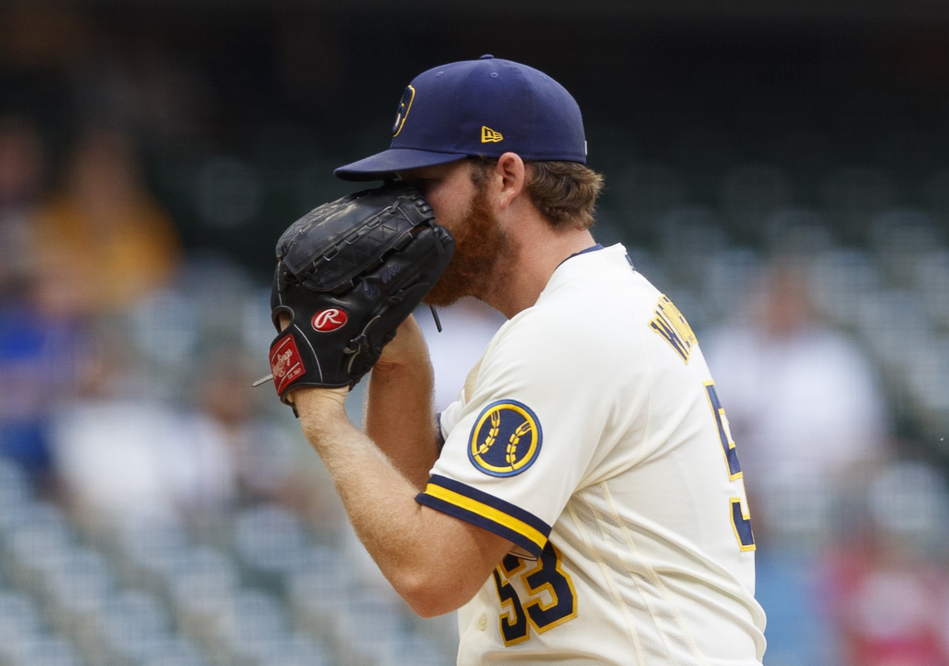
On 10/26/2021 at 8:37 PM, Gothamite said:
The Brewers had to make their baseball patch blue, but that’s because the details aren’t easily seen from a distance. No lettering, no other elements.
The seams on the baseball are made from wheat
 . That’s another element. Haha.
-
1
-
-
4 hours ago, Sport said:
I can't ignore the dumbest looking helmet in NFL history because it was the biggest part of the whole uniform. Also, the logo was and continues to be a PROBLEM.
But here's my issues with the rest of that Jaguars set:
- The weird patterns and materials on the neck and shoulders, plus the shield logo on the chest were too much "this is what the troops would wear if they played football".
- But the single biggest thing signaling the faux military cosplay those uniforms were trying to evoke is that awful awful number font. That was absolutely hideous.
- Teal should always be their primary jersey color. They accidentally got this correct when they used teal numbers on the white jersey, which is why the decision to use black numbers on the teal jersey is so baffling.
- I have a pretty hard rule on that. Only in rare exceptions does a dark number work on a color jersey and the black numbers on the teal jersey violate that rule hard. It's the kind of decision amateur designers with poor taste make. Plus they're basically illegible from any distance. You cannot go wrong with white numbers.
- I actually don't hate the pants stripe on its own, but it didn't really match with anything else in the uniform. Seeing the Bucs use a similar stripe around the same time makes it feel like someone in NFL properties just really wanted to stripe some pants like that at the time.
- I don't have a problem with the contrasting color sleeves, but if you're going to use contrasting color sleeves then put the logo or numbers on the sleeve. If you fill the sleeve with something then the sleeve's differing color looks considered and thoughtful. When you leave them blank it looks like a college or high school team who was just handed a Nike template.
- Every color is used in every part of the uniform, but it's not done elegantly the way the original uniform was. Every piece of the uniform is turned up to 11 and there's no visual focal point. There's no restraint, no thoughtful consideration for how each piece of the uniform would look with the others. It's like the helmets, jerseys, and pants were all designed by different people at different times who weren't allowed the see the others' work. And the person who designed the helmet was both blindfolded and high. The person who designed the logo works for stockvectorlogos.com.
I wish they'd made the super bowl while wearing it. It's pure, uncut, tasteless trash. I'm glad it's dead, and it would've been hilarious for it to be preserved on a stage like that for all-time.
What’s wrong with the Jaguars’ logo? I think both the original and the current are fantastic!
-
1 hour ago, oldschoolvikings said:
Well, if we move past the worst helmet idea in NFL history, here's what we still have to deal with;
1. The shiny sublimated shoulder spikes (maybe a bit of a plus for alliteration) are IMO dumb. I'm not a fan of any of these tiny "just because we can" add-ons that can only be seen from up close.
2. The all black mono-primary is always going to be a downgrade for me. The teal sleeve caps don't help, as I don't believe there's enough teal anywhere else to balance that much color in one spot.
3. I'm over multi-outlines on the numbers, personally.
4. Not a fan of the black numbers on the teal jersey... keeps me from wanting the teal to be primary, even though I absolutely do.
5. "Jags" is a nickname of a nickname, as mentioned earlier.
6. I hate everything about the pants. Everything.
7. And, just to add crap icing to the crap cake, black socks with black pants, my least favorite thing in history, ever.
Honestly, any of thee things alone are nit picky, sure, but this uniform is just another example, like the early 2000-teens contemporary Browns and Buccaneers designs, of just not knowing when to quit. Like one quirky idea just wasn't enough, there had to be four, no five piled on. Seriously, look at that picture... are those good football uniforms?
The Jaguars current design isn't perfect, but it's a damn sight closer than the 2013 version. I obviously have a bias towards simple football uniforms. The single layer number work for me, and that font is a winner. Add some teal to the white jersey, add a simple stripe element to the pants, avoid the black jerseys and pants as much as possible, stop with the minor league monochrome, and it's a top notch uniform, IMO.
But as a wise poster on these here boards always says, your mileage may vary.
By the time I got to the end of this comment, I knew who its author was. That isn’t a bad thing, necessarily.
Also, by “shiny sublimated shoulder spikes”, did you mean the ends of the toilet bowl collars Nike was all about in 2012-13?
-
4
-
-
7 hours ago, Lights Out said:
As far as the Jaguars are concerned, it would have been incredibly easy to synthesize all of their previous uniforms into something that would stand the test of time without looking too old-school.
Unfortunately, Nike got lazy a few years ago, so the Jaguars now wear glorified practice gear.
The swoosh is almost perpetually either lazy or in a fever dream. The only truly balanced new sets (as in, new-new, not a refresh of an old look) they’ve pulled off have been Vikings, Jets, and Dolphins. Seahawks’ look works for them but is a bit busy for most. Tampa, Cleveland, and Jacksonville all got shoehorned into excessively busy looks. Atlanta’s is overly simplistic.
It’s like the designers are either right out of bed after a night of terrible sleep, or on LSD. Why can’t they just have a coffee in the morning like the rest of us?
-
2
-
-
14 hours ago, the admiral said:
Yes, and yet you promote them as white pants despite the fact that the color swatch is obviously grey.
Well, hopefully a good time will be had by all.
-
22 minutes ago, DG_ThenNowForever said:
I challenge all sports teams to remove "fresh and clean" from their uniform descriptions for the rest of the decade.
Then they will just use
 and
and  emojis with no words. Is that what you want?
-
8
-
-
9 hours ago, colinturner95 said:
Better than the navy stuff. Still nothing special IMO
9 hours ago, mjd77 said:They should have lightened the green up a bit for a better reflection of the '50s set...but overall, I like this way better than any of the navy crap they've had.
I could spray diarrhea out my butt onto a canvas, and they could photocopy that canvas into better uniforms than the Packers’ navy/tan abominations.
-
2
-
-
4 hours ago, Gothamite said:
“50s Classic” might be overselling it a bit.
Really? I think that’s a fantastic look for the Eugene Bay Duckers.
-
20 hours ago, Survival79 said:
Commanders sounds like something out of GI Joe. Other two are fine by me.
-
2
-


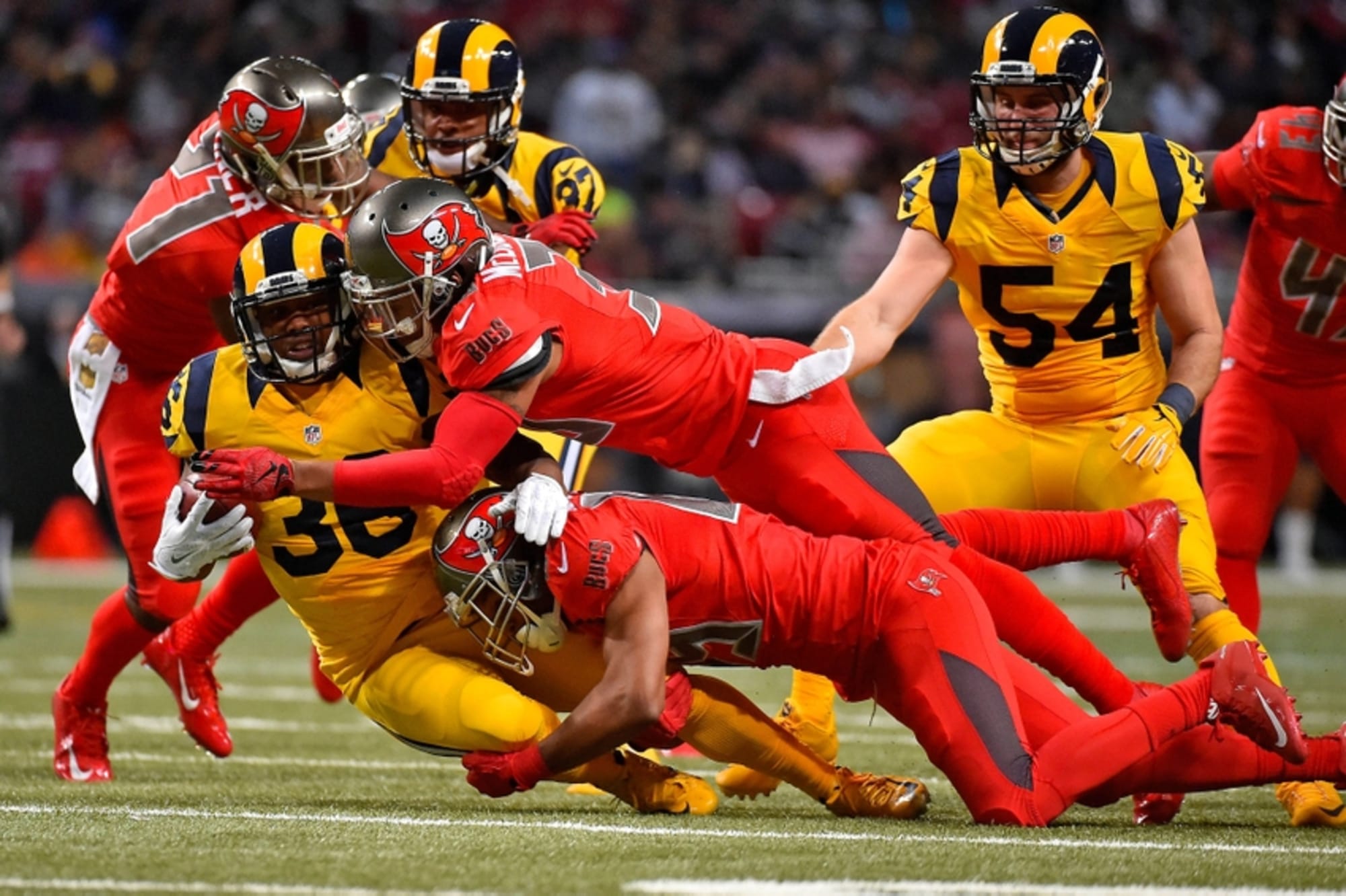


Color vs color games that people have forgotten
in Sports Logo General Discussion
Posted
Really, I’d probably prefer the gradient if it weren’t just...fade to black. The Hawks’ gradient uniforms were red at the shoulders, red right above the knees, and black in between. The Falcons could work with something like that, but the way it is now looks unbalanced.