


MCM0313
-
Posts
4,427 -
Joined
-
Last visited
Posts posted by MCM0313
-
-
1 hour ago, SSmith48 said:
Honestly, I am ok with this. More throwback options are back in the mix, and with the ability to add in some alternate looks, we should get some more intriguing options. I fear for the lack of restraint, but as long as teams are wearing their primary helmets more, I am fine with it. Great to see this happen.
Here is a list of a few teams that I think could take advantage of this rule right off the bat, not including throwbacks:
-Los Angeles Chargers (navy color rush)
-Los Angeles Rams (whatever god-awful idea they will come up with next year, unless if they do a throwback)
-Cincinnati Bengals (white jersey/pants, the white tiger idea seems to be pretty popular, this would be the perfect time to pull it out).
-Dallas Cowboys (white color rush)
-Buffalo Bills (red helmet could be mixed in with the red color rush uniform)
-Washington FT (could have something planned with the alternate along with their redesign)
-New York Jets (black alternate)
While we have seen throwback helmets before, I don't think we have seen a true alternate helmet worn as a widespread idea in the NFL (I believe the Saints tried the alternate helmet idea decades ago as part of the preseason). Seeing where modern design trends have gone, this was bound to happen when the one-helmet rule was lifted. I still expect to see throwback helmets make up the majority of the looks under this rule though.
I can’t remember whether the Saints wanted to make their helmet black full-time or if it was supposed to be an alternate, but I believe the league said they hadn’t given proper notice to receive approval.
When the Seahawks went through their first redesign for the 2002 season, some people wanted them to wear blue helmets at home and silver on the road, but the NFL nixed that, too.
-
 3
3
-
-
5 minutes ago, LA Fakers+ LA Snippers said:
Would look something like this

This picture is a prime example of why the NFL needs to ban plain white socks. Either teal or black and you have a solid, if overly simple, look.
-
2
-
-
6 hours ago, VDizzle12 said:
The official memo says it "must only be worn" with a throwback or alternate. So we'll only see these alternates a max of 3 times and not with "normal" uniforms.
If paired with a throwback it must be historically accurate. If it's an alternate, it must include a logo/colors used by the team or used in the alternate uniform. So no random colors added or new logos. Like the Vikings or Chiefs randomly adding a black helmet.
That doesn’t preclude the Rams introducing a bone(r) helmet, or the Seahawks going neon from helmet to cleats.
-
1
-
-
42 minutes ago, SSmith48 said:
Honestly, I am ok with this. More throwback options are back in the mix, and with the ability to add in some alternate looks, we should get some more intriguing options. I fear for the lack of restraint, but as long as teams are wearing their primary helmets more, I am fine with it. Great to see this happen.
Here is a list of a few teams that I think could take advantage of this rule right off the bat, not including throwbacks:
-Los Angeles Chargers (navy color rush)
-Los Angeles Rams (whatever god-awful idea they will come up with next year, unless if they do a throwback)
-Cincinnati Bengals (white jersey/pants, the white tiger idea seems to be pretty popular, this would be the perfect time to pull it out).
-Dallas Cowboys (white color rush)
-Buffalo Bills (red helmet could be mixed in with the red color rush uniform)
-Washington FT (could have something planned with the alternate along with their redesign)
-New York Jets (black alternate)
While we have seen throwback helmets before, I don't think we have seen a true alternate helmet worn as a widespread idea in the NFL (I believe the Saints tried the alternate helmet idea decades ago as part of the preseason). Seeing where modern design trends have gone, this was bound to happen when the one-helmet rule was lifted. I still expect to see throwback helmets make up the majority of the looks under this rule though.
The Chargers should do a ‘94 throwback while there are still players from that team living.
-
3
-
-
8 minutes ago, sozopol said:
That's... that's huge, no?
Not what she said.

-
9
-
 1
1
-
-
12 hours ago, AndrewMLind said:
To be fair, my degree says “The Ohio State University.” Whether or not the extra emphasis is needed is up for debate, though.As do both of mine.
-
2
-
-
3 hours ago, spartacat_12 said:
Well it is the closest thing to a replication of the throwback set. Those yellow pants need to be worn for every game possible.
Agreed. Yellow pants 100% of the time.
-
2
-
-
22 hours ago, spartacat_12 said:
Every team's version of the cap is grey. The striping behind the logos seems to match most team's striping patterns.
The Rams' hat stripes match the striping from the yellow pants, which is the only connection I could really make.
Is it bad that, even with all the flaws of this set, I think the Rams look fantastic in this uniform combo?
-
3
-
-
15 hours ago, GoHawks said:
I can't remember the first Madden game it was in but iirc they had them added during the PS3/360 era of Maddens so it's been awhile. Also Madden has had the Bears with alternate orange pants as an option since Madden 13 even though it's never been worn
Madden ‘08 for PC had a Cardinals alt with a black helmet. I feel like that was probably a glitch though.
-
1 hour ago, DNAsports said:
Idk I think these uniforms can be brought back if they elect to keep the current logo (unpopular opinion, I know). I don’t find any worth in resurrecting the older logos.
IMO, the current logo wouldn’t work as well with a block number font.
-
1
-
-
On 6/6/2021 at 5:11 PM, oldschoolvikings said:
They're basically the Dolphins' throwback stripe with a G in the middle;
Man, those throwbacks are gorgeous. If I were the Fins I’d go back to that full time, except with the aqua facemasks from the Marino years.
-
9
-
-
3 hours ago, pepis21 said:
I think pants wouldn't be a big deal because they could add a green one for yellow jersey.
They could, but we all know they wouldn’t. They’d take the opportunity for head-to-toe yellow, replete with multiple tweets using multiple fire emojis.
Besides, white pants would look better with a yellow jersey. I’d like that better than using white pants for a whiteout color rush, which doesn’t look right for them, at least not to these eyes.
-
2
-
-
11 minutes ago, Gothamite said:
This should absolutely be their helmet logo.
Blah.
-
5
-
-
2 hours ago, Ark said:
I just want to say that the idea of a giant football player in New York City makes for a great logo.
This wouldn't be a good primary logo today as is, but it could definitely be simplified and made into a modern classic.
Decent logo. Wouldn’t work on a helmet. It would also be quite easy to go overboard with a modernization and make the dude cartoonish. This one has a classy look that might be hard to duplicate.
-
6
-
-
On 5/26/2021 at 12:00 PM, Sec19Row53 said:
Very true.
If I go back to the beginning of this, I could be convinced that there is too much black used in the alternate (pretty obvious statement, I think, but bear with me). All that black hides the green, and doesn't allow for contrast. That may be where we were actually in agreement initially.
All that said, I'd still prefer 'no black' as opposed to 'some black', as I don't think it's needed in the Jets' uniform.Maybe one reason I like the black trim is that, in a vacuum (forgetting about team performance and culture in the different eras), I like their 1990-97 look, with the addition of green pants and black facemask and trim, better than the Gastineau-era look, which has always struck me as a bit too plain. Could be because I became a football fan in 1993 and thus that look was what I was first accustomed to for them.
-
4
-
-
6 hours ago, Sec19Row53 said:
Totally agree. But the Jets green is bright enough that it doesn't need black to pop, it pops all on its own.
wow - do I hate 'pop'.
It’s a good shade with just white and with black and white. It could also, in various other applications, work with silver, metallic gold, purple, different shades of blue, or even red. Kelly green is a great color and I wish more teams used it.
-
1
-
-
18 hours ago, Sec19Row53 said:
No, really, the black alternate doesn't work and is totally not needed. I'm not trying to be edgy, as I truly don't get why you need to make the green pop more by using less black, when using no black would accomplish the same.
If you break up the mono-black, you get something like what the Eagles have done with a black jersey over (a different shade of) green pants, or the reverse. In neither case does that make the green pop more. Eh - not feeling it.
Is that better discussion?Not really an apples-to-apples comparison. The Eagles’ shade of “green” (actually dark teal) is too dark to contrast properly with black. NYJ’s shade is much brighter. I’d actually like their use of black trim if they were consistent with it.
Philly, though, needs to go back to kelly green, go back to using silver as their secondary color, or both.
-
6
-
-
On 4/14/2021 at 6:30 PM, coco1997 said:
Thanks! Here's the home set with a wishbone "C." I actually used the Bears logo:
WHITE SOX HOME:
Thanks for the feedback!
My next design is actually inspired by your post in this other thread, @O.C.D:Also, @Ark:
PADRES HOME:
PADRES ROAD:
PADRES HOME ALT:
PADRES HOME/ROAD ALT:
Here's the Padres 2020 redesign swapping out athletic gold for pale pink and making the home uniform off-white for the full Neapolitan ice cream effect. I also added a new home alt to really embrace the pink. On a side note, spumoni >>>>>>>>>>>>>>>>>>> Neapolitan.
C&C appreciated as always! Another take on the Dodgers is up next.
Man, talk about outside the box! Also - yes, spumoni is way better than Neapolitan.
-
2
-
-
Kelly green looks good on the Mets! Not all that surprising, as it looks good on everyone else too. But that’s a very nice set.
-
1
-
-
On 4/7/2021 at 1:44 PM, coco1997 said:
That's doable!
Here are two options for the Astros. The first is the alt with matching Columbia Blue pants, and the second is a blue version of the road uni:
ASTROS ROAD ALT:
ASTROS ROAD:
Let me know what you think!
Today's team is the Miami Marlins!
MARLINS HOME:
MARLINS ROAD:
MARLINS HOME ALT:
MARLINS ROAD ALT:
The Marlins shared residence with the Miami Dolphins at Joe Robbie Stadium/Pro Player Park/Dolphins Stadium/Land Shark Stadium from 1993-2011 before moving to Marlins Stadium in 2012. I went back to the Marlins late '90s look but dropped the pinstripes and added a white front paneled cap in an attempt to create a more modern, sleek design. I've always thought the Dolphins' color scheme would work brilliantly for the Fish; unpopular opinion but something about the teal and black alone without a warm color always felt too "cold" to me, particularly for a team that plays in a sunny city like Miami.
C&C appreciated! The Padres x Chargers are next.Love the Marlins in classic Dolphins’ colors. I believe the Marlins actually did use orange as a non-uniform trim color and in alternate logos, in the early expansion years. Teal/orange is an underappreciated combo.
-
1
-
-
On 4/6/2021 at 2:20 PM, coco1997 said:
Thanks for the feedback!
We're back today with the Oakland A's!
ATHLETICS HOME:
ATHLETICS ROAD:
ATHLETICS HOME/ROAD ALT:
The A's and Raiders were the last MLB & NFL teams to share a multi-sport stadium, Oakland Coliseum, before the Raiders relocated to Las Vegas in 2020. For this design, I replaced the current elephant sleeve patch with the "tougher" '90s version and brought back the Old English "Oakland" script from the late '60s for the road uniform.
I know you're probably thinking "Now the A's look exactly like the White Sox!" I do have something interesting planned for the South Siders. C&C appreciated!
I like this more than I should, given how much I like the vibrancy of green and yellow. It’s like somebody stuck the Oakland Athletics into a black-and-white movie.
-
2
-
-
6 hours ago, tBBP said:
This seems silly to me...but I also ain't NFL brass, so ain't a thing I can do about it.
I don't know why so many lobby for WRs to be able to wear single digits in the NFL--but if we're gonna bust the ol' rules, then go all the way--open up everything within the range of 0-49 for WRs, and for that matter, QBs, too--yeah, let's see some QBs wearing 20, 21 and 22 again, like Doug Flutie, Don Hadl and Bobby Layne used to (Flutie in the CFL, of course).
You know what, how about this? Designate 0-60 for the offense; 60-99 for the defense. Flip the whole dang script over. Oh and allow interior linemen to wear 00 again, too, doggone it. Since the floodgates done been opened, why not???
I want the 80s to become common for WRs again, but otherwise I agree. And I’d love to see a quarterback wearing 0.
-
1
-
-
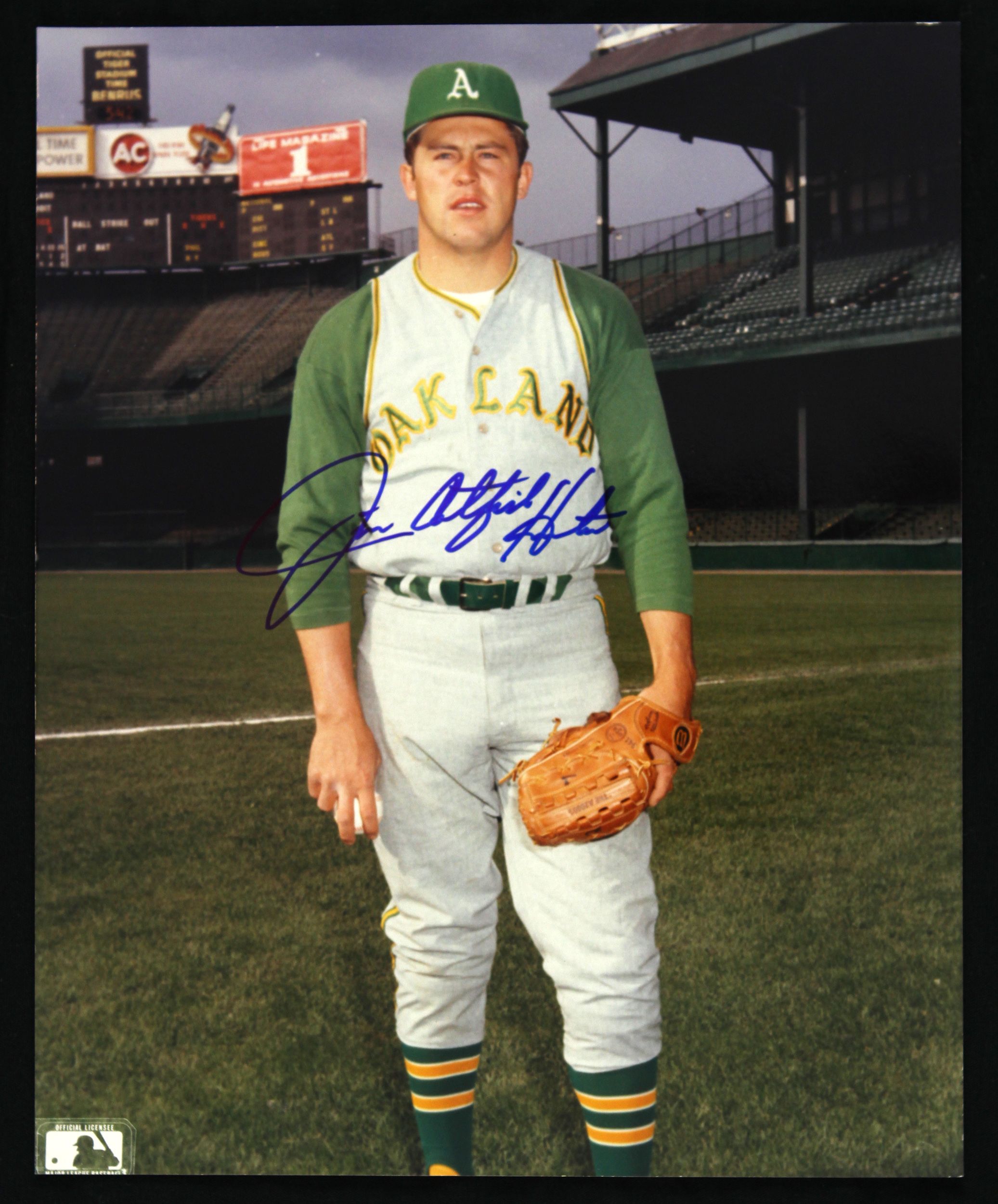
17 hours ago, DNAsports said:
100%. They couldn’t even take the time and effort to remove the number outlines and AFL patch.
Or to have Mahomes playing quarterback when this pic was taken!
-
10 minutes ago, ssj_homeslice said:
Looks like the NFL numbering system will be changed, allowing WRs and DBs to wear numbers in the single digits among other changes.
https://mobile.twitter.com/MySportsUpdate/status/1379101684912123910?s=20
Fun!
-
1
-

/cdn.vox-cdn.com/uploads/chorus_image/image/66477582/usa_today_13592132.0.jpg)


NFL Changes 2021
in Sports Logo News
Posted
It’s kind of a wash. I like Kyler’s yellow shoes in the bottom pic, to be honest.
Of course, the Cardinals should not be dressing up as blood clots in the first place.