


MCM0313
-
Posts
4,433 -
Joined
-
Last visited
Posts posted by MCM0313
-
-
44 minutes ago, nuordr said:
Make the facemask Aqua though.
And make sure the logo on the helmet is also on the jersey.
-
1 hour ago, coco1997 said:
Thanks, gentlemen!
Up next is another classic MLB rivalry identity swap!
CARDINALS x 1941 CUBS:
I wasn't originally going to tackle the Cards and Cubs, but after the Yankees vs. Red Sox this is probably the oldest and most heated rivalry in MLB history. Just as I did with the White Sox in my first post in this thread, I went back to the quirky uniforms of the 1941-42 Cubs (this time the road set) for St. Louis. Sleeveless, powder blue zippered jerseys with a white script and numbers...lots of cool stuff happening here. The centered front numbers are a detail I pulled from Chicago's 1972 jerseys.
CUBS x 1996 CARDINALS
For the Cubs, I put a twist on the Cards' iconic birds-on-the-bat logo by placing two bears playing baseball on a fallen tree. The pitching bear comes from the North Siders' 1934-37 alternate logo and the batting bear is from the team's 1908-12 uniforms. Sand replaces red as the secondary color since red didn't really work with the jersey logo. The script is from their 1994-96 road set.
Here's a closer look at the bears-on-a-log logo:
C&C appreciated!
Digging both! And I didn’t remember how cool the Cubs’ 1941-42 uniforms were, so thanks for reminding me of that.
-
 1
1
-
-
On 7/15/2022 at 12:49 PM, LMU said:
Rob Manfred:
That thing is off the chain!
No, wait. It’s ON a chain. My mistake.
-
On 7/7/2022 at 7:06 AM, heavybass said:
NOW THEN
Do you want to see the Stars stay in Baltimore or do you want Jim Irsay to take control of the Indy Stars?I know you’ve already finished that story arc, but this reminds me so much of a Choose Your Own Adventure book.
-
8 minutes ago, Volt said:
This is how it always should have been.
Silver/White/Silver is just outstanding. These pants, as someone else said, instantly make them a top NFL uni. The Navy pants were never the right call.
Also, I wouldn't be opposed to a White pant for the White jersey.Minus the plain white socks, I agree.
-
1
-
-
On 7/6/2022 at 7:55 PM, tohasbo said:
I still don't see that
Ignore all the orange.
-
20 hours ago, WSU151 said:
This jersey looked great in person...pictures don't do it justice. So the colors would work. With that said, copper is needed for Utah.
I’ve seen someone wearing a replica of that and can confirm that it’s wonderful. I think photographs convey that pretty well, though.
-
3
-
-
8 hours ago, -Akronite- said:
I don't give a
 about copper, but purple and light blue is a great idea:
- Mountainy colors, which is great for Utah
- Both have been used by the team previously
- Keeps the purple tying to the franchise's beginnings without relying on mardi gras colors which NOLA owns
- Unique combo
The concepts that turn the red rocks aesthetic into a purple mountain set kick ass, it's still wild that billionaire dollar companies flail like this so often.
I love that the NBA has/had so many purple teams and other than maybe Milwaukee (red should be their secondary color IMO) I love them all.
I included the copper (1) as a nod to the only Jazz teams to get to the NBA Finals, and (2) to include a bit of warmth in an otherwise very cool color scheme.
-
3
-
23 hours ago, DJT said:
In a interview Ryan Smith (the Jazz owner) talked about being envious of the Celtics, Lakers, Bulls how they are all identified by their color scheme.
Assuming this means the Jazz try to get into that territory in 5 years, what would their color scheme be?
purple, white, light blue?
purple, gold, green?
something else?
personally I would like a purple, white, black, copper, with maybe a little light blue too.
If they really wanna be distinctive, I’d say purple and light blue with copper as a tertiary/trim color. They would easily own that across the Big 4 sports leagues and most others, for that matter.
-
11
-
-
3 hours ago, MJD7 said:
First I've heard of it! Detroit's road script might be among my favorites in baseball.
I think I’ve seen people on here disliking the white outline, which you got rid of. I think it works great both with and without.
I also think I may once have seen someone say they didn’t like that it was two colors, and felt it should be navy blue only. I think the little glow of orange is perfect.
-
1
-
-
On 6/13/2022 at 2:05 PM, MJD7 said:
Detroit Tigers
Thicker headspoon striping, and no more white outline on the road jersey.
Thanks for keeping the road script here. It puzzles me that some people don’t like it.
-
1
-
-
On 6/8/2022 at 6:18 AM, DEAD! said:
For all their ineptitude.... I would feel better if I was a Lions fan right now.
Yeah, the Lions have a head coach that the players like, and good young talent on both lines, at wideout, at tight end, and at running back, at the absolute minimum. If my fellow OSU alum Okudah can stop tearing things and start playing like a first-round pick, this team could be a playoff contender.
The Browns, on the other hand, have a respectable QB whom they have alienated and will have to trade if they can ever find a taker; a very good RB room; a talented but injury-prone OL; a promising but often frustrating TE; one proven WR; two stud pass-rushing DEs; one very good CB; and a mega-talented but shady QB who will, at the absolute best, cause distraction through controversy, and who may well be suspended.
Head coaches are a push. Stefanski has done more thus far, but I feel like Campbell has a brighter future.
Yeah, I’d also take the Lions.
-
3
-
-
15 hours ago, bowld said:
Saw on the Madden 23 beta that the Commanders have 4 pant options.
Black, white, maroon and yellow
Yellow? Is that an Indigenous Persons throwback? Maybe a Football Team throwback? Or did they ever wear yellow pants as WFT?
I suppose they could’ve added a yellow pant at the last minute after not including them in the reveal. That sounds like something a Snyder-owned outfit would do.
-
I’m not crazy about the Saints wearing their new black helmet with white jerseys and pants, BUT…
In the photo of Cam Jordan modeling them, he was wearing BLACK socks. That is a massive upgrade over the trash white socks they’ve always worn with the otherwise excellent Color Rush look.
-
7
-
-
3 hours ago, coco1997 said:
Thanks!
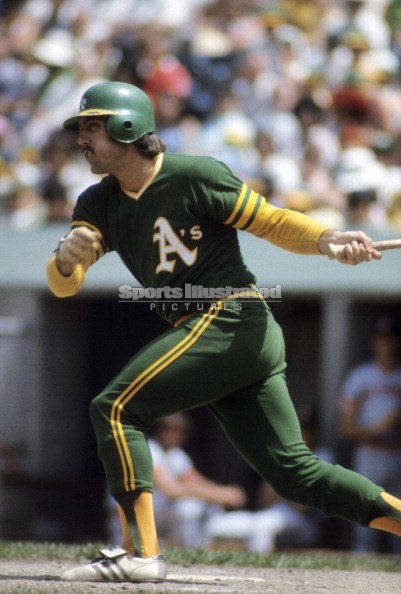
Next up are the Royals and A's!
ROYALS x 1973 A's
I gave the Royals a mono-royal blue look, a la the A's all green and all gold unis from 1973. I'm surprised this isn't something the Royals actually tried in the '70s, as I think they could've really pulled it off. I also worked up a blackletter style "R" in the style of the A's cap/jersey logo.
A's x 1985 ROYALS
It made sense to try the A's in powder blue, a color they never used but which the Royals famously wore during the 1970-80s and have since brought back. White script and numbers were a must since that was such a distinguishing feature of those road unis. Balancing powder blue with green, gold and white trim was a bit tricky but I think I pulled it off.C&C appreciated!
Powder blue does NOT look right on the Athletics, but I’m not sure of any other way you could’ve emulated the Royals’ classic look.
-
5 hours ago, DarthBrett said:
The Orioles did wear an all orange alt uni in '71 an '72. Maybe that's what you were thinking of?
I knew about those. I was thinking both orange/black teams did it.
-
4 hours ago, coco1997 said:
When was this?Huh. My mistake. Dressed to the Nines has them with orange alt shirts in the late 1970s, but never orange pants. I thought for sure those were available throwbacks in MVP 2004.
-
6 hours ago, DCarp1231 said:
The Dodgers city connect uniform and college softball teams usually wearing all color uniforms brings up a point-
Why don’t more (MLB and College) baseball teams do this?
It was a thing briefly in the 1970s. Baltimore wore all-orange, Cleveland all-red, and most famously Oakland all-yellow AND all-green. Even the proud San Francisco Giants got in on the trend; they had an all-orange road look. The Padres had a few seasons where they were all-yellow both home AND road. The infamous all-navy-blue set with white pinstripes that was pitched to Steinbrenner might’ve ended up being the straw that broke the camel’s back with that trend. Or maybe the Pirates’ mix-and-match. Or maybe the all-navy White Sox uniforms with the hideous shorts. Obviously the powder blue trend was monochromatic too, but more akin to grey.
Why isn’t that look used more today? I’d say maybe the excessiveness that it led to in the ‘70s could be a cautionary tale. Of course, one could wear it without the other, uglier parts of ‘70s design trends. I’d say, though, that the ‘80s are more in overall, with Stranger Things serving as a cultural touchstone that has led to a massive renaissance of ‘80s-inspired fashion. The throwbacks to the powder blue looks (whose original dying gasp came in the latter half of the 1980s) might’ve been an early signal that this nostalgia was growing.
Overall, fashion trends are famously cyclical. Hopefully, the next time mono baseball looks come into fashion, the designs going on those uniforms (and the usage of the uniforms themselves) will be more…responsible than those from the ‘70s. Also, hopefully mono football looks will be out by then.

-
Legit, I like that, when they aren’t wearing black alternates, the Cavaliers will have a unique color scheme in the league. I was never really okay with them dropping the metallic gold for yellow. The sword shouldn’t have been eliminated, though, and the flag was really good too.
I suspect their uniforms will be more or less decent as long as they stick to their two main colors, but I fear they may not do that very often, since everybody wears black a bunch and they won their only championship in it.
-
2
-
-
On 6/4/2022 at 8:48 PM, UnclearInitial said:
I don’t hate the Cavs going back to metallic gold, but a more brassy color would have been better than this drab Vegas gold. The shadowed C doesn’t work in 2 colors, just use the outlined version. Trying to be 5 different identities at once doesn’t work, the 2003 C Sticks out like a sore thumb, too bad it’s by far the most unique and recognizable part of the Cavs brand, which is why they should simply base their identity on that
VEGAS GOLD IS THE ONLY SHADE OF METALLIC GOLD IN EXISTENCE, AND YOU WILL APOLOGIZE FOR BESMIRCHING ITS GOOD NAME!
~~~Nike
-
2
-
-
3 hours ago, flyersfan said:
Not sure of his sources, but Twitter user caseyvitelli has been posting a bunch of “classic” edition uniforms for this season and vouching for their legitimacy:
So, from the look of some of these…the ‘90s are back? I could live with that.
-
2
-
-
On 6/2/2022 at 9:21 AM, FinsUp1214 said:
Meh, I’d much rather the Falcons have a full ‘98 Dirty Birds throwback, or an 80’s throwback if they have to wear a red helmet. The gold stripes on the ‘66 red helmet drive me crazy and it’s all I focus on when they have worn it.
Dirty Birds looked so great. I’d like to see a throwback to the white uniforms in which they won the NFC Championship. The black home uniforms were good too, but the road look had incredible balance.
-
1
-
 1
1
-
-
1 hour ago, coco1997 said:
Thanks! Your feedback is always valued.Let's jump over to the state of Missouri for the next pair of teams!
ROYALS x 1942 CARDINALS
My Royals design is based on what's easily my favorite uniform in Cardinals history, their 1942-50 zipper-down set set with t-bars and navy crowned cap. I was originally going to go with blue piping, but gold ended up looking much more distinctive.
CARDINALS x 2002 ROYALS
My Cards design imagines what the team would look like had they went all-in on the Black for Black's Sake trend of the early 2000s the way the Royals did. I went with a vest style jersey design with black replacing navy blue, while a drop shadowed version of the the birds-on-bat-less script comes from their 1956 set.C&C appreciated!
Please, PLEASE pick another Royals era than the early aughts. Those uniforms were hideous on the Royals and would be even worse on the Cards.
-
5 hours ago, oldschoolvikings said:
I like that you put gold/yellow back into the uniforms. I also like that you made the numerals on the white jersey teal again - that’s the only color they should ever be IMO. I’m not wild about the stripe on the helmet - for one, I don’t think a teal stripe would stand out enough on a black helmet, and for two, I think their current helmet looks very sleek in a glossy black with no striping.
-
1
-


 about copper, but purple and light blue is a great idea:


/cdn.vox-cdn.com/uploads/chorus_image/image/66720674/453023866.jpg.0.jpg)
NFL 2022 Changes
in Sports Logo News
Posted
That look REALLY needs black socks.