


MCM0313
-
Posts
4,438 -
Joined
-
Last visited
Posts posted by MCM0313
-
-
On 5/12/2023 at 12:23 PM, CaliforniaGlowin said:
Special Hornets jersey has error


35th anniversary logo
That is one of the funniest pictures I’ve seen in a long time.
-
6 minutes ago, Brave-Bird 08 said:
Not if the Texans aren't also adding two different shades of grey
So, aside from sparsely used accent colors…the same basic scheme. I would understand if they weren’t division rivals, but come on.
-
 1
1
-
-
13 hours ago, JustABallCoach said:
Credible leak was the Columbia blue H hat from their uniform meeting with the media. Sounds like there’s some push back from the league that they are working through. Ownership has been clear that light blue is also found on city flag and Houston police cars.
Based on everything we’ve seen and heard it seems like they will add light blue to their current colors and focus on red overall more. I’d expect the old English H Town font to be prevalent too.So what we are saying is that the Texans and Titans will have essentially identical color schemes?

-
 1
1
-
-
3 hours ago, HOOVER said:
It was just the closest example I could find.Personally, I feel the Red face guard is the “pop” and if metallic, the contrast is best when used with an anodized, satin, or matte finish on a helmet, and I don’t find any of those finishes “boring” when executed properly. I do find it boring when everything on the helmet - shell, mask, decals…is glossy/metallic.
Either way, the point I’m making is the Red facemask is the pop the helmet needs if they’re retaining a Navy shell.
I would love to see a red facemask on their current helmet. They could do that concurrently with changing their primary to red.
-
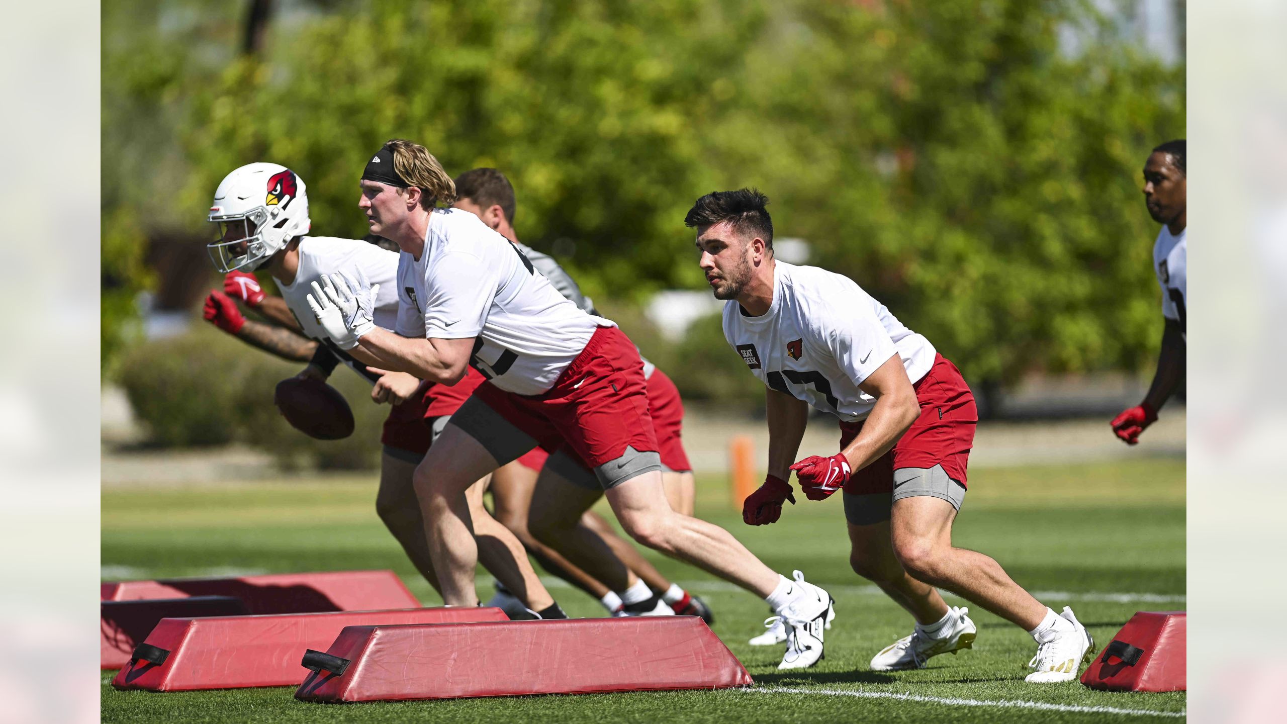
15 hours ago, TheOatsMustFlow said:First look at a new Cardinal helmet in natural lighting. Looks the same.
I think the logo looks shinier.
-
22 hours ago, MrAstrodome said:
Maybe he was the friend the stood downwind?
In that case, I fully understand why he doesn’t like the nickname.
-
46 minutes ago, Brave-Bird 08 said:
Warthogs is a terrible nickname.
I see that you, in your youth, didn’t get downhearted every time that you farted. Good for you.

-
 1
1
-
 3
3
-
-
Rename as Warthogs. Borrow some Disney goodwill like Oregon, and make Puumba the mascot. Logo should be much tougher-looking. Helmet should be same color as current, with white or yellow tusks (kind of a reverse of the Vikings’ horns). Bring back the marching band and have them play “Hakuna Matata”, with professional Broadway actors stepping out to sing Timon and Puumba’s “when I was a young warthog” parts on the bridge.
Am I joking? I…don’t know.
-
1
-
-
8 hours ago, TheOatsMustFlow said:
Not sure why it matters - they’ll just wear black every game anyway. Don’t get me wrong, I like their black alts, but they need to wear purple too.
-
 1
1
-
-
4 minutes ago, BBTV said:
per TruColor, the brown has changed several times since '99. IIRC, at one point it was called "seal brown" and even lighter (maybe the original franchise).
2007-2009 on left, current on right:
Great minds think alike.
-
2
-
-
1 hour ago, Lights Out said:
I don't think it's a supplier issue, I think the problem really is the shade of brown. How brown it actually looks has always depended on lighting and/or weather conditions, whether it's Puma, Reebok or Nike.
Thing is, they don’t currently wear the same shade of brown as in those eras. They changed the brown most recently in 2010.
Personally, I think the best brown they’ve ever worn was the “seal brown” they had from 1979-95.
-
1
-
-
3 hours ago, heavybass said:
Then again are most scandinavians furries? That's the question.I have some family members in Minnesota who have partial Swedish ancestry. I don’t *think* they’re furries, but I don’t see them that often, so…maybe?
-
1
-
-
3 hours ago, heavybass said:
Minnesota after years and years of sucking essentially willed a mascot from the gods themselves....
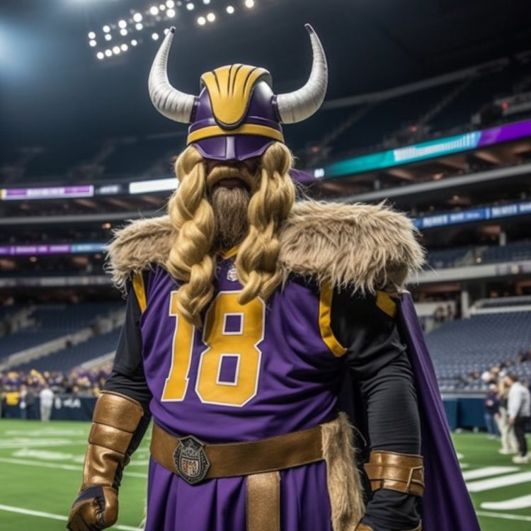
I didn’t know the Vikings were furries.
-
1
-
-
19 minutes ago, BBTV said:
Eagles D'Andre Swift will be the first player to wear 0 for them since his usual number (and its reverse) are taken.
He should campaign hard to be nicknamed “Agent Zero”. Then monetize that somehow.
-
1 hour ago, tBBP said:
Time out—where was I when this game was played? This is the first time I've seen the Panthers wear black socks with their away whites...
It was in 2018 as mentioned by another…which makes sense as that was before all-white with white socks was automatically, 100% of the time,


 and whatnot.
EDIT: the second was just last year. Surprised the Panthers haven’t been kicked off Twitter for not going
.
-
On 5/3/2023 at 12:57 PM, aawagner011 said:
It was speculated the Falcons would keep the Vapor Untouchable template, however, that appears incorrect.
There are things about these jerseys that I like. The way the thin number outline gives a subtle 3D effect is cool. Having the NOB of the white be a different color from the number is great. I could get used to the side striping if it lined up neatly with the pants stripe. Not wild about the ATL, but the jerseys aren’t at all bad in a vacuum. If they added an option for red socks, changed the gradient jersey to full red, and went mix-and-match like the Bengals, these guys could look okay. The “icy whites” make no sense for a team from HOTlanta, but that’s none of my business though.

 ️
️
-
2
-
-
9 hours ago, DCarp1231 said:
I’d be fine with the Dolphins pulling a Tampa Bay and giving a previous uniform, in this case the throwback, a facelift.
Update the logos a smidge. Hell, get an orange uniform in the mix again.
Update the logo. Change facemask back to aqua. Put newly updated logo over sleeve stripe. Have white pants and aqua pants. Wear striped socks full-time. Boom.
-
1 hour ago, gosioux76 said:
You're absolutely right. And there's that additional oddity of a team like the Pistons, which will spend five years masquerading as a teal expansion team before coming to their senses and remembering who they actually are.
The thing I find odd about the Nuggets current uniforms is that I can't really get a sense of what their actual colors are. Are they a primarily navy+yellow team? Navy + white with touches of yellow and maroon? Navy with imbalanced amounts of dark red/yellow/white? And then for good measure, they thrown in a royal blue alt that doesn't fit in at all.
It's one thing for a team to be schizophrenic with its color schemes across decades. The Nuggets seem to be doing it across every uniform all at once.
Personally, I was always fond of the Dan Issel-era wordmark, even though I found the uniforms of the pre-rainbow guts era a little lifeless, much like they are today. That's why I really liked their mixtape uniforms from last year (minus the rainbow stripes on the shorts.) Much like with the Timberwolves, I felt that Nike and the team put together something with character that could be the foundation of a permanent new look.
I would love a new set built around that.
-
2
-
-
17 minutes ago, j'villejags said:
JR Smith looks like he’s about to float off into space.I can’t unsee that now.
He has to go now. His planet needs him.
-
4
-
1
-
-
On 5/1/2023 at 12:23 PM, Saturn said:
Well dont I look dumb now...
Well, in fairness, the Chiefs *do* dominate in the AFC South when they play them.
-
3
-
1
-
-
2 hours ago, who do you think said:
Both great sets that got murdered by the material switch. I don't know why the Rockets not only stood pat afterward but even kept the general template through another material change. This crap is the turd in the punch bowl of that 65 win season.
Not gonna quote the other post, but that mid-10s Denver set (both iterations) reminds me of that ghost-piping mid-00s Orlando set, I guess you could call it the Steve Francis era. So unremarkable and easy to forget about until someone posts a pic and reminds you it existed.
*throws boiling hot water in Nike's face*
There needs to be a limit on how many times a team can wear its alternate uniforms in the playoffs. Icon and Association are the “regular” ones, right? No more than once per series or three times overall, whichever is less, for each of the other two. I actually looked at the set matchups at the start of the first round, and over half the games (at least in games 1-4) were a team in white against a team in black. We need more color!
-
7
-
-
21 hours ago, the admiral said:
I said what I meant and I meant what I said. We clocked what they were going for weeks ago with the Old English lettering, and not only is "urban streetwear" a bad fit for the brand and a misstep for a team whose league should be above trend-chasing, it's also tacky coming from an organization whose opinions on enthusiasts of "urban streetwear" are pretty clear. No apologies.
The NFL hasn’t been above trend-chasing since before The Swoosh took over. BFBS jerseys were already a thing. Mono was already a thing. The Swoosh has made those things more prominent, but NFL teams try to look trendy just like anybody else.
-
7
-
-
I’m not from Texas, not a Texans fan, not into lowriders, etc. - but I like the candy finish and, even if I didn’t, don’t see how something so shiny is all that bad. I’ve disliked matte helmets since I first saw them and, while satin finish works for the Vikings and Falcons, it’s too dull for most teams. Candy gives another way for a helmet to be colorful, besides basic gloss and metal-flake. I’d like to see more teams experiment with it - and if that means a slight shade adjustment to make it work better with the jersey, that’s fine.
Honestly, with how Nike has been jamming whiteout, blackout, Color Rash, matte helmets, monochrome, etc., down our throats, I would think a little more color would be welcomed.
-
3
-
-
2 hours ago, the admiral said:
It wasn't immediate! We've been gradually keeping an eye on the Texans trying to pander to black people and the white people who larp as them.
Lolwut
-
1
-


NFL 2023 Changes
in Sports Logo News
Posted
The Titans’ secondary color is light blue. The silver is kind of a tertiary, then they have red and dark grey competing to be quatrary.
I don’t like the idea of two teams in the same division both having double-blue, even leaving out the red bit.
Whether or not the Texans add light blue, I’d really like to see them make red their dominant color.