


MCM0313
-
Posts
4,438 -
Joined
-
Last visited
Posts posted by MCM0313
-
-
On 4/28/2023 at 2:22 PM, ramsjetsthunder said:
I think It'd be twice as good if the stripe and logo matched the white pants
Yeah, a little pop of silver would help.
-
11 hours ago, Old School Fool said:
Where have you been? They wore it and it sucks.

Yeah, Cowboys with a white helmet have never looked quite right to me. It’s passable with the blue jersey, but still much less distinctive than the normal silver helmet.
-
13 hours ago, the admiral said:
Dog in sunglasses: should not like it but I do
Rotoscoped Ohio dog: should like it but I don't
Brownie Dog: honestly, roll with this one
Brownz Pupz Kidz Club
LOL REALLY
Carson Palmer's dog getting revenge on Kimo von Oelhoffen
I think the Brownie dog is fantastic.
-
5 hours ago, 8BW14 said:
Yeah I’d be okay with that. The logo never needs to change. I’d rather see Philly ditch the black and charcoal and ride with midnight green and silver. That would probably necessitate more than tweaks to the uniforms, though.
Hahahahaha, a team ditching black! The Swoosh is laughing so hard it’s hyperventilating. Everyone knows anything black is
 .
.
(For the record, I agree with you - either shade of green, silver as the secondary. I just think the design landscape will need to shift before a look like that becomes likely.)
-
 1
1
-
-
3 hours ago, Pigskin12 said:
I'm not sure how relevant this is. The Cardinals specifically referred to each of these monochrome suits as the home, road, and alternate looks and specified the colors of each uniform element:
The Commanders only modeled monochrome as well, but they also kept plain pants for all colors, whereas Arizona has red pants without a stripe, but white ones with a stripe. This shouldn't matter, but I fear that this was on purpose and they will use it as an excuse to stick with the same three combos.
I suspect that, for the first half of the season or so, that will be the case. Then they’ll want to change something, anything, because they’re getting clobbered every time. Or they’ll get bored with the same three combos.
I think they currently fully intend to use the uniforms the way they were modeled, but I don’t think it will stay that way for the duration of this look. Teams’ uniform rules tend to become less rigid over time. (Same for the league’s, but that’s a whole different matter.)
-
7 minutes ago, batman1211 said:
Clearly I am in the minority, but I like them a lot! I don't like having "CARDINALS" on the sleeve, but at least it is small. The large Arizona on the red jersey is too big, IMO. Overall I really like the clean uniforms. Some are disappointed that they aren't more Nikefied. I am glad that they aren't! Some people don't like the northwestern stripes on the sleeve, but I think they are great In a perfect world without Nike, these may be considered average. In a world where we do have to put up with Nike's influence, these are excellent! I do think that there will be some mix and match and in that there are some great combinations.
I agree that there are some good possibilities if you mix and match. I feel like they’ll wear mono a lot out of the gate, get creamed a lot, and decide to inject a little freshness by using more variety. Or something like that. But by the end of this coming season, I think they’ll be wearing monochrome some of the time, but not all the time.
-
2 minutes ago, Echo said:
They need to save the double-digit numbers for players who aren't stick figures, I guess.
Yeah, Rondale Moore is a pretty small guy. Like, even if he weren’t an athlete and I knew him in person, I’d say he’s slightly below-average in height, with a slender frame. For an NFL guy he’s tiny.
-
1
-
-
25 minutes ago, PERRIN said:
Well... They're better than the previous set. Not great, not especially bad. The lack of stripes and giant wordmark on the home jersey bothers me a lot, but it's still by default one of Nike's better redesigns on account of how there's simply not much to talk about. I'm disappointed it wasn't something so extravagant, even if it was horrible, because at least I'd feel something about them. I'd be perfectly fine with them if the home matched the alt and away, but as they are, I can't say I like them, even if they aren't especially bad. I'd give them a C+ grade. Definitely an upgrade, but aggressively mediocre. Just about anyone here on the boards can and has done better, but what they're going with isn't actively bad, save for that goofy wordmark.
And yet, after all the chicanery I've seen on this board in the last day, I can't help but feel robbed nonetheless.
The sleeve stripes (or lack thereof, on the red jersey) are pretty clearly fashioned after those worn before 2005. Plain red jersey, three stripes on the white (mixed with the Arizona state flag after the move from St. Louis). I don’t mind the quirk because of its ties to team history.
-
5
-
-
First thoughts:
- I don’t like that they introduced all three as monochrome. They BETTER do some mixing and matching or we will have problems.
- All that fuss about the socks and they’re plain. Blech.
-The white set is the best to me. In fact, I would absolutely LOVE it paired with red socks.
-I like the subtle addition of silver. I also like the changes to the helmet. I feel like the silver flecks will work well. The upsized, brightened logo and slight 3D shading also look nice.
-Somebody PLEASE tell these clowns that all-red looks like a blood clot. Please.
-
5
-
-
It looks like different graphics are different shades of red. I’m hoping the darker one will be the one used.
-
38 minutes ago, tBBP said:
Speaking of Kyler: "PROTECT THE NEST"?? What kinda...ain't no bunch of grown men tryna be no baby birds around there, are they??
Kyler and his receivers will model the new uniforms while standing protectively in front of an offensive line dressed in duckling costumes.
-
 1
1
-
-
26 minutes ago, j'villejags said:
I love me some Leslie Nielsen.
This thread tonight:
Surely you can’t be serious!
-
 1
1
-
1
-
-
3 minutes ago, MiK said:
They’re milking this like a prized Guernsey.
-
21 minutes ago, tBBP said:
It also wouldn't be the first time Nike has literally modeled a football uniform after a bird. Observe...
(Still can't believe that actually made it onto an actual field of play in an actual game...)
Quack quack, bitches.
-
1 hour ago, Carolingian Steamroller said:
this thread has gone to some dark places.Especially dark for little Billy there. Because he can’t see.
-
 1
1
-
-
9 minutes ago, TruColor said:
Ha! That’s nice for you to say.
I am prepared to apologize to all of you if the teasers I have been dropping are all lies.
(I will fully divulge what I thought they were if they are untrue.)
Even if your impressions turn out to be mostly right, I would still like to know how you were picturing it based on your conversations.
-
4
-
-
2 hours ago, j'villejags said:
Pretty easy fix.
That could be done so easily! Make a black jersey, gold pants, black pants in this style. Burn the stripeless black pants and the plain white socks. Done! It ties to team history and has the pizazz you would expect from a New Orleans team. The set would be hailed as an instant classic by the vast majority of fans. So much better than the drab, lifeless look they insist on wearing so often today.
-
2
-
2
-
-
30 minutes ago, Sodboy13 said:
Major League Soccer did not grace us with The Iconic Jaws of Husky Stadium. Nike was pumping out the Nikespeak long and hard back when MLS was just slapping crests on whatever Adidas template was on offer.
Heh heh, he said long and hard.
-
1
-
4
-
-
45 minutes ago, AdobeDesignBG said:
Hear me out. The teams bring all these uniforms back but like slightly modernize them. For instance bucs move the numbers from the sleeves to shoulders and then add the logo from the helmet where the sleeve numbers were. For eagles make a black version of that jersey alongside the white and green. Stays similar but different at the same time.
Teams do not need encouragement to trot out BFBS crap. For Pete’s sake, the Eagles should be using silver as their secondary color, but they’re so “BLACK IS COOL AND UNIQUE WE LOOK SO COOL HURR DURR!!!!!1!!!” that they emphasize it even though it doesn’t contrast properly with their primary color.
Sorry, nothing against your idea, just that example. I’m not opposed to the concept of a Reverse Retro-type promotion in the NFL, but I’d like it much better if teams were forbidden to use black or navy blue as the base color for their jerseys in that style. We might actually see some creative designs in distinct color schemes.
-
1
-
-
5 hours ago, HOOVER said:
Saints should use the number font from their white Color Rush set.Saints should use everything from their white Color Rush set except the socks.
-
2
-
1
-
-
1 hour ago, tBBP said:
I can't understand the disdain for the Panthers, either. I've always liked their uniforms...I don't like, however, some of what they've done to/with them lately.
Now the Snatit is a different story. From having lived in Nashville when those first came out to now, I've tried—really hard, in fact—to find some redeeming quality in those sets, and to date, I've found exactly two. I will say that I like the shape of the shoulder yokes—I've even somewhat reluctantly come around on the two-tone gray treatment (two-tone blue, two-tone gray...ehh, I'll let it ride). With that, and it being the same color on all their jerseys, I also like how the two-tone grays plays against each individual jersey color; coincidentally, I find myself liking it best with the columbia blue jerseys. But that for me is where it stops. Now I can't get on Nike for the navy helmets, as I think that was the league's idea to go from white to navy, but that logo really doesn't read well against the navy helmet...and that silver/white stripe is just out of place (perhaps its too should've been two-tone gray). Then there's the numbers, a classic case of Nike "doing too much"...especially when one number pair, 11, looks stitched on backwards. But perhaps my biggest gripe—and this is probably more on the team since I watched this slowly happen during the years I lived there—is how they pushed their most identifiable brand element—columbia blue—not even to the back burner, but dang near completely off the stove.
Now, if y'all wanna know something funny...
I've always felt the Cardinals' uniforms got more hate than warranted. Of course that won't matter after today so...

Oh wow. I don't know how I've never seen those before (what team is that?), but that color combo actually looks pretty nice!
That picture shows the Jacksonville Bulls of the 1980s USFL. Sadly, they weren’t revived in the league’s 2020s edition.
They used maroon/burgundy/garnet in homage to Florida State, and orange in homage to either UF or Miami (or both). Not sure why the silver, but certainly not complaining about it either. Cool color scheme, cool logo.
EDIT: orange was for UF, silver was apparently for UGA.
-
19 minutes ago, ramsjetsthunder said:
Alright, everybody. Take one last look.
You know, from the front, those don’t look half bad. It’s just when you get to the sides that you are reminded what an utter train wreck that set was.
-
8
-
-
40 minutes ago, HOOVER said:
Last comment on this because I get triggered when I see the ATL uniforms: find me someone on the planet who thinks Atlanta's current set is better than this, or a slightly modernized version of this:
And again, if you put that Black/White/Red logo on this helmet below, with a helmet stripe that matches the pant stripe, and Grey pants, it's a tremendous uniform:
Those throwbacks are solid, but I still prefer the 1997-2002 set over anything else the Falcons have ever worn. Either is better than their current garbage - er, garb, though.
-
1
-
-
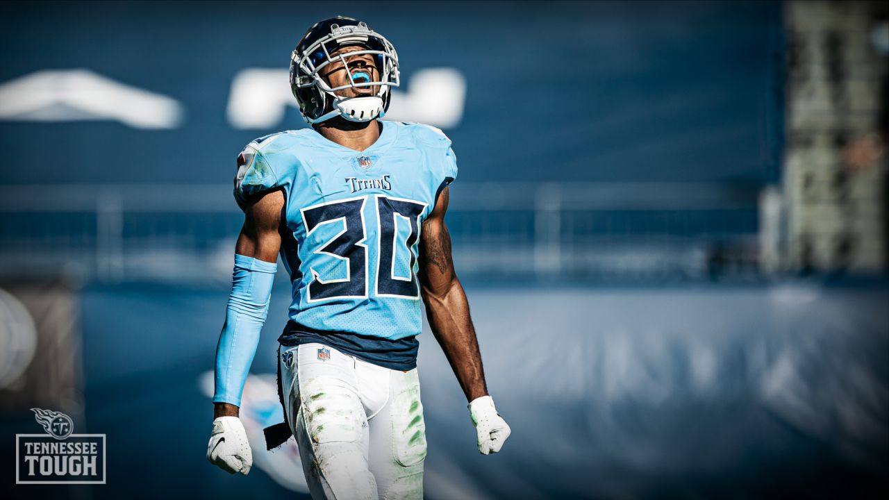
12 minutes ago, HOOVER said:
This is exactly how I feel about the Titans.
Their insistence on wearing the Navy pants with home, away, and with the Light Blue jersey ruin what is otherwise a much better design than the Jets, Commanders, Falcons. They should wear White pants home & away, and only wear the Light Blue pants for Color Rush games wearing the Light Blue jersey (which also looks best with White pants) and an occasional Away game with the White jersey.
GOOD:
MEH:
NOT GOOD:
I actually think the Titans should sub in the Columbia blue pants for the navy ones in their primary home look. And they should wear the white ones with the Columbia jersey.
Tennessee actually doesn’t have a Columbia blue color Rush with this set. Since its adoption in 2018, they have never once worn Columbia blue socks, which leads me to believe this set simply doesn’t have them.
-
3
-


NFL 2023 Changes
in Sports Logo News
Posted
Shoot, I can’t imagine the art if they were still the WFT OR the Indigenous Persons.