


MCM0313
-
Posts
4,438 -
Joined
-
Last visited
Posts posted by MCM0313
-
-
20 minutes ago, j'villejags said:
I’d welcome it. I’ve always thought purple and black with a tiny bit of red looks so good.
Vince Carter helped make ‘the look’ cool for me.
Let’s just make sure the front and back of the jersey are the same color this time around, eh?
-
 2
2
-
-
19 hours ago, oldschoolvikings said:
Or you could go in a completely different direction for the Ravens...
@HailGoldPants's beautiful realization of a "just for fun" logo I came up with.
That would’ve worked better when they had The U products Ray Lewis and Ed Reed on their team, because the bird looks like a relative of Miami’s cartoon stork.
-
On 5/28/2023 at 12:49 PM, MJD7 said:
That shade looks similar/possibly identical to the Saints throwback shade, which they ought to be wearing full-time.
The Washington Huskies also had a darker gold under Nike that in my opinion worked pretty well:
But yeah, the mismatch with so little gold on the helmet & jersey didn’t work well for the Ravens.
Those UW pants aren’t quite dazzle, but they are shiny/reflective and maybe even a bit metallic. When is this picture from?
-
10 minutes ago, the admiral said:
Ravens should be all black at home, black/white/black/purple on the road (purple numbers on the white to match the socks). Come up with a new number set: consider a variation on the New Orleans Hornets' old Council numbers from 2007-2013.
The Ravens' culture has always supposed to be dark and menacing, so I never understood how they went years wearing white pants with striped white socks at home. The mustard pants were a terrible idea, too.
I actually think they should be black/white/purple/black on the road. Their purple pants are far better than the black ones. In fact, I would say they should either add stripes to the black pants, or ditch them and just go with black, purple, or white jerseys, purple or white pants, and black socks full-time.
-
 6
6
-
-
13 minutes ago, MJWalker45 said:
Just bring back actual striped socks.
Nike has relegated striped socks to the “uncool” bin, where they reside alongside dazzle fabric and full sleeves.
-
7
-
-
1 hour ago, ltjets21 said:
Yes....but this on the other hand is atrocious.
Hey, at least Philly is wearing black socks here instead of plain white. (Yes, I know you were referring to the Baltimore guy.)
-
1
-
-
4 hours ago, JustABallCoach said:
I worked on what I think the Texans could look color wise, details obviously would be different. But I think it shows you can add the light blue without looking like the Titans.
The collar horns look great on the navy jersey but on the others they don’t look like horns.
…also, I agree. These don’t really look like the Titans. They’re a lot better.
")
-
3 hours ago, Bill0813 said:
The pants have the same grey camo stripe down the leg that the jerseys have.
The jerseys have a camo stripe down the leg?

-
1
-
-
1 hour ago, WBeltz said:
Burgundy and Light BLue are pretty common across soccer, Aston Villa, Burnley, and I'm pretty sure there are a few others across different European Leagues. Although in OTHER sports yeah under utilized.
Of course, the photoshop wasn’t quite in Avalanche colors, as they wear slate blue rather than sky blue. That combo needs something to add more contrast, and that’s where the Nuggets’ longtime use of yellow (or even gold) could come in.
-
On 5/17/2023 at 12:00 AM, j'villejags said:
Seeing the fan shirts the Nuggets had laid out for Game 1 had me thinking -- what if they adopted more of an Avalanche-esque color scheme?
They’d need some kind of yellow or metallic gold in there as a nod to their name, but there’s no reason it couldn’t be tertiary/trim. That would be quite a distinctive look - plus, having red, blue, and yellow together in one place is kind of what their state flag is known for.
-
1 minute ago, DCarp1231 said:
Imagine if they revealed the jerseys as reversible
Shoot, is it the ‘90s again? I’m pretty sure I had a reversible track suit as a kid.
-
19 hours ago, Silent Wind of Doom said:
"Randy Ready". If you'd told me that was a major leaguer, I would have guessed…he was from the 1920s.
The Roaring Twenties had some cool names (Urban Shocker (not even a nickname!) and Tony “Poosh ‘Em Up” Lazzeri both come to mind), but the best names in baseball history come from before 1900. Ice Box Chamberlain, Live Oak Taylor, The Only Nolan, Piggy Ward, Cap “Look At How Racist I Am With My Racistness” Anson, Deacon White, Old Hoss Radbourne, Brewery Jack Taylor, Ham Allen, Favel Wordsworth (not even a nickname!), Silver Flint, Bob “Death to Flying Things” Ferguson, Alamazoo Jennings, Sparrow McCaffrey among just a very few.
-
1
-
-
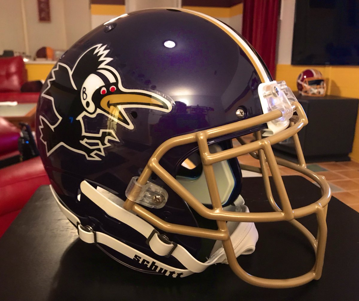
1 hour ago, VampyrRabbit said:
I love that terrible cartoon bird. Plently of teams have a letter on their cap, few rock a bird that has taken several bong hits.
Like…right on, man!
In all seriousness, I like the cartoon bird but LOVED the realistic bird. And I enjoy the cursive letters too. I suppose having too many good logos in a team’s history is a first-world problem.
-
4
-
-
On 4/10/2023 at 9:04 AM, bushy said:
That just looks like a stereotype lol
A good one like Bose, or a cheap one like Casio?
-
1 hour ago, mattb6 said:
The Cincinnati Bearcats have agreed to a deal through a third party for Jordan to outfit its basketball teams and replace Under Armour starting this fall. As I mentioned in the college football thread, the two-year deal through a third party signed less than three months ago all but guarantees UC will be in customized catalog uniforms for their first two seasons in the Big 12. The contract was signed for two years to allow the Bearcats to leave Under Armour early and order from Nike catalogs until the team can sign an official deal with Nike and receive custom looks.
After the news broke yesterday, 2023 commit Rayvon Griffith posted this to his instagram account. The post looks like an official graphic made within the program—the “Men’s Basketball” logo at the top and overall style are dead giveaways. The jersey is notably very similar to the ones worn by the team during its original run with Jordan from the mid-90s to the early 00s.
I checked the Jordan Nike Team catalog and found no such template. However, the Nike Team Men’s Basketball catalog has a template that seems almost inspired by the Kenyon Martin-era Bearcats jerseys on page 7. This look could be easily customized with a colored collar and the Cincinnati word mark and font.
Which leads me to believe that a white and black version of the jersey in Rayvon’s post will be the Bearcats uniform in 23/24 and 24/25 until the team has a direct contract with Nike and receives fully custom looks.
I like those ‘90s-style Cincinnati threads. Sharp.
-
9 minutes ago, NYCdog said:
First appearance of the Texans new Old English wordmark for the 2024 rebrand?
Am I the only one who doesn’t hate this look? Kind of has a late-nineties feel to it, but then if you combine that with red and baby blue with navy trim,.,it actually sounds good to me. Unique if nothing else.
Of course, the helmets better have either the current logo or (even better) bull’s horns on them. If it’s just a plain helmet with an Old English H on the side, that’ll look trashy.
-
2
-
-
On 5/15/2023 at 2:46 PM, CS85 said:
The man looks like he's trying really hard not to poop himself.So that’s why George Brett was screaming “JUST LET IT GO ALREADY!” at the TV while watching this game. I had always assumed someone was taking too long to shoot a free throw.
-
On 5/16/2023 at 11:26 AM, Krudler said:
I'd rather exclusive white at home green on the road, but I'll take the black set over the dark green monstrosities.
Really? I think the black set is the monstrosity. I don’t really like the dark green for the Celts, but I think it’d be a good look for a team like the Bucks.
-
1 hour ago, Carolingian Steamroller said:
On paper sure. But how many times have we seen situations where we find out "Yeah players went to our equipment team and kept pushing to wear X combination so they just did it one day." Social media, coaches, and marketing people tend to have the most control over the jersey selection and specific special combination like Color Rush but often you get the equipment managers filling gaps especially in terms of pants and socks which matters a lot to nerds like us but less to higher ups.
Some teams do tightly control their operations (I know for a fact that the Bears are not going to wear white over white again while George McCaskey is in charge because he doesn't like that combination) but that tends to be more of an exception.Is McCaskey (what a perfect Chicagoan name btw) also responsible for keeping them in striped socks long after the vast majority of other teams have dumped them? If so, bravo to him!
-
2
-
-
29 minutes ago, Kiltman said:
Yeah for like a one off look it’d look cool
…I mean, if they’re gonna have a navy alt helmet, they should just do a full 1994 throwback while at least one or two of those guys are still living. (I’m exaggerating, but they did have like 8 or 9 of them who died before 50.)
-
1
-
-
14 minutes ago, DCarp1231 said:
It’s almost like the helmet is being used as a decorative piece in an office
Hey, it’s the Washington Warthogs’ perfect logo!
…or at least a perfect representation of the Snyder era in DC - a pig with a nonfunctioning brain.
-
3
-
3
-
-
On 5/5/2023 at 1:53 PM, Chicageaux said:
Last time I was wandering the woods by myself, I came across a blue & orange bear in an open clearing. The Bear was wearing aviator sunglasses and it was eating deep dish pizza & I thought to myself, "It all makes sense now."Then it had its ninth heart attack. Blame those Polish sausages, or the sudden presence of Hurricane Ditka.
-
 1
1
-
-
10 hours ago, batman1211 said:
The titans have a muddied dark blue/grey/silver/columbia blue jersey with huge crooked/broken numbers. I don't think there is anything that the Texans could possible come out with that would be confused with the dumpster fire that is the Titans jersey.
Oh, I agree that, whatever the Texans come up with, it will probably be much better than Tennessee’s set, unless it involves a dramatic style change. I just don’t like the idea of division rivals sharing three colors, more or less. But if the Texans were red primary and either navy secondary with Columbia tertiary, or Columbia secondary and navy tertiary, that would give the color schemes enough space. And it would be a cool nod to Houston’s past, especially given Tennessee’s stubborn insistence on remaining navy-primary.
-
1
-
-
5 hours ago, BBTV said:
I'm not sure why teams put out tweets like that when they're guaranteed to receive mostly negative comments. Some are even mildly entertaining. On the other hand, I love how people post their concepts and are so adamant "WOULD THIS HAVE BEEN SO HARD?!?!?" when they're designs are considerably worse. Also sad is that so many people feel like there needs to be a state flag somewhere on them.
“All publicity is good publicity”, or so they say.
Here’s my take: I consider myself a pretty fashionable guy. Most of the time my shirt is one color, my pants are another, and my socks are either the color of my shirt, or a color found within the design on my shirt. And bear in mind we aren’t talking suit and tie, but shorts/khakis/jeans and either t-shirts or a button-up, depending on what I’m doing. And I look great most of the time, if I do say so myself!
The “it’s called fashion” tweet implies (though probably unintentionally) that the concept of color blocking is dated and no longer part of current fashion. Yet I need only to look at my own wardrobe to know otherwise.
-
1
-


Columbus Blue Jackets reboot 6/1/2023
in Concepts
Posted
I think the home and road work great. Not a fan of that alt. The logo on the front of the sweater could work as a secondary, but the yellow streak down the back, even with explanation, doesn’t look good to my eyes.