


MCM0313
-
Posts
4,438 -
Joined
-
Last visited
Posts posted by MCM0313
-
-
On 2/10/2023 at 9:21 PM, BBTV said:
Rather than a patch, the Yankees should work the advertiser's name into their pinstripes.

(not really)
I looked at that and thought, “Isn’t that the leader of Egypt?” I was mostly right - he used to be. Do those pinstripes really have words in them?
-
2 hours ago, Pigskin12 said:
This game has gone from possible best of the weekend to mediocre. Pant color shouldn’t even be a debate for the Chargers if the other team is wearing white from the waist down, but I guess using the term ‘icy’ makes it worth it.
They’d better still wear the blue socks.
-
On 1/10/2023 at 9:01 AM, tBBP said:
The Jags can solve their *lack of teal* problems simply by sticking with teal pants home and away, especially with their current sets. They do that and we'll be guaranteed a lot more teal on the field. (Plus, as long as they stick with single-color numbers & this current set, I personally think it's their best primary pairing.)
Observe:
They keep it to this and, while not ideal, I could live with the teal jersey as an alternate--and I'd be fine with never seeing the white pants again. Plus, since "Black and Teal" has been their marketing thing for almost a decade now, what better way than to emphasize them the most with the color combos they wear on the field. (Yes, I realize I'm making a ton of concessions here as a fan since their inception, but given their current state or aesthetics, if this is what they're gonna stick with, those are the best ways to present it.)
O-Shag-Hennessy!
-
14 hours ago, mahnkej said:
According to an NFL source, Detroit has submitted paperwork to update their uniforms for the 2023 season. According to the article:
"Per NFL Source, The Lions have submitted paperwork to the NFL to redo their uniforms. The prevailing thought is the Lions will be combining their current throwbacks with their current Lions logo with a modern twist on the jersey that would look similar to the Sims/Sanders years.”
If true, this is fantastic news. Detroit has some decent, albeit unspectacular, uniforms currently - definitely an upgrade from the previous-generation ones, but still inferior to their 90's look IMO. As such, my take on the Lions combines some of my favorite aspects from different eras that I think would mesh well together.
- Uniform is upgraded to the newer Nike Vapor Fusion template
- Player name/number font switches to a modified version of the look from the Megatron years
- Home uniforms go back to using white numbers with silver trim. Steel grey is no longer used in the palette at all
- "Lions" and "WCF" wordmarks get moved from the sleeves, to the chest and helmet bumpers respectively
- Helmet and pants swtich from a 5-stripe Northwestern pattern, to the traditional 3-stripe pattern from the Barry Sanders era. I also brought back Honolulu blue facemasks
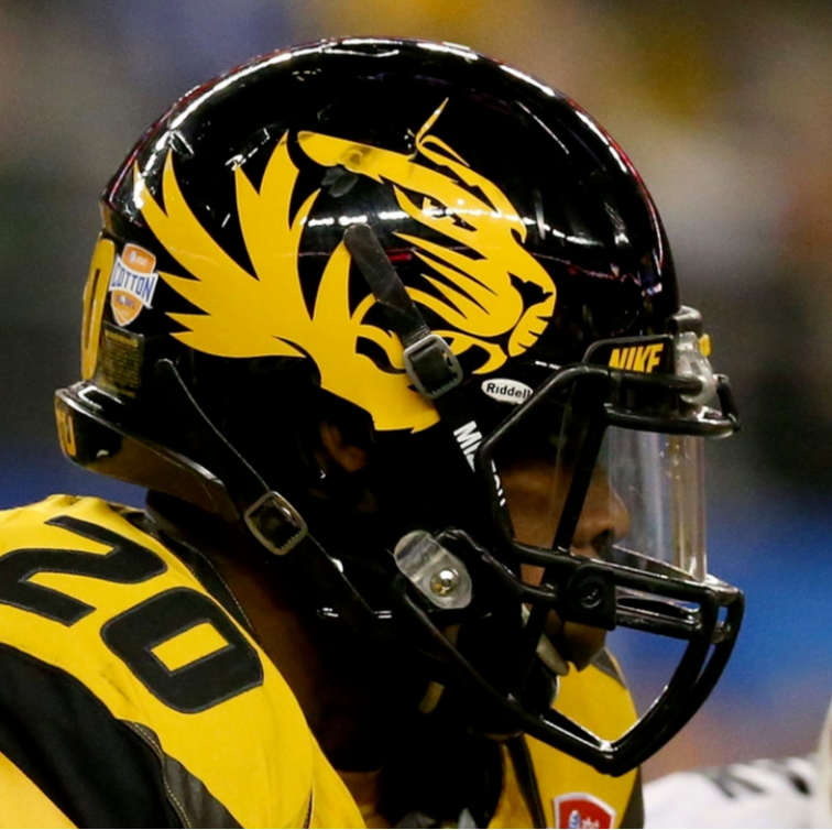
- With the one-helmet rule no longer in effect, I made a blue alternate helmet featuring an oversized logo, a la the Missouri Tigers. Facemask is a chrome silver color (I know these are MS Paint templates... use your imagination)
- Dumped the terrible steel grey alternate uniform and created a new silver alternate in its place. This jersey pays homage to Detroit's famous automotive industry, using "Motor City" wordmarks on the jerseys and helmets. I also made a modernized version of the classic lions logo, and used this on the sleeves
- Throwback jersey stays exactly as is, as IMO this might still be Detroit's best look
Comments/feedback welcome!
I would subtract the grey jersey, the white pants, and the white socks, none of which teams can be trusted with these days.
-
23 hours ago, TBGKon said:
If anyone should switch to a light blue helmet, its the Panthers.
Naw. Silver>black>blue for their helmets, IMO.
-
 1
1
-
 2
2
-
-
22 hours ago, leopard88 said:
I'm not (quite) old enough remember those uniforms (though I do remember the blue helmets), but I've always loved that shade of silver. It almost looks a very pale metallic blue (excluding the helmet pic at the top).
EDIT: Did the Oilers ever use the top stripe pattern on the silver helmets? That version looks like a generic grey/silver helmet with the decals from the white helmets put on it.
Nothing like that uniform set will ever happen again, for the same reason that the Cleveland Spiders will never happen again.

-
22 hours ago, TBGKon said:
Agreed, this kind of silver shell would be very good for the Titans.
Whoa. I normally hate weird one-off looks, but the finish on that helmet is outstanding.
-
1
-
-
14 hours ago, Jymp said:
Ban me, seriously, not bowing to silly wokeness.
I generally agree, and I will use the franchise's former name to refer to their old teams in other fora. But the mods have a very clear policy on no politics in these boards, and for good reason IMO. They also have a policy against using the old name. With those two policies in mind, any use of the old name would be inherently political and thus violate both.
-
4
-
-
2 hours ago, Brave-Bird 08 said:
Alright now, hold on a second. A full rebrand of the Titans is not necessary. The major issues they have are with the uniform itself, not the colorway, logos, etc. To me, what's most critical is returning to a white helmet, because as many have pointed out, it gets lost in too many key lines on top of the navy blue shell.
But a full overhaul would make me sad. The Titans before they started mixing and matching in the late 2000s/2010s had a modern classic identity.
I’d like to see them return to a light blue helmet for the first time since the 1960s. Would certainly stand out.
-
5
-
-
13 hours ago, CDCLT said:
No, they're not.
https://www.seahawks.com/throwback-uniforms/
The ones with the logo in the sleeve stripes.
Good, because those are very much preferable to the inaugural version (to me, anyway).
-
1 hour ago, fouhy12 said:
Looks like Cards in all-red tonight.
They hosted MNF this week last year and wore all-red for that one, too.
The Arizona Blood Clots.
-
1
-
-
2 hours ago, canzman said:
Regular Season Week 15 (Part1)
49ers @ Seahawks
Dolphins @ Bills
Colts @ Vikings
Falcons @ Saints
Giants @ Commanders
Ravens @ Browns
Eagles @ Bears
Lions @ Jets
1. Are the Colts really going to wear blue socks on the road? It’s a welcome change if so!
2. It’s about time we saw the Jets’ green jersey, which is probably their best one aesthetically. If they could just go ahead and wear white pants and green socks with that, that’d be greeeeeaaaaaaat. M’kay?
-
4
-
-
55 minutes ago, Cujo said:
If onlyyyyyy Miami has chosen aqua pants

Or even aqua socks.
-
3
-
 2
2
-
-
On 11/21/2022 at 8:54 PM, BBTV said:
One problem with that mothership article is that the 'quotes" aren't actual quotes (literally, they're not quotes nor are they contained in quotes) and there's no attribution. Doesn't mean that the gist of it isn't correct, but the team's story has been inconsistent from the start.
I believe that 2023 was the plan from day 1 of the rule being lifted. When that occurred, they said that there wouldn't be kelly green in '22 because of the 2-year rule and they didn't put the changes in prior to the rule change. Sounds reasonable enough, and part of the reason for the 2-year rule in the first place is to give manufacturers and licensees time to ramp up production. However, earlier this year is the first time I heard the club claim that anything had to do with Nike's pallet, with this quote from the owner back in March of this year:
“It’s going to be as identical to what that existed as possible,” Lurie said. “And we’re working with Nike to make it happen. We wish we could deliver it right away, but it takes a two-year process with the material that it’s going to be utilized in 2023. They don’t have that in their palette.”
That's a little vague in that it says "the material that's going to be used in 2023" - is it some new fabric that doesn't exist today, and they don't have the right shade of green? It sounds to me from the (admittedly light) research I've done that despite the colloquialism, it's not simply "kelly" green, but a custom shade that may not look custom to the average person, but is different than what Marshall uses or any other current Nike green team. It doesn't make sense to me that Nike simply can't create a dye of any possible color at any possible time, but either way, I think 2-years was the plan the whole time and even if it was a stock color, they would still have had to wait.
We don't know that other teams changes didn't take 2 years for the same color-matching reason, it's just that the "2-year-rule" obfuscates any of the behind-the-scenes difficulties.
EDIT:
at the end of the day it doesn't matter - Nike sucks, we're not getting throwbacks till 2023 regardless of reason, and the BLACK HELMET SUCKS. I'm pretty sure most of us can agree on that point.
Are the ‘90s Eagles’ green and the current Marshall green the same shade? I feel like Marshall’s is slightly lighter.
-
3 hours ago, BBTV said:
I've yet to see any concept in which numbers that match the new wordmark don't look terrible. Too italicized.
My hunch, based on past statements the team has made, is that they're unlikely to make any other alterations to the current midnight green, because they've stated (years ago, when petitioning for the one-helmet-rule to be rescinded) that they wanted to use the '80s throwbacks as a "test" for a change back to that color. That may have changed, of course, but my gut tells me that they're either currently working on a full change, or will be after this season (assuming the throwbacks are well received), and we'll see something new for the 2025 season. Not a throwback, but something new in the kellyish green / silver pallet.
Here’s hoping. A return to green and silver, rather than dark teal and black, would be fantastic.
-
On 11/21/2022 at 7:15 PM, Pigskin12 said:
The Giants’ uniform schedules have been pretty accurate in the past, but this has to be a mistake with Dallas in navy throwbacks already.
Man, I hope so. It was blue-vs.-blue on gridiron-uniforms when I checked last night. They better change it.
EDIT: it now shows the Giants in their normal road whites. That’s a relief, and will provide excellent contrast.
-
On 11/18/2022 at 8:04 PM, 29texan said:
Forget the uniforms, I want that flag:
1. All glory to the Hypnotoad!
2. Ordinarily I hate when people say their all-white look is “icy” - but this is an incredibly creative photo shoot.
-
3
-
-
On 10/30/2022 at 2:46 AM, VampyrRabbit said:
No, and Houston aren't the only team to use stars/a star in their branding.
The Phillies play with two stars on their script with the earliest version of that script dating from 1944, The Washington Nationals use two stars on their roundel, the Texas Rangers use two stars in their roundel and one on their TX alternate logo, the Rays use a star/sunburst thing on their script and the Mariners use a nautical star in their logo
As long as the Twins don't blatantly copy the Astros, it should be fine.
I dunno, I think being blatantly copied would be the sort of comeuppance the Astros deserve.
-
1
-
 1
1
-
-
5 hours ago, Carolingian Steamroller said:
The Bears have their own shade of navy blue and its demonstrably darker than any other navy used in the league. For most the history of the NFL, they wear the only team to wear it.
If they switched to Cubbie blue, they'd storm Halas Hall with pitchforks and torches.
Right. Per TruColor, the Bears' shade of navy blue is the same as the Texans'. It is also a very minor trim color for the Bills, and was the primary color of their horrific 2002-10 set.
That said, I see no evidence of it being used in any other Big 4 leagues, or by anybody else in the NFL.
-
1
-
-
14 hours ago, Carolingian Steamroller said:
Did you prefer the original striping on the silver pants or the reversed later striping?
Original with black jersey, revised with white jersey/red numbers/red socks.
-
1
-
-
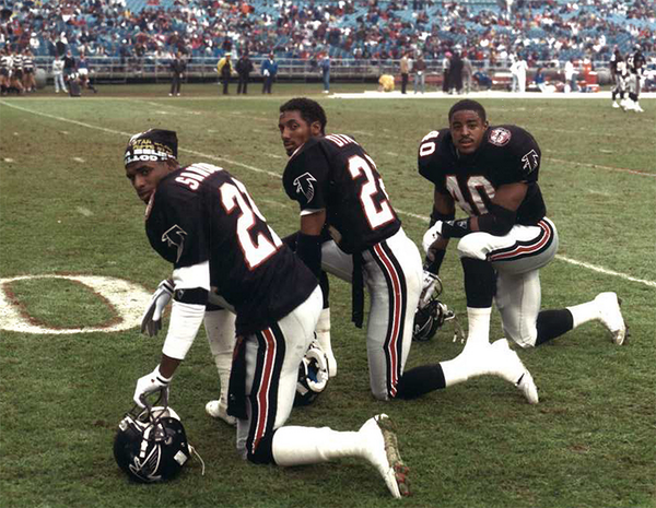
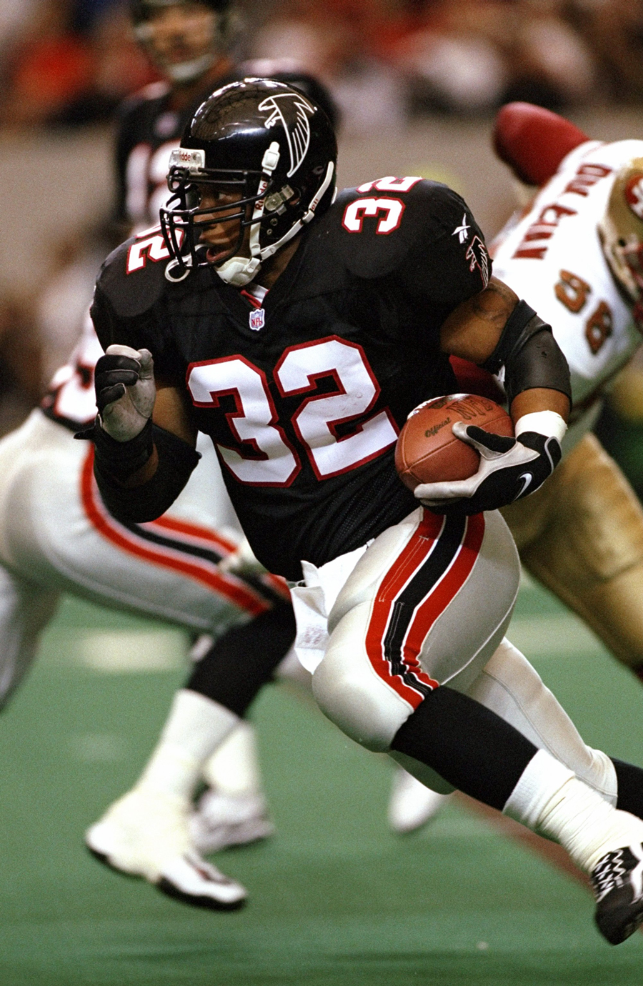
On 11/15/2022 at 6:12 PM, Carolingian Steamroller said:
My unpopular opinions is that this was better:
My unpopular opinion is that the ‘98 “Dirty Birds” set was better than either of those two.
-
5
-
-
On 5/1/2022 at 5:20 PM, chcarlson23 said:
To follow this, I hate the sanitary sock look. I’d love to see more stripes on socks, but I’d much rather see the full color all the way down to the cleats. I mean the days of practically needing sanitary socks is over. Those dyes in the socks aren’t gonna kill anyone anymore.
The way NFLers should wear socks these days is a full tube sock essentially, with the stripes on it, if the team has it. Baseball should be like this too, but stir-ups are an option I guess.
Socks can add so much if they’re worn right, and I think having half of the socks be white really takes away from what they could be.
Regarding your last sentence, be careful what you wish for. Seems like half the teams anymore have decided that having the entire part of the sock be white is the bee’s knees.
-
12 hours ago, tBBP said:
I think at this point the Jets are too invested in their Jets Bold typeface to toss it aside wholesale--of course that's just speculation. I actually kinda like that typeface for what it is--but yeah, I think reviving an updated version of the more angular JETS mark would really help bring this brand all the way up.
Yeah, the Jets have had the same basic font or close to it, I think, going back to the Namath days. The 1978-97 logo was italicized and had the jumbo jet silhouette, but it still looked like a highly stylized version of 1960s airline/airport ad font, which I think was the original inspiration.
-
12 hours ago, Pigskin12 said:
Third straight road game in white on white. I’d say this pretty much guarantees the yellow pants make an appearance next Sunday night at San Fran.
I was hoping this game would’ve been white/yellow vs. black/white in Atlanta, but instead it’s all white against all black.
Still not such a bad-looking game. I don’t think the Chargers count for all-white, because they have those gorgeous blue socks instead of ugly white ones.
-
4
-
 1
1
-


/cdn.vox-cdn.com/uploads/chorus_image/image/70322790/usa_today_17412506.0.jpg)

/cdn.vox-cdn.com/uploads/chorus_image/image/69485379/504568152.jpg.0.jpg)
/cdn.vox-cdn.com/uploads/chorus_asset/file/20087060/79574798.jpg.jpg)
/cdn.vox-cdn.com/uploads/chorus_asset/file/11708351/usa_today_10481768.jpg)
MLB 2023 Uniform/Logo Changes
in Sports Logo News
Posted
Not to get political, but that’s the kind of thing that shows someone lacks the maturity to effectively lead a country.