

edjb93
-
Posts
1,007 -
Joined
-
Last visited
-
Days Won
8
Posts posted by edjb93
-
-
Thanks for all these suggestions!

@TheAnt755, before your suggestions came in, one of them is already in my backlog, that being JetBlue. I haven't made a concept set as I'm typing this message, but it would be interesting which design shall I go, though I'm really in favor of JetBlue's all-blue livery. As a spoiler, I'll be using the design of "What's Old Is Blue Again" for the alternate uniform, since it's a throwback-inspired livery.
@Bomba Tomba, since Air Koryo sports both the old and new liveries, I'm thinking about which should I go for.
@Blindsay, Air Jamaica might be the first defunct airline in this series once I'm finished with that carrier. And which Eastern Air are we referring to? Is it the old Eastern Air Lines from the US?
@FCMacbeth, yep. As much as possible, I would like to finish the full-service carriers first,. However, I've sneaked in some LCCs in between, so let's see what happens next.
-
 1
1
-
-
Since I'm running out of ideas, I'm now open for airline suggestions! There are things that should be kept in mind, though:
- Airlines should be either mainstream full-service or low-cost carriers that all serve international destinations.
- I'll be limiting this forum to only passenger airlines, since cargo carriers have limited livery histories.
- I'll also be open to create concepts for defunct mainstream airlines such as Northwest and Continental. Just make sure that the defunct airline suggestions serve international destinations too.
Please take note that designing uniforms for a certain airline may vary depending on the livery design, there are the simple ones like Japan Airlines (which take a short time) and there are more complicated designs such as Egyptair (which take a longer time, depending on the complexity of the design).
Thank you for your appreciation of this forum topic, and I'll be looking forward to your comments and suggestions!
-
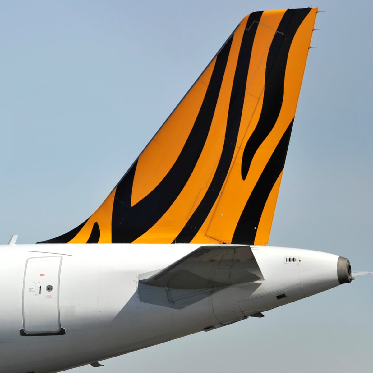
SCOOT
Singapore Airlines' low-cost subsidiary also knows how to make itself unique among the rest, just by looking at its livery. I took the curved design found in the front part of the fuselage and made it suitable on a football uniform, while the curves on the empennage and the tail are found on the helmet and socks. Just a tidbit of an info, the usual shade of yellow used by Scoot is different from what's applied on the livery, and I chose the latter so that it's not that hard to read when paired with white. Don't worry, I applied black as an accent color on the NOB and the numbers.
For the throwback uniform, I decided to honor Tigerair, which merged with Scoot in 2017. The tiger stripes from the tail is the main design element throughout the uniform, and the outcome looks something that the Cincinnati Bengals can wear.

-
2
-
-
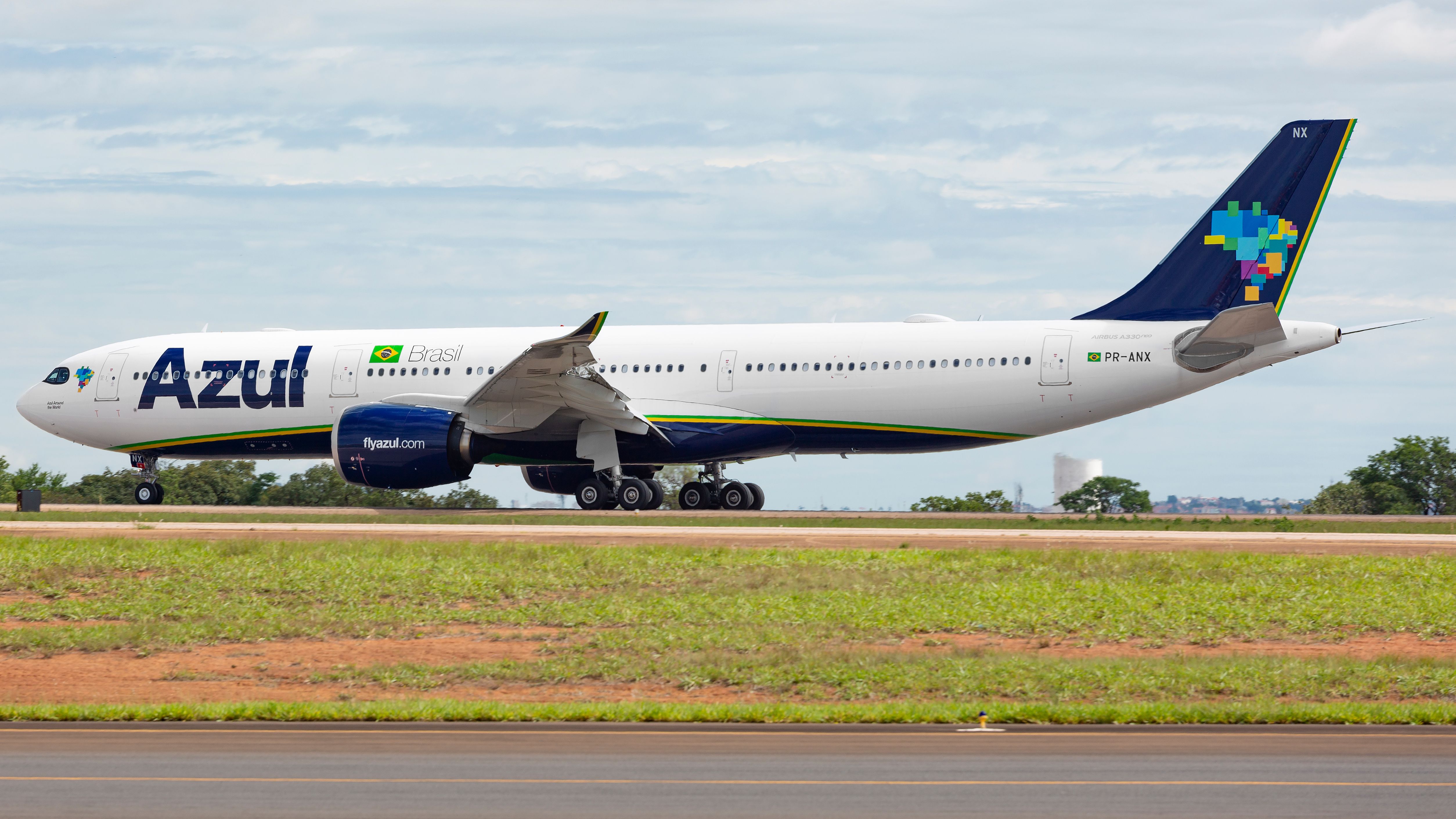
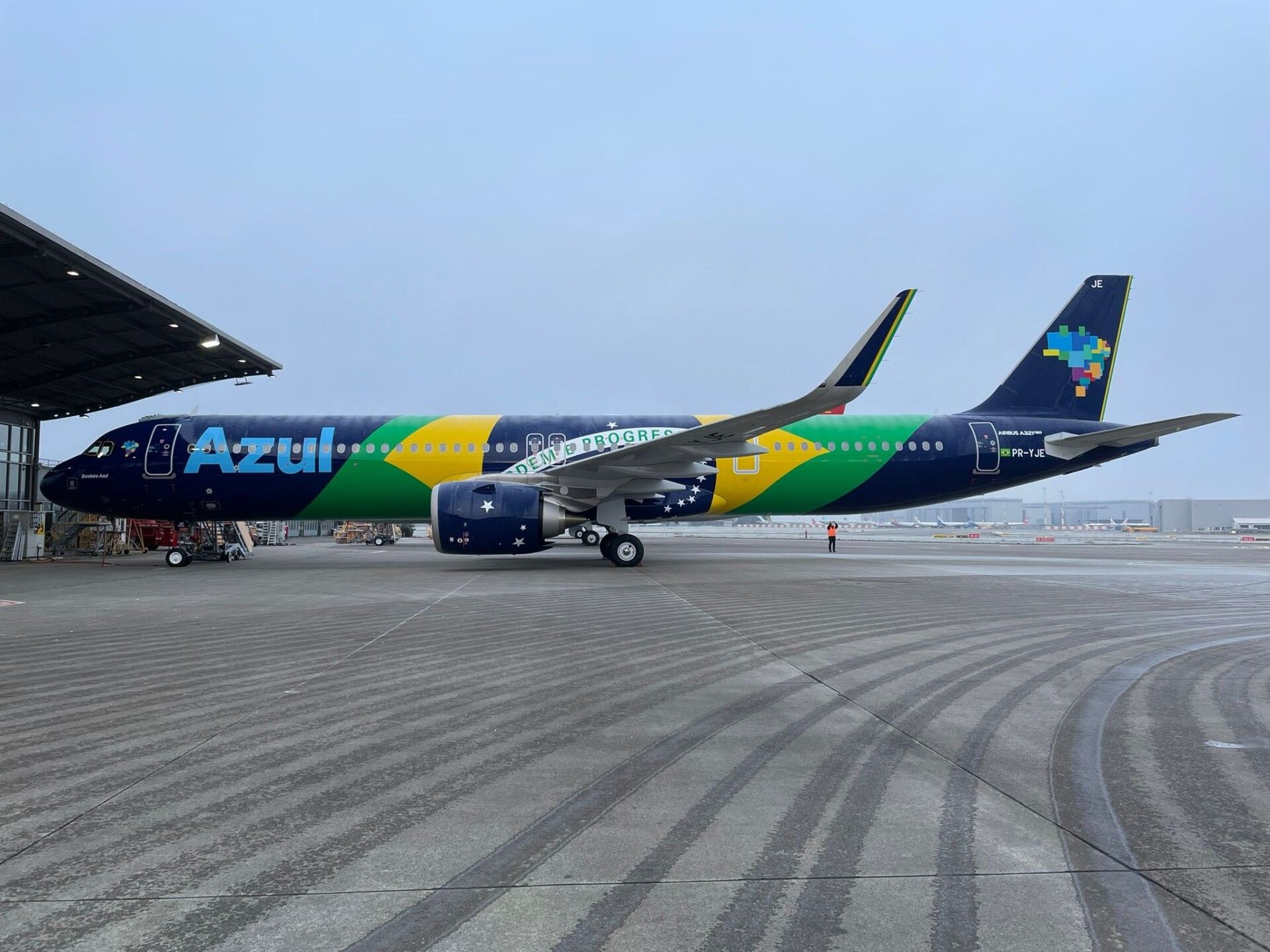
AZUL BRAZILIAN AIRLINES
Now we head to Brazil for one of its full-service airlines. I know almost everyone will compare this to the 2010-2016 Utah Jazz uniforms, essentially a football uniform version of it. The explanation behind the striping is the overall design of the airline's livery, where navy blue is surrounded with yellow inner striping and green outer striping—thus making it similar to the look of the Jazz in the early to mid 2010s. And if you'll look closer, inside the sleeve stripe is a sublimated version of Azul's logo.
On the other hand, I consider the alternate uniform that I made as a "national pride" uniform since I based it on the airline's flag livery.
-
1
-
-
JETSTAR
Since Jetstar right now has a few subsidiaries, I'm focusing on the mainline carrier that's established in Australia. Sure, this airline's livery is plain and simple, but the choice of colors is out-of-the-box. And so, grey is the home jersey color, while the orange jersey will be worn on the road. The color combo definitely reminds me of the BC Lions or Oklahoma State football.
Speaking of Oklahoma State, that was one of my inspirations behind the all-black (except for the helmet) alternate uniform. Well actually, I first thought of the Detroit Lions' new black uniform, and thought, "hey, I can make one for Jetstar!" The orange helmet is taken from a livery variant in which the tail is orange.
Since the livery is quite simple, there's no striping throughout all three uniforms. The unique design element for this concept set would be the sublimated star logo on the sleeves.
-
1
-
-
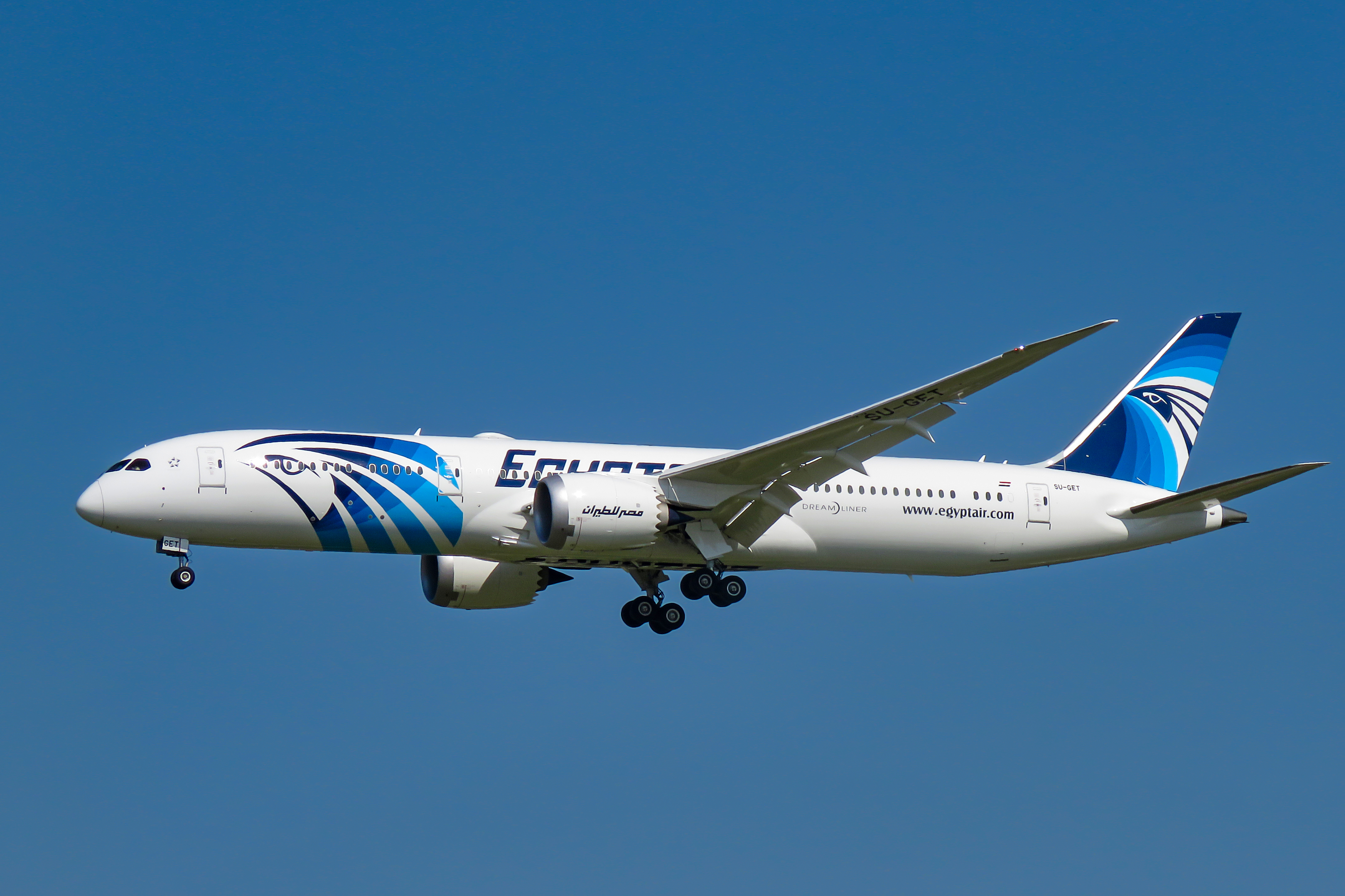
EGYPTAIR
When I looked upon Egyptair's current livery, the tail design alone made me intimidated, since the gradient is quite intricate. Anyway, the home and road uniform designs are straightforward. And by straightforward, I mean, I just literally translated the livery design into a football uniform: tail design to the helmet and front fuselage logo on the sleeves. A random curved, tapered stripe based from the front fuselage logo adorns the sides of the pants.
The airline's livery for much of the 90's was the basis for the throwback uniform. Red was one of the primary colors of Egyptair at the time, and it looked great along with gold on the white background of the fuselage. I then applied the same curves from that livery's tail design to the helmet, and it evoked an old-school look, much like what I did with my Garuda Indonesia and Southwest Airlines throwback uniform concepts.
-
3
-
-
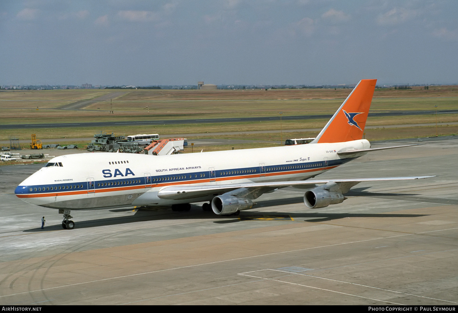
SOUTH AFRICAN AIRWAYS
When it comes to my home and road uniform concepts for SAA, it's all about the tail logo—from the helmet, to the jerseys and the pants, all the ways to the socks. Since the current livery is generally just a Eurowhite scheme, I had to make the uniforms distinguishable without the helmet and the socks, so I added the triangles from the tail logo and made them sublimated on both the jerseys and the pants. And since blue has been generally one of the main colors of SAA throughout the airline's history, I chose it as the primary dark color for the clothing.
In the case of the retro alternate, though, it's the complete opposite, as orange takes the lion's share in the color distribution. This is heavily influenced by the tail color on the airline's old liveries, specifically on the most recent orange-and-blue paint scheme. For a change, I positioned the stripes on the shoulders, since most of my concepts have stripes positioned on the sleeves.
To mark the special occasion, all three uniforms feature SAA's 90th anniversary logo on the helmets' front bumper and on the front of the jerseys as a patch.
-
2
-
-
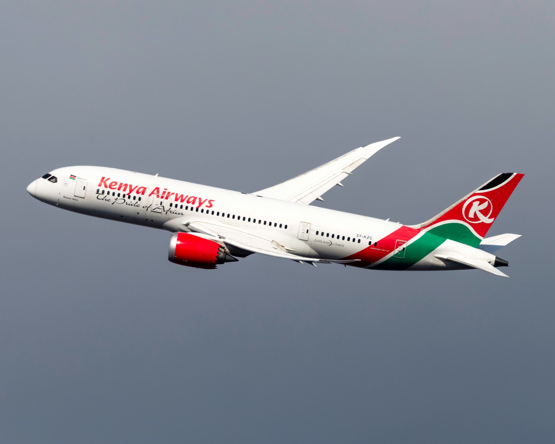
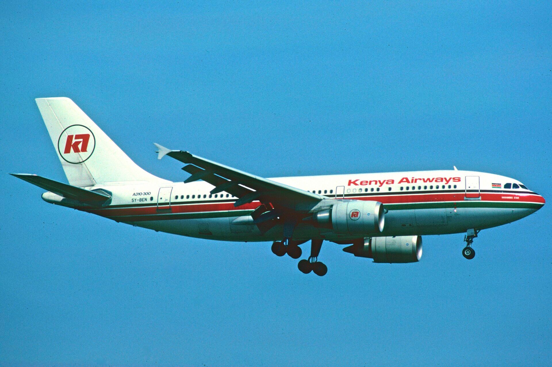
KENYA AIRWAYS
The flag of Kenya is basically the inspiration behind the tail design on Kenya Airways' current livery, which is the primary design element found all throughout the home and road uniforms—from the helmet to the jersey sleeves and onto the pants' side panels. It's quite a straightforward explanation, and the only thing I would add to it is my decision for the color choices on the socks: red socks when paired with white pants, and black socks with red pants.
For my retro alternate, I chose the particular livery featuring cheatlines containing all three colors from the flag of Kenya. The light grey pants had its traces from that livery's silver fuselage belly.
-
2
-
-
On 5/8/2024 at 8:01 AM, Bomba Tomba said:
If not for the plane theme I'd have done black home, mint away, zero traces of white
Yeah, like I said in the beginning, the number one rule I set in this series is to translate airline liveries into football uniforms as much as possible. I've already imagined a mint jersey, and unfortunately, I did not like it. So I dropped it in favor of black.
-
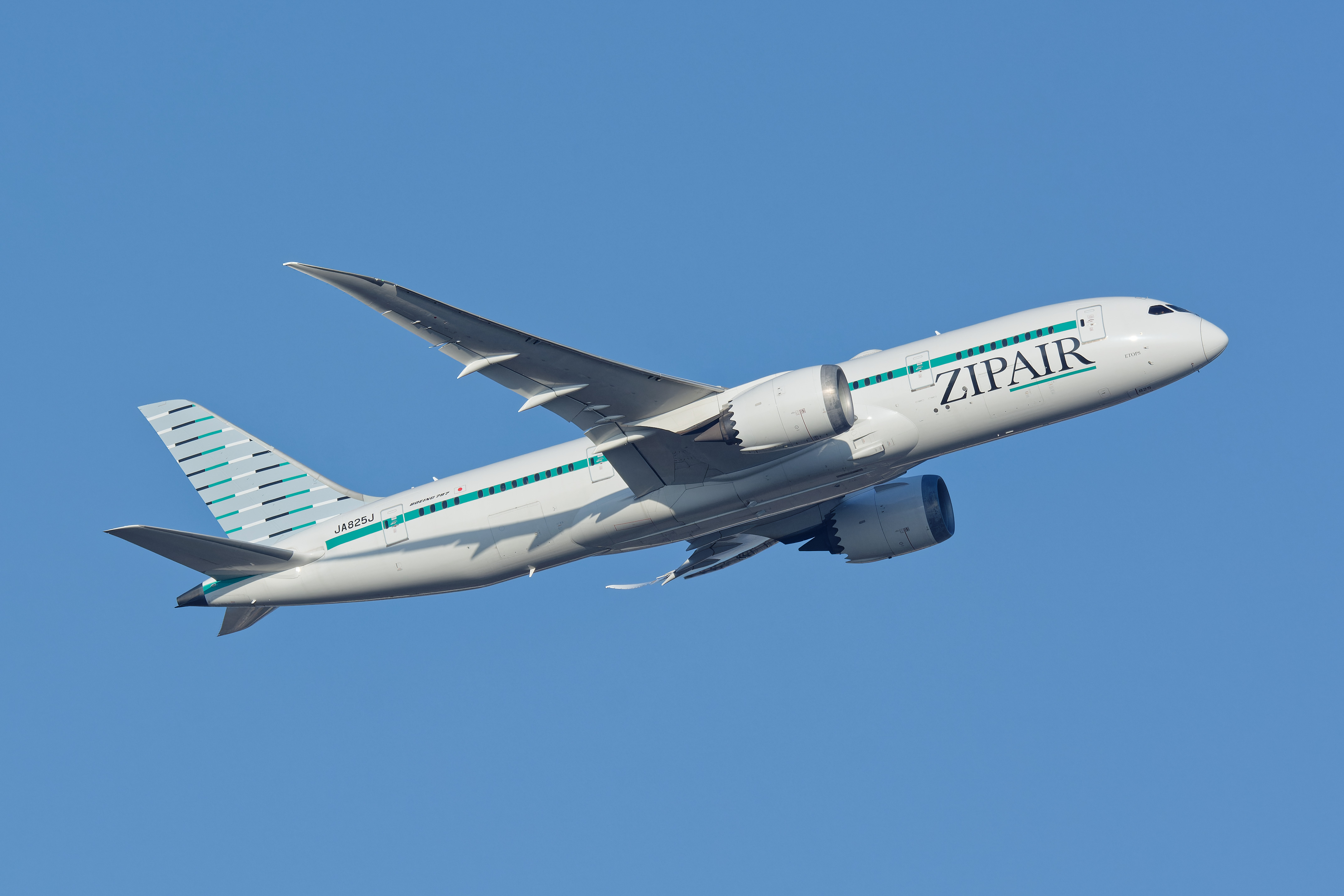
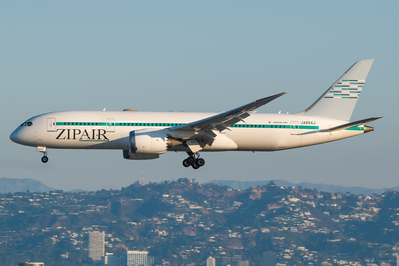
ZIPAIR TOKYO
An airline in which I'm looking forward to try, Zipair truly gives other low-cost carriers a run for their money. "Simple but complex" is how I define its livery. Who would've thought that a good livery can be done using multi-colored lines and two "boring" colors? Anyway, I chose the wide version of the pattern on the tail over the narrow one, and placed it all over the uniform. Those "boring" colors are the two choices for both the jersey and the pants, and all of these are complemented with mint green socks.
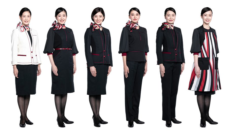
Since Zipair is relatively new, having commenced its operations during the pandemic year of 2020, there won't be a retro alternate, similar to the case of my Starlux Airlines uniform concept set. I initially went for a mint green-on-mint green jersey-pants combo, but I didn't like the result. Then, I just realized that an all-black uniform can be made. Part of it is due to the airline's flight attendant uniforms (which happened to have the same black theme as Zipair's parent company, Japan Airlines), and another part is due to the color of the seats, whether with standard Economy Class seats or the lie-flat seats.
One important thing to note is that I didn't apply the "Z" monogram logo on any part of the uniform because of something I couldn't say here, so check that out for yourselves. This is also the same reason behind the change in the tail graphics. But graphics-wise, it's a great move by the higher-ups of Zipair, since putting up a "Z" on the tail along with a single mint green line makes the livery even more boring.
-
 1
1
-
-
UPDATE ON MY ETHIOPIAN AIRLINES CONCEPT:
After some thought, I decided to push through with the yellow pants. Also, I made the primary socks solid: all-red on the home, all-white on the road. You can view the changes here.
-
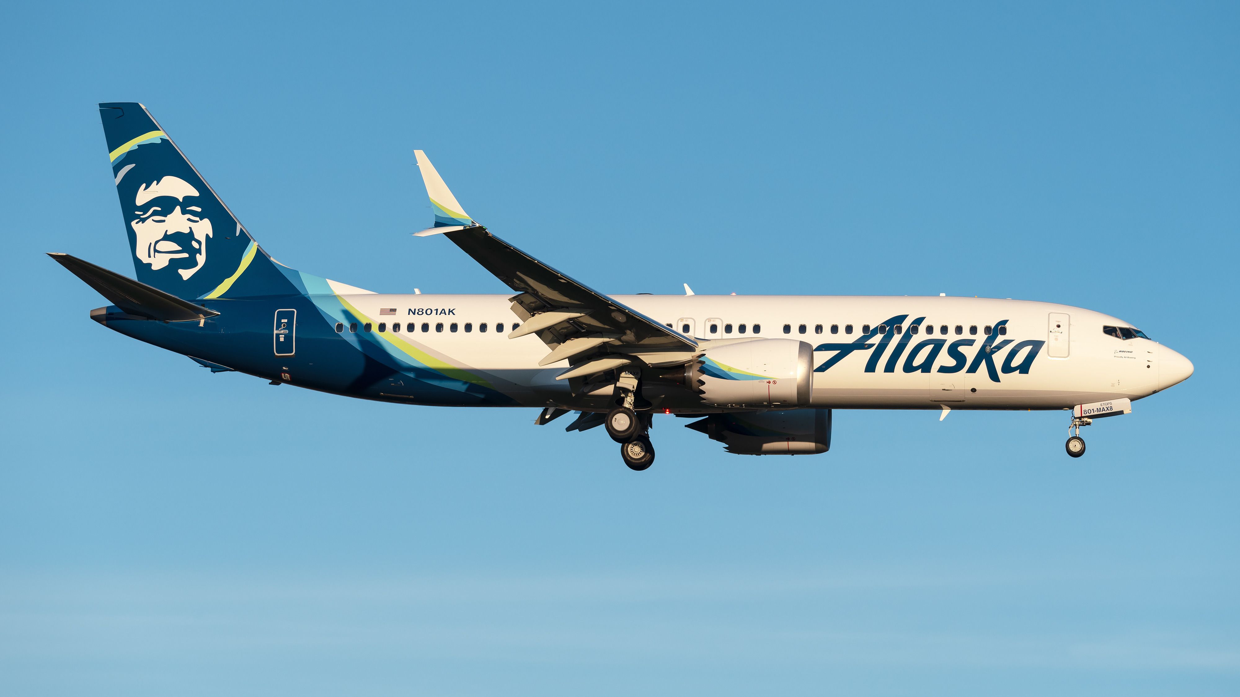
ALASKA AIRLINES
While Chester might have been Alaska Airlines' most recognizable symbol, the airline's current livery is catching up when it comes to things that instantly comes to mind about it. All the random curves from the fuselage's paint —except for the silver or gray ones—are widespread throughout the home and road uniforms. And of course, I'll not forget the gigantic Chester decal on the helmet.
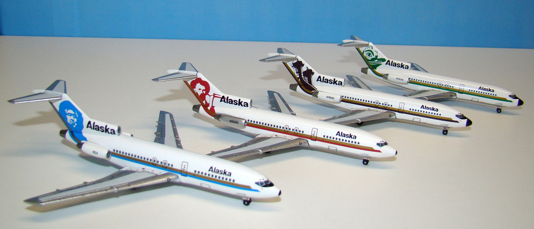
I had to dig deep towards whatever I could find online, upon searching what to put on the throwback uniform. Eventually, I settled on the 1972 livery—or should I say, liveries, since there were four of it (one of which is the debut of Chester).
-
2
-
 2
2
-
-
13 hours ago, TheGiantsFan said:
I may recall something I read a long time ago that the current Virgin Atlantic livery has a slight gradient and quite a shine to it. I was wondering if you could add a light-to-dark red gradient to the helmet to give it some more depth!
It would also be quite interesting to see a Virgin Australia jersey that throws back to the V Australia brand that merged with Virgin Blue to make Virgin Australia
Thanks for your suggestions! I never noticed Virgin Atlantic's "candy-coated" finish on its aircraft tail until now. Anyway, updates to the two Virgin Group's airlines are now up. Take note that I did not add an actual V Australia uniform, but just the helmet instead, so that it can be used as an alternate to be worn with either red or white jerseys.
-
That Crescent City wordmark placement is ingenious. I love it!

-
1
-
-
4 hours ago, johne9109 said:
It probably would work but I think with the cream city connect it would feel a little repetitive but it's worth a try
Oh yeah, I forgot to mention that if ever cream becomes the primary road uniform color, then you might have to consider any of the Bucks' blue uniforms as the "City" alternate.
But I gotta say, what an awesome job you're doing on all these concepts.
-
1
-
-
VIRGIN AUSTRALIA
While its counterpart from the United Kingdom focuses on the red, Virgin Australia puts more emphasis on white, as evidenced by its current livery. That's the reason why there's no regular red pants for the home and road jerseys. Though I applied the same design from my Virgin Atlantic concept, there are some noticeable differences other than the white helmet, such as the replacement of purple with silver and VA's own version of the Flying Lady on the sleeves.
Per the suggestion of @TheGiantsFan, I added a red alternate helmet as a tribute to Virgin Australia Holdings' defunct long-haul airline, V Australia, which unbelievably consisted of only Boeing 777-300ER aircraft. It just so happened that after the absorption of V Australia into the main operations of Virgin Australia, a merged livery was created.
The retro alternate is also the same as the one for Virgin Atlantic, but in blue, since the airline was originally known as Virgin Blue. I'm unable to find a clearer copy of the Flying Lady from that era, so I just used the best available version of the illustration.
-
2
-
1
-
-
VIRGIN ATLANTIC
The flagship airline of Virgin Group looks simplistic nowadays, so I also went with a simplistic design for the uniforms. Red and white dominate the home and road uniforms, with purple being added for accents. The sleeves feature one of the Flying Icons, a red-haired lady named Ray, holding the Union Jack. I chose Ray on the grounds that, since the Flying Icons replaced the iconic Flying Lady illustration, she is the one that closely represents the former Flying Lady.
Meanwhile, the regular helmet has a gradient to it, so that it resembles a "candy-coated" finish applied on the tail of Virgin Atlantic's aircraft.
Speaking of the Flying Lady, she's still represented on the retro alternate, where the illustration is placed on the top portion of the pants' side panels. The shoulder yoke on the alternate jersey is attributed to the shape that encloses the Virgin logo, which is also found on the airline's livery in the 2000's.
-
3
-
1
-
-
Maybe it's just me, but I think cream would fit well as the primary road uniform color for the Bucks. If the Padres made sand an acceptable road uniform color, perhaps the Bucks can do the same.
-
2
-
-
On 4/28/2024 at 11:59 AM, Bomba Tomba said:
3 very different looks? We entering soccer territory now boys
Yup! For an airline that's famous for being infamous, it's just fitting to get wacky and unconventional at the uniform designations.
23 hours ago, Bomba Tomba said:PANK
Such a fine scheme, shame the merger means that these colors will soon be gone from the skies
Well, the Alaska-Hawaiian deal implied that the two airlines will still operate as separate brands, much like how Air France-KLM works ever since they merged.
17 hours ago, TheGiantsFan said:Wow, that Hawaiian Airlines set is absolutely GORGEOUS!
 My favorite part is the gradient use on the numbers for the modern white jersey
As a frequent Southwest flier, you did an amazing job with that one as well!
")
Thank you very much! I initially thought of using a single color on the front and back numbers of the white jersey, but then I realized that a purple-to-pink gradient would make things better. I didn't apply this on the purple jersey due to legibility issues, especially when viewed from, let's say, a stadium's nosebleed section.
I'd think the design of Southwest's blue socks is possible, with the rise of unusual sock designs (commonly made by Stance) for MLB City Connect uniforms.
-
HAWAIIAN AIRLINES
Hawaiian owns one of the most beautiful liveries—if not THE most beautiful one—among the world's airlines. Pualani surely is an eye-catcher and it's just fitting that she adorns the primary helmet. I'm unable to replicate the sublimated lei from the current livery, so I just picked out (no pun intended) the flower from Pualani and made a sublimated pattern. When applied on a white background, the flower pattern is in light grey, while when on a dark background, it's in a gradient. The latter is also applied to the road jersey numbers for color balance.
I went with the very first Pualani livery as my reference for the airline's throwback uniform. Note the lack of TV numbers on the jersey, as the dual curved stripes extend to the portion of the shoulder a la Houston Texans' brand new white and red jerseys. This color combo might be familiar with those who followed or witnessed the defunct World Football League, as I indeed drew inspirations from one of its teams, Southern California Sun—even if there's another team that's simply called The Hawaiians.
Since the merger of Alaska Airlines and Hawaiian Airlines will now come into fruition, I added the Oneworld logo onto the uniforms (please take note that Alaska Airlines is a Oneworld member).
-
3
-
7
-
-
Hey there! First of all, these concepts looked great, especially that Nordiques set, which looks similar to what I did.
For the Skipjacks, have you tried using the old RWB scheme of the Capitals? That's what the old AHL team of the same name used in its final years. It would be a challenge, though, since there are the actual Capitals and the Rangers within the same division.
-
ETHIOPIAN AIRLINES
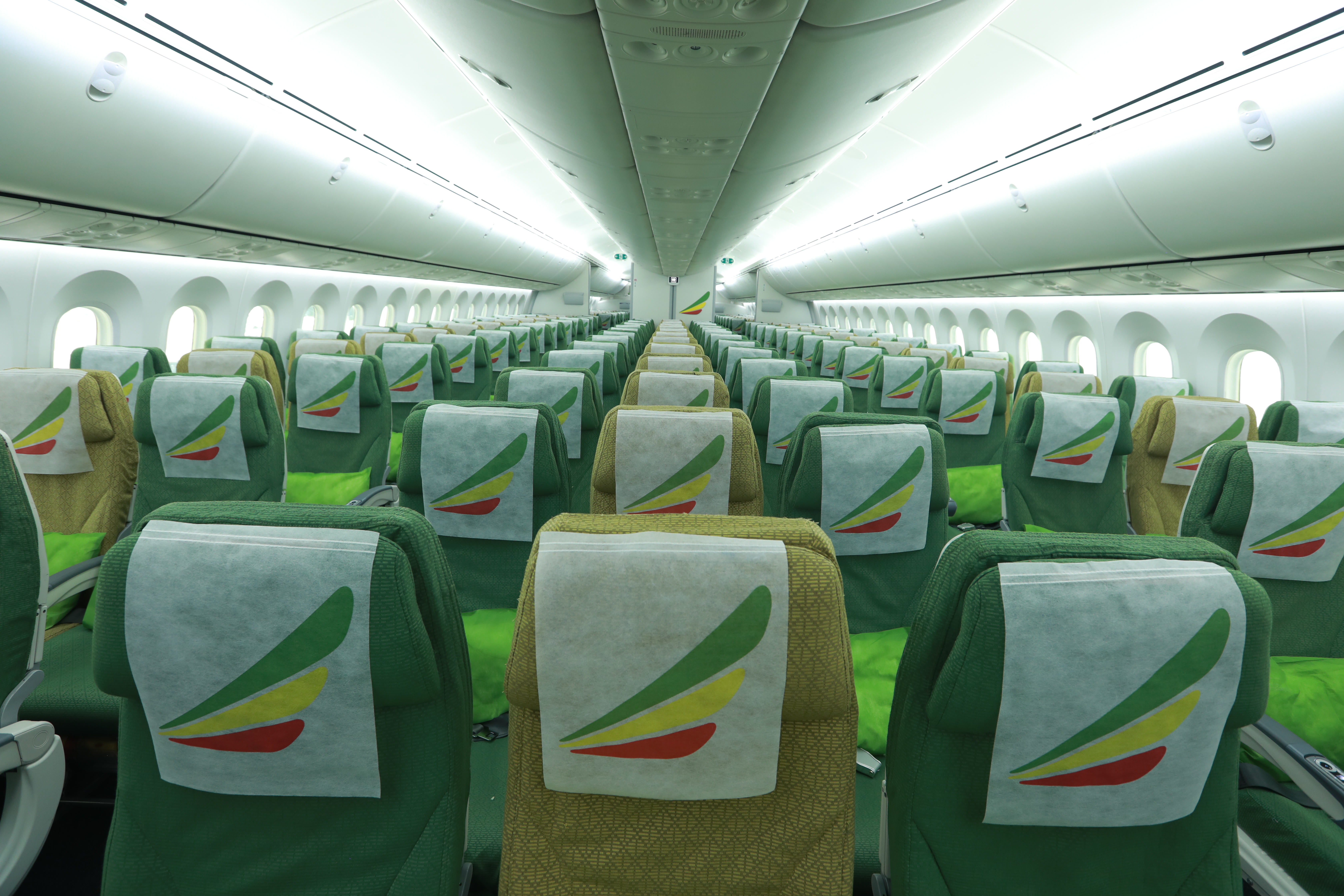
Okay, back to another full-service carrier, and this time, it's Africa's largest airline! Ethiopian's livery is yet another simple one, as it only consists of several wordmarks and the logo—a big thanks to the firm responsible for simplifying Ethiopian's logo into what it is today. Since that's the case, I resorted to the cloth pattern found on the airline's Economy Class seats, applying it on the sleeves and the pants' side panels. Speaking of the latter, Ethiopian's name in Amharic is also applied there.
Now, you might have noticed the usage of green on the dark jersey and red on the socks. Well, that's because it's the home color combo of Ethiopia's football team. I could've used yellow on the pants, but I thought it would be too much.
Let me know if you want yellow pants on the home combo, though!Okay, since silence means yes, I decided to put up yellow pants to be paired with the green jersey as a tribute to the aforementioned national football team.As for the retro design, I can't help but to describe the airline's old livery as really ancient-looking. With that said, when applied to a uniform, it's not that too old, due to the number font.
-
3
-
-
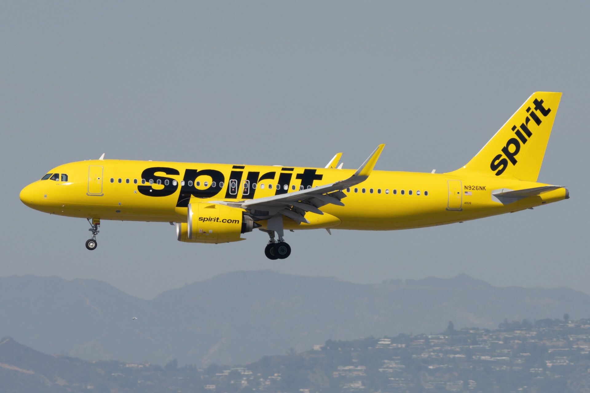
SPIRIT AIRLINES
The "school bus of a plane" really knows how to get attention, and my uniform concepts for Spirit Airlines do the same thing, perhaps. When I implied at the beginning that there will be some airlines which will get the primary-clash-alternate designation, I was not thinking then about three SEPARATE designs from the helmet all the way to the socks (well, I actually thought about that for my Thai Airways concept, but I then abandoned that idea). However, for a distinct airline like Spirit, this is the full exhaustion of the unofficial rule I just mentioned.
Starting off, we have the all-yellow uniform with touches of black. Actually, I just learned recently that Spirit tweaked its current livery where all logos no longer have the scratch pattern. By the way, that same scratch pattern is applied on the sleeves and the pant striping, so that this won't be just another all-yellow uniform.
The clash uniform tackles the much "tamer" livery—Eurowhite with significant usage of blue. I specifically applied the livery's empennage design to the shoulders, and I went with blue pants and white socks this time, to add more color to what's essentially a road uniform.
Finally, we have the livery that I mostly like, the grayscale pixel livery. I also recently realized that this is a later variant of the original pixel livery, which uses blue. The former is the basis of my alternate uniform for Spirit, as it looks more professional.
-
1
-
1
-
1
-
-
PERFECTION. Honestly, stripes are what the non-silver pants need. I also don't mind about the wordmark above the number on the front of the white and black jerseys, though.


_Boeing_737-7FE_at_Melbourne_Airport.jpg)
/cdn.vox-cdn.com/uploads/chorus_asset/file/15579497/613946528.jpg.jpg)
Airline Football Uniform Concepts - Open for Airline Suggestions
in Concepts
Posted
Hi everyone!
I know it has been weeks since I made my last concept. That's because I put my attention on other important things recently, and I'm feeling both excited and nervous these past days because I'll be heading to Japan for a solo trip, in which I'll be hopping on one of the airlines covered in this forum.
Don't worry, I already have a design for JetBlue and I'll just put the numbers and logo on the uniforms. It will just take a while before I can finalize that.
I would like to apologize for the extended delay, and I hope I can get back to this project.
Thanks for all your appreciation!