


MJD7
-
Posts
2,561 -
Joined
-
Last visited
-
Days Won
54
Posts posted by MJD7
-
-
Here’s a look at the real-life version of the “Florida Sox” jersey! Be on the look-out for more MLB MULTIVERSE jerseys available for sale in the near future.

-
 5
5
-
 1
1
-
-
5 hours ago, floydnimrod said:
More of an overall question: not considering the new template, are there any teams whose road grays are better, or at least on par with the home whites? I can't think of a single team where the road gray isn't just a worse uniform design than the home uniform
This is considering the new template, which isn’t what you asked, but: although I like the Twins’ home jersey slightly more than their away, on the new Nike template, the away jersey made it through relatively unscathed: since it has pinstripes, there’s no collar insert, nor are their perforations in the numbers. Unfortunately the home jersey got subjugated to both of those.
That’s not factoring in the mismatching grays though, which is an absolute abomination.
-
I forgot to mention it before, but all 30 jerseys are now up on my portfolio website.
I’d be curious to know: what are your Top 5 favorite designs? Mine probably are, in no particular order:• Angels
• Rockies
• Tigers
• Astros
• Mariners -
I hope you enjoyed this 2nd volume of the Cooperstown Collection! This was probably one of my favorite series I've done to date.
I'll be around to post my changes to this year's City Connects as they release, and then after that, who knows...
Now let's enjoy Opening Day!
-
5
-
 4
4
-
2
-
-
38 minutes ago, CaliforniaGlowin said:
Grain of salt department: someone on discord mentioned a new teal city connect for the Diamondbacks. It would make sense to drop the sand CC because they're dropping this color altogether. I hope they wear the teal hat with the teal jersey!!!
It wouldn’t be this year, since MLB & Nike already announced the teams that would be getting a new City Connect this year, & the Diamondbacks weren’t one of them.
-
 1
1
-
-
Washington Nationals
I loved the throwback the Nats wore in 2019, which was the powder blue jersey the Expos wore for a decade, from their inception in 1969 until 1979, so I referenced that here.
-
6
-
3
-
1
-
-
15 hours ago, BlueMoon18 said:
Heh. The fact the minor league Leafs went out the SAME year as the hockey Leafs won their last Stanley Cup is insane. Other than that, great design as always.
Interesting! I did not know that.
14 hours ago, Discrim said:Nice to see you put it to good use

Thanks again for letting me use it!
-
-
Texas Rangers
Since I kept a red jersey in the main set for the Rangers, this was the perfect opportunity to add powder blue back into the mix, like they wore from 1976-1982.
-
6
-
3
-
-
-
On 3/23/2024 at 12:35 PM, colinturner95 said:
Gonna have to rethink my Mariners idea a little bit now

I'd be curious to see what you had in mind!
-
1
-
-
St. Louis Cardinals
With the help of the wonderful site cardinalsuniformsandlogos.com, this jersey is a combination of a couple of different designs the Cardinals wore in 1922.
-
6
-
1
-
-
Seattle Mariners
This jersey is based on the design the Seattle Pilots wore for their one year of existence in 1969.
-
5
-
3
-
1
-
 1
1
-
-
San Francisco Giants
As @Discrim sort of guessed, I went with a plaid pattern inspired by what the 1916 New York Giants wore.
-
5
-
2
-
1
-
-
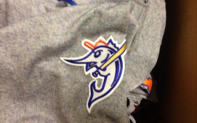
1 hour ago, -Akronite- said:
I adore that sleeve logo! Was that something the old minor league team used or did you make it? It's head and shoulders ahead of anything the modern franchise has done and, honestly, better than any iteration of the dolphin either.
Thanks! To answer your question: yes! It is a logo the Minor League team used, and the team threw back to in 2013, but I had to recreate it digitally.
-
1
-
-
12 minutes ago, MNtwins3 said:
And the TC hat at home/M hat on the road is a call back to the 2000's when we used to do that, even down to the pinstripes on the road. Our current set is awesome, and my only complaint is Nike's stupid 4+1 rule so we can't have a powder blue version of our home uniform
I have a strong hope/suspicion that the City Connect will be powder blue. That was the one thing I was sad to let go of with the rebrand, and I have a feeling the team feels the same way, given that powder blue is still featured in many social media graphics.
-
1
-
-
42 minutes ago, Digby said:
Yeah, I'd agree with that -- nudging the color balance toward navy and the front number would've helped. That or the curly-W only on the front, though that's not my favorite look (more of a beveled-DC guy I think). Obviously they've gone well into the realm of confusion, regardless.
The curly W jersey grew on me after it was gone, that was a really solid, unique jersey for them. They shouldn’t have gotten rid of the red version.
42 minutes ago, Digby said:One other thing I still want to complain about re: the Twins is that, while the home looks great and has grown on me for the reasons others have beat to death already, it also looks a little bit lonely in the overall set, given the away set's abandonment of the TC and the script, and the City Connect (which is worn too much) losing the red. I know uniform set-wide cohesion and consistency is an outdated concept but it bugs me.
Even though I love the new “M” cap personally, I have a feeling it might be dropped within the next few years, due to the surprising amount of distaste I have seen of it on social media. I’d be fine with them going with the “TC” for the road grays, but I would keep the M cap for the navy alternate, since the TC already appears on the sleeve patch.
The cream jersey actually isn’t their City Connect (even though it says “Twin Cities”), their actual City Connect will be revealed later this summer.
Interestingly, based off of my count from Uniform Lineup, the Twins wore their white, gray, and navy jerseys exactly equally in 2023, 46 times each, and wore the cream 24 times. In the grand scheme of things, that’s honestly a pretty perfect distribution if you ask me.
-
1
-
-
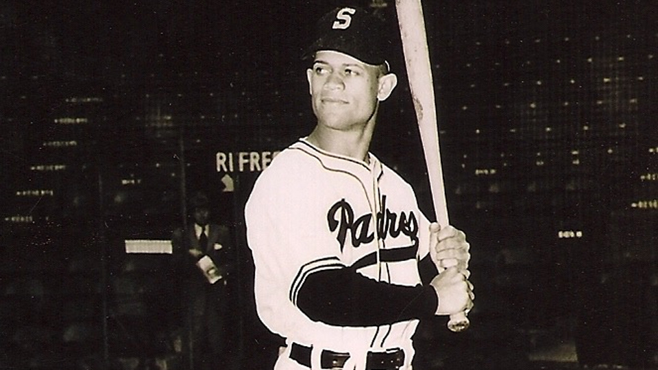
San Diego Padres
It's also pretty fitting that the Padres fell today, since they opened the season this morning: I went with the Padres' initial gold jersey, which they wore in 1972 & 1973, and paired it with a script from the Pacific Coast League version of the team.
-
10
-
3
-
1
-
-
4 hours ago, Digby said:
It's hard to say that anyone looks "similar to the Nationals" because they've changed things so often that they don't even look similar to the Nationals. If anything, gold/mustard trim felt more Nationals-y (the Twins had dibs on that script/color treatment decades earlier) but the Nats didn't keep that, either.
That's a fair point. I think the most recent set they had (which they just butchered ahead of this season) was just a few subtle tweaks away from becoming a really solid, cohesive set. Namely, I would have gone with the two-stripe pattern across the board, and flipped the colors of the away script to match the home (as I've concepted for them).
-
2
-
-
2 hours ago, adsarebad said:
Navy, Red and a special shade of gold, it was unique.
Now they look like 5 other teams........
Of the 7 teams that have a navy & red color scheme, the Twins are now the only one that do not utilize an outline on their wordmarks & numbers.
In fact, they are one of only 4 teams in the league overall that don't use outlines on any of their main jerseys (the others being the Royals, Dodgers, and now the Yankees).
If anything, I think their lack of outlines helps them stand out possibly the most among the 7 navy & red teams, 5 of which utilize a red wordmark with a navy outline:
The Twins previous home jersey actually looked pretty similar to the Nationals, just with an ugly mustard gold color thrown in as an accent. Plus, their previous set was a complete mismatched mess, where that gold color only appeared at home, not on the road, and every single jersey had a different striping pattern.
I truly think the Twins went from one of the worst identities in the league to a Top-5 uniform set with their rebrand last year.
-
12
-
-
Pittsburgh Pirates
This is the only simple recolor from Volume I of the series, I couldn't help but go with a black version of the Pirates' pullover pinstripe jersey they wore from 1977-1979.
-
5
-
2
-
1
-
-
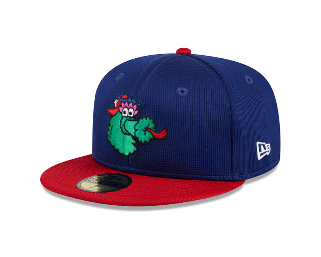
22 hours ago, GrayJ12 said:
This would be the perfect uniform to have the Phillies' Fanatic spring training cap with:
Agreed! Either that, or a simple block or Old English letter "P." I think the Phanatic would be a lot more fun though.
-
Philadelphia Phillies
I went with a wordmark that dates back to at least 1888, and added the Phanatic on the sleeve for an added vintage feel.
-
10
-
1
-
1
-
-
Oakland Athletics
It's pretty fitting that the A's fell on St. Patricks Day: I went with a design inspired by jerseys the Philadelphia A's wore throughout the 1920's with the elephant on the front.
-
10
-
3
-
1
-


MLB 2024 Uniform/Logo Changes
in Sports Logo News
Posted
I’ve always liked the old-timey font It alludes to the Reds’ history as the oldest MLB franchise, and ties in well with Mr. Redleg and that 19th century aesthetic. That’s one element of the current brand I’d be sad to see go.