


MJD7
-
Posts
2,561 -
Joined
-
Last visited
-
Days Won
54
Posts posted by MJD7
-
-
New York Mets
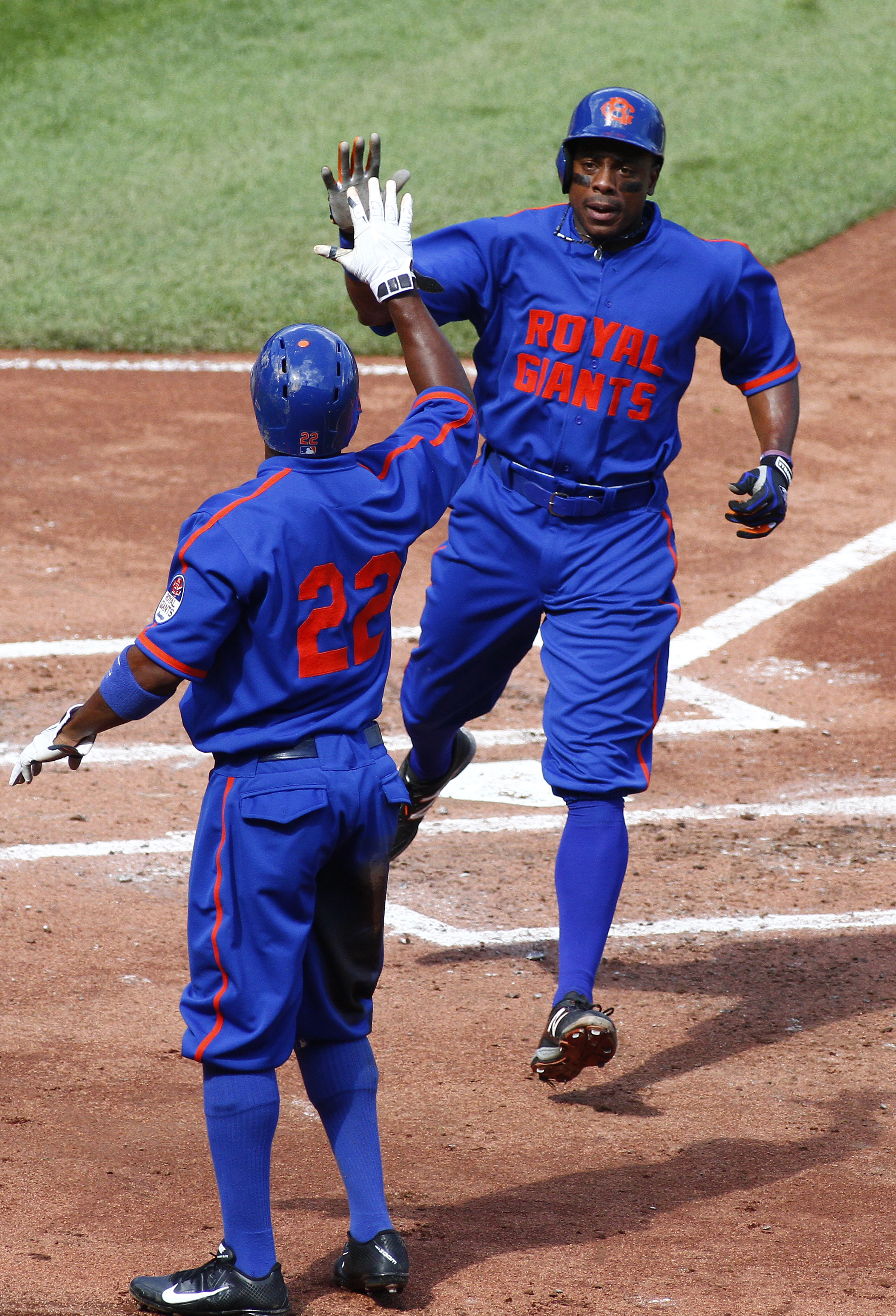
This jersey is inspired by the Brooklyn Royal Giants, a Negro League team that existed from 1904-1942, that the Mets wore a throwback for in 2014. I believe it also hypothetically would mark the first time the team wears the full “Metropolitans” name on a jersey.

-
 10
10
-
 3
3
-
-
Minnesota Twins
This design is inspired by the Washington Senators’ (the iteration that eventually moved to Minnesota) “3-D” design that they wore from 1956-1958.
-
10
-
 6
6
-
 1
1
-
-
3 hours ago, colinturner95 said:
this series is making me want to take another swing at MLB designs. all very well done!
Do it! I’d love to see another MLB series from you.
-
1
-
-
Milwaukee Brewers
The striping is inspired by the former Brewers of the American Association, & the font & sleeve logo come from the Brew Crew’s amazing “YOUniform” promotion they did in 2013, in which the winning design was created by Ben Peters.
-
9
-
2
-
2
-
-
11 hours ago, Discrim said:
Not gonna lie, I tried this Dodgers idea at least twice, and I'm not proud of either version even though that Brooklyn uniform is among my favorites. I think this version works a bit better than either of mine, though...now a Mets fauxback version I made, I'm a lot more proud of. Weirdly, the plaid uniforms the Giants wore at about the same time, I could actually make a San Francisco version look great, even choosing to use violet plaid like the 1916 Giants did (yeah, I later made a Mets version of that too, complete with violet).
Yeah, I really liked the design when I first did it, but I’ve kind of soured on it a bit since. Someone on Twitter said it looks like a “school maths book page” (i.e. graph paper), & now I can’t unsee it. You might be onto something with the Giants though…
-
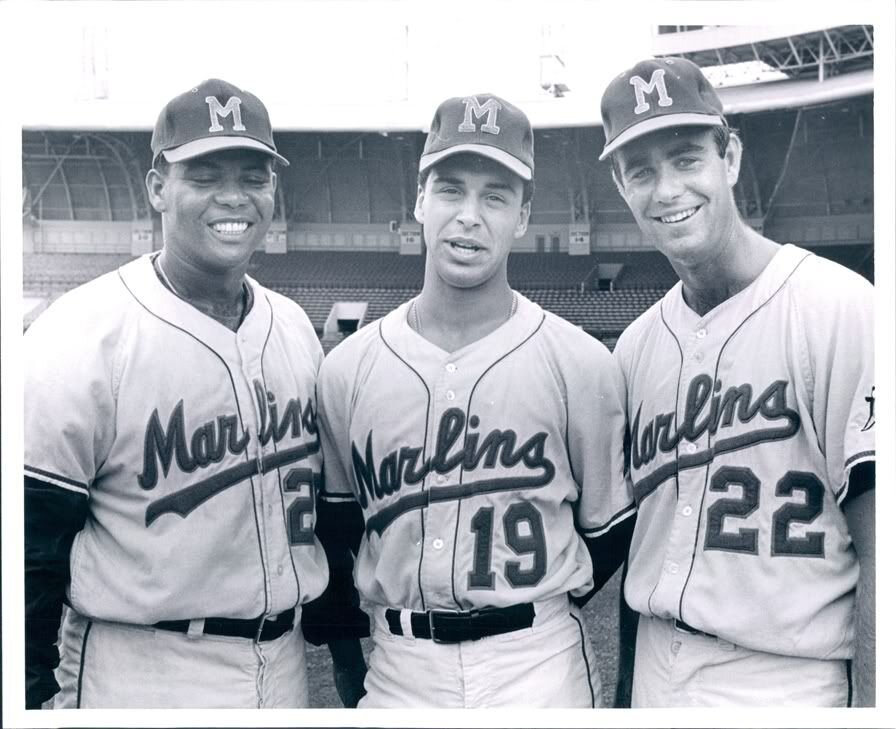
Miami Marlins
This jersey is based on the Triple-A Miami Marlins that existed from 1956-1960. Pairing the design with the modern colors personally reminds me a bit of the Miami Art Deco District.
-
8
-
6
-
1
-
1
-
-
Los Angeles Dodgers
This checkered design is based on the 1916 Brooklyn Dodgers, who had a similar jersey pattern.
-
5
-
2
-
1
-
-
On 3/8/2024 at 1:33 PM, thebutkiker said:
Amazing! Also love the use of the space font for the number. Would buy that in a heartbeat.
On 3/10/2024 at 12:57 PM, Victormrey said:Amazing combination of eras and styles for the Angels! The result is just stunning

Thank you both!
-
Los Angeles Angels
This design is inspired by the Pacific Coast League Los Angeles Angels' "UCLA Stripe" jersey they wore in the 50's, with a periwinkle base color inspired by the '90s Disneyland era.
-
5
-
5
-
1
-
-
Kansas City Royals
The Royals have had pretty much the same uniforms for much of their history, so I once again went with some inspiration from the Kansas City Monarchs of the Negro Leagues, but this time with powder blue & royal.
-
7
-
5
-
-
Houston Astros
I went with the racing stripe pattern used throughout the 80's and early 90's, and paired it with a script that uses the shooting star as its tail, inspired by @SFGiants58's Astros design.
-
13
-
4
-
2
-
-
Detroit Tigers
This jersey is based off of the experiment that only lasted one season, in which the Tigers replaced the familiar Old-English 'D' with a tiger head in 1927.
-
7
-
4
-
-
Colorado Rockies
This design is based on the Denver Bears Minor League team's infamous "Strike Zone" jersey, which they began wearing in 1952, to supposedly help umpires with calling balls and strikes.
-
6
-
3
-
1
-
-
-
6
-
1
-
-
-
7
-
3
-
2
-
-
Chicago White Sox
There were so many different options to go with for the Sox, but I eventually settled on a jersey inspired by the first throwback in MLB, worn in 1990, throwing back to 1917. It was also inspired by the "Field of Dreams" uniform the team wore in 2021.
-
12
-
4
-
1
-
-
Chicago Cubs
I abolutely love the script the team used in 1932 & 1933, so it takes center stage here.
-
11
-
6
-
2
-
-
2 hours ago, FrutigerAero said:
I don't think the current look is bad, especially after they just got rid of "DBACKS" this season which I didn't think was a good primary look. But I wish they went the route of the Phillies who have a throwback uni they wear regularly.
I agree. I could be cool with that.
2 hours ago, FrutigerAero said:Also, I have a question about the Braves uniform, with the firemen's axes, I've seen some people say that's a great connection to the city of Atlanta, but I'm confused at what the significance or connection is? Me searching google doesn't give me anything, so I'm a bit lost with that logo.
Sure, so Atlanta was burned down almost to its entirety during the Civil War. There is a statue in the city commemorating that they “rose from the ashes” following the war.
-
2
-
-
Boston Red Sox
This was a tough one, since the Sox didn't really have many unique uniforms before their current classic set. So, I combined the large letters of the 1902 & 1908 jerseys, the socks patch of the early 1930's, and the collar striping of the 70's.
-
7
-
1
-
 1
1
-
-
On 2/29/2024 at 10:39 AM, GrayJ12 said:
The yellow ties this whole look together, and it gives it a unique "Atlanta" feel. Yes, all of ATL's teams use red to some extent, but I feel like yellow could be a good secondary color for the city. Great job!
Thank you! I agree, the yellow is an essential (but underrated) part of the Braves' identity. Since the Hawks already use red, black, & yellow, like my Braves concept does, & the Falcons have used gold as an accent in the past, I agree that it could be a nice secondary color for the city.
Since I reframed the team name to be referencing firefighters, there's something about the combination of the color scheme with that font that feels very "Fire Department-esque" too, so I'm happy with how it turned out.
14 hours ago, FinsUp1214 said:I absolutely love what you did with the Orioles’ sleeve patch. Such a clever and creative way to blend the Browns and Orioles together! Well done across the board with these so far!
Thank you! The idea honestly came about pretty naturally, and I'm very happy with how it turned out.
7 hours ago, FrutigerAero said:Pretty nice, and if the Dbacks had sense they would have uniforms like this already
Thanks. I'm honestly partial to their current brick red, black, sand, and/or turquoise color scheme myself, but I can't deny there are a lot of people that love the purple, teal, & copper.
-
Baltimore Orioles
This jersey is inspired by the design the St. Louis Browns, who eventually relocated to Baltimore, wore for the duration of World War II.
-
11
-
4
-
1
-
1
-
-
Atlanta Braves
This jersey is inspired by the 1929 Braves, which is probably where the modern-day Braves' subtle use of gold can be traced back to.
-
16
-
4
-
-
Arizona Diamondbacks
Naturally, I went back to the purple & teal era again, but this time with a teal base color, which the team had never done during that era or since. The new full "Diamondbacks" wordmark makes an appearance.
-
9
-
7
-
1
-
-
Hello there,
Since Nike’s City Connect jerseys were originally intended to cycle through new designs every few years, I figured I’d try the same thing with my “Cooperstown Collection” concepts. I tried to be more creative and adventurous with the designs this time around, hopefully that shows. I’ll be posting one team a day, leading right up to Opening Day!
I'm putting these in a separate thread since I'm not yet sure of Nike's City Connect release schedule, and those tweaks will likely take up that thread.
I hope you enjoy!
Cooperstown Collection Volume II
- Arizona Diamondbacks
- Atlanta Braves
- Baltimore Orioles
- Boston Red Sox
- Chicago Cubs
- Chicago White Sox
- Cincinnati Reds
- Cleveland Guardians
- Colorado Rockies
- Detroit Tigers
- Houston Astros
- Kansas City Royals
- Los Angeles Angels
- Los Angeles Dodgers
- Miami Marlins
- Milwaukee Brewers
- Minnesota Twins
- New York Mets
- New York Yankees
- Oakland Athletics
- Philadelphia Phillies
- Pittsburgh Pirates
- San Diego Padres
- San Francisco Giants
- Seattle Mariners
- St. Louis Cardinals
- Tampa Bay Rays
- Texas Rangers
- Toronto Blue Jays
- Washington Nationals


MLB x NIKE Cooperstown Collection Volume II
in Concepts
Posted
New York Yankees
If there’d ever be a good reason for the Yanks to not wear their iconic home pinstripes, it’d be to honor the New York Black Yankees, specifically by wearing a design inspired by what they wore in 1935. I decided to pair it with the classic Yankees script.