


MJD7
-
Posts
2,561 -
Joined
-
Last visited
-
Days Won
54
Posts posted by MJD7
-
-
9 hours ago, aawagner011 said:
Hard to see, but looks like the Braves have the perforated numbers on their alternates. If you zoom in, you can see them on the bottom left part of Acuna’s “3.”

This comes after their home whites were shown without the perforations at a fan fest event.
A few other clubs have shown similar situations (such as the Mets, no perforations on their pinstripes but they have them on their blue jerseys). My guess is the ball clubs didn’t love how pronounced the white poked through against the dark numbers, but were willing to concede to Nike on alternates where they may not be as visible (for example, the Braves blue jersey bleeding through the red numbers is not very noticeable). At least this appears to be a choice and not mandated by Nike.
I'm starting to suspect, but can't yet confirm, that the perforated numbers are in fact league-wide. Even teams that I originally thought may have opted out of the perforated numbers based on the early renderings, appear to have them upon closer inspection in Spring Training. The main teams I'm still looking to see if they have perforated numbers are the Yankees, O's, Mets, Cards, & Phillies.
I wonder if the Braves maybe just applied the old numbers to the new template for their FanFest, maybe because completely authentic new white jerseys were not yet ready.
9 hours ago, aawagner011 said:Paul mentioned this on Uni Watch today, but man, the slightly see through pants need a total rework. You can see the jersey material under the pants, including the silhouette, jock tags, and pinstripes. This is not the move, Nike!
Apparently the see through pants are not a new thing, though. Here are some images from the Majestic era (check out #70 and #63) where you can see the jocktags just as easily as the 2024 Nike pants.
The pants were pretty see-through on the old template, as well, but yeah, this doesn't make things any better.
3 hours ago, Delicate Genius said:Jarrod Saltalamacchia has been dethroned.
If anything, I think this proves the need for the smaller player names. There's no chance his name would have fit in the previous style, given that Saltalamacchia's barely did.
Don't get me wrong, pretty much every other aspect of the new Nike template is an immense downgrade in my eyes (at least for authentics), but the smaller player names seems to be a reasonable move.
-
 1
1
-
-
1 hour ago, gosioux76 said:
Fabric weight seems to be an underlying theme with every apparel innovation Nike introduce into the organized sports world. And I can see how that has made a difference in American football and maybe even soccer.
But was this ever a complaint in baseball? Were players actively saying, "man, I'd play so much better if we could only get rid of all this embroidery." It's the same in the NBA. I don't think polyester and tackle twill ever held a player back from greatness.
All of these uniform innovations feel like solutions in search of a problem.
If anything, I’ve always felt that buttons & belts are what’s most cumbersome and intrusive against player performance (particularly when sliding/diving). I’m surprised Nike didn’t push harder to get rid of those elements (or maybe they did, who knows).
-
 1
1
-
-
I'd be very happy with this. It essentially fixes all of the problems with their current set, while keeping what works. Great job!
-
2
-
-
Some random thoughts just based on everything we've seen so far:
- I really don't think the smaller player names look bad at all. If anything, I think it illuminates that the former player names were at least a bit too big.
- The Braves switching to red piping is a definite upgrade. I wish they'd drop the all-navy cap that goes along with it (and the road jersey) too.
- I agree with @coco1997 that the Nats losing the front number is a downgrade to their set, as the contrast was nice. (Keep in mind, the new away jersey does have a front number, so it wasn't even done in the name of consistency).
- The bright colors of these caps are really nice for Spring Training, especially when paired with brighter colored jerseys, as well. The O's, Marlins, and Rockies are some particular stand-outs.
-
3
-
Also, I updated my Spring Training template to include contrasting sleeves, two buttons, & a wordmark on the sleeve.
They can be seen at this website, let me know what you think!
https://mjd7design.myportfolio.com/spring-training
Here are some of my favorites:
-
6
-
-
Inspired by Twitter user @SethR94’s wonderful Reds jersey concept (which I’ll link below), I've adjusted my Reds away jersey to match his wavy “Cincinnati” away wordmark, which itself was likely inspired by the 2015 All-Star Game logo & the Cincinnati flag.
Here’s @SethR94’s original concept:
-
9
-
 1
1
-
-
2 hours ago, CC97 said:
 1 hour ago, TBGKon said:
You were saying the Rays we're not getting a City jersey?
@CC97, I was about to ask if you had any insider info as to which teams were getting a City jersey this year, and then this pops up! I’m excited. A couple of interesting tidbits from this:
- The Dodgers appear to be trying again with their City jersey
- Official confirmation of no Yankees or A’s jersey, both of which make sense.
-
2
-
I’m surprised the Jets are in fact just straight-up going back to the Legacy uniforms, & a bit underwhelmed. Honestly, I think this outgoing set was a bit over-hated:
9 hours ago, fouhy12 said:
6 hours ago, MJWalker45 said:
Much more 2017 Lions or 2023 Cardinals than 2014 Bucs or 2015 Browns. The shoehorning in of black onto the green & white jerseys was a bit unnecessary, as was the black helmet. Otherwise, it’s a fine modernization of the Jets’ look to me, even if the helmet logo is a bit boring. I didn’t even mind the black uniform on its own for a couple games a year, as long as it was paired with the green helmet with the gorgeous finish.
This is probably just me, but I think the Sack Exchange uniforms are at most a lateral move below the helmet. As I’ve stated before, if they were going to simply revert to a throwback look, the Namath-era set with the brighter green would be much more iconic and unique.
As much as I used to be a Nike homer & still generally prefer them over other companies, this is a really bad look for them. Pretty much every uniform change they made in the 2010’s decade has already reverted or is about to revert to a more classic style, save for the Seahawks and Vikings. Even relatively conservative designs like these Jets and the Lions are getting changed. I wonder if it has to do with the teams seeing fan perception or just wanting to change for the sake of change.
-
2
-
3
-
-
12 hours ago, JohnnyCowboy5 said:
Whats this meaning?
I thought it might’ve meant something at first, but given the context of the Super Bowl being yesterday, it’s probably just hyping up baseball season now being up next.
Like @coco1997 said though, I’m not sure why they went with the Princess Leia theme. Maybe they’ll be announcing this season’s theme nights soon or something like that.
-
3
-
-
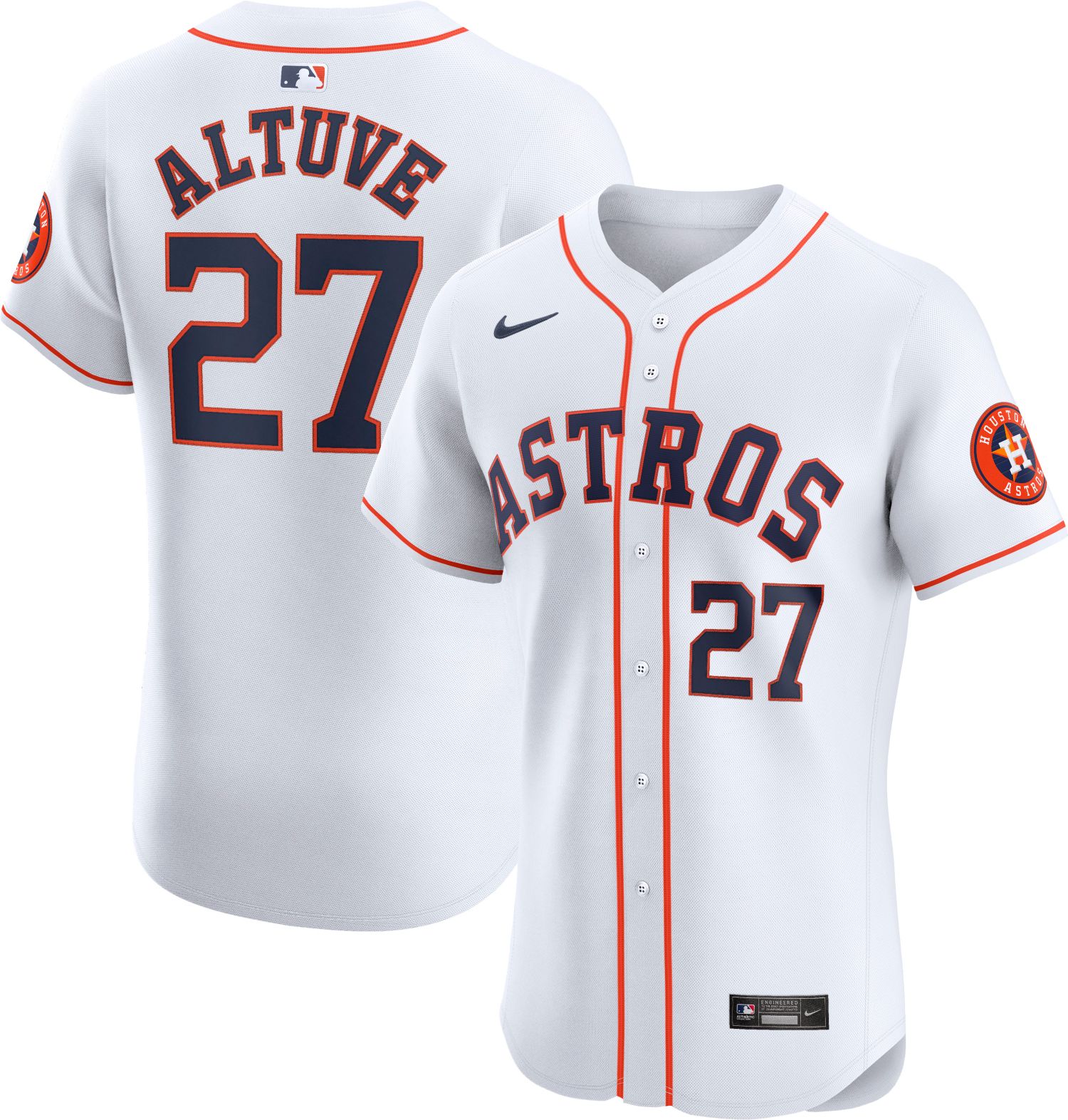
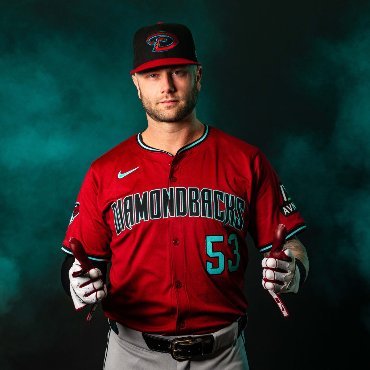
42 minutes ago, aawagner011 said:
And away we go! One of the first on field looks we have seen at spring training.
Also, I’m wondering if the perforated numbers will be a team by team decision, instead of a league wide thing. We saw the Braves a week or two ago with the non perforated numbers and I assumed they were using old number stock. But now a few of the Nike Elite jerseys are starting to hit retailers. So far, the only clubs I’ve seen with the perforated numbers are the Dodgers and D Backs (below). The retail Nike image includes that number style for them, but regular numbers for most teams. This gives me hope teams have a choice.
I hope more than anything that the perforated numbers are optional, & that the Twins in particular opt out.
-
5
-
-
The caps I’d use for these MLB designs:
-
5
-
1
-
-
5 hours ago, Lights Out said:
The Phillies, on the other hand... WTF were they thinking.
I think that’s gonna be the most popular one. I wouldn’t want them to wear it in a game, but I have a feeling that thing is gonna sell like hotcakes.
-
5
-
-
On 2/5/2024 at 4:41 PM, johne9109 said:
I like it. It's one of those designs that's subtle to where I'd be like I don't get the reference, but then there'd be a behind the design graphic that would make me go oh that's genius
Thanks! That's definitely the goal with 'storytelling' designs, to do something clever but not too obvious, while still achieving the main goal of simply looking good.
23 hours ago, VampyrRabbit said:When choosing that shade of pink for the logo (which I am going to tweak when I have the chance), It was only intended to be used as part of the Marlin on the main uniforms, just a nice little tie to the masterpiece that is the Miami Art Deco district along with blue. I like the home, road and alternate (though not a fan of the pullover alt), though I would prefer them with just black and teal, with the pink just on the Marlin.
Yeah, I assumed the pink would be logo-only for your set (which works), I just wanted to extend it a little bit further.
23 hours ago, VampyrRabbit said:Make the stripe cream and move it higher on the shirt and match the sleeve stripe with it, and put the BREW CREW script on the stripe.
Good idea:
It's probably an upgrade.
-
3
-
-
Looks great! Unfortunately the flag was probably a bit too late to be finalized for the Twins to actually use it as inspiration for their City Connect, assuming they are in fact releasing one this year, but it's a fun idea, nonetheless. The navy version is a lot more palettable to me, as the particular shade of blue they chose for the flag seems like it'd be a bit much for a full uniform. It might work for just the jersey, or even just the pants, though. I agree with @chcarlson23 that the modern "Minnesota" wordmark is an upgrade. Great work!
-
41 minutes ago, Silent Wind of Doom said:
The Rangers have the same number of stripes on their sleeves as a few other teams, but they're clearly bigger. Yet the seam is still in the same location above the top stripe. Are the Rangers getting more material below the seam? Are their sleeve seams higher? And either way, why are they getting a different treatment than others? So many issues could be fixed with this extra space. Did the other teams just not care enough to even ask? Is there something that would make the Ranger special in this respect?
I noticed this in the earlier renderings, as well:
On 1/19/2024 at 8:44 PM, MJD7 said:For sure. To use a more clear-cut example, both the Twins and Brewers are using 3 stripes, but the Twins are clearly bigger (which is a surprise, because the Brewers’ home jersey had really big sleeve stripes on the previous template).
There seems to be the ability to have different stripe sizes, which I wasn’t expecting. The Twins are another team that appear to have bigger stripes than the average. The Twins & the Rangers were two teams that had larger stripes on the previous template, as well, so it seems they were able to accommodate more than we would’ve expected, even though we can’t have stripes above the edge of the sleeve anymore.
-
5 hours ago, BBTV said:
Then they should make it shaped like a star.
Don't give them any ideas.
-
2 hours ago, BBTV said:
Phillies standard caps should have a white squatchee. The day they were unveiled, young me thought it was a cool touch. Now I think it looks childish.
I'm not sure if there's another example of a team who's squatchee doesn't tie into any other color on their cap.
The blue squatchee is one of my favorite aspects of the Phillies’ current set. It ties in nicely and subtly with the blue stars on the jersey.
-
9
-
1
-
-
I had this idea of an adjustment to the Brewers’ City Connect, instead of limiting the “beer foam” stripes to the sleeves I translated it to the whole jersey. Thoughts?
-
6
-
-
I've been meaning to comment on these:
- Rockies: I dig the wordmarks and the inclusion of lavender. The "subtitle" font for the "Baseball" wordmark looks too close to the Diamondbacks' old "Matrix" font to me, and doesn't really fit as well for the Rockies in my mind. I think the update to the "home plate" logo in removing black was a good one, and the new mountains are an upgrade, as well. I'd be curious to see how the fauxback would look as part of a whole uniform.
- Marlins: This is probably my favorite one you've done so far. It does feel inescapably Miami and inescapably '90's at the same time, and your explanation of "Factory Pomo" brings to light why that is. I'm not entirely sure the logo would feel like it fits among the rest of MLB, but on its own I really dig it. The marlin itself is a nice blend of the current fish and the original.
- Diamondbacks: I've never really liked the "db" logo, so I didn't even realize it had rounded edges on the outlines, but sharpening it up to match with the "A" logo improves it a lot. I'm not entirely sure that purple, red, teal, & copper would all work together in a Diamondbacks set, but your attempt is as valiant as any towards making it work.
- Nationals: Nice, solid update of the "DC" logo. I like the idea of going with a more cherry shade of red for Washington.
- Rays: I love the idea of combining the gradient with the fauxback logos, as it's an idea I've had myself. However, I'm not entirely sold on the gold, as I think it distracts a bit from the gradient. Maybe the sunshine shape inside the "b" could remain yellow, although I'd prefer the brighter, more lemon-y shade the Rays currently use, and the outline could become white?
- Guardians: Just as sharpening up the "db" logo really helped for Arizona, I think it could do the same here. I actually really like the Guardians' current "C" logo, so I wonder if there could be a way for you to achieve the same effect using it. I also like @coco1997's idea of incorporating the wings into the white space, but I wouldn't want it to be too distracting.
I'm looking forward to hopefully seeing more, as well as maybe seeing how some of these would translate to uniforms!
-
1
-
43 minutes ago, BadSeed84 said:
Also lots of comments that this still should be the Phillies logo.
It should.
-
5
-
-
7 hours ago, CaliforniaGlowin said:
 Imagine these glowing in the sun! I'm tempted to watch.
Spring Training hats should be bright & fun like this. I’m generally in favor of Nike’s 4+1 rule limiting the amount of jerseys a team can have, but I feel Spring Training should be an exception. I’ve never liked when teams wear their regular season jerseys during Spring Training. They should instead have the opportunity to try something new, a bit more bright & colorful, & a bit less traditional.
-
16
-
-
42 minutes ago, rwaters1221 said:
What I REALLY wish they would have done that would have been a cash cow is make the batting practice hat just like their batting helmets. That is one hat I'd buy multiple of so I could switch out after it gets worn too much. Maybe the Spring Training cap will go that route. This hat at least saves me done money I guess.
A hat like that should be the Twins' primary home hat. It's one minor thing I think the current set could use to elevate it to essentially perfect status.
-
3
-
-
After discussing with @Marlins93 in the MLB 2024 Uniform/Logo Changes thread, I started to become more convinced that going back to teal really is the way to go for the Marlins. True to my comments, though, I kept pink as an accent, but went with a more pastel shade inspired by @VampyrRabbit's "Factory Pomo" Marlins logo, which keeps the Marlins' identity close to its 90's roots, which I appreciate.
I also think the Marlins are a rare team that doesn't really need a road gray jersey, so in its place I added a pink alternate inspired by the Nationals' recent raglan-sleeve pullover.
I might make this my "standard" Marlins set, I'm still a bit conflicted whether to keep the current "Marlins blue." Let me know what you think!
-
6
-
-
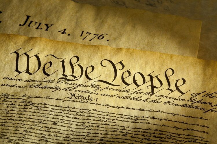
15 minutes ago, Anubis2051 said:
I think it's supposed to evoke this:
If that’s what they were trying to evoke, then I’d say they missed the mark entirely. It looks more like a logo for a heavy metal band than it does any Revolution-era document.
-
11
-


/cdn.vox-cdn.com/uploads/chorus_image/image/71569170/1437750496.0.jpg)


MLB 2024 Uniform/Logo Changes
in Sports Logo News
Posted
The Twins Minnesota state outline sleeve patch was always on the left sleeve last year, it being on Buxton's right sleeve means an ad is likely coming for them too, unfortunately.