


MJD7
-
Posts
2,575 -
Joined
-
Last visited
-
Days Won
54
Posts posted by MJD7
-
-
New Haven Goblins
After gliding his way into the MCU in No Way Home, the Green Goblin cemented himself as one of the best villains in comic book movie history.

-
 3
3
-
 1
1
-
-
I know this is gonna be unpopular, but in the short glimpse I got of the “snowcapped” Broncos set, it looked better than expected. White socks or pants would make it even better (although very Syracuse-like).
I wouldn’t hate it as a once-a-year thing going forward.-
3
-
 2
2
-
-
Stalingrad Black Widows
Inspired by one of the original Avengers' long-overdue solo film branding. The Cinematic alternate takes inspiration from Black Widow's electric current Age of Ultron costume.
-
3
-
-
20 hours ago, johne9109 said:
Missed opportunity to revive the Brooklyn Americans moniker, great set
I honestly really like the Captains name, and prefer it to "Americans."
-
1
-
-
Talokan Submariners
Inspired by Namor's aesthetic in Black Panther: Wakanda Forever, this set uses the font from that films branding and Talokan's oceanic colors.
-
2
-
-
Brooklyn Captains
My personal favorite Marvel character, this set keeps things classic. The alternate is based on Captain America's Winter Soldier navy stealth suit and shield.
-
6
-
 2
2
-
-
Tomorrow is the LAST DAY to get a real-life version of my Florida Sox jersey, made with the the help of ProLine Mockups! Get it now before it's too late!
-
Vancouver Deadpools
This name doesn't really make much sense, but given the character's meta nature, I went with it.
-
4
-
-
Xandar Nova Corps
The intergalactic police force in the Guardians movies, their titular hero Nova has yet to make an appearance in the MCU. The alternate is inspired by the Corps uniforms in the films.
-
1
-
-
San Francisco Ants
One of the few west coast Avengers, who just rounded out his trilogy this year. The giant wordmark on the alternate takes inspiration from his ability to transform into "Giant Man."
-
3
-
-
Hell's Kitchen Daredevils
After making his MCU debut in Spider-Man: No Way Home & then subsequently appearing in She-Hulk: Attorney at Law (which the yellow alternate takes inspiration from), the Man Without Fear is set to have his own TV series revived.
-
5
-
-
3 hours ago, johne9109 said:
These do look great, but might I suggest instead of the blue alternate doing a feauxback style uniform based on his brown outfit. Just a suggestion
That's a good idea! The shade of brown in the image you linked seemed pretty perfect, so I ended up using it:
I'd also probably have to adjust the yellow alternate to be more in-line with the main set (the original one was inspired by his costume in the X-Men '97 TV series).
-
1
-
2
-
-
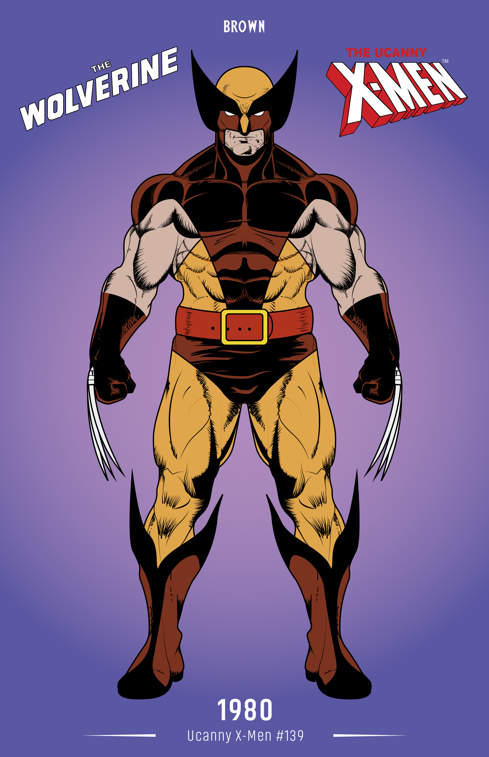
Alberta Wolverines
He hasn't appeared in the MCU yet, but Hugh Jackman is set to return as Wolverine in the upcoming Deadpool 3. I based the uniforms on his comic book aesthetic.
-
3
-
2
-
-
I’ve long thought the Broncos’ best throwback look was this one, it’s so much more unique than the Orange Crush:
It seems to me like it’d be very adaptable to modern templates, too. Go with the robin’s egg blue helmet, keep the current number font & logo (or update the D horse logo), & you’ve got a winner.
-
7
-
-
7 hours ago, johne9109 said:
Looks good, but why ths color scheme over their uniforms?
The colors were inspired by the purple Power Stone, which is the MacGuffin of the first Guardians film, and the gold lettering of that same film’s branding. Since so many superheroes use the primary colors of blue, red, & yellow as their color scheme (which has some interesting color theory behind it), and since the Guardians’ suits weren’t really present until the 3rd film, I decided to avoid using them as inspiration for the color scheme.
-
1
-
-
2 hours ago, Ferdinand Cesarano said:
During the Yankees' run of championships in the late 90s and early 00s, there were so many Yankee fans who said that a season that doesn't end with a championship is a failure. The word "joyless" was mentioned earlier; someone who believes what those Yankee fans asserted is bound to be joyless, and is overlooking so much of what's fun about a season.
This I can agree with, I think that’s just a symptom of consistent winning though, as you tend to hear similar sentiments from fans of the Patriots or Lakers, for example, where winning became expected, as opposed to enjoyable. If only fans of other teams could be so lucky.
2 hours ago, Ferdinand Cesarano said:(And I am aware that the Yankee Stadium crowd cheered David Ortiz in his last appearance there; but I still doubt that they'd do that during a player's career the way the Yankee fans of the past did for Seaver.)
This seems to me to be more of a contradiction to your point than you may realize. Was it still while Ortiz was playing? It seems like a pretty analogous situation to Seaver, since a 300th win is also towards the end of one’s career.
2 hours ago, Ferdinand Cesarano said:I am indeed unaware of that. But I do know that Phillies fans for the longest time gave Mike Schmidt a terrible time, even as he was highly respected around the National League. It wasn't until very late in Schmidt's career that he became accepted by Phillies fans. This parallels the experience of Mickey Mantle with Yankee fans; up until the big home run chase with Mantle and Roger Maris during the 1961 season, Mantle was just as likely to be booed as cheered by Yankee fans. (This was before my time, so I can't really explain it, apart from people being irrationally resentful of the player who replaced Joe DiMaggio. However, Bobby Murcer fell far shorter in replacing Mantle than Mantle did in replacing DiMaggio; yet Murcer was one of the most beloved players for the Yankee fans of my era.)
I’ve seen a similar thing online lately of some Twins fans trashing Joe Mauer, since he is up for Hall of Fame induction this year. I personally think and hope he will be a first-ballot Hall of Famer, and I can’t understand Twins fans who are unappreciative of a literal hometown hero, who always did things the right way on & off the field.
This is getting way off-topic of uniform discussion, though, so to get back on track: the Giants look fine on the new template, their design translates pretty well, as will the Pirates, although I suspect the perforated numbers are going to bug me.
-
2
-
-
23 hours ago, Ferdinand Cesarano said:
I grew up a Yankee fan, but I no longer identify as one, because Yankee fans in my day had a scholarly bent, while today's Yankee fans tend toward the stupid and goonish.
7 hours ago, Ferdinand Cesarano said:In this environment, the Met fans were the know-nothing trend-followers, and we Yankee fans were, yes, the scholars. We were the ones who were actually familiar with the players and the teams from both leagues. When the Mets would acquire a new player, the Met fans at my school would have to ask us — the Yankee fans, and therefore the serious baseball fans — about that player. When a Met fan was about to go to a game, that Met fan would ask us for a rundown of the opposition. For we were the Yankee fans, the keepers of the knowledge.
Then the Lean Years ended, and we Yankee fans got our championship teams. Still, immediately thereafter, we were knocked down again by having no World Championships in the entire 1980s, during which time the Mets once again became the media darlings — and, therefore, once again became the go-to team for the empty-headed know-nothings. And so for a second time, now as an adult, I had the experience of my Met-fan friends asking me for information on new acquisitions, on call-ups, and on opposing players.
I retired from following current baseball after 1996, when the Yankees were nice enough to play me out with a championship. So I watched the Yankees' resurgence after that as an outsider. And what became clear to me was that the nature of Yankee fans had altered radically. While Yankee fans of my generation were arrogantly haughty, the Yankee fans of the latter generation were just loutish.
There is a profound difference between the Yankee fans of my day and those of the current day. If the Seaver scenarios had played out at any time after 2000, the Yankee fans of today would certainly have booed a longtime Met, rather than cheer a baseball hero.
Feel free to disagree, but in my experience any generalization about a group of people seems bound to be inaccurate for at least a decent amount of people in that group.
There are plenty of good and bad Yankees fans out there, just as there are good and bad Red Sox fans. I don’t like the Yankees myself, but I don’t hold any illusions about all of their fans, or even a majority of them, being terrible. I honestly can’t fathom ditching my team allegiance because of a perception of how other fans behave, even if I perceived them to be the majority.
Now, if the team themselves did something to warrant criticism, such as a serious scandal or something, I could see how that could be grounds for deserting fandom of the team, even if only for a temporary time.
General attitudes of fans can even be shown to change, as evidenced by Phillies fans’ eventual re-embrace of Trea Turner, even when the results weren’t showing early this past season (although, if you say you haven’t been following baseball since ‘96, I guess you may be unaware of that situation).
-
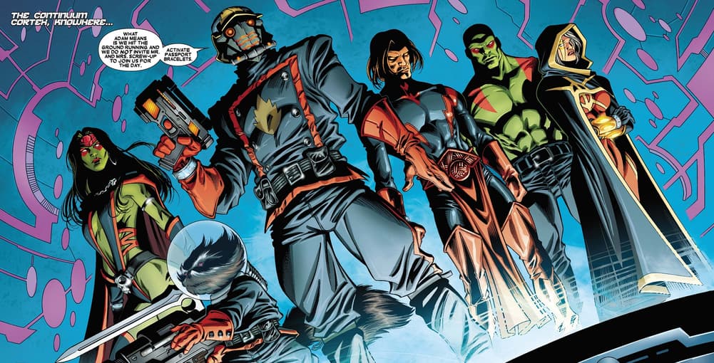
Knowhere Guardians
Inspired by the most unlikely heroes of the MCU. The alternate, fitting for the holiday season, takes direct inspiration from the only Christmas special in the MCU.
-
5
-
-
57 minutes ago, Marlins93 said:
I'd add the Brewers, Reds, Giants, Braves (lazy), and maybe even the Red Sox to that list. Pirates are among the absolute worst, too, even aside from the batting helmets. The Braves is basically a derivative knock-off of a throwback.
The Brewers are pretty "meh" to me, I like the choice to go with powder blue & the sleeve stripes design is pretty clever, but the rest is kind of a miss for me. It's not a disaster, but it's pretty uninspiring.
I actually kind of like the Reds', they were willing to completely go all-in a futuristic design instead of the "respect the past, embrace the future" trope so many teams employ, to good or bad effect.
I'd like the Giants' better if they went with the darker "International Orange" that matched the Golden Gate Bridge, & the fog seems like a good concept but it was executed poorly. Using a "G" instead of "SF" or "San Francisco" was also a poor choice. I wouldn't call it a complete fail, but it's definitely near the bottom.
The Braves' is definitely a copout to keep the throwback in the rotation, but all things considered, it's probably the result that most people here would want. If they did anything else, people would say it's too much of a departure from the brand (which is a perfectly reasonable opinion). I wish they were a bit more adventurous myself, but I wouldn't call it bad or anything.
On the contrary, the Red Sox' uniform looks pretty nice aesthetically, but feels like such a departure from the Red Sox' brand. A Fenway Park inspired uniform would've been a much safer route to go, while still tying into the city, in my opinion. On the other hand, given how intertwined the Sox and the Boston Marathon are, the inspiration for this one is near the top, in regards to sticking to the premise of connecting to the city.
If the Pirates' jersey spelled out "Pittsburgh," instead of the silly abbreviation, I'd be perfectly happy with it (again, apart from the batting helmet). A gold jersey with black pants is a welcome readdition to the Pirates' rotation.
To summarize, each of the jerseys you mentioned definitely have their flaws, like many jerseys do in our eyes, but I wouldn't call any of them complete fails, like many of the recent NBA City jerseys have been.
-
2
-
-
9 minutes ago, BBTV said:
yeah I tweeted that to PL earlier.
And that's where I saw it.

-
1
-
-
-
I understand the idea of the Yankees pinstripes being their City Connect, so I wouldn't be surprised if they truly end up not having a jersey. It would honestly be pretty strange seeing them wear anything other than the pinstripes in Yankee Stadium.
Although I was very against the City Connect program when it was announced, as it felt like a cheap ripoff of the NBA City program (which, in reality, it still is), most of the designs have turned at least pretty decent. I love the White Sox & Angels, and the Diamondbacks, Rockies, and Astros are all pretty great too. Others are really nice but have one fatal flaw (The Mariners' black pants, the Pirates' batting helmets). Only a few are real stinkers (Baltimore, Dodgers, San Diego). Overall though, the program has resulted in some pretty unique and interesting designs, and I'm looking forward seeing to how the remaining teams turn out.
-
2
-
-
Westview Witches
This branding is based around the great introduction to TV in the MCU: WandaVision. The alternate really leans into the early television aesthetic of the opening episode.
-
5
-
2
-
-
On 12/13/2023 at 3:55 PM, throwmesomepics said:
completely agree with this rule, which is why I've always disliked when teams use solid white socks to break up mono looks like these:
Without any stripes on white socks, it just makes the uniform feel incomplete, especially when everyone on the team is wearing them
At that point, might as well commit to the mono look, the bland white sock taking up 50% of the legs doesn't do much to help.
This one works better because of the stripes
My general rule of thumb is that if the jersey matches the pants, the helmet should match the socks, whether that results in a completely monotone combo or not. That's part of why certain monochrome combos like the Seahawks work for me, while a number of the Color Rush sets, which often were a different color from the helmet but were one color from the neck down, didn't.
It's also why I think that Bills set actually works, as @fouhy12 said, the socks help balance out the helmet. It'd be better with stripes on the socks, though.
That Jets combo isn't bad, as there's plenty of white on the jersey for the socks to balance out with, and a white facemask would be even better. Green socks would probably work just as well with this set though.
As for the Bears, if they go all-navy, I prefer their worn-once Color Rush combo:
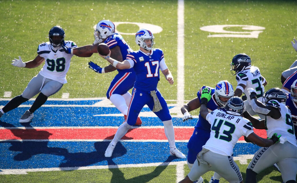
27 minutes ago, S316 said:Gridiron Uniform Database has the Cardinals in all white uniforms at home against the 49ers this Sunday if this is true they are wearing white at home for the 1st time since 2009 against the Texans
The team confirmed as much, as you can see in @Pigskin12's post on the previous page:
On 12/13/2023 at 7:37 PM, Pigskin12 said:This team has gotta be trolling us at this point.
This is now the third incorrect road jersey the 49ers announced at the beginning of the season. They’ll have worn red for three road games.
-
2
-


/cdn.vox-cdn.com/uploads/chorus_image/image/56607075/usa_today_10271753.0.jpg)

2023 NFL Season week by week uniform match-up combos: From HOF Game to Super Bowl LVIII
in Sports Logo News
Posted
I agree they should be the full-time road jersey, especially now that they’re in the Silver State. I’m not sure if they can make the outlines much thicker than they already are, though.