


MJD7
-
Posts
2,561 -
Joined
-
Last visited
-
Days Won
54
Posts posted by MJD7
-
-
Yeesh… there’s not much I like about that Phillies City jersey. The patch is decent, but that’s about it.
I could rag on about all the things I don’t like, but I’m just gonna leave it at that. I am curious of what explanations they have to offer, but I don’t imagine it would lead me to like the design any more.
Nike has honestly had a pleasantly surprising track record with the City Connects in my view, really only a few have been complete swings & misses. This immediately becomes one of them, though, and probably the worst of the bunch, at that.
-
 4
4
-
-
On a similar note, I updated my Marlins' City Connect design to be more like their real-life version, which had been growing on me (I just went with pink instead). Thus, I had to alter the Cubs', so I tried to make it closer to the Wrigley Field sign aesthetic.

-
8
-
 2
2
-
-
On 1/30/2024 at 2:37 PM, aawagner011 said:
^Marlins look great! I love how they now have an established color palette with that concept. Currently, you look at their main jerseys (let’s say white, black, and gray, TBD how much they wear the blue since it’s new) and they’re basically just a black and white team. You see a tiny bit of blue and red but it’s so small and neither color is dominant over the other. This concept clearly establishes them as black and blue and vaguely alludes to their old teal sets, so I’m all about it.
Thank you! I agree, their current set is way too black & white heavy, which thankfully the blue jersey will help with at least a little bit.
On 1/30/2024 at 2:45 PM, VampyrRabbit said:The teal was great, the mistake Miami made was relegating it to an accent colour, with just the right shade it popped against the black.
The problem wasn't that the teal looked dated, it was with the wordmark and the logos, which were well past their sell by date when the team moved to their new stadium and would have been so even if the Fish had used light blue instead.I do agree that the teal itself wasn't the problem, it was their minimal use of it. Teal/aqua is pretty much the quintissential Miami color, so I think it would've been fine had they stuck with it. The only reason I'd not want them to get rid of the current blue doesn't really have anything to do with Miami itself, more-so that I'd be sad to see that beautiful shade go. However, I'm starting to be more convinced that going back to teal might be the way to go with the Marlins, which you'll see pretty soon...
-
58 minutes ago, GriffinM6 said:
I guess I must be the only person who like the raglan sleeve Nats alt?
Nah, I like it for what it is. Like @coco1997, I’m not sure I would have replaced the red alternate with it, but there’s nothing I find objectionable about it from a purely aesthetic standpoint. It does but me that they didn’t commit all the way in one direction or the other though in terms of overall branding.
-
3
-
-
I've been meaning to comment on this, it looks good! It kind of reinforces my notion that, if they went in this direction, they don't really need both the primary set and the throwbacks, it'd be best to just pick one. Any of the variations of "King Blue" and "Apple Green" would look good in my opinion.
I'm looking forward to hopefully seeing more variations in this style!
-
1
-
-
On 1/26/2024 at 8:38 PM, aawagner011 said:
The City Connect should be the basis for an update. That script is so much better! It’s also much simpler because it has a single contrasting color whereas the current script has two trim colors.
Imagine that design (with or without the pinstripes), but with a black base, white script, and that thick, vibrant blue drop shadow. The drop shadow would pop so much more than the new black jersey’s blue and red outlines. I could see a blue version with a white script and black drop shadow. And then white and gray with black scripts and blue drop shadows. The Marlins have long emphasized black and that would be a great way of continuing black while heavily showing off the blue because of that incredible script with the big drop shadow.
This comment inspired me to try out @aawagner011's suggestions, and I quite like how it turned out, especially the black jersey:
I prefer the current scripts myself, ideally without red, but I wouldn't be upset at all if the Marlins went with something like this.
Next up will be another Marlins set, but with more of a throwback twist.
-
6
-
1
-
-
16 hours ago, GriffinM6 said:
I think it looks good, but maybe do it like the Florida Gators do on their football uniforms and have a master stripe pattern of R/W/B on every uniform element.
That could work, it would allow the (now former) red alt to remain pretty much as it was, which would be an upgrade in my book:
14 hours ago, VampyrRabbit said:I prefer the original concept, never liked the double outlines for the Rangers script and not really a fan of them for the Nats. Though I dig the original Bevelled look for the Nats and would like the Padres/Brewers/Blue Jays treatment for that era someday, so make of that what you will.
The W Nats are a good look, just not my cup of tea.Yeah, I probably prefer the original too, although this is growing on me. I actually like double outlines for the Rangers, but an outline & dropshadow might work even better.
Trying to update the beveled Nats might be an interesting endeavour.
-
5
-
-
I have a few loose concept ideas I'd like to post here, plus I'm sure I'll be revising each of the new City Connects once they begin to be released.
First up is an attempted revision of the Nationals' recent jerseys: I tried to see if double-outlines across the board could work. I'm not sure if I'd take it over my original Nats' concept, but I think it does work. It definitely gives an added patriotic feel to it.
Let me know what you think.
-
11
-
1
-
-
On 1/24/2024 at 10:27 PM, M59 said:
I'm with you on the number font. Still of the opinion that the Orioles black jersey with the orange/black/white lettering and numbers (low i version) was the best version.
https://goldinauctions.com/1999_cal_ripken_jr_baltimore_orioles_game_used_alt-lot96150.aspxYeah, I'm more partial than most are to custom number fonts, so I can understand that. Maybe a number font like their City Connect would work better. I'm just not a fan of regular block beyond a few classic of the classic teams, like the Yankees and Tigers.
As for the O's jersey you linked, I definitely don't mind that version at all, the O's just don't feel like a double-outline team to me, at least not anymore. It'd definitely be my 2nd choice ahead of orange with only a white outline or vice versa.
-
3 hours ago, NOLAPelicans23 said:
What is the big deal about Baltimore having stripes on the black pants? What has always stood out to me about them is their simplicity and versatility. The B gets it away from the blehness that many teams suffer from with monochrome pants (Commanders/Lions/Jags), but they can be worn with any jersey. Adding what I would assume would be a purple/white/purple stripe to the black pants would remove the versatility and make it stick out like a sore thumb. The pants stripe is already different from the numbers with their lack of gold, and it's my gripe with the purple pants Baltimore has now.
Stripes do not equal good.
I don't think the Ravens necessarily need stripes on the black pants like other people may, they make it work as-is. But I think a solid purple stripe or two could maintain the "versatility" you speak of, since it would blend pretty well into the black, but it would get more of their signature color into a pair of pants that is pretty much devoid of it right now.
-
3
-
-
32 minutes ago, fouhy12 said:
I shouldn't like Baltimore's yoga pants, but, for some reason, they've always been an exception to me. I think this game looks tremendous all around. The darkness of Baltimore's looks against the bright red and yellow works really well and played outdoors on a grass field in gloomy weather just sets the tone perfectly for playoff football.
17 minutes ago, Wackyriderfan14 said:I know it’s not a popular opinion but the Purple and Black combo just works for the Ravens. Stripes would improve it for sure but it looks better than white pants
Their purple Color Rush socks paired with this look would be my pick for their primary home combo.
I wouldn’t mind some stripes on the pants either.
-
3
-
-
11 minutes ago, DCarp1231 said:
Nationals are ditching their city connect jerseys after 2024.
The first domino has fallen.
9 minutes ago, BadSeed84 said:Or it means they'll have an even worse one in 2025
The City Connects were always intended to have a 3-year lifespan. It’s a slight improvement on the NBA model, to have a new City jersey every year, which has resulted in progressively worse designs.
They’ll almost certainly have a new one in 2025. Since the cherry blossoms seemed to be pretty popular, we’ll likely get an updated version, hopefully with pink as the base color this time.
(I’ve really been quite the champion for pink lately…)
-
3
-
-
12 hours ago, aawagner011 said:
Couple looks at the Braves in the new on field template. The script and tomahawk seem a hair smaller. Sleeve trim has already been touched on, but still taking some getting used to. The Quikrete sponsor patch has changed from full embroidery to a cheaper patch with a thicker outline. It looks like the embroidery no longer goes deep under the placket to mask the clear separation (not sure of a better way to describe that). Also, they do not appear to have perforated numbers. Not sure if that’s something they were able to opt out of, or if they just slapped some old numbers on the new jerseys for their Fan Fest event.
If you click the tweets, you can view the photos in higher res and a better aspect ratio.
10 minutes ago, (probably)notabandwagonfan said:Is it just me, or did the navy get lighter again and did the script get smaller?
This is from last year's BravesFest
I also don't see any perforations in the numbers, like we have seen with other teams. Either they're too small to really be noticeable, or teams maybe have the ability to opt-out of them. Either way is a win in my book.
-
5 hours ago, Marlins93 said:
Although the Marlins and Mariners both unveiled new brandings in 1993, I still contend that the Marlins "wore it first" especially since their announcement came months earlier.
I also think the shade of "teal" is distinct enough for both teams and I actually don't even consider the Mariners' Northwest Green to be teal per se, anyway.
But I definitely disagree with any notion that the Marlins should back away from teal because of the Mariners. And I also don't think the "Miami blue" shade is *that* good.
In no shape or form would I consider *this* drab:
"Drab" probably wasn't the best word choice to describe what I was thinking, maybe more like... "sterile"? Don't get me wrong, I love that Marlins uni, so even that description feels a bit too strong.
Essentially, the point I'm trying to make is that I think just a little bit of a warm color as an accent would help.
Orange would work, as @M59 suggested, but that feels a bit safe, with the only team in the NL East that doesn't use red (the Mets) already using it, not to mention Miami's own NFL franchise essentially sharing the same scheme.
Pink would be unique, definitely in MLB and even in the 4 major sports as part of a primary color scheme. Plus, it wouldn't even really be that much of a risk given that, as far as I can tell, the Heat's "Vice" program was quite possibly the biggest hit of the NBA's City Edition program, and probably was as popular of a uniform campaign as any in recent memory.
I've long thought that Miami's teams should share teal, pink, and orange: the Dolphins should be teal & orange, the Heat should be orange & pink, and the Marlins should be teal & pink.
-
1
-
-
9 hours ago, Marlins93 said:
Or they could just go back to a color scheme that is clearly preferred (teal) and one that no Marlins fan wanted to get rid of. They have only been teal-less for so many years due to owner hubris.
NYC carpetbagger Jeffrey Loria decided to Yankee-fy the Marlins original uniform set as soon as he bought the team. They were still technically a "teal" team but it was basically BFBS with teal very attenuated. He got rid of it altogether when the new stadium opened just because he wanted to flex his ego and put his stamp on things. Jeter did exactly the same thing when he bought the team.
I feel like the team bosses just doesn't get it. They are not gaining any extra revenue by having this soulless identity trotted out since 2019 that most fans merely tolerate on the basis of "hey, at least the blue jersey is cool!" Look around Marlins Park on game day. Most people are either wearing City Connects or vintage teal.
The Marlins do seem to be in a Padres-like situation where most of the fans clearly want to go back to the original color scheme, but ownership seems to not want to.
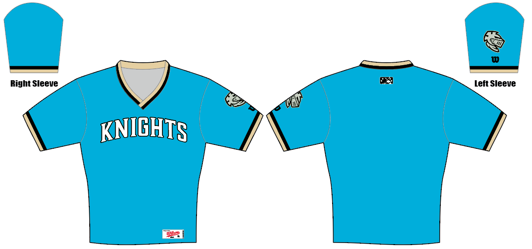
For me, having no tie to the Marlins, my only hesitation would be in not wanting to lose that gorgeous blue color, while going to a color another team already has (the Mariners). If Charlotte ends up getting an expansion team, I'd fully support them adopting that blue (essentially, the Knights' new color scheme) and the Marlins going back to teal.
I also think teal & black on its own can get a bit drab at times, even with a larger presence of teal. My solution, as I've mentioned, would be to add a little bit of pink: it'd be perfect for Miami, and would even tie to a bit of unknown history that they were almost named the Flamingos.
-
5
-
-
2 hours ago, aawagner011 said:
Seeing the real life photos of the Marlins reinforces that the changes are a big step in the right direction, but man, could they definitely be better. Particularly the black.
In my opinion, I just don’t think they need red. It serves very little purpose in their color scheme. Clearly the emphasis is on black and blue. And the shade of blue is great. Pretty unique and distinctive. If done correctly, I think they could evoke the black and teal era but the blue would be more timeless and not reminiscent of a single decade in sports when everyone had the color.
The City Connect should be the basis for an update. That script is so much better! It’s also much simpler because it has a single contrasting color whereas the current script has two trim colors.
Imagine that design (with or without the pinstripes), but with a black base, white script, and that thick, vibrant blue drop shadow. The drop shadow would pop so much more than the new black jersey’s blue and red outlines. I could see a blue version with a white script and black drop shadow. And then white and gray with black scripts and blue drop shadows. The Marlins have long emphasized black and that would be a great way of continuing black while heavily showing off the blue because of that incredible script with the big drop shadow.
Probably the single most puzzling thing about the Marlins' 2019 was the addition of red, with 3 other teams in their division already using it, not to mention the rest of MLB. It was made that much worse by placing it right next to the (really nice) bright blue color in the wordmarks & stripes, giving a "3D-glasses" effect to it all, whether they intended to do that or not.
It was the perfect opportunity to hop onto the Heat's "Vice" jersey hype, and do them one better by making it the full-time set, but they blew it.
I actually really like the current scripts, they feel like a perfect blend of the original Marlins' set and the more modern vibe of the 2012-2018 set. I agree with you that they don't need the red, though, so maybe replacing the red dropshadow with more blue would help with adding color. It'd be a subtle change, but would definitely help emphasize the blue:
-
11
-
-
2 minutes ago, SFGiants58 said:
I've got a take hotter than yours:
Replace the "G" cap with an appropriate W design and you've got a better look than any design the Nationals have trotted out. Yes, even with the '30s/'40s-style shoulder-placket combo stripe.
I like your version that goes with a double-gray. Makes it feel a bit less Yankees-like.
-
3
-
-
18 minutes ago, aawagner011 said:
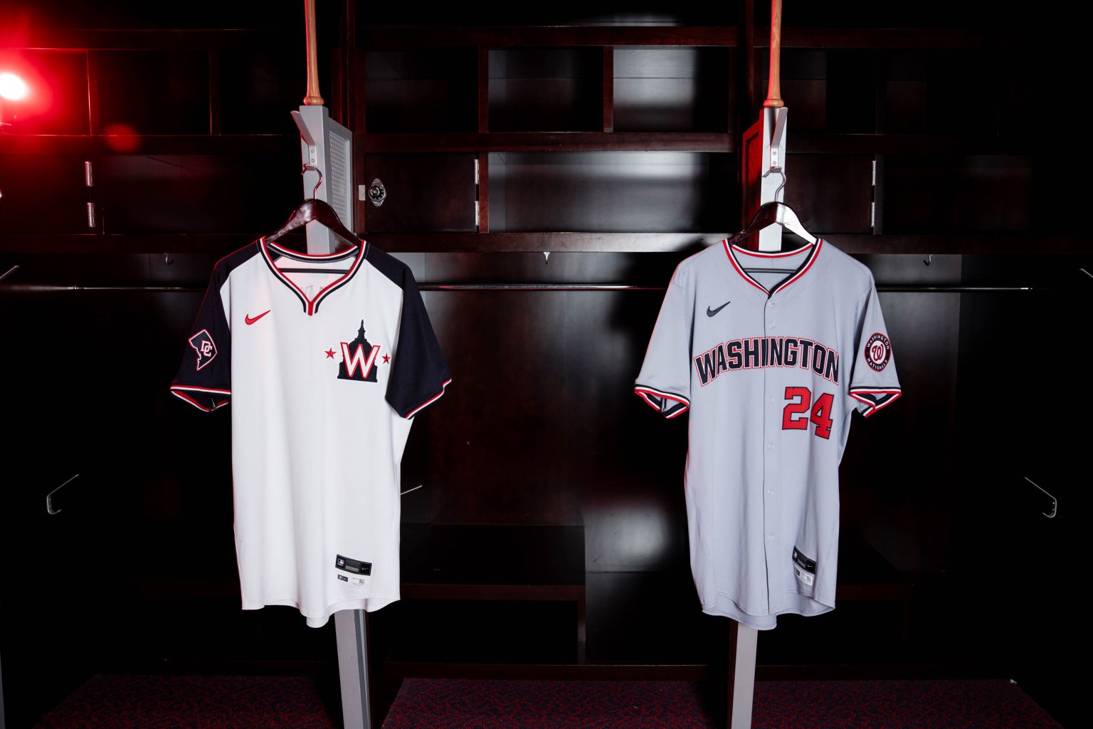
To make matters worse, I just noticed the stars beside the "Capitol" logo are navy on the cap, but red on the jersey. Maddening.
-
 1
1
-
 7
7
-
-
23 minutes ago, McCall said:
One (and probably the only one other than the DC patch) positive is the Nats switching their trim to red/white/blue instead of the just red and blue. Looks less Braves-ish.
It makes it looks more Twins-like, which I don't appreciate. Plus, the home still has a red & blue dual-stripe.
12 minutes ago, SFGiants58 said:WTF even is this?
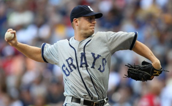
Why must they make me wish we had the Washington Grays instead?
Even if the Nats set was perfect, I think I'd still prefer the Washington Grays.
-
3
-
-
Wow, there's a lot to unpack with these new Nationals jerseys...
I try to avoid saying things like this, but the gray away jersey really looks Create-a-Team like. It's hard to believe they deliberately went in the opposite direction of consistency with the home "Nationals" script jersey (which appears to be staying, by the way), when the easy solution would've been to just flip the colors of the "Washington" script to match the home. The new wordmark is brutal (especially after @monkeypower pointed out the inconsistently filled-in "S"), incredibly generic, and now the stripes don't match. I would've at least had more respect for it if they moved on completely from the curly W and the scripts, but they only went halfway. Just a baffling move there.
On the other hand, even though I've never liked the Capitol Building logo, I think it actually works pretty nicely with this white jersey. The contrasting sleeves and the "wishbone" collar give it a bit of a soccer jersey vibe, which I honestly kind of like, it feels really unique. I'm not sure I'd use it in place of either the red or navy jersey (which, given the 4+1 rule, they'll seemingly have to drop one of those two now), but I actually really like it for what it is. It'd make a nice Spring Training jersey, maybe.
It's also worth noting that the "DC" patch is shown on the model/player's left sleeve, while on the "display" jersey it's on the right sleeve, meaning an ad patch is surely coming, unfortunately.
The Nats have been a bit of an inconsistent mess for a while now, and these jerseys only make it worse.
-
14
-
-
4 hours ago, SilverBullet1929 said:
Looks like the Marlins will be updating the legibility on their dark uniforms (probably just filling in the wordmark white) and seem to be bringing out a Miami blue jersey with a Marlins word mark. Much needed, details will be revealed tomorrow at Fan Fest.
The blue jersey is long overdue for the Marlins. That immediately becomes the best jersey in their set by a landslide.
I’m honestly not that big on the black jersey, though. it’s probably an upgrade by default because it’ll actually be readable, but I liked what they were going for with the neon aesthetic, they just unfortunately didn’t execute it well.
This would've been a great time to subtly transition to pink in place of caliente red.
-
11
-
-
52 minutes ago, adsarebad said:
It's great that they "cleaned up" the Yankees jersey ..... without the messy white outline, the Starr Insurance patch will really pop!


No more distractions!
Name checks out.
-
8
-
-
21 hours ago, VampyrRabbit said:
Modern flair I can get behind, but they should keep the Teal. The problem is that the shade of teal they generally use for their uniforms is too dark to contrast well with the navy.
If they can consistently match the teal across the board to a shade similar to the alternate here, then that should solve the contrast problem. Seattle can definately create something new and modern while keeping the navy and teal, get those colours right and it's a fantastic scheme.
In regards to the Mariners, as I've certainly mentioned before, navy & teal is probably my single favorite color scheme in all of sports, so I wouldn't want to see it go. I think that photo shows how gorgeous the shade can be, as does pretty much any other photo of the teal jersey.
The problem is that they don't use the shade nearly enough across the rest of their set. As @SFGiants58 has suggested, they really need to go the Orioles' route as far as color distrubtion: teal wordmarks with navy outlines. While we agree that the font has become a bit dated, I do think an update using the ITC Serif Gothic font can work, as I tried in my most recent MLB series.
As part of promoting teal more, they also ought to use the teal-brim cap full-time, if not a teal alternate cap. The M's have no reason for an all-navy cap.
-
7
-
-
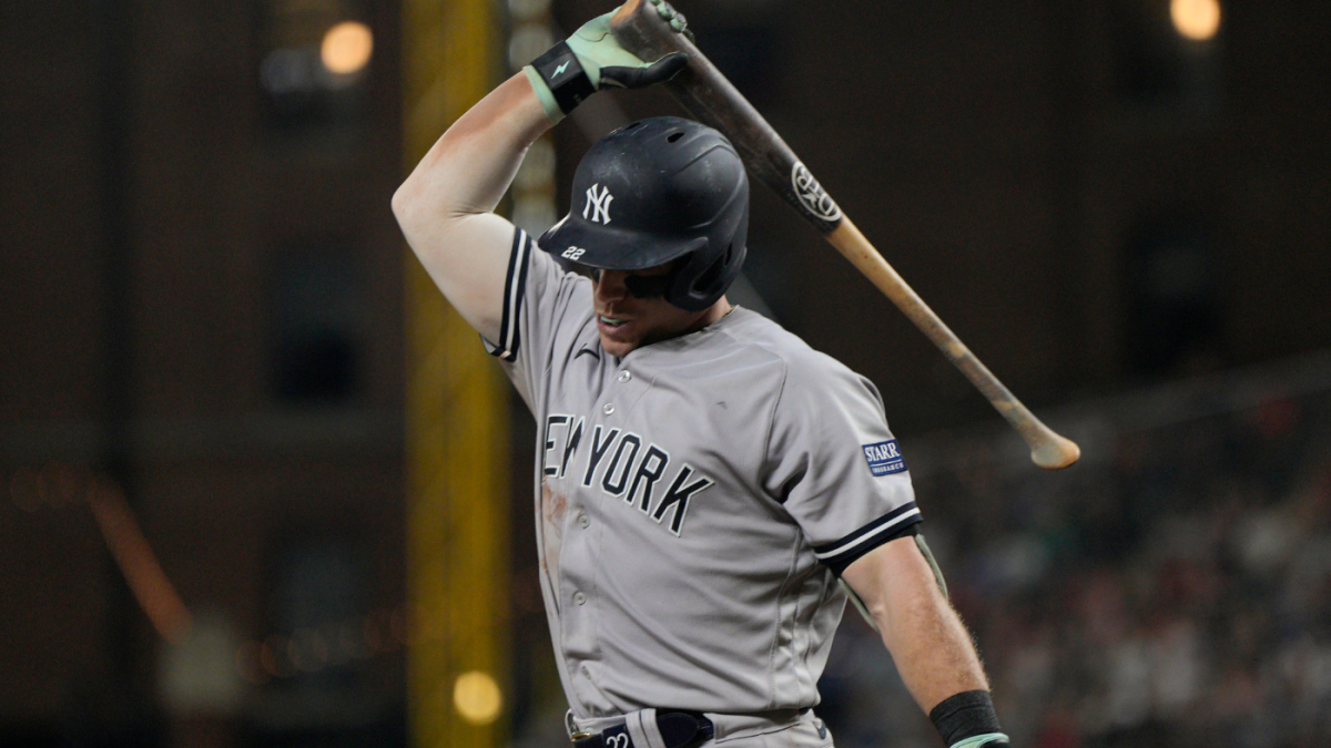
1 hour ago, Carolingian Steamroller said:
Something interesting to me about the new Yankees road jersey is that they got rid of the sleeve stripes at the exact time the template switched back to elastic inserts at the cuff.
The Yanks had been using the elastic insert.
Then they switched a few years ago to braided ribbon stitched flat on the sleeve.
If you were ever a fan of the original style, now would be an ideal time to let it come back but they just let it drop.
Maybe they really did get great feedback on the Field of Dreams Game:
I do wonder how much of this change was facilitated by the new Nike template, because their (now) old design would’ve seemingly transferred over just fine.
8 minutes ago, aawagner011 said:Real life photo of the Yankees road jersey. Pretty sure this is an authentic and not a replica. You can tell it’s the new template and not the Field of Dreams because of the extra collar trim, batterman below the headspoon seam, and the letters are slightly taller than the FOD set. I’m loving the simplicity. Long overdue.
It definitely looks to be an authentic because of the much thinner placket. It looks like authentics are keeping the more “chubby” thicker Nike swoosh, while the replicas now have a thinner stitched version (which, in my opinion, looks better).


:no_upscale()/cdn.vox-cdn.com/uploads/chorus_asset/file/24552149/usa_today_20364376.jpg)


MLB 2024 Uniform/Logo Changes
in Sports Logo News
Posted
In avoiding talking about what I don't like about it, I didn't get to talk about that. I actually don't mind gradients in certain instances (the Falcons' gradient jersey was one of my guilty pleasures, and I don't think the gradient aspect of the Rams' numbers is all that bad either), but it really is just so abrupt on that jersey. I'd genuinely rather it just be two separate colors than to feign a gradient like that.