


MJD7
-
Posts
2,575 -
Joined
-
Last visited
-
Days Won
54
Posts posted by MJD7
-
-
48 minutes ago, Dynasty said:
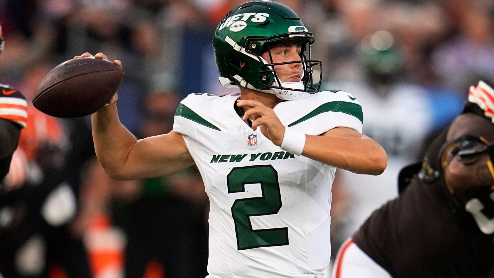
Yes, there wasn't anything I liked about the Jets' 2019 update outside of the brighter green. The logo change felt lateral to me, though the previous oval logo did have too much going on with the Jets script, Times New Roman NY in the back, and the small football, so I would argue it might've been an upgrade from that.
I've said it before, but I hate the striping more than anything. The idea, at least on paper, looked like it was intended to have them completely straight, but it's ruined when the players are moving around with them.

The way the striping just bends and curves makes it look so awkward. They would've been better using standard striping that goes from top to bottom, or maybe just omitting them altogether.
I hadn’t really minded the Jets’ stripes, but yeah, you make a good point, it’s not as good at alluding to a jet if it’s pointing downward. I’d much prefer them return to the Namath set with kelly green, and maybe a green helmet, than use that “Legacy” set, which doesn’t have nearly as much character to it in my opinion.
-
 1
1
-
-
35 minutes ago, itsmb8 said:
From the pictures, both are using a 2-stripe cuff. The Royals cuff is definitely bigger.
For sure. To use a more clear-cut example, both the Twins and Brewers are using 3 stripes, but the Twins are clearly bigger (which is a surprise, because the Brewers’ home jersey had really big sleeve stripes on the previous template).
-
1 hour ago, McCall said:
What the Royals did, and I think it's how the Diamondbacks do it, is a 2-stripe cuff, ala, the White Sox previous black and white striped away uniforms. It appears the Guardians, like the Marlins, Blue Jays, Pirates, etc, are utilizing a 3 stripe cuff, just with navy sandwiched between two white stripes.
I don’t know, they both look to me like 2-stripe cuffs, but the Royals one just appears bigger.
-
I'm pretty conflicted on the new Nike template. On one hand, I think the replicas are a huge upgrade, as I never liked the previous jersey material, and getting front numbers and patches is much-needed, especially for teams where the front number is so essential to the design, like the Dodgers and Twins. I'm also glad that the so-thin-you-can-barely-see-it piping is going by the wayside for teams like the Marlins, as @McCall mentioned. The Angels also look to be a bit of an upgrade for me by increasing the width of their striping, as do the Nationals.
However, the neck inserts when no striping is present is just a bad look. It's also frustrating that sleeve striping is noticeably thicker than headspoon piping for teams like the Rays, Reds, Astros, & the Diamondbacks' new design. Also, thank goodness the replicas don't have the perforated numbers, because I have a feeling that is going to be rough in game action.
Overall, teams with pinstripes and teams with collar + sleeve striping, such as the Giants and Pirates, seemed to get by the most unscathed on the new template. The Padres might be the overall winner, as they have both of those elements.
In a development I wasn't expecting, though, it seems like the sleeve cuff might be able to accomodate for different widths of striping? Compare the Royals and the Guardians below:
It's not as noticeable in the pictures @aawagner011 posted above, but the Royals' striping still looks to be at least a bit thicker. The same goes for the Twins' and Rangers' striping compared to other 3-stripe teams like the Brewers and Blue Jays, for example. I was expecting the stripe widths to be completely standardized with the new template, but it seems that may not be the case.
As a side note, I don't know if it's just me, but the Brewers' home jersey looks especially cream, if that makes sense. Same goes for the Giants. I wonder how the shade compares to the previous template. It looks like the Diamondbacks have a lighter shade of off-white. I wonder which shade the Twins' "Twin Cities" alt will go with.
-
3
-
-
1 hour ago, NFLfan42 said:
Next to the White throwbacks, which I'm not sure they wore this year. Interesting pairing possibly for next year.
1 hour ago, SSmith48 said:Eh, I don't think it's something to look into. Looks like it's just one of those Riddell fashion helmets. Seems to fool a lot of people in similar situations with other teams.
Likely a hot take: if they ever decided to add back an orange alternate, this might not be a bad idea to pair with it (and probably aqua pants).
-
6
-
 1
1
-
 1
1
-
 2
2
-
-
Why would they make their main uniforms closer to the throwbacks in every way, but also still keep the throwbacks, and not only that, add in a white version? I don’t buy it. If they do end up going that route though, they’d join their rival 49ers in having throwbacks that are unnecessary.
-
6
-
-
-
8 minutes ago, tBBP said:
I mentioned this in another thread (or maybe it was this one?), but perhaps Houston missed their workaround of the Oilers IP. Rather than simply adding light blue to navy and red a la the 2003 LA Avengers (and for those who remember, the amount of light blue seemed to increase ever so slightly from the time they first added it as the slightest bit of trim), perhaps they should have explored co-opting the Colorado Rapids/West Ham United colorway of light blue and maroon/crimson/garnet...???
Just a thought...I or someone would have to concept that out to see how it'd look.
Darkening the red would defeat the point of having the color scheme in the first place. It’s a similar dynamic to the somewhat common suggestion of adding pewter to the Bucs’ creamsicles — darkening the color scheme to fit as the primary set kind of ruins the whole point, it takes away what was originally appealing.
I’m not suggesting that simply adding light blue to their current color scheme is the way to go, either. That just puts them even closer to the Titans, when the two teams really ought to be distancing from each other.
Although the Texans obviously can’t just recreate the Oilers uniform design, I truly wonder if there’s any reason why they couldn’t just use the color scheme full-time if they really wanted to. I have to imagine they could’ve made a claim to it before the Titans reintroduced the Oilers throwback, but now it might be a bit tough. The logo wouldn’t really work great in that color scheme, either.
-
1
-
-
Honestly, I’d go as far as to say that the Texans’ set would be pretty perfect if they just switched to a red helmet and/or jersey as the primary. I’d maybe flip the colors of the stripes on the pants, or change them to match the “USC” stripes of the jersey, but that’s just nitpicking at that point.
I think the predominance of navy is what contributes a lot to the feeling of their set being “boring.” The red helmet really does wonders to brighten their set up. Red also just feels like more of a Houston color to me, and would help them stand out more in their division and in the NFL in general.
-
5
-
-
On 1/11/2024 at 8:00 PM, bob95 said:
Based on the rumors surrounding the Broncos Rebrand from the Uni watch article yesterday, I made some mock-ups using the Gridiron Unifrom Datata Base template.
I... don't hate it? I don't really buy that the uniforms will actually resemble that design, but it makes for some interesting combos. I particularly like the white/navy/white and the white/orange/white. If they absolutely have to use the "5280," I would have the numbers upright instead of sideways.
My ideal Broncos uniform set, similar to @tBBP, would be the '65-'66 set (that picture is approaching Rams' 50's yellow jersey painting territory of ubiquity, which I have contributed to), with the blue helmet. I'd also have either orange or white as an occasional alternate helmet, as well as a blue alternate jersey, and orange & blue pants as options. It's a toss-up for me between the cyberhorse and the D-horse logo, both are well and good.
-
3
-
-
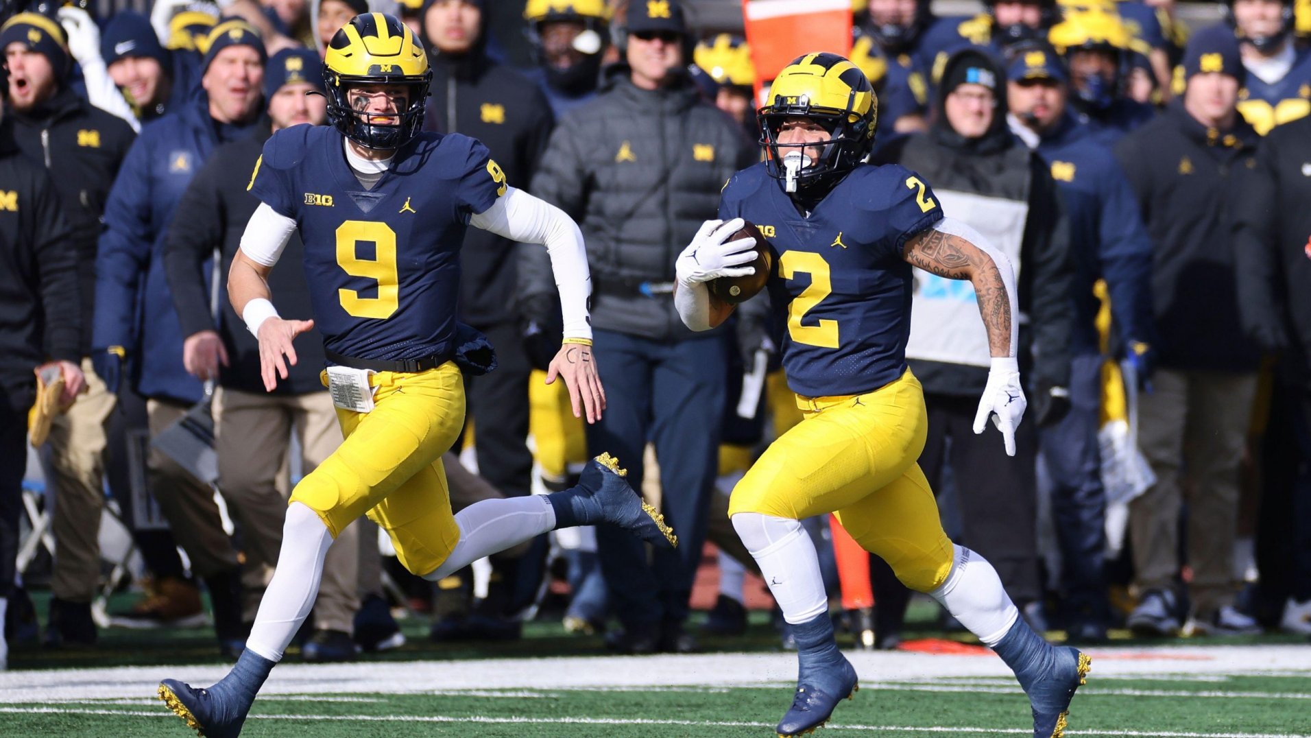
13 hours ago, HopewellJones said:
Yeah, Jersey-Pants-Socks/Sleeves.
I know the average fan doesn't really notice socks and accessories, but most people here do. And they make a big difference in aesthetic. The blue jersey/pants combo definitely has a different feel when they wear maize socks and sleeves with it. Wearing the maize pants with maize socks just looks bad. But anyway yeah it seems as though they very deliberately tried not to repeat any uniform combos until the very end.
Blue-Blue-Blue
Blue-Blue-White
Blue-Blue-Maize
Blue-Maize-Maize
Blue-Maize-White
Blue-Maize-Blue
12 hours ago, HopewellJones said:The away looks:
White-Blue-Blue
White-Maize-White
White-Maize-Maize
White-White-White
White-White-Blue
I think they could afford to drop the white accessories, although I understand why they did it for the Rose Bowl.
I agree that the maize accessories look terrible with the maize pants. I think the maize accessories look really nice with the navy jersey and pants, though, but all-navy looks really nice, too. I also think navy/white/navy/maize could work as an occasional road combo.
I think the ideal combos for Michigan are navy/navy/maize/navy at home, and navy/white/maize/navy on the road. I'm fine with some mixing and matching for them though, so long as they don't go with maize for both the pants and the socks/accessories.
-
This last update of the main set is essentially perfect, I especially love the red helmet with the primary jerseys! I'd love to see the red helmet paired with the navy jersey and white pants, and vice versa. The only change to the red jersey I'd make would be to have the front "Texans" wordmark and the Nike swooshes white, as in navy they're a bit tough to read.
I also love the "H-Town Blue" design, the double outline on the numbers looks great. I personally think the best way to differentiate the Texans' use of "H-Town Blue" from the Titans' use of columbia blue would be to pair it with mostly red, since the Titans now use so much navy. Maybe the helmet and/or pants for the H-Town Blue design could be red?
-
1
-
-
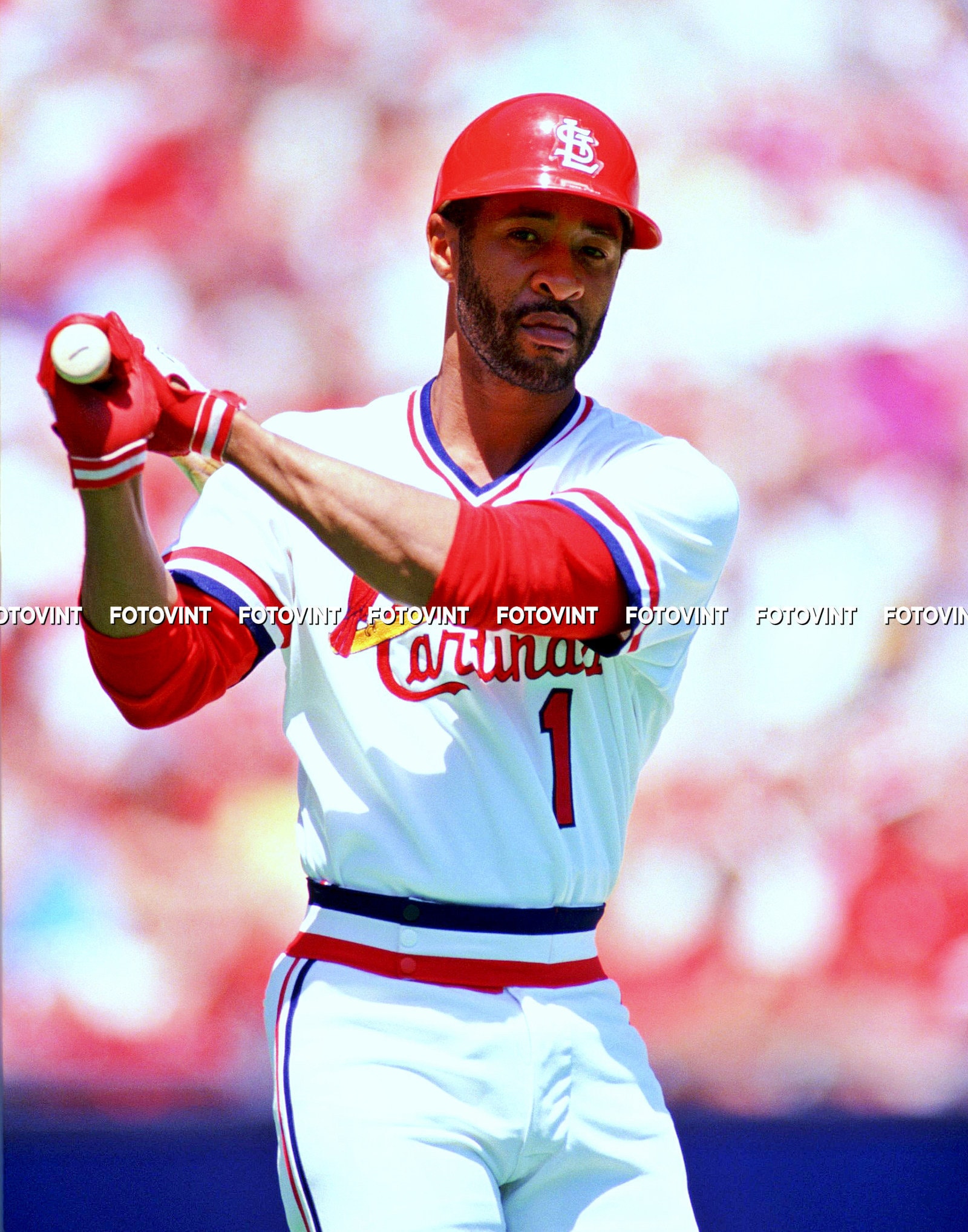
5 hours ago, PlayGloria said:
I would not want this full time as that would be sacrilege, and this probably 1000% has to do with nostalgia, but I love this Cardinals era. Like loooove it. I would rather trade out the baby blue jersey they do now to add this to the rotation.
The powder blue uniform would look so much better with this striping style, whether as a pullover or a button-up.
-
3
-
 1
1
-
-
8 minutes ago, ruttep said:
?? Not trying to argue that black needs to be in the Lions' color scheme (it shouldn't), but how are these two confused for one another?
I never said they were confused for one another, only that the two were unnecessarily similar.
I'm not sure how one could argue that these two aren't remarkably similar, though:
Of course, the Panthers' primary jersey is black, and they don't really wear the silver pants much anymore, so the point is pretty moot. But regardless, even if the two aren't confused for each other, maintaining distance, especially while remaining truer to the Lions' broader history, is a good thing.
15 minutes ago, ruttep said:No. Burn the gray jersey
I'd like it if it matched the lighter silver. With blue pants it'd look especially nice (and maybe even the blue helmet). I wouldn't mind all silver once a year, though.
16 minutes ago, ruttep said:This helmet needs to be worn with the blue pants
Agreed.
-
2
-
-
2 hours ago, Jezus_Ghoti said:
I get that this is a ridiculously elitist take, but the general trend among fans, players, and increasingly more teams toward preferring monochrome uniforms instead of traditional balanced uniforms is because most people have sh** taste and are morons.
I, like most people here, would prefer Michigan in navy over maize against Washington in white over purple, but there is something to be said about monochrome matchups offering the maximum possible contrast between the two teams, which is the purpose of having sports uniforms in the first place.
I tend to prefer more traditional, colorful matchups myself, but calling anyone who disagrees “morons” is pushing it too far. It’s worth a reminder that this stuff is, like all forms of “art,” subjective.
-
The best thing the Lions did in their 2017 redesign was remove black from their color palette. It gave them necessary distance in color scheme from the Panthers, which I honestly forgot was even an issue back then, until this talk of a black alternate came up.
The Lions set is honestly close to perfect as-is, the only change I would absolutely make would be to get rid of the dark gray, replacing the outline of the home jersey numbers with white, and sticking with the lighter gray for the alternate, using it as a road alt much like the Seahawks have done. The helmet finish on their alternate blue lid is honestly really nice too, though I’d probably make it closer in design to the main helmet. Overall though, I can’t say I’d be optimistic about a redesign improving on what they have now.
Similarly, even though the Texans’ current set leaves a bit to be desired, from the sounds of it I don’t anticipate their redesign improving on what they currently have, although I can’t help but be curious. It’ll likely be a Titans scenario where a middle-of-the-road uniform set looks great in retrospect, compared to what replaced it.
-
5
-
-
On 1/8/2024 at 11:14 AM, WBeltz said:
How many instances has that happened? A team wearing one version of a uniform, winning a title in them then moving away from it? Can't be too many.
It’s not professional sports, but FSU football won the national championship in 2013 and the school rebranded their logo and uniforms for 2014.
-
4
-
-
I think the navy sleeve caps on the away jersey are a wash, I like both versions but I probably slightly prefer the white sleeves, just because it preserves the white star and would match the white pants better whenever they (presumably) decide to do that combo.
The navy numbers looked really nice, but looking at the red numbers they definitely feel like an improvement. The red socks are as well. With a red helmet, & the white sleeves returning, this set would be pretty much perfect to me.
-
2 hours ago, itsmb8 said:
the Astros orange hat, and Rockies purple hat all as “on-field” and none of them were worn the past 2 seasons at least.
These two ought to be each team’s primary “on-field” hat.
-
5
-
-
I actually really like the Falcons' current uniforms... *ducks*
I'd just slightly adjust the numbers, use "Falcons" or "Atlanta" instead of "ATL," and get rid of white socks.
-
6
-
1
-
-
This set looks wonderful! It's pretty similar to what I'd do for the Texans (I'd keep the "USC style" stripes but just make them dual-colored like you did. I'd also make the helmet, away jersey numbers, and socks red).
I'll echo the comments above that the "H-Town Blue" feels a bit out of place in the star on the home jersey, I think navy would look better. However, I'm still excited to see how you hopefully include the color in the alternates.
I agree with you that the Texans only need minimal changes, but unfortunately I have a feeling that your designs will end up being a lot better than what the team actually unveils. We'll have to wait and see.
I'm looking forward to seeing more designs from you, whether that be Texans alternates or (hopefully) other teams in the league!
-
1
-
-
9 minutes ago, Brian E said:
i know "tradition" and all, but if nike was insistent on this template, why didn't they just go to full pullovers instead of button-downs? button down jerseys don't really serve much in the way of in-game function, and i'd venture to say that it may even hurt them in retail. i don't know, seems wild that of all the innovation and everything, we still go with buttons because that how it was done for the majority of the game's history.
I haven’t gotten a chance to talk about this, but I’ve been on this train for a while now. Even when I was playing baseball I didn’t really understand the need for buttons & thought they were a bit cumbersome.
-
2
-
-
2 hours ago, aawagner011 said:
Where are you seeing that? To my knowledge, the only on-field authentics we have seen are the Dodgers, D Backs, and maybe one other team. Everything else we have seen has been the lower grade fan replica. I know Uni Watch said the Cardinals still plan to use chainstitching but they have to apply it to a patch and then sew it on (as opposed to direct embroidery). I believe that’s the same process the Phils currently use.
The Cardinals article did say that Bill DeWitt III had to fight hard to keep the chain-stitching. Who knows if the Phillies fought as hard.
That Phillies jersey is almost certainly a replica though, so it doesn’t say anything definitively of how the authentics will look.
-
We must have missed this, but here’s a good look at a lot of jerseys on the new Nike template.
Some key takeaways:
- The Marlins’ stripes will be a lot bigger (an improvement, although their color scheme still needs to change).
- Pinstripe jerseys thankfully appear to be exempt from the collar and sleeve cuffs, as can be seen on the Rockies & Phillies. This should’ve been what the Nike template was in general.
- Patches appear to be heat-pressed, which, if these are replicas, is an improvement over the old replicas, which rarely ever had patches at all.
-
3


:format(webp)/cdn.vox-cdn.com/uploads/chorus_image/image/72868123/1788082630.0.jpg)
:format(webp)/cdn.vox-cdn.com/uploads/chorus_image/image/72733512/1723400658.0.jpg)


2024 NFL Changes
in Sports Logo News
Posted
The easy solution would be to just flip the colors of the shoulder stripes or, even better if possible, just do one shoulder stripe spaced out away from the shoulder cap.
(Side note: look how off-white Revis’ helmet is in that last photo compared to the jersey. Rough.)