


MJD7
-
Posts
2,577 -
Joined
-
Last visited
-
Days Won
54
Posts posted by MJD7
-
-
We must have missed this, but here’s a good look at a lot of jerseys on the new Nike template.
Some key takeaways:
- The Marlins’ stripes will be a lot bigger (an improvement, although their color scheme still needs to change).
- Pinstripe jerseys thankfully appear to be exempt from the collar and sleeve cuffs, as can be seen on the Rockies & Phillies. This should’ve been what the Nike template was in general.
- Patches appear to be heat-pressed, which, if these are replicas, is an improvement over the old replicas, which rarely ever had patches at all.
-
 3
3
-
14 minutes ago, AnPheitseog said:
Bills, more than anything else, need blue jerseys, white pants, red socks at home and white shirts, blue/white pants, and red socks on the road.
Whatever helmet does this the best should be the one they use. I'm leaning towards white, but the socks (as @Jer15 knows very well) matters most.An idea I just had: maybe a white helmet, but with a red facemask?
My main issue with the white helmet for the Bills is it makes them pretty close to the Colts, with them both having the same white/blue/white home combo, when they could really use (and have used in the past) more red.
The benefit of the white helmet, though, is that the logo stands out a lot better.
Maybe a red facemask on the white helmet, with the red socks like you mentioned, would be a good way to add some red while keeping the logo at its most visible.
-
1
-
-
1 hour ago, Cujo said:
Side note: Bills and Falcons could both upgrade if they went back to red full-time
1 hour ago, SFGiants58 said:The Bills look best with a white helmet and blue facemask.

The Falcons should wear red helmets full-time and retire the black ones for ‘90s alternates.
I think the Bills & the Falcons are two of the teams that could benefit the most from the recent elimination of the One Helmet Rule — I’d personally like to have the Bills primarily in red helmets, and the Falcons remain in black, but I’d be perfectly okay with the Bills having a white helmet option & the Falcons having a red helmet option for a few games a year.
-
1
-
-
On 1/2/2024 at 3:46 PM, (probably)notabandwagonfan said:
It looks the new Nike Template is going to force the Orioles and the Braves into a sleeve cuff instead of the triple piping they had
19 hours ago, ptay said:Not surprising but that's a shame. I bet the Braves' version will be even more jarring.
The new piping seems to have thicker black sections than the previous piping. It's a small change but I'm wondering if it will look funny with the piping on the pants (unless they alter that too?)
This is a major bummer, albeit unsurprising. Along with the Braves, the Brewers will likely be affected as well. Even more disappointing than the stripe being moved to the edge of the sleeve is that, like @ptay mentioned, the orange stripe now isn't wider than the black stripes, they're all equal. I have to imagine they'd at least alter the pants to match, but we'll see. It's pretty sad that teams seemingly can't have stripes above the edge of the sleeve anymore, nor can those stripes be of unequal width.
22 hours ago, Brian E said:mets modified their black alt cap:
5 hours ago, Brian E said:so, while i have many fond memories of this cap, i think the black brimmed version is superior. when combined with the black crown, the blue brim gives off a very purple vibe to me. i do think the mets are probably updating the jersey to match this, which i like a lot. i did this (very crude) mock up over two years ago and i think it's superior to the current black alt.
This is also quite a bummer. I don't mind the Mets' black alt, the only thing that would've been needed to improve it would be to add back the black brim. I actually think the blue outlined by strictly orange looks more "purpley" to me, as the warm orange & the cool blue kind of blend together against the black background. I think the white outline all around was superior.
-
1 hour ago, DG_ThenNowForever said:
Penix has one of the most beautiful throws I've ever seen.
I hadn’t really watched Washington yet this year, but he seems ridiculously good. I wasn’t really invested in the Heisman race, but after watching him I’m really surprised he didn’t win it.
-
1 hour ago, Germanshepherd said:
Having the Rose Bowl patch on the jerseys when they already have the graphic on the shoulders was too much.
I agree, not sure if it's unpopular but the Rose Bowl graphic on the shoulders seemed a bit silly and excessive to me, though pretty inconsequential. I guess it's their version of Clemson adding the tiger paw or Ohio State going with the throwbacks in the playoffs.
I also wasn't much of a fan of the white accessories most players were wearing, I would have much preferred they sticked to navy and maize.
1 hour ago, Germanshepherd said:Sad Washington left the gold pants at home.
Also agree. I don't hate the all-purple but would much prefer the gold pants.
-
Yeah, Carolina wearing the blue pants with the white jersey is a combo I never would’ve thought of, but it looks great. The only unfortunate thing is they chose one of the worst possible opponents the wear them against in the Jaguars.
It almost convinces me that a white or a blue helmet might be the way to go, as opposed to black.
Also, Ravens - Dolphins looked great. I wish the Dolphins wore aqua pants instead, but a lot of the players at least seemed to wear aqua socks. It contrasted great against the Ravens’ black & purple.
-
4
-
-
16 hours ago, alxy8s said:
What do you mean by realistic? It's a very equitable proposal that certainly gives opportunities to teams that don't really have them today, it preserves regionality, and it looks like most rivalries could be preserved. 10-team conferences also leaves a lot of room for quality OOC games. Sounds great.
Unfortunately, that's exactly what college football has been moving away from. The geographic footprints of conferences is past the point of absurdity, century-old rivalries are being trashed, and power is assimilating rather than being shared. If the entire sport started from scratch tomorrow, we wouldn't get anything resembling that 8-conference arrangement. We'd get a B1G+SEC+ND+FSU Super League, and the bottom half of the B1G and SEC would honestly be very lucky to be included. It's headed that way anyway unless one of the new P2 conferences ends up having some self-restraint.
I guess the word I was looking for was more along the lines of "logistically feasible." Obviously it's not realistic in the sense that college football is very clearly moving in the opposite direction, but I was more-so wondering if there was any reason something like that wouldn't be feasible, in a more ideal world.
It's wishful thinking, but maybe the B1G & SEC will eventually get too big for their own good, and they'll end up dividing into subdivisions that are more geographically practical.
-
And that'll do it for this Marvel series! Thanks for following along, I hope you enjoyed it!
-
2
-
-
Earth Avengers
To wrap up, I considered this as sort of an "All-Star" team, with each jersey representing one of the Avengers films.
And as a bonus, two jerseys from the upcoming Avengers films:
-
4
-
-
3 minutes ago, BBTV said:
Completely irrelevant comparison. The NFL as a league has rules that objectively govern who makes the playoffs... just like the ACC does, and the SEC does, the B1G, etc. That's where this comparison ends. If the ACC said "sorry, we're going to bypass you for the championship game" then it's apples-to-apples. This 4-team playoff thing isn't governed by any league rules, since it's just a subjective committee of people that are picking teams from various independent leagues.
Not necessarily, the argument is that the NCAA ought to be the broader governing body, over regional divisions/conferences, similar to how the NFL is. Is there any reason that kind of format, like the one I proposed above, wouldn't realistically work?
I'm well aware that objective standards are not at all the way things currently are, but again, the way things currently are is dumb. That's why we're having this conversation. It feels pretty reductive to just say "it is what it is
 " and shrug it off.
-
I don't know why I'd bother getting back into this conversation, since it's such an uphill battle after that performance, but here it goes...
2 hours ago, See Red said:Don’t care who was out for Florida State, they look like a mid-tier FCS team right now against Georgia. Embarrassing efffort that probably doesn’t bode well for their 2024 team.
I don't normally stoop down to the FSU-Florida rivalry banter, especially considering I've now attended both schools, but dancing on the grave of your rival after a historically successful season is a pretty low blow, especially considering your team did not even see a bowl game this season.
1 hour ago, BBTV said:Or this is what they are now.
I don't want to be making excuses, as there's no way of getting around that loss being embarrassing.
But to say that FSU isn't the same team without Jordan Travis (which most people used as their justification for leaving FSU out of the playoff) while also saying that this team without:
- its 2 star wide receivers,
- its running back duo that carried them to the ACC Championship,
- multiple star defensive players, at least one of whom will almost surely be drafted in the 1st round,
- & the backup QB,
all of whom we surely would've seen in the playoff, is the same team, is simply logically incoherent.
1 hour ago, BBTV said:I genuinely don't understand any argument that how good they may have been 3 months ago has any relevance in a system where the teams are picked subjectively based on how well they're playing at this point in time.
I hope people realize the argument isn't that that FSU belonged in this subjective "best team" playoff system as much as it is that the subjective system itself is dumb.
If Lamar Jackson somehow gets injured in tomorrow's game and is out for the rest of the season, no one would be arguing that the Ravens don't deserve their playoff spot. They will obviously be at a significant disadvantage without Jackson, they'd be much more likley to win having him under center, but what they've done up to this point in the season has earned them at least a shot to play in the playoffs. It ought to be the same in college.
I mean, honestly, who would say no to something like this:
... where each conference champion gets a playoff spot?
If any FCS teams have issues with being left out, then they could play the worst team of their respective region at the end of the season to earn their way into FBS, Premier League style. That'd be a great way to keep all of these random bowl games, while giving them actual stakes and intrigue.
-
2
-
Iowa Hawkeyes
The most overlooked member of the original Avengers, this set takes inspiration from his TV show's great branding, which itself was inspired by the comics.
-
2
-
-
Malibu Iron Men
The one who started it all in 2008, this set takes inspiration from the main character of the Infinity Saga. The Cinematic alternate takes inspiration from Tony Stark's more metallic gold suit in Iron Man 3.
-
4
-
-
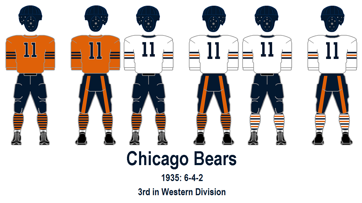
7 hours ago, Carolingian Steamroller said:
See, I loved that look and still think it's superior. The huge block numbers hold it back in my opinion which is why I favor swapping them out for the current rounded numbers.
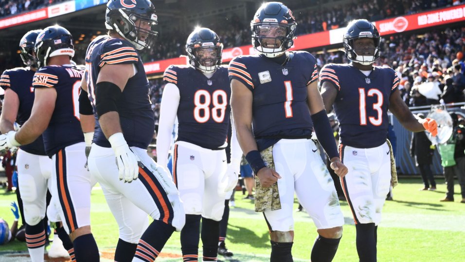
I don't think the color swap has worked so well for the Bears. The sleeve stripes are quite fine. It works on the navy jersey because the orange and white blend together to create a glowing affect.
However, that same blending of orange and white when you do the color swap works against the orange jersey because the white outlining blends into the jersey color making the stripes look very, VERY thin indeed. (Ditto for the "C" on the helmet.)
That's why I like a thematic connection. The Bears have a jersey with three identical outlined stripes (navy) and one with three alternating solid stripes (white) so have one with three identical solid stripes is the logical missing piece. It's a bonus that it also happens to be a historical design.I think that the same reasoning that you employ for the stripes not working on the orange jersey (that it makes them look too thin) would also apply to the current numbers, in my opinion. I agree with you that I'd like to see the Bears go with navy numbers for the orange jersey, but I think the current round numbers, while I love them for the primaries, wouldn't really work as well for the orange.
To make it more of a true throwback, I'd like to see them adopt the font of the white throwback jersey, essentially making it the home version of that uniform:
(I'd also love to see the white jersey incorporate those socks on the far right).
-
1
-
-
Detroit Blades
Blade is set to make his MCU debut in his upcoming solo film, which hopefully makes it to its release. I love the branding the film has been using, so I incorporated it into the wordmarks.
-
3
-
-
7 hours ago, Silver_Star said:
Anyone who disliked my comment can see the similarities to these two uniforms. The white pants do not make this uniform unique at all. Here, take a look
Only difference is that they throwbacks do not use the same orange, but design wise it is TOO SIMILAR TO EACH OTHER! A no go for me if Denver decides to do the Syracuse style.
I didn’t dislike your comment because I disagreed with the combo looking similar to the Bucs, I actually disliked it because of this:
On 12/24/2023 at 11:26 PM, Silver_Star said:HAHAHAHA! What a joke.
It just felt brash and unnecessary.
To comment on the “dislike” button in general, I only use it when the comment feels in bad taste or is especially egregious. I don’t really dislike comments that I disagree with but still understand or respect. As others have said, I’d prefer to elaborate why I disagree and make it a conversation. That’s part of what makes this site enjoyable, is being able to actually discuss these kinds of things.
To get back to the Broncos, my comment was more that the white helmet didn’t look bad in general, regardless of the striping pattern. I’d also prefer for them to go back to the robin’s egg blue, to differentiate more from Syracuse. I even advocated for them to go back to a different throwback look that isn’t the Orange Crush in the other NFL thread:
On 12/17/2023 at 12:31 AM, MJD7 said:I’ve long thought the Broncos’ best throwback look was this one, it’s so much more unique than the Orange Crush:
It seems to me like it’d be very adaptable to modern templates, too. Go with the robin’s egg blue helmet, keep the current number font & logo (or update the D horse logo), & you’ve got a winner.
-
5
-
-
Wakanda Panthers
After making his debut in Civil War, Black Panther almost immediately became one of the most legendary characters in the MCU and in popular culture at large. The Cinematic alternate is inspired by the depiction of the Ancestral Plane in the first film.
-
8
-
 1
1
-
-
4 hours ago, wildwing64 said:
I don't follow baseball or Marvel, or even the MCU all that closely, but it's been fun to see how you're interpreting these characters as teams - especially as someone working on a similar project.
When names like the Admirals, Generals and even Commanders exist, the Captains makes sense and is a good fit for a Captain America team. The star containing the numbers is a nice touch.
Thanks! I'm glad that you've enjoyed following along even despite not sharing the two interests involved (baseball & Marvel).
-
I agree that the purple facemask is probably better, but the white facemask looks better than I'd expect, too. I'd be curious to see it paired with the rest of the uniform.
-
11 hours ago, Jake3roo said:
I may be wrong, but I believe it's Bourbon, an adobe font.
That looks to be about as close to a perfect match as you can get! The Cubs' number font looks to maybe be a bit wider, but that can easily be remedied. Thank you, I appreciate it!
-
Unless I’m mistaken, I believe I saw somewhere that Vanderbilt’s pants are a case much like the Raiders where another manufacturer made them, & then Nike slapped their logo on.
I made the case in a reply to that Tweet that I’m not sure Vanderbilt’s & the Saints’ pants are all that different, I’d need a side-by-side comparison to know for sure.
Vanderbilt also appears to have at least a bit of an issue matching the helmet to the pants color, as well.
Regardless, the Saints matching the helmet to either shade would be a massive improvement over the vegas gold, not to mention the mismatch they have now with their Color Rush (which, as a side note, was a lot more drastic and bothersome than I remembered).
-
1
-
-
The Vikings' current set is my favorite they've ever worn, and I hope they never change, so I may be a bit biased against this, but everything still looks really nice. I think the highlight for me is the "Primetime Purple" you just posted, as the idea to include a more "mustard" gold is a truly inspired way to keep it consistent with your main set in using outlines.
My two main objections are the black-out and white-out sets: I don't consider myself an uber-traditionalist who always objects to such things, but I'm not sure either combo works for the Vikings, at least in their current forms. I'm not sure the Vikings could make any black alt work, and the purple horn on the white helmet just feels wrong to me. My personal solution for a "Winter Whiteout" would probably be either settling for the white horn with a purple outline or putting the Viking head logo on the helmet for the first time ever.
Overall though, your designs are really well-made, and you seem to clearly have a passion for the Vikings, which I share. I'd love to see more future designs from you, either for the Vikings or other teams!
-
1
-
-
I thought I would have given feedback on this already, but since I haven't, I guess there's no better time than the present:
It looks really good! I love the decision to go with the white front panel cap, at home especially, it makes them almost the red version of the Blue Jays. I think the road jersey could probably use a solid red cap, but the white looks great with the home and alternate.
I think each update is generally an improvement, although I prefer the number font you had to the Angels' real one. I personally would be fine if you dropped the "spikes" in the font, too, like the original did.
Can I ask what font it is you used, which I assume the same one as the main wordmarks? It looks similar to the Cubs' City Connect number font, which I've been trying to find.


:format(webp)/cdn.vox-cdn.com/uploads/chorus_image/image/72478559/1427334392.0.jpg)


:format(webp)/cdn.vox-cdn.com/uploads/chorus_image/image/1593109/134857460.0.jpg)


MLB 2024 Uniform/Logo Changes
in Sports Logo News
Posted
The Cardinals article did say that Bill DeWitt III had to fight hard to keep the chain-stitching. Who knows if the Phillies fought as hard.
That Phillies jersey is almost certainly a replica though, so it doesn’t say anything definitively of how the authentics will look.