


MJD7
-
Posts
2,561 -
Joined
-
Last visited
-
Days Won
54
Posts posted by MJD7
-
-
I'm not sure how I feel about the Yankees' road uniforms. I honestly really liked the white outlines and the sleeve stripes, it really helped cement them as a navy & white team as opposed to just navy. It's also been their road uniform for as long as I've been alive, & way longer at that.
On the other hand, I can appreciate the even older history of the outline-less look. It definitely also has a classic feel in its own way.
They'd never do it, since they wouldn't want to have more jerseys than are absolutely necessary, but I wouldn't mind if they had a Dodgers-like situation where they had two road jerseys, one with an outline & stripes, & one without. Speaking of...
3 hours ago, LMU said:Dropping unnecessary outlines and trim on road gray jerseys is always a positive. See: Dodgers.
 3 hours ago, Ferdinand Cesarano said:
Wrong. This is the best the Dodgers have ever looked on the road.
If the Dodgers want to continue their two road uniforms thing... the best solution in my mind is to keep the "Los Angeles" one without outlines (and probably drop the sleeve stripes while they're at it), and add a white outline and the stripes of that 80's jersey to the "Dodgers" one.
-
 3
3
-
-
I love purple and old gold as a color scheme, especially for Washington, but I've just never liked the Ravens having gold in their color scheme. It's not even because it would make them too close to the Vikings or anything, I've just always found it to be a bit superfluous for them.
I used to think that red should take its place as the tertiary color for them, but now I think that would be just as unnecessary. Purple & black is all they really need.
-
1
-
-
4 hours ago, AstroCree said:
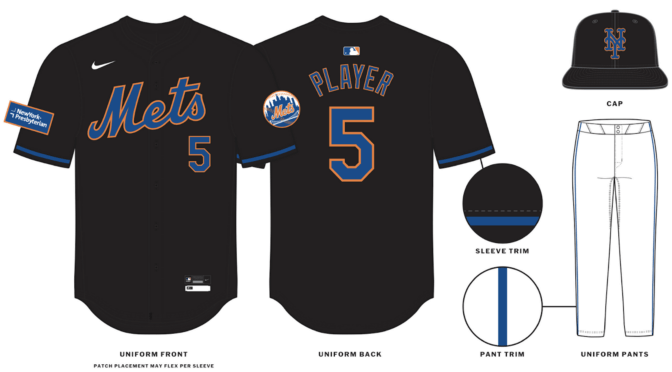
We had a feeling they might do that, and it's unfortunate that they did. The worst part is that the maker's marks (Nike & New Era) are remaining white, so they stand out extra, like they do on the Marlins' black alts. The white outline was probably the best part about the Mets' black alt. I don't anticipate this is going to look good, and at this rate I'd be fine without the black alt in it's entirety.
-
2
-
-
8 hours ago, FiddySicks said:
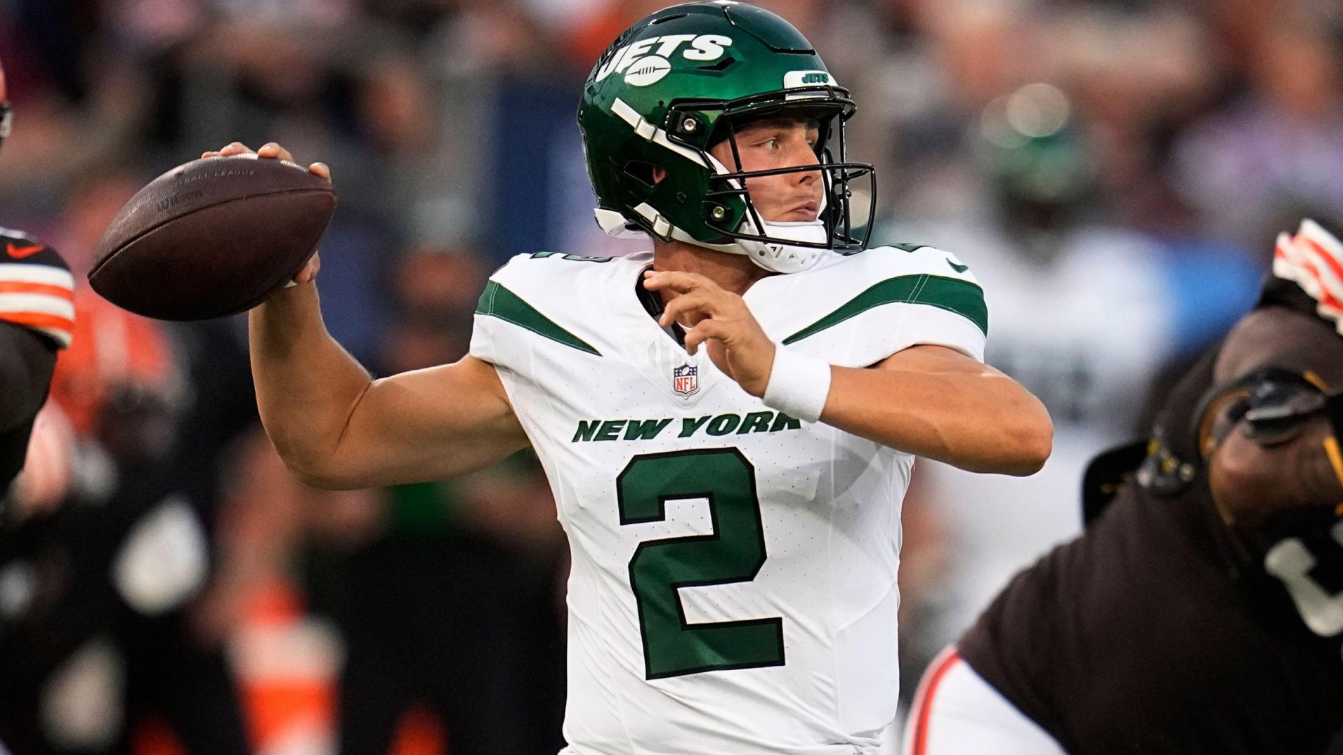
YES. And that is so frustrating. You’re called the Jets , for Christ’s sake. Why are you trying to emulate the boring ass Giants with a script helmet rather than, I dunno, use an actual jet, which is one of the COOLEST things on the planet, as a logo? It’s legit SO easy, and they’ve fumbled the bag every single time outside of that one 80s logo which I still don’t think is all that good.2 hours ago, AstroCree said:If I'm being honest, the Jets not having an actual JET logo has never bothered me. They seemed find without it for most of their existence. Every concept I see of a JET logo comes off super cheesy.
I (somehow) actually agree with both of you, in a way… I think it’d be cool to see the Jets try to utilize more actual jet imagery in their brand, but any jet logo I’ve seen either as a concept for the team or just in general doesn’t really captivate me. I’m genuinely not sure there’s a way to depict a jet that will really look professional and evoke speed any better than the 80’s logo did.
-
5 hours ago, Carolingian Steamroller said:
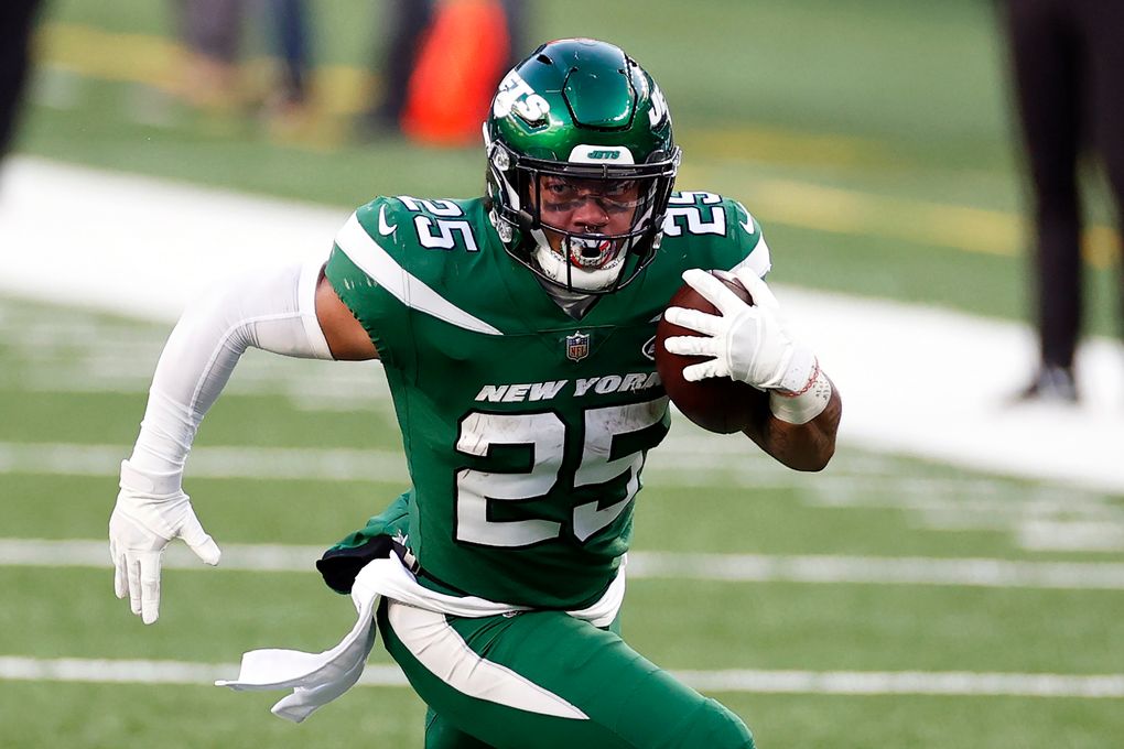
The Jets were wearing the Namath era uniforms just 5 years ago. As much as I like the green helmet Jets (both the NYSE era and the early Parcels years) this to me remains my favorite look of theirs.
It's hard to believe it was really that recent, but yeah. I think what did that set in, and why so many people wanted a change (myself included) was the green becoming so unnecessarily dark and drab over the years, along with the template issues (remember the sweat stains?) and the off-white effect with the helmet, which you can see in that photo and others.
I do think the 2019 set upgraded the Jets in those regards, in that they got a better shade of green, and that the new helmet finish was/is pretty awesome. Everything else was kind of a wash. Implementing those changes to the Namath uniforms would have made me fine with the Jets having that as their forever uniform.
I personally think there is a way to combine the Namath era, the NYSE jet, and the current uniforms, though. I don't want to infest the Sports Logos discussion with a concept, and I also don't want to show all my cards before I'm ready to do the series, but it'd look something like this, just for the sake of discussion, even though it's very crude:
(Here's a gif for comparison's sake)
It's got the 80's era jet, with a modern touch of also adding it onto the jerseys, along with referencing the Namath era general striping style. I'd also probably remove the football from the helmet logo and add the jet back above the name. Not to mention that I'd brighten up the green even more to kelly green across the board.
If it were completely up to me, they'd do something like that, or simply go back to the Namath set with all of the aforementioned adjustments.
-
8
-
-
31 minutes ago, WBeltz said:
Why is it that people are clamoring for teams to revert to throwbacks for their primary uniforms (in many cases it makes sense), but with the Jets rumors of going to the NYSE era, people seem, underwhelmed? Like The Dolphins could go back (I like their current set tbh) and the teams that I could see doing it (i.e. Falcons, Saints) probably won't consider it since they have their current uniforms that are serviceable .
Because not all throwbacks are created equal.
For the two teams that people seem to most often clamor to return to their throwbacks, the Dolphins and the Saints, I think most would agree that those throwback designs themselves are far & away better than the teams’ primary sets, and would be among the best uniforms in the league if they were full-time.
In the case of the Jets, the NYSE uniforms are probably better than their current set, almost by default due to not having black. But I don’t think many people would put them among the best in the league, like the Dolphins’ & Saints’ throwbacks are. If anything, this discussion has revealed that a lot of people think the Jets have another throwback that’s better in their own repertoire, i.e. the Namath era uniforms.
-
5
-
-
Only people on here would notice this, but it looks to me like the shade of silver on the Lions' pants stripes is noticeably different compared to the jersey stripes. The silver on the pants has much more of a warm tint to it. It's another reason why silver pants would be preferable with their home jerseys.
-
5 hours ago, BBTV said:
The legacy Jets stripes are so easily fixable by simply flipping the colors in the shoulder insert. It's literally so simple and wouldn't result in any change to the look (besides fixing the issue of the awkward extra white part. It's so easy and doesn't require any changes to anything - just switch the inserts between the white and green jersey.
It's so easy a... you know.
-
2
-
 3
3
-
-
6 hours ago, Brave-Bird 08 said:
I'm in the camp that the "legacy" uniform is boring. The helmet is great, but just standard stripes and block numbers are as dull as it gets.
To me, the proper New York Jets uniform is the Testaverde/Curtis Martin era uniform -- callback to the classic with a darker shade of green. They really just needed to figure out the striping application.
It’s not often I’m giving the Reebok jerseys credit, but I didn’t realize how well they did the Jets’ shoulder stripes:
-
5
-
-
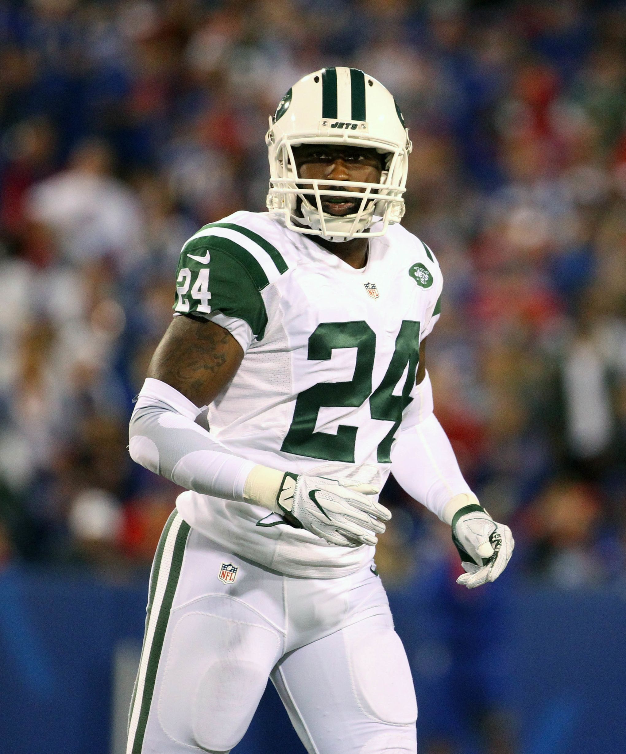
15 minutes ago, DCarp1231 said:
Is there an actual color difference between the regular green Jets helmet and the throwback helmet?
I believe they are the same exact shell. They probably could’ve implemented the throwbacks before the removal of the one-helmet rule if they so wanted to.
-
2 hours ago, DrunkKidCatholic said:
Unless you can convincingly clean up the shoulders on Namath/Parcells era uniform which always had issues under Nike.
The easy solution would be to just flip the colors of the shoulder stripes or, even better if possible, just do one shoulder stripe spaced out away from the shoulder cap.
(Side note: look how off-white Revis’ helmet is in that last photo compared to the jersey. Rough.)
-
5
-
-
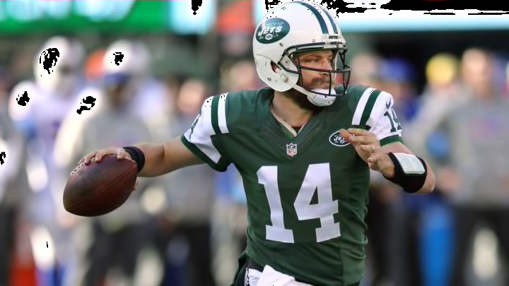
48 minutes ago, Dynasty said:
Yes, there wasn't anything I liked about the Jets' 2019 update outside of the brighter green. The logo change felt lateral to me, though the previous oval logo did have too much going on with the Jets script, Times New Roman NY in the back, and the small football, so I would argue it might've been an upgrade from that.
I've said it before, but I hate the striping more than anything. The idea, at least on paper, looked like it was intended to have them completely straight, but it's ruined when the players are moving around with them.
The way the striping just bends and curves makes it look so awkward. They would've been better using standard striping that goes from top to bottom, or maybe just omitting them altogether.
I hadn’t really minded the Jets’ stripes, but yeah, you make a good point, it’s not as good at alluding to a jet if it’s pointing downward. I’d much prefer them return to the Namath set with kelly green, and maybe a green helmet, than use that “Legacy” set, which doesn’t have nearly as much character to it in my opinion.
-
1
-
-
35 minutes ago, itsmb8 said:
From the pictures, both are using a 2-stripe cuff. The Royals cuff is definitely bigger.
For sure. To use a more clear-cut example, both the Twins and Brewers are using 3 stripes, but the Twins are clearly bigger (which is a surprise, because the Brewers’ home jersey had really big sleeve stripes on the previous template).
-
1 hour ago, McCall said:
What the Royals did, and I think it's how the Diamondbacks do it, is a 2-stripe cuff, ala, the White Sox previous black and white striped away uniforms. It appears the Guardians, like the Marlins, Blue Jays, Pirates, etc, are utilizing a 3 stripe cuff, just with navy sandwiched between two white stripes.
I don’t know, they both look to me like 2-stripe cuffs, but the Royals one just appears bigger.
-
I'm pretty conflicted on the new Nike template. On one hand, I think the replicas are a huge upgrade, as I never liked the previous jersey material, and getting front numbers and patches is much-needed, especially for teams where the front number is so essential to the design, like the Dodgers and Twins. I'm also glad that the so-thin-you-can-barely-see-it piping is going by the wayside for teams like the Marlins, as @McCall mentioned. The Angels also look to be a bit of an upgrade for me by increasing the width of their striping, as do the Nationals.
However, the neck inserts when no striping is present is just a bad look. It's also frustrating that sleeve striping is noticeably thicker than headspoon piping for teams like the Rays, Reds, Astros, & the Diamondbacks' new design. Also, thank goodness the replicas don't have the perforated numbers, because I have a feeling that is going to be rough in game action.
Overall, teams with pinstripes and teams with collar + sleeve striping, such as the Giants and Pirates, seemed to get by the most unscathed on the new template. The Padres might be the overall winner, as they have both of those elements.
In a development I wasn't expecting, though, it seems like the sleeve cuff might be able to accomodate for different widths of striping? Compare the Royals and the Guardians below:
It's not as noticeable in the pictures @aawagner011 posted above, but the Royals' striping still looks to be at least a bit thicker. The same goes for the Twins' and Rangers' striping compared to other 3-stripe teams like the Brewers and Blue Jays, for example. I was expecting the stripe widths to be completely standardized with the new template, but it seems that may not be the case.
As a side note, I don't know if it's just me, but the Brewers' home jersey looks especially cream, if that makes sense. Same goes for the Giants. I wonder how the shade compares to the previous template. It looks like the Diamondbacks have a lighter shade of off-white. I wonder which shade the Twins' "Twin Cities" alt will go with.
-
3
-
-
1 hour ago, NFLfan42 said:
Next to the White throwbacks, which I'm not sure they wore this year. Interesting pairing possibly for next year.
1 hour ago, SSmith48 said:Eh, I don't think it's something to look into. Looks like it's just one of those Riddell fashion helmets. Seems to fool a lot of people in similar situations with other teams.
Likely a hot take: if they ever decided to add back an orange alternate, this might not be a bad idea to pair with it (and probably aqua pants).
-
6
-
 1
1
-
 1
1
-
 2
2
-
-
Why would they make their main uniforms closer to the throwbacks in every way, but also still keep the throwbacks, and not only that, add in a white version? I don’t buy it. If they do end up going that route though, they’d join their rival 49ers in having throwbacks that are unnecessary.
-
6
-
-
-
8 minutes ago, tBBP said:
I mentioned this in another thread (or maybe it was this one?), but perhaps Houston missed their workaround of the Oilers IP. Rather than simply adding light blue to navy and red a la the 2003 LA Avengers (and for those who remember, the amount of light blue seemed to increase ever so slightly from the time they first added it as the slightest bit of trim), perhaps they should have explored co-opting the Colorado Rapids/West Ham United colorway of light blue and maroon/crimson/garnet...???
Just a thought...I or someone would have to concept that out to see how it'd look.
Darkening the red would defeat the point of having the color scheme in the first place. It’s a similar dynamic to the somewhat common suggestion of adding pewter to the Bucs’ creamsicles — darkening the color scheme to fit as the primary set kind of ruins the whole point, it takes away what was originally appealing.
I’m not suggesting that simply adding light blue to their current color scheme is the way to go, either. That just puts them even closer to the Titans, when the two teams really ought to be distancing from each other.
Although the Texans obviously can’t just recreate the Oilers uniform design, I truly wonder if there’s any reason why they couldn’t just use the color scheme full-time if they really wanted to. I have to imagine they could’ve made a claim to it before the Titans reintroduced the Oilers throwback, but now it might be a bit tough. The logo wouldn’t really work great in that color scheme, either.
-
1
-
-
Honestly, I’d go as far as to say that the Texans’ set would be pretty perfect if they just switched to a red helmet and/or jersey as the primary. I’d maybe flip the colors of the stripes on the pants, or change them to match the “USC” stripes of the jersey, but that’s just nitpicking at that point.
I think the predominance of navy is what contributes a lot to the feeling of their set being “boring.” The red helmet really does wonders to brighten their set up. Red also just feels like more of a Houston color to me, and would help them stand out more in their division and in the NFL in general.
-
5
-
-
On 1/11/2024 at 8:00 PM, bob95 said:
Based on the rumors surrounding the Broncos Rebrand from the Uni watch article yesterday, I made some mock-ups using the Gridiron Unifrom Datata Base template.
I... don't hate it? I don't really buy that the uniforms will actually resemble that design, but it makes for some interesting combos. I particularly like the white/navy/white and the white/orange/white. If they absolutely have to use the "5280," I would have the numbers upright instead of sideways.
My ideal Broncos uniform set, similar to @tBBP, would be the '65-'66 set (that picture is approaching Rams' 50's yellow jersey painting territory of ubiquity, which I have contributed to), with the blue helmet. I'd also have either orange or white as an occasional alternate helmet, as well as a blue alternate jersey, and orange & blue pants as options. It's a toss-up for me between the cyberhorse and the D-horse logo, both are well and good.
-
3
-
-
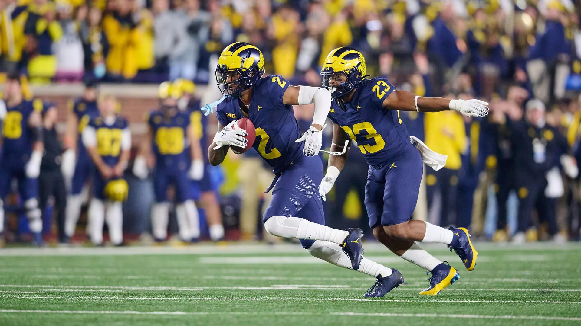
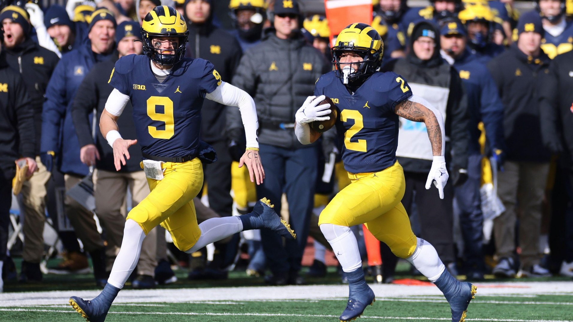
13 hours ago, HopewellJones said:
Yeah, Jersey-Pants-Socks/Sleeves.
I know the average fan doesn't really notice socks and accessories, but most people here do. And they make a big difference in aesthetic. The blue jersey/pants combo definitely has a different feel when they wear maize socks and sleeves with it. Wearing the maize pants with maize socks just looks bad. But anyway yeah it seems as though they very deliberately tried not to repeat any uniform combos until the very end.
Blue-Blue-Blue
Blue-Blue-White
Blue-Blue-Maize
Blue-Maize-Maize
Blue-Maize-White
Blue-Maize-Blue
12 hours ago, HopewellJones said:The away looks:
White-Blue-Blue
White-Maize-White
White-Maize-Maize
White-White-White
White-White-Blue
I think they could afford to drop the white accessories, although I understand why they did it for the Rose Bowl.
I agree that the maize accessories look terrible with the maize pants. I think the maize accessories look really nice with the navy jersey and pants, though, but all-navy looks really nice, too. I also think navy/white/navy/maize could work as an occasional road combo.
I think the ideal combos for Michigan are navy/navy/maize/navy at home, and navy/white/maize/navy on the road. I'm fine with some mixing and matching for them though, so long as they don't go with maize for both the pants and the socks/accessories.
-
This last update of the main set is essentially perfect, I especially love the red helmet with the primary jerseys! I'd love to see the red helmet paired with the navy jersey and white pants, and vice versa. The only change to the red jersey I'd make would be to have the front "Texans" wordmark and the Nike swooshes white, as in navy they're a bit tough to read.
I also love the "H-Town Blue" design, the double outline on the numbers looks great. I personally think the best way to differentiate the Texans' use of "H-Town Blue" from the Titans' use of columbia blue would be to pair it with mostly red, since the Titans now use so much navy. Maybe the helmet and/or pants for the H-Town Blue design could be red?
-
1
-
-
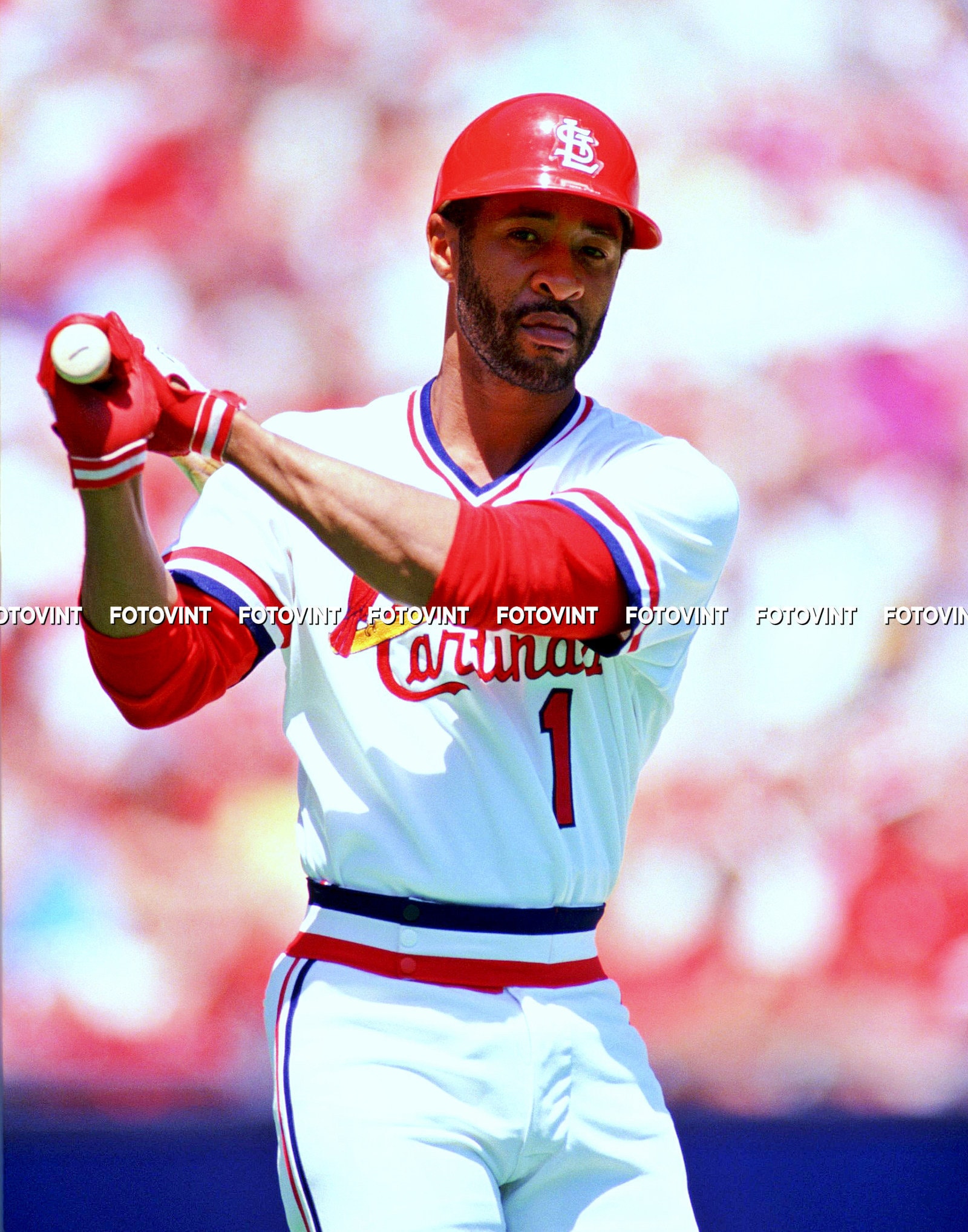
5 hours ago, PlayGloria said:
I would not want this full time as that would be sacrilege, and this probably 1000% has to do with nostalgia, but I love this Cardinals era. Like loooove it. I would rather trade out the baby blue jersey they do now to add this to the rotation.
The powder blue uniform would look so much better with this striping style, whether as a pullover or a button-up.
-
3
-
 1
1
-

/cdn.vox-cdn.com/uploads/chorus_asset/file/22891446/1342345440.jpg)


:format(jpeg)/cdn.vox-cdn.com/uploads/chorus_image/image/53469519/usa_today_9781117.0.jpg)


:format(webp)/cdn.vox-cdn.com/uploads/chorus_image/image/72868123/1788082630.0.jpg)
:format(webp)/cdn.vox-cdn.com/uploads/chorus_image/image/72733512/1723400658.0.jpg)


MLB 2024 Uniform/Logo Changes
in Sports Logo News
Posted
If they're gonna keep their current design, then I'd rather them go with that number font across the board instead of block.
A full-on rebrand would be much preferable, though.