


simtek34
-
Posts
738 -
Joined
-
Last visited
-
Days Won
1
Posts posted by simtek34
-
-
FUUUUUUUUUUUUUUUU
-
 4
4
-
 1
1
-
 3
3
-
 9
9
-
-
7 hours ago, simtek34 said:
This doesn't involve a Throwback but it involves Thanksgiving still, but I hope to god my Vikings don't wear their Color Rash, which they probably will, considering they've worn it for their past three TNF games. This would be a better matchup:
 vs
vs
We're probably gonna get the Patriots with Leotards and the Vikings with Color Rash or Mono-Purple knowing my luck. I hope not.
Goddamnit. We're wearing the f***ing Color Rash Unis.
-
2
-
2
-
-
13 minutes ago, spartacat_12 said:
Wouldn't the easiest solution have been to designate the white jersey + black pants as the primary road uniform, and make the white jersey + white pants look as the alternate? That way they could use the white helmets with the all white alternate.
The Texans wore their red helmets with white pants, so there's no rule that says alternate helmets can only be word with colour rush uniforms.
It's with alternate uniforms in general, not Color Rash. Every other Alt helmet team besides the Panthers are wearing their Alt helmets with an Alt Jersey. The Panthers got around this by designating their Black Jersey/Black Pants/Black Socks as their other "Alternate," since their primary uniform is Black over Silver.
1 hour ago, TCRagnar said:Since the NFL has said they will be honoring John Madden on Thanksgiving, we already know the Cowboys are rolling out their throwbacks, I'd like to see the Bills, Lions and Giants do the same.
Completely agree! While the eras won't necessarily match, seeing these combos would be cool.
vs vs This doesn't involve a Throwback but it involves Thanksgiving still, but I hope to god my Vikings don't wear their Color Rash, which they probably will, considering they've worn it for their past three TNF games. This would be a better matchup:
vs We're probably gonna get the Patriots with Leotards and the Vikings with Color Rash or Mono-Purple knowing my luck. I hope not.
-
 5
5
-
-
28 minutes ago, Cujo said:
Just 'cause they're old doesn't make 'em good.

Yeah, the golds don't match for a variety of reasons. (Saints wasting their alternate helmet on Black instead of the correct shade of gold, it being from the 60s, where matching colors wasn't exactly as good as it was now.) But if the Saints were to make their Throwback and Color Rash uniforms permanent (which they should,) then of course they should fix the mismatching golds, making them all similar to the shade on the jersey numbers, which is a beautiful shade of Gold.
-
10
-
 1
1
-
-
I have to say, it's weird seeing the Saints look good uniform-wise. All of the Monochrome they've been putting us through makes this SUCH a breath of fresh air.
-
14
-
 1
1
-
-
19 minutes ago, MJD7 said:
@Kg54mvp, I'd like to take a moment to apologize and eat my words from earlier, it appears the rumors you heard were nearly spot on. I guess I didn't consider the possibility that President St. Peter would outright lie (or, more charitably to him, simply doesn't have quite the eye for this kind of stuff that we do).
I'll post a full review of the set a little bit later (Spoiler alert: I love it).
4 hours ago, simtek34 said:Turns out, thanks to the article on the mothership, that Minnie and Paul aren't quite dead, just being put in the home. While they won't be featured on any uniform elements, they will remain at the Target Field scoreboard. If this is correct, they are presumably gonna modify the wordmark as the one on the Target Field scoreboard has the old Twins wordmark. They are doing renovations currently this offseason, so that is probably apart of that.
-
1
-
-
29 minutes ago, Ferdinand Cesarano said:
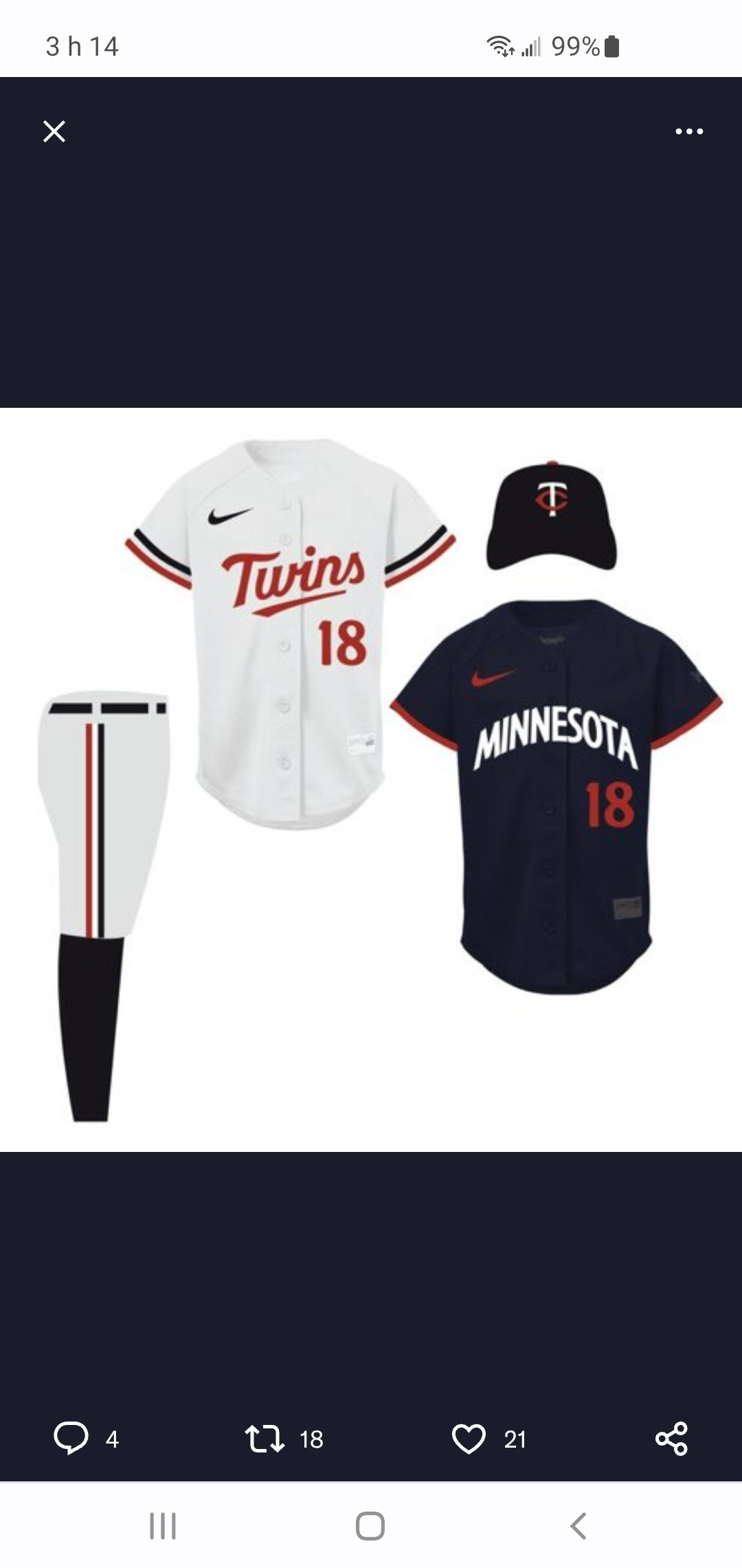
Are you saying that these pants are not grey? If the Twins are going to wear white pants on the road with the blue jersey, and if they are going to have two distinct road looks (a dignified baseball look, and a Sunday beer league softball look), that knocks the overall grade from me down a peg, to B+.
The Navy Jersey is a Home and Road alternate, worn with the White Pants when worn at home, of course. They'll still wear the M cap with the Navy jersey at home to according to them, give the fans a chance to see the M cap in person.
-
2
-
-
29 minutes ago, Ferdinand Cesarano said:
The road greys with pinstripes are beautiful. (Though they don't need two sets of grey road pants.)
They only have one pair of Grey pants, the pinstriped ones.
-
3
-
1
-
-
1 minute ago, pluggerplugger1 said:
Just returned home from the Mall of America unveiling and wow there were a lot of folks there! It was awesome seeing everyone energized about the Twins, especially considering how the season ended. Were any other CCSLC-ers at the event?!
I love most aspects of the rebrand, though I'm not super fond of the new "M" logo. As soon as they unveiled it, a guy next to me remarked it looks like the old Marlins mark, which many here have pointed out too. Losing Minnie & Paul also sucks, but I do like the new crossed flags logo. Overall, an upgrade imo
I almost went, but I'm in college and had class right before so it would have been a tight turnaround.
-
1
-
-
Just now, Magic Dynasty said:
It's strange that they used the old Twins font for pretty much everything except the updated Twins wordmark. Overall I'd still vastly prefer if the wordmarks and numbers had outlines but still fairly solid, especially the road.
Also, completely unrelated to the actual uniforms, but I can't be the only one that this thread is freaking out with, right? Every page is duplicated, for a new one you have to go 2 ahead.
I think that has to do with the thread separation and moving all the posts over, as we were originally in the MLB 2023 Changes thread.
-
1
-
-
Turns out, thanks to the article on the mothership, that Minnie and Paul aren't quite dead, just being put in the home. While they won't be featured on any uniform elements, they will remain at the Target Field scoreboard. If this is correct, they are presumably gonna modify the wordmark as the one on the Target Field scoreboard has the old Twins wordmark. They are doing renovations currently this offseason, so that is probably apart of that.
-
1
-
-
Overall, this is decent. It isn't bad. It's what I was expecting over the past week based on the rumors. Here all all my initial reactions and thoughts as a lifelong Twins fan and uniform nut.
Likes:
- The wordmarks are growing on me! I'm liking the new Twins script more than I was last week when it was leaked The Twin Cities one is good, and the Minnesota reminds me of the 1987-2009 Road uniforms in a good way.
- The updated TC. I didn't like it at first last week, but that's probably the fact that I was so used to the 1961-2022 TC that anything different would look weird.
- The Primary Uniforms. Seeing it on an actual person, the Home Whites look a lot better than I thought. And The Road Greys are great too. Pinstripes are back (only on the road? Odd but okay.) The road uniform is so close to excellence, just wear the TC cap and its great. I'm usually anti-piping on pinstriped Uniforms, but it looks fine here.
Dislikes:
- The Number Font. It's not awful, but it's not well-suited for numbers IMO. Shoulda just stuck with Block Font.
- The new M logo. The whole North Stars look it's going for is not it. I'm curious how it would look italicized with an underline like the 1987-2012 M logo?
- The Navy Blue alternate. It's not bad, but it's a letdown. It's close to being good, but the color distribution to me misses the mark. The work mark needs some red. A red outline like the 1997-2009 road alternate would improve that. And same with what I said about the Road Greys, a modified M cap or TC cap would look better.
- The Cream uniform is NOT GOOD for a Twins uniform. Just using Cream and Blue without any red kills it for me. Also the TC hat is somehow even worse. Some red would make it great. Maybe even pinstripes too?
- Minnie and Paul have been killed, and this is a travesty. Rip 1961-1987/2000-2022. Their spirits remain on in the form of pennants, but their sacrifice will be in vein. I hope they rethink that decision and bring them back ASAP.
-
 1
1
-
1
-
And last but not least, the money shot, all five combinations together.
-
7
-
 2
2
-
-
Home and Road alts
-
5
-
-
Home and Roads
-
5
-
-
-
The uniform unveiling is being live-streamed on FOX 9 KMSP-TV's website, here. I was thinking about going to it, but had conflict with college classes so I didn't. https://www.fox9.com/sports/watch-minnesota-twins-unveiling-new-uniforms?taid=6377c16345ca560001dd1204&utm_campaign=trueanthem&utm_medium=trueanthem&utm_source=twitter
Also, the website has already been updated with the new font and TC.
-
1
-
-
Just now, logo-maker said:
Outlines must cost too much.
Cheap Pohlads! /sarcasm
-
 2
2
-
-
4 minutes ago, FiddySicks said:
Saints in the black throwbacks this weekend, according to Adam Schefter.
Confirmed by the Saints. THANK GOD, IT'S ABOUT TIME.
Now Saints, this isn't hard. Make this the Home Uniform and the Color Rush jersey your Away uniform, with matching Golds and no White Socks of course.
If only they were wearing it against a team that wasn't the Rams with those Uniforms they have.
-
2
-
4
-
-
It's fake
-
4
-
-
1 minute ago, jp1409 said:
Source of this? If it's real, I'm disappointed. They REALLY need outlines and neck Piping. Also, no Gray uniform is a BIG NO.
-
This probably won't happen, but Packers, PLEASE, wear Green Socks, PLEASE.
That will be all.
-
2
-
2
-
-
Someone posted pictures of how the survey looked like, and the uniform options that had to be ranked are seen too.
Looking closely at the images, they just used @CC97's art from the mothership, which I find funny.
Also, on the helmet one, I can't tell if those are official NFL renders or not. I know they're not from the mothership. I feel like they are official renders, but the shade of white for the "D" helmet is off compared to other official helmet art.
-
3
-
1
-
-
32 minutes ago, Sec19Row53 said:
Can you post the survey questions? I'm really curious how they are framed, as in, are they trying to lead fans in a particular direction.
They posted one on twitter. Classic Throwback, along with Classic/Modern hybrid are neck and neck at 43% each, while Modern is way behind at 13%. Other is at 1% right now. I voted for Classic, as I really don't trust Nike.
-
6
-


 vs
vs 
 vs
vs 


MLB 2023 Uniform/Logo Changes
in Sports Logo News
Posted
I wouldn't hold my breath out for that, as supposedly, the Yankees were the team that was pushing for the Nike swoosh to be on the front of MLB jerseys instead of on the sleeve like Majestic/Russel/Rawlings/etc...