


ManillaToad
-
Posts
1,875 -
Joined
-
Last visited
-
Days Won
4
Posts posted by ManillaToad
-
-
Saints in black/white/black isn't that bad tbh
 Would be better if the pants had stripes but I'm seeing several worse unis on redzone right now
-
 2
2
-
 1
1
-
-
Sean McVay after 1 losing season

-
3
-
 2
2
-
-
1 hour ago, Volt said:
It's pretty much up to the player. I think the only rule they must enforce is that the Yellow stripe must be on the sock somewhere, because I swear some of the guys just wear White leggings and then cut the stripe out of the sock and wear that over their ankle or calf:
I also noticed that in pregame, JuJu & Juan Thornhill were wearing all White socks/leggings, but in the game, they had the Yellow stripe or an additional sock on over top.White on White is the only combination my Chiefs should wear on the road. I'd be just fine with them burning the Red pants.
This is a great example of how much socks matter in a uniform. I don't understand how 10 can see his teammates and think the all-white is the look to go with
14 minutes ago, WSU151 said:Literally every NBA and NHL jersey looks better when the ad tries to match with the jersey colors. The worst ads stick out like sore thumbs.
It's a real shame sports uniforms have come to the point where we even have to discuss stuff like this. And it's only gonna get worse. Grim.
-
5
-
 1
1
-
-
The Chiefs had 3 primetime home games, same as Buffalo and fewer than Philadelphia and Green Bay
-
29 minutes ago, CrimsonBull9584 said:
What I would like is for each FBS conference to get an auto bid to the 12 team playoff.
9-5 Toledo does not deserve to play for the natty
-
1
-
 2
2
-
-
2 hours ago, Brave-Bird 08 said:
Alright now, hold on a second. A full rebrand of the Titans is not necessary. The major issues they have are with the uniform itself, not the colorway, logos, etc. To me, what's most critical is returning to a white helmet, because as many have pointed out, it gets lost in too many key lines on top of the navy blue shell.
But a full overhaul would make me sad. The Titans before they started mixing and matching in the late 2000s/2010s had a modern classic identity.
The flaming thumbtack is definitely an issue
-
-
Jags have never done teal/teal/black. mite b cool
-
5
-
1
-
-
42 minutes ago, Red Comet said:
It's analytics run amok. You know, except for one thing: I remember a hell of a lot more Hail Marys succeeding than Cal-Stanford/Miami Miracle/Music City Miracle type plays succeeding. In fact, those are the only three times I know of that something like that works and the team involved won.
River City Relay and Miami Miracle are the only successful multi-lateral plays ever. One of them didn't even win the game!
-
Washington wearing balanced color combinations but having such an ugly uniform is so frustrating
-
16
-
 2
2
-
-
The Alamo pants stripe is awesome! Uniform is gonna look great with the normal logo on the helmet
-
Moribund franchise with no history asking fans for ideas? I can't think of any team I'd trust more with a uniform redesign
-
1
-
-
16 hours ago, uniformity said:
I cant believe we are having this discussion. The slug is a horrible logo. Universally panned when it debuted. Before today I dont think I had ever heard the screaming eagle logo taken down. Fans clearly like it.
People want bad logos brought back so they can ironically like them. The buffaslug is hideous, therefore it's good
-
7 minutes ago, Red Comet said:
Coincidentally, Namath and Stabler are the only two QBs in Canton who had more career INTs than TDs
Gonna umm akshully you here and mention there's a lot of pre-Super Bowl era guys who share that distinction
-
1 hour ago, infrared41 said:
I'd argue that Foles had "major" success for just a few games. The only reason he had that run in 2017 is because Carson Wentz was injured in week 14 of that season. Foles isn't unusual. Remember Matt Flynn? Scott Mitchell? Kelly Holcomb? I'm sure there are many others.
In 2013 he had a 27TD/2INT season and went 8-2. One and done in the playoffs but he had a pretty good game and they lost on a last second FG
-
1
-
-
2 hours ago, Cujo said:
. Hackett was given a HOF quarterback
High hopes for Rypien?
-
1
-
-
Remember when the Colts used to be a guaranteed good looking team every week? This is like if the Raiders started wearing all-black or all-silver every game. I hate color rush so much
-
6
-
1
-
-
For the third year in a row I am disgusted by the existence of the 7th playoff seed
-
7
-
-
15 hours ago, infrared41 said:
Tonight might have been the one time in my life I was actually rooting for a Steelers win. I know it's fun to hate on Steelers fans and a lot of that hate is deserved, but I don't see the harm in letting them have this one. Franco Harris was one of the good guys. I'm glad the Steelers won on the night he was supposed to be there to have his jersey retired.
It's much easier to root for them in the occasional neutral game now that Fat Ben is gone
-
3
-
-
6 hours ago, Blindsay said:
Georgia Force could be a good rebrand for Tampa
Huh??
-
NFL players : Have their jerseys tailored to be form-fitting so that there's nothing loose for the other team to grab on to, meaning uniform designs have to change to account for the lack of space
Also NFL players:
-
2
-
 1
1
-
12
-
 3
3
-
 1
1
-
-
39 minutes ago, -Akronite- said:
The throwbacks are great, no question, but I think a more modern look makes sense for Miami as a city and is a perfectly fine full time look. Keep the stripes as a special occassion thing.
I've always been an Aquafresh logo apoligist, to contribute to the thread. But as I've gotten older the concept of a dolphin wearing a football helmet has grown on me.
What does "modern" mean in this context
-
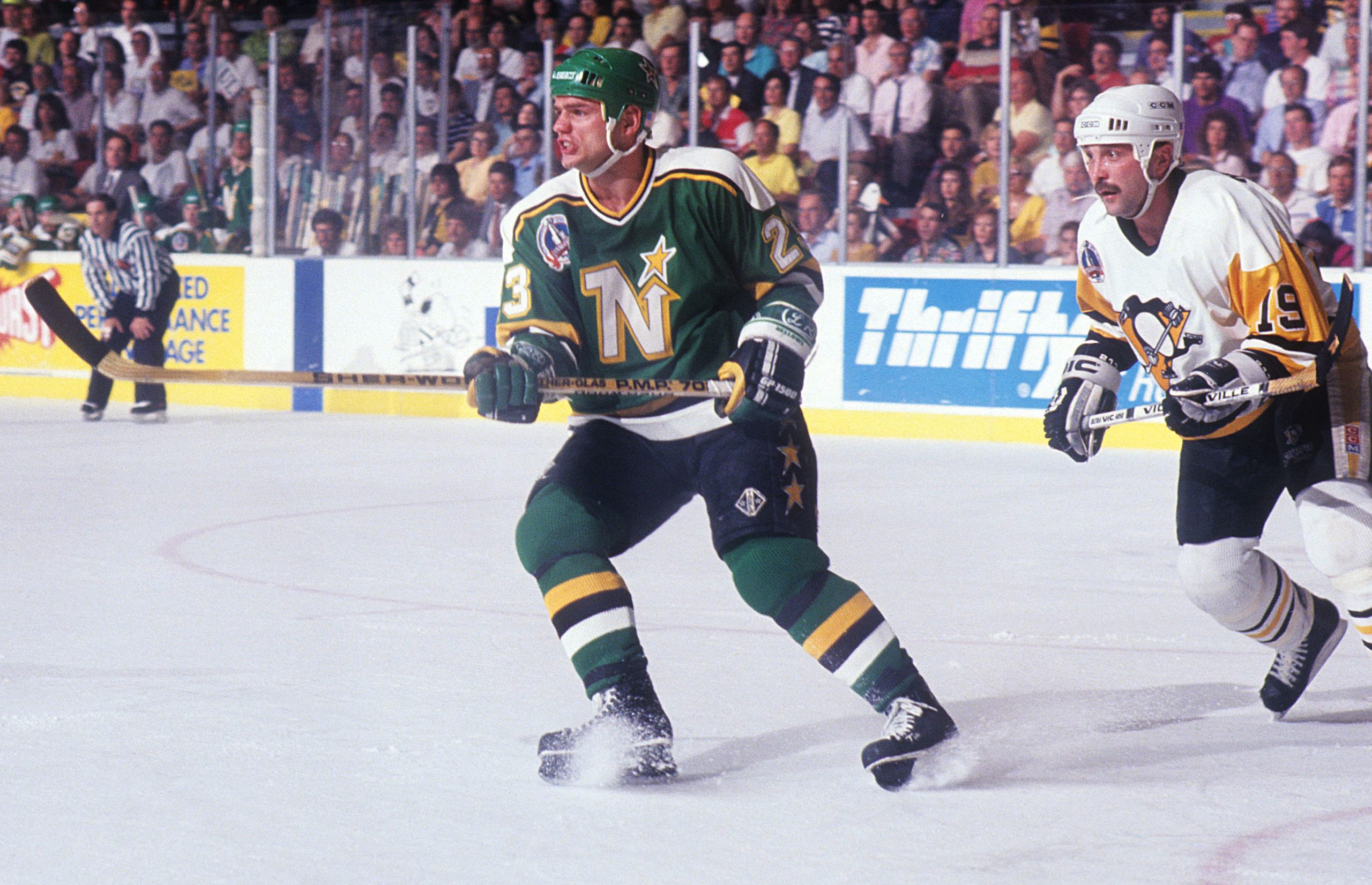
On 12/16/2022 at 8:30 PM, Ridleylash said:
I'm still partial to the late 80's design with the added black, personally, and I kinda wish they went with that version this time even if the way they went is also really nice. Like, this is a gorgeous uniform and I really want to see modern ice even if it were to have a Wild logo on the front;
The sponsor ad could even take the place of that SCF patch. Now that's dedication to a throwback
-
1
-
-
MIA/BUF looking like a solid matchup here in the Toothpaste and Tampons Hygiene Bowl
-
4
-


2022 NFL regular season through Super Bowl LVII
in Sports In General
Posted