


ManillaToad
-
Posts
1,875 -
Joined
-
Last visited
-
Days Won
4
Posts posted by ManillaToad
-
-
53 minutes ago, DCarp1231 said:
I thought Commanders-Seahawks was a pleasantly surprising matchup between two very progressively modern uniforms


You know we're in a grim situation when this is one of the best uniform matchups of the week
-
 6
6
-
-
Do you think the rest of the defense bullies 29 for not being icy
-
2
-
 9
9
-
 3
3
-
-
6 hours ago, Cujo said:
Brady's Patriots never won a huge road game either.
Wut?
-
1
-
-
On 11/2/2023 at 12:17 AM, throwuascenario said:
Side note: It's crazy to me that while uniforms go up and down in quality so heavily, NFL logos have almost exclusively gotten better and better. I don't think it would be a stretch to say that the Rams and the Buccaneers are the only two teams not using their all-time best logo as their current primary logo.
Eh... Dolphins, Jets, Bengals. And the Comms, but that's due to extenuating circumstances. Ratio wise I think the league is about on par with MLB and the NHL when it comes to this.
-
1
-
-
34 minutes ago, Sport said:
I wouldn't miss the Texans if they did a HornetsPelicans with the Oilers, but I'd miss the logo. The Texans are the Wild of the NFL - A fantastic logo saves the awful name. The uniforms are nothing to get excited about, but they're not terrible either, which counts for something now. I'd even go on to say that they wear a handsome look and is kind of immune to combination :censored:ery. They look good more often than they don't and if they were given to the league office to redesign I can only imagine what Titans-like BS we'd get - I'm picturing a Texas flag that covers both shoulders and stars down the pants leg.
Houston Texans is a great name for a football team. Only slightly behind Dallas Texans
-
1
-
-
I would love to pick the brain of the people involved in putting this uniform on national television. What could they possibly see in something like this?
-
1
-
-
3 hours ago, MJWalker45 said:
This has been one of the prettiest fields, but I didn't like the uniform matchup all that much.
Wonder how a reversal would've looked. Would've been nice to not have the same uniform matchup in back to back Super Bowls
-
2
-
-
A kitsch mascot-playing-the-sport logo that the team had a perfect season in being replaced by a boring, soulless corporate bellyflopping fish is a tragedy.
Also I think it's funny people praise the current Miami uniform for being "vibrant" and whatnot when the aqua looks like it got left in the sun too long, the jerseys are stripeless and bland, and they barely even bother with orange anymore. The old colors and combinations were much more vibrant
-
3
-
 1
1
-
-
1 hour ago, DCarp1231 said:
If the Dolphins simply merged the current and throwbacks together, then we’re cooking.
What's there to take from the current uniforms? The throwbacks are better in every aspect as far as I can tell
-
4
-
 1
1
-
 1
1
-
1
-
-
10 hours ago, GoHawks said:
I prefer the grey jerseys being retired instead of the action green. The grey jerseys are always worn against the same team (cardinals) which made the novelty of it disappear. The grey pants are also still in use which can be worn with both navy and white jerseys while the action green pants are only worn with the action green jerseys. The action green color is also unique and is not used by any other team.
They need to try the green pants with the navy or white jersey. It might not look good but it's worth trying
-
2
-
 1
1
-
-
Or people could just stop taking Cujo's bait every single time
-
4
-
-
1 hour ago, BBTV said:
Has a player actually missed a game the following week after getting a concussion? Did Tua after his head was essentially used as a basketball?
Yes. Yes.
-
1
-
-
2 hours ago, Pigskin12 said:
Falcons confirmed black over white for their game against the Tennessee Oilers. Why?
Why is there a random color vs. color matchup every couple of years that makes no sense at all? Teams have worn light blue jerseys before and the road team always wears white. This is gonna look strange. I'm surprised the Titans are even okay with this.
Color vs color games are a good thing. They should be happening more
-
5
-
1
-
 3
3
-
-
The Rams are also the first team to have no home games
-
2 hours ago, SFGiants58 said:
This is a much deeper problem than a “bad aura.”It's that stupid hat he wears
-
2 hours ago, McCall said:
A 2-division format for a 12-team league with a 10-game schedule means you would only play your divisional opponents
This isn't a con for me
-
2
-
-
The only problem with the dynasty Pats uniform was the side panels. Don't get why people act like it was a Cardinals-tier fiasco
-
8 hours ago, McCall said:
If this IS indeed the final roster of teams, wouldn't it make more sense to do a North/South division alignment?
SOUTH NORTH Arlington Canton Birmingham DC Houston Michigan Memphis New Jersey New Orleans Philadelphia San Antonio St. Louis
Probably be better (schedulingwise) to do a 3-Division format:
WEST CENTRAL EAST Arlington Birmingham Canton Houston Memphis DC New Orleans Michigan New Jersey San Antonio St. Louis Philadelphia One thing I do hope the USFL does, if indeed, they are calling the shots, is change the Renegades back to "Dallas".
North/South for me. 3 divisions of 4 makes it too likely that a team under .500 makes the playoffs so no thanks to that
-
25 minutes ago, Survival79 said:
“The flow,” the club says, “symbolizes how we perform at a peak level while embracing San Diego’s unique rhythm of life.”
-
1
-
3
-
-
28 minutes ago, Ferdinand Cesarano said:
Sorry for the double post, but I just found some of these interviews that I had recalled hearing before.
In the interview by Lawrence Ritter of "Wahoo" Sam Crawford (the holder of the all-time career record for triples) from the mid-1960s for the book Glory of Their Times, Crawford refers to the year 1907 as "nineteen seven".
In Ritter's interview with Smoky Joe Wood, Ritter himself (born in 1922) refers to the year 1908 as "ninteen eight".
In Ritter's interview with Hans Lobert, an infielder in the National League from 1903 to 1917, Ritter asks "What were the parks like in nineteen three, four, five?"
This practice was the norm for people born in the mid-19th century and the early 20th century. The norm changed to "ninteen oh (whatever)" probably for people born in the late 1930s or early 1940s.
These videos are great. Thanks for posting them
-
3
-
-
-
1
-
-
Worst "throwback" ever. It's just an excuse to wear a stupid ugly color rush
-
4
-
2
-
 1
1
-
-
8 hours ago, MrAstrodome said:
Hmm..
Vice-versa
EDIT: I have an older Madden that does not have the current white pants for some reason.
It's hideous. Who would have thought?
-
1
-
1
-
-
3 hours ago, the admiral said:
Nope, I'm right there with you. I never liked the seasonal affective disorder 49ers to begin with, but the fact that Nike refuses to replicate metallic pewter pants and leaves them instead with warm grey makes it irredeemable.
Another problem: what is their home uniform? Is it:
pewter/red/grey/black,
pewter/red/white/black,
pewter/white/grey/black,
pewter/white/white/black?
And that's not even mentioning the ill-conceived warm grey jersey or the tendency to wear snowflake-emoji white socks. You have a good chance of seeing any of these combinations in Tampa. I know every team's identity is a complete mess right now, but that's been a problem with this set going back to the days when the whole league didn't have that problem. A creamsicle set would be comparatively idiotproofed.
Changing to the creamsicles isn't going to stop them from mixing and matching what they wear at home. O/O/W, O/W/W, O/O/O, W/W/W etc
/cdn.vox-cdn.com/uploads/chorus_image/image/72859237/1790286174.0.jpg)


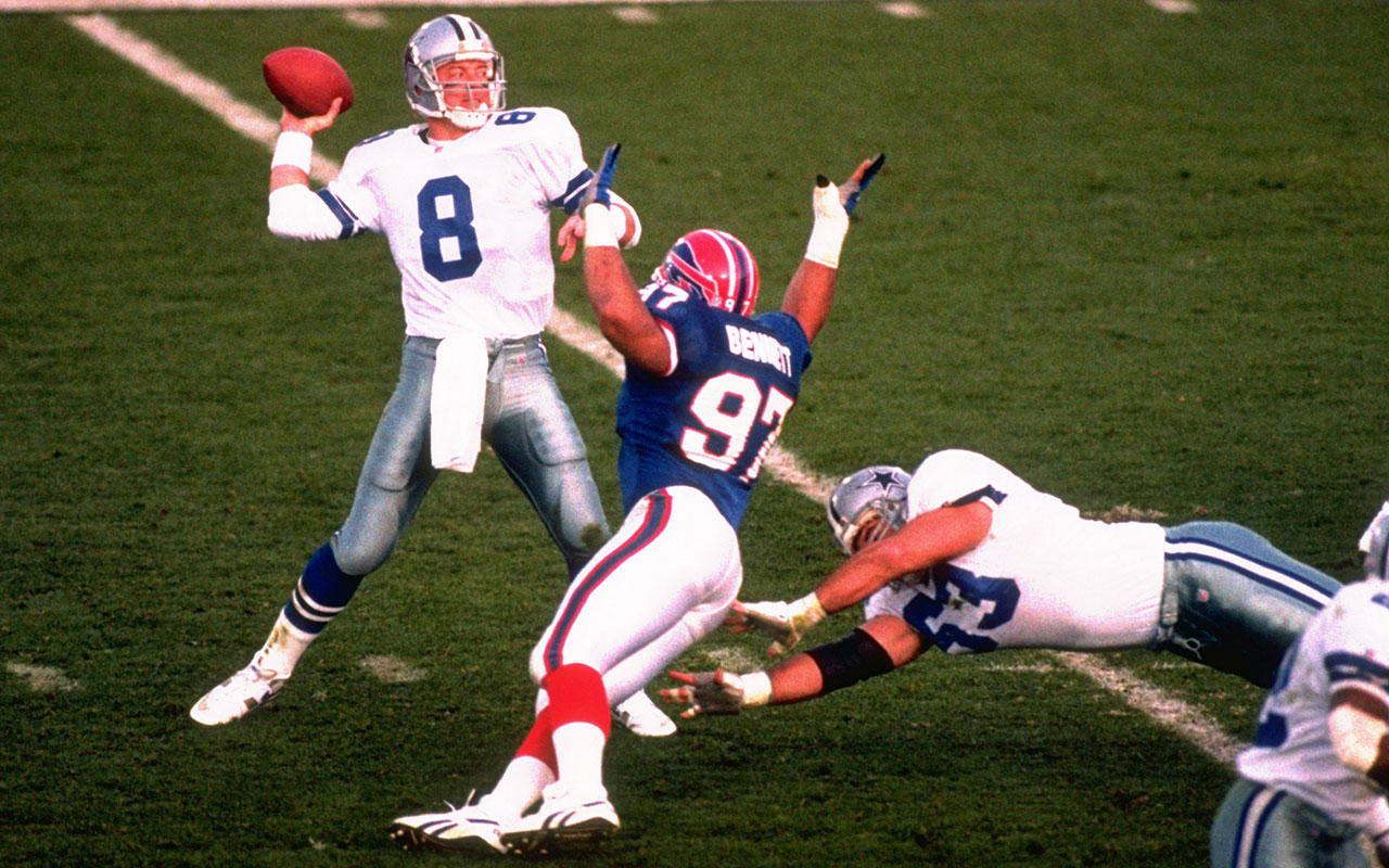
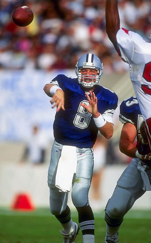


2023 NFL Season week by week uniform match-up combos: From HOF Game to Super Bowl LVIII
in Sports Logo News
Posted
Anybody else notice Denver started wearing stupid combinations as soon as Russell Wilson got there