-
Posts
10,506 -
Joined
-
Last visited
-
Days Won
193
Posts posted by oldschoolvikings
-
-
-
52 minutes ago, Sodboy13 said:
They'll point to a team like the Panthers and say something about how modern uniform cuts make shoulder numbers almost vestigial, and that the idea of "TV numbers" need not apply in the age of HD.
Well, yeah, those ridiculous tiny shoulder numbers the Panthers insist on sticking with suck. They look beyond stupid.
I don't miss mandatory TV numbers. I like them as an option, but I also like the option the option of not having them. Modern football jerseys have such a tiny amount of real estate from collar to cuff there's no point of cramming in too much stuff.
Plus, even when they had more space, open shoulders have such a classic football feel, IMO.

-
 14
14
-
-
40 minutes ago, dont care said:
I don’t see it with the other examples, where there is no design element 3 inches in any direction of the logos.
Three inches?

-
2 hours ago, BBTV said:
That's literally my point. The horn curves up, creating a perfect semi-framed space for the swoosh to live, making it essentially a logo. If you change the swoosh to some other company's logo, it changes the look of the jersey in a way that's much bigger than way back in the day when sleeve advertisers switched between Russell, Puma, Wilson, et al, and their patches were just placed any old place.
The swoosh is framed, and looks like it's a team logo.
42 minutes ago, dont care said:Don’t know how putting a logo in a blank space is “framing” the logo when it isn’t being bordered by anything else but ok. They put it where every other manufacturer has put their logo as dictated by the NFL
I think a few of us have made this point before and IMO it’s valid. The Vikings curved stripe creates a small open space that sort of “cups” the swoosh. You either see it or you don’t but I don’t think it’s a crazy stretch.
And if you don’t think the Seahawks sleeve is specifically designed to showcase the Nike logo, I don’t know what to tell you.
-
 9
9
-
-
8 hours ago, JustABallCoach said:
It’s just the perforation, not a patter. I prefer solid twill, but this is fortunately not a pattern. It does appear to me that the red outline might have some shine or texture to it.
Po-tay-toe, po-tah-toe.-
 1
1
-
-
I hate stupid sublimated patterns inside numbers.
-
 6
6
-
 1
1
-
-
-
5 minutes ago, ManillaToad said:
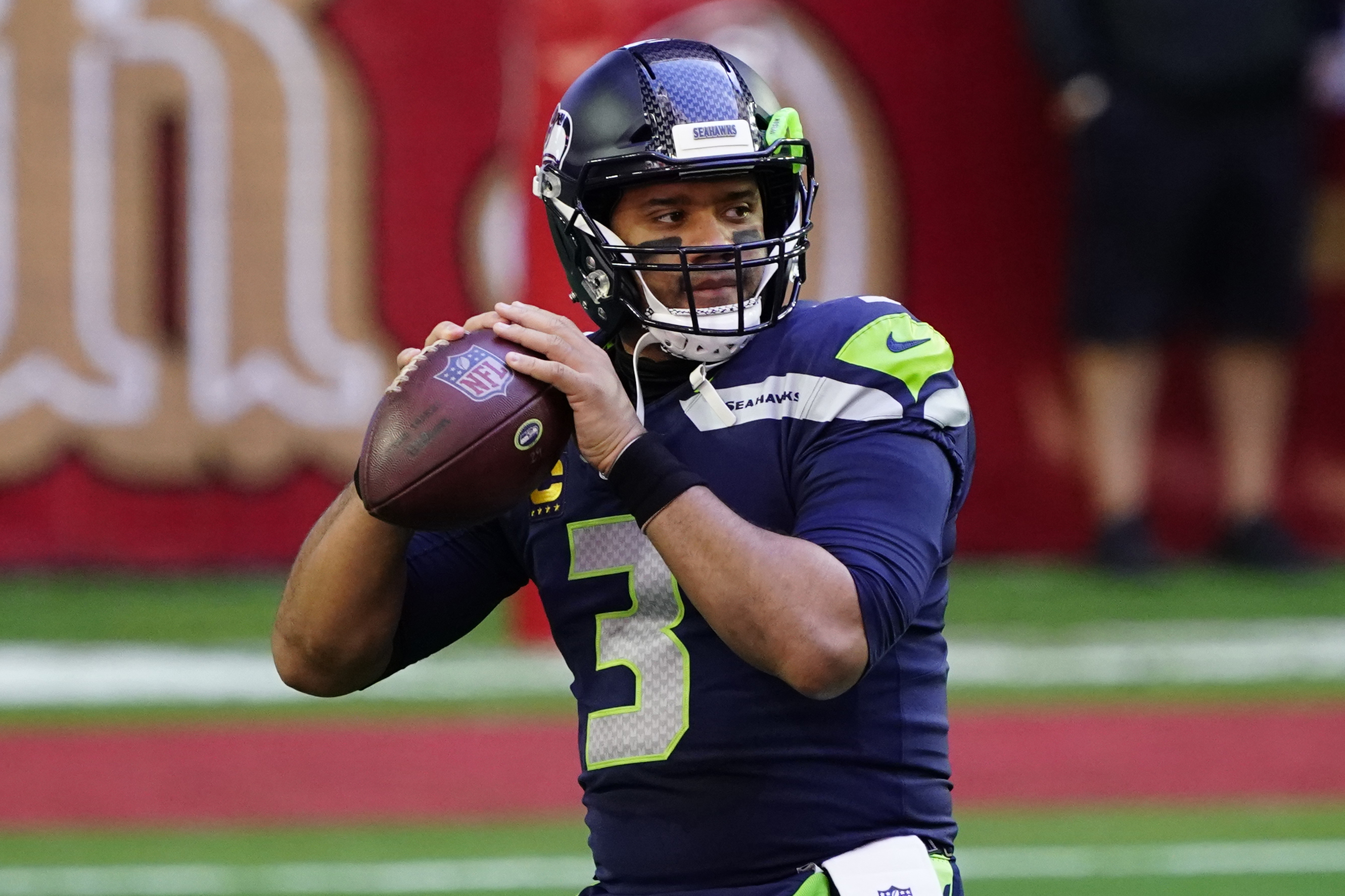
Fields is not an above average QB and the Steelers aren't holding a QB competition. Wilson is the starter
Wilson isn’t an above average QB either.-
 3
3
-
 1
1
-
-
So the Steelers got a third and two sevens for Kenny Pickett. And they got Justine Fields for a sixth?
What?
Bears.
-
10 hours ago, DCarp1231 said:
Really digging these updates!
The one that I’m not so sure about is San Antonio. The white helmet feels a bit off.
Recently in a different thread, I was defending the L A Chargers use of white helmets with gold pants so I used this as an opportunity to continue the argument.
-
With the exception of the red pants, I actually really liked the pre-covid version of the DC Defenders, so I'm bringing that back...

And, last...

-
 2
2
-
-
And here come the former XFL teams, re-imagined as USFL 2.0...
(This one is so easy... how do they not see it?)


-
 8
8
-
-
Next, the Memphis Showboats. I toyed with the idea of moving them back to red and silver. I still might. Regardless, they got the biggest makeover of the three former USFL teams.

-
 6
6
-
-
First up, the two best USFL transfers, both largely the same as they were...


-
 9
9
-
-
Last week I left a post in the current "UFL Branding and Uniform News thread" that read as follows;
The USFL returned with some really nice branding a few years ago. All nice updated nods to the original 80s looks. One helmet, one pair of pants, two jerseys. No monochrome, no leotard pants and socks combos. Nicely done all around. The XFL’s comeback arrived with some really terrible uniforms, to no one’s surprise. Ugly monochrome, gimmicky crap everywhere. I’m also not surprised this merger has made the former USFL teams go more in the direction of the nasty XFL styles. Disappointing but not surprising.
I’m thinking about a concept series where the designs go in the opposite direction… the XFL teams take on the old USFL feel.
So, yeah, I got right on that. The XFL 2.0 uniforms from the past year were a complete disaster, while the USFL 2.0 uniforms were largely good. Now, after the merger, the Michigan Panthers and the Birmingham Stallions are probably still the best uniforms post merger (Memphis was the worst USFL uniform, making it just an average UFL uniform), but all have been taken down a notch with bad color matching, dumb pants stripes and monochrome becoming (no doubt) the go-to choice. The UFL's version of the XFL holdovers are terrible across the board. So I thought, wouldn't it have been nice if the XFL teams had adopted the USFL style with this merger? And, based on the USFL 2.0's two year run, that "USFL style" is as follows;
- One helmet, one dark jersey, one white jersey, one pair of pants, one pair of socks. (I think the Stallions were the only exception, as I believe they had both white and gold pants, but I'm rectifying that here.)
- No non-white monochrome combinations.
- Socks that contrast in color from the pants.
- And while not an absolute rule, there was definitely a trend towards more traditional stripes on the jerseys and pants.
Anyway, I'm posting all 8 in one big dump. Enjoy! (Or hate, it's up to you.)
-
 1
1
-
33 minutes ago, Dynasty said:
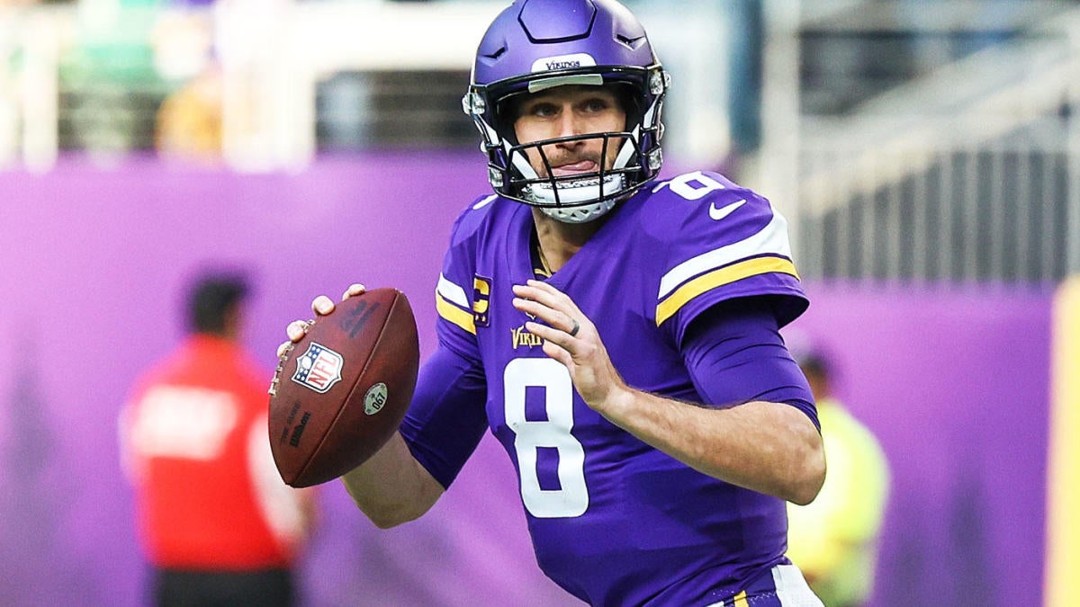
Anyway, with Kirk Cousins to Atlanta, I have no clue where the Bears are going to ship Justin Fields because it's clear that nobody wants him. There's no way they'll draft Caleb Williams and keep Fields on the roster, right?
Nobody wants him for a second or third. Or a fourth probably. Bears need to lower their asking price. -
The USFL returned with some really nice branding a few years ago. All nice updated nods to the original 80s looks. One helmet, one pair of pants, two jerseys. No monochrome, no leotard pants and socks combos. Nicely done all around. The XFL’s comeback arrived with some really terrible uniforms, to no one’s surprise. Ugly monochrome, gimmicky crap everywhere. I’m also not surprised this merger has made the former USFL teams go more in the direction of the nasty XFL styles. Disappointing but not surprising.
I’m thinking about a concept series where the designs go in the opposite direction… the XFL teams take on the old USFL feel.
-
 10
10
-
 1
1
-
-
6 minutes ago, burgundy said:
They even creamed their pants.

-
 2
2
-
 10
10
-
-
1 hour ago, HOOVER said:
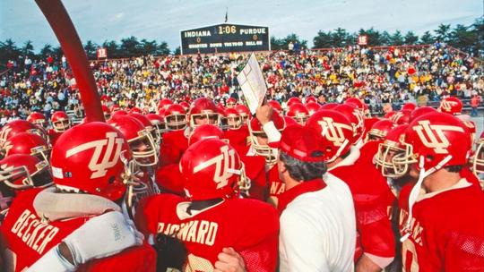
My wife’s family are all diehard Hoosiers. I can’t even watch the teams because of how bad the adidas looks are.
Praying they flip to Nike.
And yea…Crimson & Cream.
Anybody else remember the 1983 version of the Indiana Hoosiers (coached by Sam Wyche) when the replaced all the white in the uniform with a pasty yellow cream color?


Cream facemasks, and even cream road jerseys. Super hard to find pics of it.
-
 1
1
-
 1
1
-
 1
1
-
-
I'm a fan of all of these...


As long as the pants are Yellow, gold, silver, or some other light color, I think it's an enjoyable little quirk, in small doses. Those Charger and Breaker uniforms especially are two of my favorites.
-
 7
7
-
-
The Chargers need to dump both alternates in favor of a Dan Fouts era throwback.
-
 4
4
-
 1
1
-
 1
1
-
-
Discounting the two pointless mono alts, the Chargers current uniforms are easily top 5. And on any given day, looking at them alongside the IMO other best uniforms in the NFL (49ers, Bears, Browns, Raiders… discounting alts for all of them, of course) the Chargers might end up at the top of the list.
With this latest uniform, the Chargers did pretty much exactly what the vast majority of us were hoping. Some people are just never satisfied I guess.
-
 24
24
-
 1
1
-
 3
3
-
-
2 hours ago, JakeH28 said:
I don't think I've seen a single person who likes the TV numbers on the helmets

-
 9
9
-
 2
2
-
-
21 hours ago, MCM0313 said:
Sorry, obligatory anti-UM trolling by an OSU alum. And yes, I’m quite aware what has happened the past three seasons.
What, that they cheated?
-
 2
2
-
 1
1
-


/cdn.vox-cdn.com/uploads/chorus_image/image/61073513/94182419.jpg.0.jpg)








Oldschoolvikings' NFL concepts - Commanders concept added
in Concepts
Posted
And that is…?