

TBGKon
-
Posts
15,490 -
Joined
-
Last visited
-
Days Won
2
Posts posted by TBGKon
-
-
On 6/7/2018 at 8:08 PM, Griffinmarlins said:
I was talking about the Bucs wearing white pants in this scenario.
I was thinking the same thing, i didnt realize the Bucs wore the white pants that early into the history of the red and pewter.
-
 2
2
-
-
Army Ants and GloWorms are the best of the bunch, and that’s being nice...
-
Oh god, the North Alabama/Huntsville Southern League team for 2020 released its top 10 name candidates
Quote- Army Ants: Sound off! The Army’s Redstone Arsenal serves as a center for missile and national defense programs and employs more than 40,000 members of our community.
- Comet Jockeys: “Rocket City” was put on the map for its cutting-edge aerospace development. Comet Jockeys is a celebration of our brave astronauts who explore outer space.
- GloWorms: GlowWorms are rare, tiny, bioluminescent creatures that call the caves at Dismals Canyon in North Alabama home, one of the few places in North Alabama!
- Lunartics: We are home to some of the wildest mad scientists facing today’s challenges in space and technology. You’d have to be a “Lunartic” to do that!
- Puffy Head Bird Legs: No joke! It’s lingo coined by our astronauts for body fluid moving from feet to head in outer space due to lack of gravity!
- Space Chimps: A tribute to Miss Baker, one of the first animals safely launched into space who is buried on the grounds at the U.S. Space and Rocket Center.
- Moon Possums: A scavenger at heart, these local critters are known for hanging around and having a good time with their family– just like going to a ballgame!
- Space Sloths: A nod to NASA’s Marshall Space Flight Center, the Space Sloths is up there with classic Minor League Baseball names like IronPigs, Flying Squirrels, Chihuahuas and Jumbo Shrimp.
- ThunderSharks: Mix the powerful thunder of North Alabama’s storms with the Ultra-strong, sleek determination of the share and you end up with the personality of our community: willing to attack any problem. Visiting teams won’t mess with ThunderSharks.
- Trash Pandas: (Slang for raccoon) Our community is known for engineering, and no creature in our galaxy is as smart, creative, determined, and ingenious. A problem solver– dedicated to the challenge at hand– as our local raccoons!
https://whnt.com/2018/07/26/ballcorps-releases-top-10-list-of-madison-minor-league-baseball-team-names/
-
Balls to the wall!!!!! Rocky Mountain Oysters or bust!
-
1
-
-
Rocky Mountain Oysters or nothing at all....
-
Ugh....my local minor league team (and team i thought would never play this game) is doing a what could've been night. The Clearwater Threshers will play as the Clearwater BeachDogs in August.
...at least its not food...

-
32 minutes ago, mr.negative15 said:
To clarify, I wasn't complaining, just comparing.
That said, yes, I would pay for that. If there was a "CCSLC premium" or something to that effect.
Agreed with this post entirely....
-
1 hour ago, mr.negative15 said:
I find once i click the "X" on the bottom pop up it leaves until i navigate away from the boards.
39 minutes ago, BringBackTheVet said:Not me. It seems to come and go, and comes at really annoying times. Also, the "x" is so small that when in phone, I often fat-finger it and either click the ad or whatever is partially covered up behind it.
I noticed the same ad on the UniWatch site, so obviously it's not unique to this site, and I'm sure I'll get used to it, but hover / pop-up ads are bad.
@mr.negative15 it works like that in desktop version, but @BringBackTheVet is right my main issue is with the mobile platforms (ipad for me)
-
1
-
-
Im not getting the Amazon popup page, but on mobile and desktop the new ad package is very overwelming. I am fine with the banner at the top and on the sidebar of the forums, but the damn popup one that shows at the bottom of my browser every time in switch pages is getting a little annoying. Is there another option we can consider?
-
1 hour ago, Sec19Row53 said:
Is there a change in ad policy? I'm getting a constant bottom of screen ad whether in phone or PC?
I'm also seeing an ad within the posts, always following the first post of a page.Same here started yesterday...
-
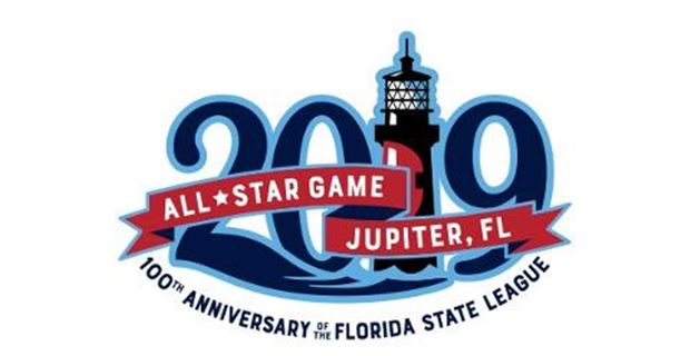
Tampa hosted the Florida State League ASG on Saturday....not sure if this logo made it here.

And it was announced that Jupiter will host next year
-
1
-
-
1 hour ago, the admiral said:
Grand Rapids seems like a rather large market for just Single-A. Maybe it's a matter of geography, I dunno.
Well, AA wouldn't happen since its nowhere near the Southern, Eastern, or Texas Leagues. The only AAA option would be the International League, but expansion at the MLB level would be their only option if they're interested.
For Grand Rapids, its pretty much Midwest League or bust.
-
10 hours ago, gosioux76 said:
Are you sure that isn't a throwback? I see a pretty modern-looking patch on the sleeve with what looks like a 20th anniversary patch.
11 hours ago, CaliforniaGlowin said:Just discovered this used from 1988-1991. Has this ever been used as a throwback, I love it.
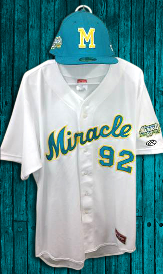
This was a throwback for the Fort Myers Miracle from 2012.
https://www.milb.com/milb/news/miracle-unveil-20th-anniversary-jersey/c-27745714
-
Who is the third one? Its just the first one slightly slanted left and a different red.
-
20 hours ago, Rebuy said:
I'm not sure if it got any notice here but the Clearwater Threshers have a new alt cap. I really like this and as a Phillies fan will definitely buy one.

I just noticed this the other day as well. That logos been in the set since the 2004 rebrand, but not used that often.
-
11 hours ago, MBurmy said:
Metro Milwaukee's AA name-the-team contest is down to three names...and my nickname's still in it!
BaseballWI.com lists the final three as the- Wisconsin Haymakers
- Dairyland Milk Men
- Wisconsin's Crop Dusters
(I swear, my submission was Milwaukee Milk Men...missed opportunity for the "MMM" letter logo there.)
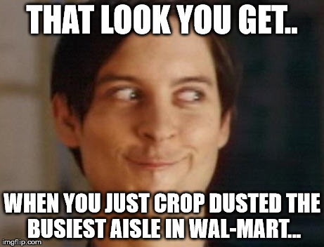
Crop Dusters....hehehehe
-
This food rebrand crap is getting really old in 2018....can the fad die soon?
-
4
-
-
16 hours ago, Gothamite said:
Even the farm club a thousand miles away knows what the Brewers should be wearing.
Pretty sure the Brewers own them now too..
-
1
-
-
Is ESPN+ the same as the WatchESPN app?
-
In regards to the autoposts beings created for news stories on the mothership, can we create a subforum in that forum to catch all of the news stories? Unless its breaking news, theres likely already a thread on the boards for the subject and this would avoid duplication (ie. The Titans blue helmet story)
-
8
-
-
1 hour ago, mr.negative15 said:
Yup..... just announced
")
https://www.echl.com/board-governors-approves-changes-2018-19-season
Word is that the Leafs will shift from Orlando to St. John's as their ECHL affiliate.
I'd like that...would be nice to have a Lightning affiliate in Orlando since TB doesnt have an affiliate this season.
-
1 hour ago, Ferdinand Cesarano said:
Ah. I can see that. But I have to say that I don't get why this reasoning applies to logos of a single letter. What I mean is that a cap with the graphic logo of the Tarpons can be used only by a youth team whose name is "Tarpons". Whereas, a cool T logo could be used by little-league teams called Tarpons, Tigers, Tomcats, Timberwolves, Thunderbolts, etc., could it not?
True but most little league teams nowadays arent creating their own names, around here its either the Major league club names or wacky minor league names.
-
1
-
-
31 minutes ago, Ferdinand Cesarano said:
I don't see the problem here. I like the way the P nestles in the extended arm of the R.
But that T from the two wordmarks needs to be the cap logo. Just the T, no fishtail; and there's no point at all in an additional T logo, the one made of a hook. Most important, wearing that busy blotch of a logo on the cap is a mistake; I think it clashes aesthetically with the rest of the uniform.In a perfect world, a identifiable letter should be the cap logo, or at least be an alternate, but you have to keep in mind that minor league primary caps with generic logos are becoming the norm. This is because little league teams can adopt these monikers and buy the licensed merchandise which makes money for the individual teams.
I know a bunch of local leagues in Florida do this and personally I think its a great idea. If you're team is the Cardinals, Yankees, or Braves and your little league is in Nebraska for example, having to wear a cap with an STL, NY, or A doesnt really represent your team name. But if you have a league made of AquaSox, Storm, Grasshoppers, or Seawolves you can wear a cap representing your team name as it has a representing logo.
-
1 hour ago, WSU151 said:
That hat logo seems incredibly out of place with the rest of it. Cool idea, just lacking in execution.
I thought the same thing. I get that it's a T for Tampa, but its more abstract than the T-tail logo on the white panel cap.
-
1
-

Non-sports logos that could be good sports logos?
in General Design
Posted