

TBGKon
-
Posts
15,456 -
Joined
-
Last visited
-
Days Won
2
Posts posted by TBGKon
-
-
Road navy looks good too

-
 7
7
-
 4
4
-
-
2 minutes ago, who do you think said:
Also someone please tell me why putting the stadium in Tampa and putting everyone in Pinellas County on the wrong side of that treacherous 40 minute drive, across that really scary, crowded bridge that's apparently made of lava and used dildos, is the solution to the Rays' attendance problems. Oh wait, you can't.
Going by what you're saying, I think you might live in Pinellas and have a little bias. Let me show some examples for the masses. Both of these maps come from here https://www.draysbay.com/2011/6/24/2242433/draysbays-stadium-proposal-part-1.
This is an article from 2011, but the information is still valid today in my option. The first map below is the current Tropicana Field location. Red circle is 5 mile radius, and the blue circle is a 10 mile radius. 2/3, if not 3/4 of the circle is water.
Look how much of that area is water? Guess what, pretty sure fish, turtles, and dolphins don't go to baseball games.
Below is a map of the same distanced circles, but centered at downtown Tampa. Yes, about 1/4 of the area is water, the rest is swelling with populated areas.
10 miles in this area is 30-35 minutes driving, which moving to a center around Tampa would increase the potential population that could make a decision to go to a home game.
-
6
-
 3
3
-
-
This should go over real well with the rest of the teams in the ACC
-
On 2/24/2023 at 8:52 PM, Dalcowboyfan92 said:
I don't get the love affair people have with Fontana. I've always hated the track, and the racing it had for as long as I've been a fan, which is now over a quarter of a century. (I've been a fan as long as the track has been apart of the circuit.)
You say the last few years have had great racing, but conveniently leave out the fact the track has had about two decades of crappy, subpar, and boring racing. It happened, those snoozefests happened. You can't change the past. The track may have had great racing in the past few years, but it doesn't change the fact this track was bad.
I, for one, will be glad to see this track reconfigured. Now, if they could only reconfigure Texas into a parking lot...
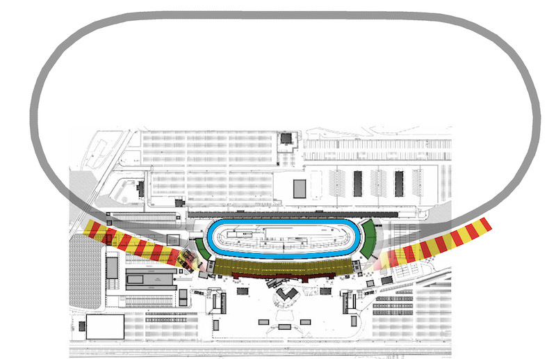
Oh wow, the reconfiguration is really happening.
Here's an overlay of the current 2 mile track with the plans for the half mile short track on top. Looks nice, and not your typical short track either.
-
3 minutes ago, the admiral said:
I agree. The Bolts should be the same color as the Rangers or Islanders. The Leafs should always be a bit darker than that. Also, put me down for black helmets and breezers with blue sweaters and socks; ABAB distribution will never let you down in hockey or football.
I've always thought that black helmets and breezers would be a good addition too.
-
2
-
-
On 2/25/2023 at 3:22 PM, VampyrRabbit said:
If the Rays manage to get an indoor stadium that is actually an attractive place to watch a game in or near Ybor City, then drawing 30,000+ is more than doable.
30k would be great, but in an 81-home game season probably isn't feasible. Averaging 20-25k would probably seem more likely.
-
2
-
-
On 2/25/2023 at 2:18 AM, who do you think said:
Or talking about that 10 minute freeway drive on 275 across Tampa Bay as if there's landmines in the pavement and they would totally fill the house if they were in Tampa so people wouldn't have to make that treacherous journey.
You really must not live in the Tampa Bay area. That "10 minute freeway drive on 275 across Tampa Bay" is more like 30-40 minumum during peak drive time in the evening.
-
4
-
-
19 hours ago, GriffinM6 said:
I really wish the Lightning would use a more "electric blue" color. Not the same as the Carolina Panthers, but definitely something brighter than what they currently use.
I think what the Lightning need to do is match up their shade of blue in the print logos to be aligned more with the blue of the fabric of their jersey, similar to what the Atlanta Braves and a few other teams have done recently. The blue on the jersey seems to be more vibrant than the dark royal that shows in most of their print logos.
-
19 hours ago, Kramerica Industries said:
So frustrating. Take those two sweaters plus the white one, swap out the original logo for the current logo, and the Lightning have their three sweater combination that they would never have to change again (whether black or blue would be primary is a different debate).
I actually do like the blue "storm" jersey (I hated this year's white RR version), but that could never be more than a 2-3 times a year novelty, at the absolute most. It loses any hipster appeal when worn too many times.
As long as the current logo remains in place, this would be fine with me.
-
1 hour ago, spartacat_12 said:
Good riddance. Tampa might have the worst collection of alternate jerseys of any team in the league. The only decent one was the blue Edge third jersey, but even that got brought down by the 'BOLTS' wordmark & the armpit stain/chest piping.
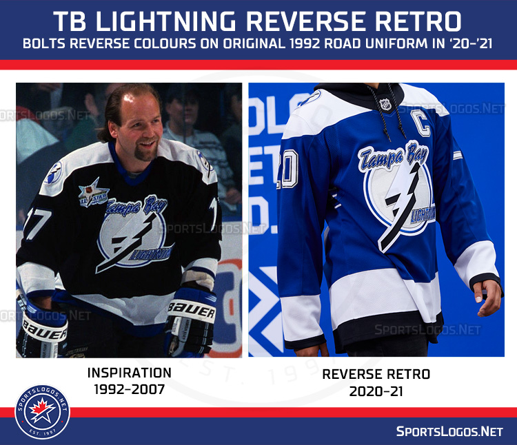
Agreed, that blue Bolts jersey was the best of the bunch, and actually had 2 versions. One had the 2007-2011 logo on the shoulder.
And then they swapped it out for the current logo as well. I actually have a full authentic one of this one:
-
3
-
-
The Lightning haven't worn their blackout alternates this season, and based on this post from their official arena store they've been retired.
Makes me wonder if we'll see a new Lightning alternate for the 2023-24 season or if they wait until the new uni manufacturer in the 2024-25 season.
-
4
-
2
-
-
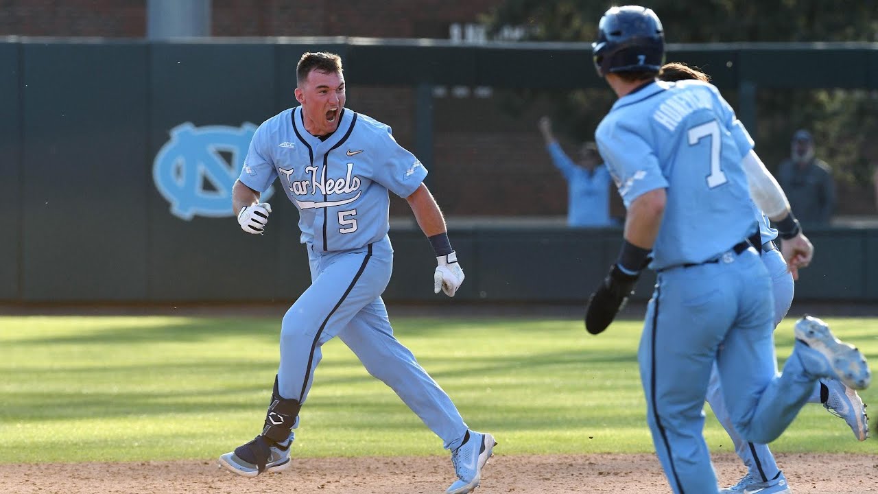
Personally, the monochrome color look in baseball is fine by me. I do think it looks best with either the very dark (black, navy blue) or lighter colors (columbia blue, gold, green?). The vibrant reds, royal blues, kelly greens, and that level of vibrance could work, but without accents it screams brightly.
Some good examples from colleges:
Whereas something like this seems very bold and garish.
-
4
-
2
-
 1
1
-
-
9 hours ago, Cujo said:
Aside from the logo downgrade..
I’ve wondered if the shift to a new Dragons logo in 2023 was due to some back room pressure from UAB in the similarity to the Blazers logo.
-
Stuff like this makes me think of what if some of the rumored teams moved to Tampa Bay.
-
2
-
1
-
-
46 minutes ago, McCall said:
I feel like the XFL is set-up better for players who were on NFL rosters during the season, but didn't play or get a lot of playing time. They're in playing condition, but don't necessarily have the wear and tear of a full NFL season. Whether they're free agents or if NFL teams would allow these players to play for the XFL, not having to wait 3-4 months for the USFL to begin would probably be more appealing to them. The USFL on the other hand, while it starts months after the end of the NFL season, it does, itself, end closer to NFL training camps, which means they may be better suited for those looking to potentially break into an NFL roster ahead of camp.
Also, OTAs and minicamps usually occur in the April-June timeframe, so the XFL doesnt conflict with that either for the fringe NFL players the XFL would likely target.
-
55 minutes ago, Ferdinand Cesarano said:
The Generals would have the same problem at Rutgers that the Guardians had at the Meadowlands, as the Rutgers stadium holds 50,000.
So explain the USFL playing in 65k seat Ford Field, where Michigan and Philadelphia will be? Kinda defeats your purpose of smaller venues.
-
I think we're also forgetting that the Generals could also play at Rutgers.
-
2023 Thread can be found here
-
45 minutes ago, Nordiks_19 said:
The Ducks posted this on Facebook. I feel a rebranding announcement. Kinda odd in the middle of the season however
It's not unprecedented. The Lightning released their now current logo midseason in the 2010-11 season, and even painted the logo at center ice for the rest of the season.
-
Interesting to see OT Sports manufacturing the replicas. Curious to see who the manufacturers are for the on field unis.
-
1
-
-
Locking this up as the season is complete. The 2023 Thread is here for further conversation.
-
4 hours ago, Indigo said:
So what happens to all the regional FOX Sports channels?
I know this article is Tampa-centric, but it does share some details that might come about across the board.
-
2
-
-
15 hours ago, NashConcepts said:
This mlbshop.com "World Baseball Classic Official Online Shop" is very sloppy-- some of the teams are visible when you hover and enlarge the "World Baseball Classic Bar", but when you click the teams not named Canada, China, Columbia, Cuba, Dominican Republic, Italy, South Korea, Puerto Rico, U.S.A., and Venezuela, (which is half of the tournament), only one item pops up as being a team-branded item:
To be fair, I don't believe we have seen the full merch release for the WBC. I would have to think it will be soon.
-
Probably just the lighting. We've seen the LVI and LVII official files, and the LVIII art is a pull from photos. I suspect it will be darkened slightly.
-
2
-


:format(jpeg)/cdn.vox-cdn.com/uploads/chorus_image/image/13848117/20130424_sal_sd9_146.0.jpg)


/cdn.vox-cdn.com/uploads/chorus_image/image/70674010/B496C503_F832_485E_97AE_E9F2E05ADC68.0.jpeg)
/cdn.vox-cdn.com/uploads/chorus_asset/file/23257121/IMG_9736.jpg)


MLB Stadium Saga: Oakland/Tampa Bay/Southside
in Sports In General
Posted
If nobody cares, then why do you care? You started this whole thing...