


ManillaToad
-
Posts
1,880 -
Joined
-
Last visited
-
Days Won
4
Posts posted by ManillaToad
-
-
Iced out for the West Coast
 ? What does that even mean
-
 1
1
-
-
5 minutes ago, M4One said:
At regular prices, nobody is buying a jersey with an ad.

-
 2
2
-
 1
1
-
-
49 minutes ago, DEAD! said:
I found out Chase Daniel (Chargers) has been around since 2010, has 178/261 (68.2%) passing for 1694 yards and supposedly made over $40+ million in career earnings.
We should all strive to be good enough to get by on a decent salary, but without the workload.

Daniel's been in the league since 2009. He won a ring as Brees' backup
-
Put the navy helmet on the old uniform, change the logo to something that isn't a flaming thumbtack. Mix and match the pants, whatever.
It's not perfect, but it's an identity they could have stuck with for 20+ years, and it's a lot better than their current joke of a uniform.
-
5
-
 1
1
-
-
8 hours ago, M4One said:
I can't really see too many people, if any, will buy one
8 hours ago, M4One said:Only way I would buy a jersey with an ad...
Lol
-
 3
3
-
 1
1
-
-
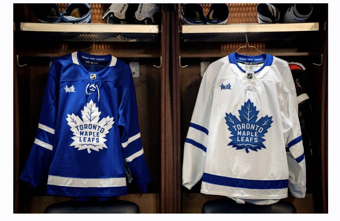
2 hours ago, VancouverFan69 said:
Forget all the sour milk jokes, the Leafs did it right with their corporate ad, much unlike the Habs.
And you "can take that to the bank".
Let's all give Toronto a hand for putting an advertisement on their sweater

-
1
-
 1
1
-
 1
1
-
-
1 hour ago, spartacat_12 said:
The Leafs have announced their jersey ad for this season.
If the league insists on ad patches, this is about as inoffensive as they can be. Can't wait for all the sour milk jokes when they inevitably collapse in the first round again.
The breast of the jersey is as inoffensive as it can be?
-
1
-
-
17 minutes ago, Froob said:
Awful uniform matchup in buffalo. Bills mono again?
Why is it the monochrome games where players decide not to pull up their white oversocks?

-
1 hour ago, FiddySicks said:
The Trey Lance pick reminds me so much of the Alex Smith pick. Niners had the first crack at QB choices, and ended up getting probably the worst one available. What a miserable franchise.
Smith was the best QB in that draft other than Rodgers
-
C > B > A > D
LA in speed blue would look fantastic. Jacksonville would look great in maroon. Orange would be fun but you're right it's a bit of a leap. Tampa in black would be a lateral move, Baltimore in blue I think is a step down (I really love their new helmets)
-
What a little baby. Waahh I have to wear a uniform correctly like everyone else has done for decades it's not fair
-
4
-
3
-
 3
3
-
1
-
-
29 minutes ago, BBTV said:
I thought the Titans yokes looked fine. Plus, there's at least some historical precedent for the Eagles having yokes / vertical stripes:
Yeah but imagine every team switching to vertical stripes. Fauxyokes wouldn't be a good look for the majority
-
5 hours ago, Bruhammydude said:
Looks fine from the side, but it makes the jersey look like it has shoulder yokes
-
10 hours ago, JTernup said:
Completely agree, the think Fakers ignored in their post is that we got to see that cuff stripe on a more modern template. Although it had only probably been 7 or 8 years from that Tony G picture things got bad by 2011. It was not uncommon to completely lose that stripe. Nike really saved the classic Chiefs jersey IMO.
I think it's a lot more likely the Chiefs saved their classic jersey. nike probably suggested they add black to the uniform and C H I E F S running down the pant leg
-
1
-
1
-
2
-
-
They should move the swoosh to the trash where it belongs
-
 1
1
-
1
-
2
-
-
42 minutes ago, floydnimrod said:
With Cleveland bringing back an old logo to put at midfield, I really wish the Bengals got rid of the Tiger B altogether during their uniform redesign, and brought back an actual Tiger logo to be everywhere. The 97-03 set of logos were great and would still be around if the team wasn't complete ass at that time.
The majority of teams in the NFL should start using alternate logos more. Put them at midfield, in the endzones, on the uniforms.
-
2
-
-
Normally I'd go with Raiders/Chargers for the best matchup this week because something about AFCW rivalry games is aesthetic heaven for me. However, I absolutely love rain games, especially downpours that affect the level of play. Pair that with a classic uni matchup in 49ers vs Bears and it's an easy choice.
-
1
-
-
12 hours ago, habsfan1 said:
I don't think this would be well received, if the Yankees did this, in 5 years from now...
When (not if) this happens there will be people on this website defending it
-
4
-
-
Chiefs are doing a throwback field design for the TNF matchup against the Chargers
-
6
-
4
-
-
That helmet looks really good
-
#68 Chicken Strip?
-
I don't mind Seattle using the bright green, but going monochrome with it is so stupid. Mix and match the neon elements with your normal uniform until you find something good then stick to that. How grown men can get excited about dressing like a circus act is beyond me.
2 hours ago, DCarp1231 said:“Turds” you say? These are turds. I believe it’s been a season or two since they’ve been on the field though
This is a great example of how insidious the color rush mentality is. Cleveland had been through 5 years of being horrendously ugly, proudly went back to their proper look which is traditional through and through (to the extent they actually make the players wear their striped socks correctly), but still threw in a "dude brown lmao!!" monochrome look, because... it's the modern NFL and you need to look ugly on purpose?
-
1
-
-
The nike defense force always comes out strong whenever someone
 s on their ugly logo making uniforms worse
-
2
-
-


2022-2023 NHL Jersey Changes
in Sports Logo News
Posted
Seattle is one of the more cities to get a team since Gary took over