SFGiants58
-
Posts
8,267 -
Joined
-
Last visited
-
Days Won
79
Everything posted by SFGiants58
-
Several people on the concepts section think of it as a viable name because it's sorta plural. Here are the examples of it: I don't like the name, and I don't like that people like it. There are better New Orleans-centric names.
-

forum questions Ask A Moderator
SFGiants58 replied to Nick 1733's topic in Forum Policies and Announcements
Hey guys, I'm having issues embedding images from the mothership. Whenever I try to copy a url in, all it says is "The link could not be embedded because content.sportslogos.net does not allow embedding of that image." Is something messed up on my end, or is it the software somewhere? Thanks in advance. -
Powder blue/red is a terrible color scheme. It needs navy to balance out the two bright shades, and powder should never touch red. That's why these uniforms look good (Concept Credit: @oldschoolvikings): ...and this looks hideous: Additionally, the Texans and the Titans (when wearing the right combos) look better than the Oilers ever did.
-
I really don't get the love for any of the Sabres' crests (classic, classic in navy/yellow/silver, goat head, and the slug). Heck, the only one I remotely like is this guy: I like the complex design of the swords, and I really like that there's no buffalo in the logo. Just because they play in Buffalo, doesn't mean they have to have a buffalo in their logo. Putting that logo in the royal, yellow, and silver/gold/powder would produce the best possible crest for the team. As for a template, something like the 2010-12 alternate sweater would be ideal (as it doesn't infringe on the '67 Maple Leafs' template, my preferred look for Toronto).
-
I wish the White Sox would have one alternate uniform with the full "White Sox" name on it, preferably based on either of these uniforms (1942, 1987-90): Putting either one of those uniforms in the black/grey/white color scheme would be fantastic.
-
Players on the "RIGHT" Team, but "WRONG" Uniform
SFGiants58 replied to kimball's topic in Sports Logo General Discussion
Johnny Bench in 1966 or 1967 Spring Training, not only wearing the wrong uniform style (1961-6/7 Spring Training) but also the wrong number (53). On a side note, I enjoy the number font on those uniforms. At least one team in the majors should use this thin, wide varsity block with a Packers-style "5" and minimal serifs.
-
It's unusual striping for sure, but I like it. The Sharks are a modern enough team where they can get away with it.
-
That's...interesting. I like the curved striping and I oddly don't mind the abundance of grey on the white sweater. Good on you for using the fin patch and a modern display font (block wouldn't really work here). I am curious to see how the new "alternate" logos would look on it.
-
I've thought about the team going for a Philadelphia Athletics-esque look, albeit in forest green/gold. Basically, take the current gold and green alternates and make a white version of them, with an "Oakland" road uniform using an updated version of this script:
-
Per uni-watch.com today, we've got a 1970 Brewers prototype! It seems that one of the reused Pilots jerseys (the source for most of the 1970 Brewers' uniforms) got turned into this, a modernization of the American Association Brewers' vintage uniforms (per borchertfield.com).
-
Players on the "RIGHT" Team, but "WRONG" Uniform
SFGiants58 replied to kimball's topic in Sports Logo General Discussion
Edgar Martinez in the royal/yellow drop shadow set for the Mariners. George Brett, Mike Schmidt, and Expos Gary Carter in grey road uniforms. Tim Salmon in the 1989-92 Angels' uniforms. Frank Thomas with the navy/red White Sox. Barry Bonds wearing the 1983-93 Giants' uniform set. -
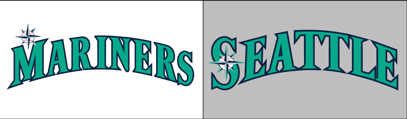
I do think the road uniform is better with the alterations. The teal used to just blend in with the navy wordmark and white outline. However, this prevented the tweak I actually wanted to see: Using teal like the Orioles use orange (a statement I've been saying a lot lately) would allow the Mariners to stand out from the other navy teams and promote their unique color scheme. Also, going down to one outline makes for clearer scripts.
-
Yeah, I've really soured on this logo. Never mind that it lacks purple, but it also has another glaring issue. The triangle backing, presence of hockey sticks (showing equipment is a mark against any hockey logo), and the prominence of teal and black make it look a little too much like the Sharks' logos. I know that they're in different styles and nobody in real life would confuse them, but the phenotype similarities are a little too strong for my liking. The purple/teal color scheme was nice, but the NBA Hornets use those colors in a better capacity. I don't even like the pumpkin guts look. While the foot-d is a decent logo, it's really best left on the shoulders. An ornithologically-correct duck logo (either a portrait view from within a bounding shape - be it a roundel or a shield or a full view of a duck in flight) would be better. What also would be better is a dark green/orange/vegas gold color scheme, as there's too much black and not enough green in the NHL. A better template, like the current third sweater, should be implemented. That's not unpopular. Heck, most of the people who want the old Ducks identity back don't want the "Mighty... of Anaheim" to return. These are people who've had to put up with the whole Los Angeles Angels of Anaheim crap, and I think they'd appreciate both a more straightforward/Anaheim-centric name.
-
I love these uniforms as a modernization/New Orleans-ized version of the original Hornets' set: Heck, I wish the current Hornets used these uniforms as a template. All they'd need do to would be to swap "Creole Blue" for teal, incorporate more purple in outlines/striping, dump the yellow accent color, and add either their current font or Rockwell Condensed Bold.
-
I'm hardly obsessed. I merely take issue with people who randomly throw out things like "a little girl picked the team name" while providing weak evidence. If you want me to believe that "a little girl picked the team name independently and the expansion group bypassed all focus group testing and a team naming contest (which is thoroughly documented) to listen to a specific little girl," you'd best provide a link to it (preferably The Toronto Star, due to the difficulty of linking to radio), please. Bold claims need bold, concrete (linkable, if discussing things on the internet medium) evidence provided by the claimant. If a student turned in a research paper with no specific citations and told their professor to "go look it up," they'd receive a failing grade on that paper. You don't have the best track record with citing your sources on your claims, and coupled with your gimmicks (a pathological hatred of the Mighty Ducks, blaming the North Stars' failure entirely on high school hockey, and pretending that your actually a giant octopus) growing stagnant, I would like you to buck that trend. Citation matters. MLA, APA, Chicago/Turabian, a simple link to a website or a picture, etc., are the backbone of any good claim in an argument. The joke's probably on me, though. AFAIK, I'm telling a sentient octopus to cite its sources on a story that's about 75% apocryphal.
-
Point us to it in the Toronto Star's online archives, please. I'm sure you can find it, you're a crafty octopus.
-
Ah, some unused Marlins logos:
-
A citation for that would be nice. It could be a simple link, a page from a book, etc. Speaking of unused uniforms, we have some interesting concepts about what a "baseball uniform of the future" looked like to 1968 conceptual artists: Here's the source, and the referral point to source.
-
If it weren't for Wahoo, the 1965-9 uniform set would be my favorite look for the Cleveland Indians: It makes excellent use of red and doesn't use a cursive/lettering script, differentiating them from the Twins, Red Sox, and Angels (since the Angels don't use a similar template). Sure, it makes them look like their Ohio brethren, but the navy accents and different road template should be enough to differentiate them (more than the Dodgers and Royals, anyway). Swap out Wahoo and the wishbone-c for a block C with feathers, and you've got my ideal look for the team.
-
I must say, you've really been on a roll with this latest batch of NHL concepts! Penguins: The updated version would be my ideal modernized Penguins. Incorporating grey effectively (through both the striping and shading in the logo), while promoting yellow to the home sweater color (differentiating them more from the Bruins), produces a solid look. Canucks: I like what you've done with the template, and the color distribution is fantastic. However, I think using the full bodied-version of Johnny Canuck would really put it over the top. The Orca and the "Johnny Canuck head + v", while both fine logos, just don't do it for me. I'd also recommend adding green outlines to the numbers on the white sweater. Capitals: This is a fantastic modernization of their classic set with the current logos. I'm not a fan of the script logo, but you've managed to make it look good. I second the critiques that the Weagle on the third sweater doesn't need the roundel backing it. I'd also be curious to see what the red and white sweaters would look like with the Weagle as the primary crest. Seals: You've managed to make the crest look halfway decent, and your uniform templates effectively balance the kelly/yellow/royal color scheme (something I thought couldn't be done). I can't really think of any way to improve it. Nice work! North Stars: Thank you for not including black, instead using that lovely dark kelly green as a primary color. Your striping pattern beautifully balances green, yellow, and white (no white yoke is also a good touch), and the drop shadow on the numbers (in a font that resembles the crest, which I like) is handled in a far better manner than the actual North Stars' uniforms. I think it might be my favorite North Stars concept I've seen here. All in all, I look forward to more of your handiwork.
-
India's flag has always been a favorite of mine, namely because of how it incorporates the Ashoka Chakra (symbolizing the "eternal wheel of law" and tying the nation to the Edicts of Ashoka, commissioned by Mauryan Emperor Ashoka in the third century BCE) alongside the green, white, and saffron bands. Maryland's flag is the perfect demonstration of an effective way to incorporate heraldic symbols into a flag without compromising aesthetics. That said, it does not belong on sports logos. The Emperor of Japan's flag, a golden 16-petaled Chrysanthemum on a red background. It ties in well with the national flag, while also incorporating a historical symbol of the Imperial throne that dates back to the 12th century (the Chrysanthemum). Also, Japanese prefecture flags are an excellent demonstration of how to follow the rules of vexillology while incorporating significant regional symbols (often in the form of stylized kanji). I grew to like the Portland, Oregon flag when I lived there for undergrad. The colors are striking (with a tiny vexillogical violation of dark gold and white touching), the pattern is an interesting take on the Nordic cross style, and it fits well within the green/blue aesthetic of Cascadian flags. Denver's flag carries the symbolism of the sun and mountains (two well-recognized attributes of the city), rendered in an eye-pleasing rendition of the red/blue/white/yellow color scheme.
-
I think they could have split the difference and just been the "Stingrays." It's one word (a two syllable one at that), refers to an aquatic animal (albeit one that looks somewhat different from a Devil Ray), and it doesn't have the connotations of failure that "Devil Rays" has.
-
Double post.
-
You've been trying it over several accounts, and the mods wind up banning you for a variety of reasons, sometimes in spite of your precious VPN protecting your IP address. Remember: TomTucker Rays Angels JasonFromMiami Almighty That one account where you posted Leviticus 18:22 in response to the SCOTUS gay marriage thread ...and a few I'm forgetting at the moment. Go back to 8chan. Quite frankly, they don't even need the Buffalo. The "sword-B" logo would work well on the shoulders, tying in perfectly to that royal/yellow/silver crest. Unpopular opinion, the Sabres are a Buffalo team that can get away with not using a buffalo in their logos.
-
I would be totally cool with the NHL dropping the requirement for NOB's, especially for Original Six teams. It could really help teams with traditional aesthetics evoke an additional vintage style. I'd advocate for teams to try it out during an outdoor game, be it the Winter Classic or Heritage Classic. Besides, they're not as important as TV numbers (pre-empting a @hockey week reminder on the importance of TV numbers for sportscasters).