Search the Community
Showing results for tags 'nba'.
Found 25 results
-
Good evening. I have a decent amount of uniform/logo concepts in my drafts but I've never posted them here. This would be one of them. The Cavs' recent uniform rebrand was extremely disappointing. The colours are strong and the logos are cool... but the design was incredibly boring and uninspired. I kept their current colour scheme for the two primary uniforms and deviated slightly for the two alternates. As boring as their redesign was, I don't think it needs a massive overhaul. I like the Cavs hoop script a lot so I kept it as the primary wordmark, although I updated it a bit to include an actual basketball. The sleeves and collar now feature a simple stripe to add a bit more colour pop. The iconic sash returns to the front of the uniform with a bit more fade to give it a two-tone look... but not too busy. The alternates draw from the Cavs' deep history of unique uniform designs. City - The sleeve/collar pattern draws from these threads from the 70s. I simplified it a bit and opted for a two-colour combo instead of three. The logo on the front is drawn from this set. Statement - One of the best throwback colour schemes in ball. Overall, not a drastic design but I don't think the Cavs need one. Just a few things here and there. Let me know what you think!
- 5 replies
-
- 6
-

-
- nba
- basketball
- (and 4 more)
-
If you’re someone who pays attention to the Pelicans, you may have heard fans raving about this year’s City Edition line. To a point where many people are calling for the team to even rebrand into the theme. And honestly, its for pretty good reason. I’m not one to be impulsive but I really do think the Pelicans hit the mark this year and now have a great opportunity to rebrand (and i rarely give props to this team’s marketing.) Purple and green is a color combination rarely used in sports. Let alone purple, *lime* green, and black. Not only is this so unique in terms of sports, but it also speaks to the VooDoo and supernatural culture of New Orleans. It’s something i never thought of before and I personally find it way better than the surface level stuff the team has done like Red-White-and-Blue and Mardi Gras. RWB is just way too commonly worn and Mardi Gras just looks odd outside of Mardi Gras season. So alternatively I think this spooky VooDoo theme would be the perfect concept for a rebrand. So with that being said here’s my take on what a Pelicans “Skelican” rebrand would look like. Credit goes to the team for the coming up with the basis of all of this. I’m just branching off it. So for the wordmark i actually had to recreate the font myself. The font the team used was a custom made one so i had no choice but to piece together every letter i can find from promotional pieces. i tried to upscale them as much as i can, put them all together on a template, and then put it through an AI font maker to clean things up. So it’s not perfect but it’s close. For the middle logo, it’s of course the famous “Skelican” logo that many fans have been raving about. I couldn’t find any official file of it so again, i cut it and upscaled it myself. fun fact: there's still no official file of the logo anywhere so when you google for the Skelican all you can find is my edited version lol And for the third logo, i have no idea if this would be legally allowed in the real world but i combined the old New Orleans VooDoo logo with the secondary "bird de lis" logo the team currently has. And then adjusted colors accordingly. This probably wouldn’t be allowed but it’s fun to imagine for concept purposes. And i’m sure the team can pull off something like this the right way if they wanted to. And for this main logo, this surprisingly took a long time to make, longer than anything else here. But long story short, i managed to combine the smaller city edition logo with the bigger official logo the Pelicans have used (up until this year they decided to remove it for no reason) Also added a little drop shadow to the letters mostly so the NEW ORLEANS doesn’t just blend in with the green bones. And for the jerseys, I actually wanted to do more but didn’t want to stray too far from the familiarity of the city jerseys. I have to admit I was not sold on the plainness of the official jerseys that came out so I added some more striping so the colors can pop more. For the City Edition jerseys here’s some designs of my own that take a less traditional route. The first one goes all in with the skeleton theme with a bone-like font, pinstripes made of bones, and a skull pattern all around the uniform. For the second jersey i was inspired by the one of the retro Hawks jerseys with the big bird in front. with how much the fans love the logo i thought this would be a bold but slick way to incorporate the logo and let it do the speaking. And as a bonus here is my third city jersey concept, this actually came from an old concept I made before this season. As you can see I went for a ghosty teal color to pair with the purple. Added VooDoo doll stitching on the sides and used a haunted spooky font. Then i added the new logos and recolored accordingly And if you’ve made it this far, congrats. I now lastly present my court design. Personally this is my favorite part as it required the most thinking from me. I was mostly inspired by the current home floor that includes Louisiana nature all around the border. So I took that same design and took it up a notch by using dead trees and *flying Pelican Skeletons* at the top. and at the very bottom of the court is the classic “Let The Good Times Roll” motto in French. As for inside the court, I of course used the beloved “Skelican” logo at center court and in the 3pt arch’s I added more Pelican Skeletons. Is it a *little* horrifying? yea, but one can say that perfectly fits the vibe of New Orleans edit: fixing some images that aren’t appearing let me know if there’s any empty pictures
- 11 replies
-
- 20
-

-
-

-
- new orleans
- new orleans pelicans
- (and 2 more)
-
Rebrand for the Clippers, for the move to their new arena. The team should have moved away from blue and red with a 1993 rebrand that would have looked awesome in Anaheim, but like the full time move to The Pond, it was kiboshed. Some elements of that proposal I've used in this concept. So the main team colours are a shade of blue called Ocean Melody, which is darker and more saturated than the shade the Clippers currently use, and Mayan Green, a similar shade to the seafoam green from the 1993 proposal, with Orange Juice as the third colour. Ensign Blue is used for the compass needle. The Clippers script is used here and a compass forms the dot in the i, I wanted a nautical symbol that the Clippers could own and the compass fitted the bill. The font for LOS ANGELES is Talldeco. that The primary logo has the Clippers script below a basketball representing the sun rising above the ocean and the prow and sails of a clipper in font. The secondary logo has the basketball and clipper, but with LA in modified Talldeco beneath. Coming soon - Uniforms. C+C would be cool.
- 4 replies
-
- 5
-
-
- la clippers
- los angeles clippers
- (and 3 more)
-
Another day, another project. The recent Rockets city uniform inspired me to overhaul their brand a bit. I've never been a fan of any of the Rockets logo combinations or uniforms, outside of a couple of throwbacks and alternates. The logos haven't necessarily been terrible, it just lacks so much for a team from Houston called the Rockets. Although their current primary is THE worst in the NBA by a wide margin (and that includes OKC). As for the logos... I went in a completely different direction with the new set. I really wanted to bring an actual rocket back to the forefront because the team is called... the Rockets. Their old navy/blue/red colour scheme makes a return, although the blue has been lightened to a sky blue-esque shade. The Dunkstronaut has been promoted to an official mark of the team because of how awesome it is. I brought back the retro wordmark style, with a rocket added within the negative space of the O to provide a bit of extra identity. The uniforms... I went simple with the design and let the colours do most of the talking. I tried several different versions of pinstripes and side piping but it always ended up looking gaudy and unprofessional. The Dunkstronaut makes an appearance on the shorts to give the uniform set a bit more charm. I demoted the red to an accent colour on the uniforms. I opted for navy blue to reflect a "Deep Space" vibe. The sky blue operates in the place that white normally would, including the primary colour of the road uniforms. I feel like it's light enough that it wouldn't cause any issues with other teams that use blue as a primary colour. Let me know y'all think!
- 8 replies
-
- 18
-
-
-
- houston rockets
- nba
- (and 1 more)
-
With the NBA likely expanding to Las Vegas sometime in the near future, I wanted to create a concept for an expansion team that I don't think anyone has done yet. I've seen a lot of very interesting concepts surrounding gambling, casinos, and other mascots that pay tribute to the culture of Vegas, but one that I thought would be really cool is something that connects to the Alien culture and lore that is driven by all the UFO sightings that have been seen in the city. Being so close to Area 51, I thought a "Alien-themed" mascot could be really cool, since it is a big cultural myth of Vegas that often gets overlooked, and there aren't any real alien themed mascots out there yet in professional American sports. Below is my full concept, and my pitch for who would make the perfect mascot for this team, if they could somehow pull off getting the legal rights for it.
- 4 replies
-
- 8
-
-
-
- nba
- expansion team
- (and 4 more)
-
Hello, good folks at the SportsLogos.net forums! What I'm about to introduce is something I've been wanted to get off the ground for a while now, but here it is, I previously announced this several weeks in advance on my profile's status update, but this is the start of a multi-sport concept series called "Into the 816-Verse" this series will feature a mixture of breathing new life into Kansas City's forgotten sports teams and a little bit of alternate history. Over the course of this thread, I will be updating my profile banner with each finished concept until it eventually becomes a full collage of every logo in this concept thread plus all of my previous KC-related concepts. All of the primary marks in this series will be Fiverr commissions. FOOTBALL Kansas City Cowboys/Marshals (NFL) Marshals (ex-Dallas Texans) (NFL) Kansas City Blues (NFL) Kansas City Stars (NFL) Kansas City Renegades (CPIFL) Kansas City Mules (NFL) Super Bowl LXII (NFL) BASEBALL Kansas City Mules (MLB) Royals-style Athletics-style Kansas City T-Bones (AAPB) Kansas City Packers (FL) Kansas City Blues (AAA) Kansas City Blue Sox (A) Kansas City Giants (NLB) Kansas City Royal Giants (NLB) Kansas City Maroons (NLB) BASKETBALL Kansas City Knights (ABA) NBA-style Kansas City Grillers (ABA) Kansas City Tornadoes (TBL) Kansas City Mustangs (WBA/WNBA) HOCKEY Kansas City Blades (IHL) Kansas City Outlaws (UHL) SOCCER Kansas City Wizards (MLS) Classic colors Kansas City Comets (MASL) Kansas City Spurs (NASL) BONUS Kansas City Royals (NBA) Classic colors Kauffman colors Kansas City Steers (ABL) Kansas City Soul (ABA) Kansas City FC (MLS/NFL) Kansas City Chefs (NFL) Kansas City Reapers (NFL) Kansas Tech Jackals (NCAA) Kansas City Chiefs (Redesign) (NFL) Fort Worth Cattlemen (AAA) Omaha Outlanders (G-League) Omaha Gnomes (MLS Next Pro) Kansas City Royals (NLB) Apollo Beach Royals (A) Kansas City Thunder (NBA) Kansas City Lakers (NBA)
- 80 replies
-
- 1
-
-
- kansas city
- kansas city cowboys
- (and 72 more)
-
Welcome! I put my NFL concepts on here last summer and I've been slowly, but surely, working on the NBA since I finished the thread. Like previously, these concepts are all done already, so my hope is to upload one every day like with the NFL. I'm also going to be doing one home alt and one away alt, given the NBA's propensity for having a myriad array of kits for every team, constantly adding new ones every year. Also, these will be organized by city this time around, so we're starting with Atlanta. (1/30) Atlanta Hawks The worst things the Hawks ever did to their uniform was remove their primary logo from the jersey and change their color scheme. I personally enjoyed the black accents that the 90s and 2000s had on offer, so I included black as a tertiary. Outside of that, the overall design and alts are pretty straightforward: A yellow recolor and a throwback recolor.
-
Over the past couple of months, there have been some wonderful concepts and ideas for a hypothetical NBA expansion team in Kansas City, Missouri, and I decided to put my own spin on it, with the "Kansas City Dreamers", now why did I choose Dreamers?, Well I've always had an idea for a Kansas City sports-team name based on the early animation history in Kansas City that started at the Laugh-O-Gram Studios building on East 31st Street, and I decided to go with "Dreamers" as a nickname to harken back to the early days of Disney and Warner Bros. The mascot for the team is a chinchilla which is a type of mouse, and it's name is Ubo the Chinchilla named after Kansas City-born animator Ub Iwerks who worked alongside Walt Disney in Kansas City and was instrumental in co-creating Mickey Mouse. BRANDING The logo and wordmarks were a Fiverr commission, and I wasn't able to identify the font used in the wordmarks, but for the insignia logos and jersey numbers I used Mickorama. The color scheme is blue, red, and vanilla, in which the blue and red are meant to resemble the colors of Kansas City's brand new flag but also the city's former NBA franchise; the Kansas City Kings and the nearby Kansas Jayhawks of the NCAA. EXTRA SCRIPT, INSIGNIA, AND PRIMARY MARKS I of course designed a ton of extra logo assets for this concept (You know me) COURTS This is the standard home court design which features a lot of local(ish) sponsors plus the wordmark logo on both sides of the court And here is the "City Edition" court with a vanilla and black color scheme made to resemble the color scheme of the cartoons made in the era where western animation got its start and its also features the Kansas City skyline on the bottom UPDATE: Made some small tweaks to the court to make things more centered, and reflective of the more recent courts I've designed UNIFORMS Here is the uniform set I designed, the home and away uniforms are very reminiscent of the old Kansas City Kings home/away set, and the red and black alternates I took inspiration from some of the Los Angeles Clippers sets, and the "City Edition" uniforms matches the "City Edition" court design. UPDATE: I fixed an oversight with the naming of the black alternate uniform and changed the jersey manufacturer from Adidas to Nike, since that's what every NBA team has. REJECTED LOGOS To close out this concept, here are some logos that didn't make the cut, plus the initial design that I got from Fiverr, which the mascot here just looks more like a standard chinchilla. This is something I've been wanting to do for a while, and of course critiques and comments are welcome!
- 7 replies
-
- 6
-
-
-
- nba
- kansas city
- (and 4 more)
-
Not good. But first city edition for next season has been released.
-
Hey, all! It’s been several years since I was last active on here – as Hoopladawg87 – but I’ve still been designing uniform concepts. I joined the social media community shortly after COVID started, but it seems there’s less and less meaningful discussion on those platforms these days. That’s led me back here, and I’m looking forward to any and all feedback, criticism, etc.! Last spring, I started an Earned Edition project which included new uniform designs for all 16 of the NBA’s playoff teams. My self-imposed design brief as follows: 1) The look must be identifiable – this is the foundation of good, fundamental branding; 2) The concept must extend the brand in a meaningful and/or relevant way; and 3) The design should incorporate un(der)used assets, such as colors, marks, and logos, whenever reasonably possible. With those guidelines in mind, I’ve spent some time over the past few months revising my original ideas. More specifically, I’ve made adjustments to further align each concept with its respective team’s identity and uniform Editions for the 2022/23 season. I’m very confident in where this project stands currently, but I’m also excited to continue improving it however I can. As always, any and all thoughts and suggestions are sincerely appreciated. Thanks in advance! (First actual post coming momentarily once I fix formatting)
-
 Overview: Here is the second jersey redesign concept ive done. As we all know, mardi gras colors are an iconic color combination signature of New Orleans. There has been sort of a debate over the years about whether or not the team should rebrand to these colors. although i cant really pick a side, i feel like it was only right to at least make a concept. i of course am an amateur designer (i made all this on my phone) so please excuse the roughness. for this concept. I was inspired by the three identities that basketball in New Orleans has had. There's design elements from the New Orleans Jazz, Hornets, and of course Pelicans. And obviously, as a whole this concept was inspired by the city of New Orleans and Mardi Gras. i was also inspired by a lot of other concepts ive seen on the internet as i did some research. The Association and Icon Uniforms: For these jerseys i started off with a subtle fleur de lis pattern as the first layer of the jerseys. it's pretty subtle because i didnt want the jerseys to be overly busy so you might have to look closely. on top comes the biggest design element which are the multicolored pinstripes (callback to the new oreleans hornets days.) the pinstripes i made resemble mardi gras beads. and lastly goes the wordmark and numbers. I made the first and last letters a little taller to represent the bridges of new orleans (but honestly i just did it because it looked cool.) Also added a tricolor collar which has been a popular design choice for the pelicans over the years. For the shorts it's pretty simple it just matches the jerseys but i threw in this little secondary logo i sorta made (ill get to that later) The Statement Uniform: I was crossed between making a green or a gold jersey, but i really wanted a jersey to emphasize the unity of the mardi gras colors. so instead i opted for a midnight indigo color inspired by the 2022 city edition jerseys. to represent the nightlife of the city and provide fans with a much more slick and wearable color. and with this color it leaves room for design elements that feature all three colors of mardi gras together and not separated. as you can see i did that by usinga repeating mardi gras pattern on the collar, arm holes, waistband, and shorts trim. (which actually resembles mardi gras king cake now that i think about it) I used the popular NOLA wordmark from the 2021 city edition jerseys (they resemble a flock of birds formation if you couldn't tell) then i gave that wordmark and numbers a tri color outline. on the side of the jersey goes three different colored fleur de lis. and on the shorts is a big pelican silhouette logo. again, i really wanted to emphasize the unity of mardi gras colors on this jerseys since the other two jerseys dont really do that outside their collars and shorts trim. The Logos: All i really did was just recolor the current logos. I came up with the idea of two-toned wings because i wanted to keep a balance of green and gold. same idea goes for the two toned outlines that all the logos have (the pelicans came up with that not me.) for the main logo i adjusted the bottom letters to use the official pelicans font (and added some shadow for it to stick out.) unfortunately i couldnt do the same for the other logos that have letters due to spacing issues. also if you're wondering where that 6th logo is from it was from the 2014 new orleans all star game. i of course recolored it and cut off the big star part of the logo. The Main Court: I wanted to keep the core design of the current team that im sure we all recognize. So with that all i really did was just recolor the court. I made the base color of the court purple and the wordmarks yellow. i wanted to involve green so i added a green frame design (similar design to the new orleans jazz court) Used the fleur de lis logo at center court to really just embody the city since this is the main court. also a small touch i did was add some shadow to the baseline wordmarks to help them stick out a bit more. (fun fact ive posted this same design a bunch of times already all over the internet over the past several years so forgive me if you've seen this same design for the hundredth already lol.) The Statement Court: The pelicans have never had an alternate court before so i thought it would be cool to make one. Especially since the statement jersey i made is a whole different color from the main two. (i've also used this same concept for the 2022 city edition jerseys you can find that in my court concepts thread.) But anyways, i wanted to go a more traditional route with this court (ironically for an alternate court.) solid dark base color all throughout. solid yellow wordmarking. an just the main logo at center court with secondary logos in the arc. the special design element here is the tricolor paint area which like the statement jerseys, emphasizes the unity of the mardi gras colors. Conclusion: So yup i guess that's everything. I might make some edits after i post this but generally speaking i think i got everything i wanted covered. Also i have no idea how the colors translate to everone else's screens because viewing this from my laptop looks much different from my phone, so theres that lol. But yea let me know what you guys think, thank you everyone seeing this for your time.
- 5 replies
-
- 2
-
-
-
- new orleans
- new orleans pelicans
- (and 7 more)
-
I'm going to work on some full concepts for NBA team rebrands through here and see how far I get. I feel like some in the league are already pretty tough to beat so I may not get to all of them but there's a few I think could use some work. Let's start with a team that doesn't exist yet! With the Vegas NBA expansion team on the horizon in the next few years I took a run at it with "The Revelers". A royal theme that fits Las Vegas and potential part owner LeBron, and also a bit of a medieval old timey theme that goes with the Raiders and Golden Knights. Definitely can be a little close to the Kings but I think it has enough of a difference to have legs. I could always make the cap look a little more like a Jester cap and less like a crown if it was too close. I went with 3 jerseys, one with each of the main colors (cream and gold) and one with the alternate color (black) with the primary logo on the front. With Revelers being a bit of a mouthful I'm sure they'd be referred to as the "Revs" so I included an alternate logo with that as well. I put the full concept here.
- 27 replies
-
- 2
-
-
- basketball
- jerseys
- (and 9 more)
-
First up, I want to fix the drafts of the four major sports. Currently, NFL is simply the reverse order of final record, which gives incentive for teams to tank at the end. NBA has the lottery where you really need to be in that bottom four to have a shot at the top, so tanking is practically required. Baseball is straight record, and most years is such a crap shoot it doesn't really matter. I'm not sure how NHL works, but I know the Penguins tanked twice, and IIRC, Edmonton tanked (or was legit horrible) for MacDavid. So here's my solution to this problem: Do the draft order by the order in which teams are eliminated from the playoffs. Nobody is going to tank from day 1 (except the Process-era Sixers), so they're going to legit play until they're about out of it. In the event Detroit is eliminated by week 9, it will be on merit, and they get the top pick and still have incentive to play hard the rest of the way. Toward the end of the season when teams are teetering on the brink, they're going to want to make the playoffs so there's little - if any - risk of the tanking. The first 10-15 picks will be locked in by week 12 or so, which means the end of the season should be legit competitive, and the teams with the top picks got them while playing hard. What do you think?
-
The thread is simple -- what championship teams wore the WRONG jersey, sweater, uniform, etc. I don't want to limit this to just championship winning teams, so maybe the finalists of that league's championship round (ie-Super Bowl, World Series, NBA Finals, Stanley Cup Final, etc.). Here are a few examples to get the ball rolling ... Washington Capitals, 1998 Stanley Cup Finalist Cleveland Cavaliers, 2016 NBA Champions Edmonton Oilers, 2006 Stanley Cup Finalist
-
Considering all of the 2021-22 jerseys have been unveiled or leaked and the recent leak of the 2022-23 Suns' jerseys this might be a good time to start this thread. First off, here are the Suns leaks ... Here is a fans' mockup from the leak ... A few other rumors or news ... The regular City Jerseys will return. It'll be interesting to see if any teams keep their 75th anniversary City Editions next season. The Pacers, Grizzlies, Pistons, Blazers, Bulls, Celtics, Spurs, Kings, Thunder, Wizards, Timberwolves, Hornets, Warriors and Knicks could definitely pull it off considering the look and colors aren't far off their current full-time looks. Speaking of City Jerseys and the Suns, last year the Suns were testing fan interest in an Aztec-themed City Jersey for the 2022-23 season. It got some pushback so I am not sure if it is a go? The Jazz are switching from navy, green and gold to black, volt/yellow/gold (whatever you want to call it) and white. They'll keep the Jazz note within the identity, but it seems like new logo sets and not just a recoloring is happening. There have been some rumors of the Cavs rebranding. Not sure of the details, but I think I heard they're eliminating blue from the logo? Though you wouldn't really know it's there in the first place with the current look. It'll be interesting to see if the Earned Edition comes back. It seems like it's been an every other year "thing" since Nike introduced them. And, of course, there's the NBA All-Star Game in Salt Lake City and whatever sh** jerseys Nike comes up with for the game.
-
With the Season about to start, I figured now would be a good time to finally finish restart my long awaited 32-team NBA project. Going in order isn't going to be possible for me, so I'm going to post these as I gain ideas for them. Starting with...the Detroit Pistons. I always liked the 2002 recolor of the 90's teal horse logo for Detroit. It actually has some character to it, other than the plain red/blue basketball that we've seen different variations of. THis time around, I'm removing the navy, going full red/blue/silver. Now for the Uniforms. Association/Icon: I brought the recolored horse-head wordmark to the front of the jerseys (just like the 90's Grant Hill-era), I swapped the stripe colors back to normal, and the number gets the logo treatment with the outline. "DP" goes on the shorts leg, while the horse-ball goes on the waistband. Statement: I brought back the fan-beloved red alternate. It's a simple recolor, really, but the fans adored it, so back in the rotation it goes. City: For as much flak as the pistons get for their "Motor City" alternates (especially on these boards), It is an actual nickname for the city. Silver, mostly used for trim on the main jerseys, becomes the base. The stripes bring back the teal, gold, and red of the Grant Hill-era, while black and gold go on the wordmark & numbers. The waistband, shorts trim, and neckline are half teal/half red, corresponding with the nearest stripe. And the new courts: Main: Nothing spectacular, just placing the recolored logo on the current court. City: Old 90's logo returns to center court, with "Motor City" in the mid-range area.
-
 Hi everyone, I have recently started a new project where I have made it a goal of mine to combine all of the sports logos from NHL, NBA, NFL and MLB (and at times MLS) from all of the major cities in the U.S. and Canada to create a singular city logo. I know this has been done countless times before but the way my designs stand out is they are more cohesive. They feel less like something was Frankenstein'd together and can almost act as a standalone logo. Consider this the definitive collection. I say this with confidence because they were all composed in Adobe Illustrator with linework redone to make the designs more seamless, images rendered in crisp high resolution quality, each one taking several hours of work and trial and error and the cherry on top of the cake is that I own my own print shop so I can make stickers and shirts out of these designs. It's a true passion project for me. My journey began when I was first getting serious about graphic design, the summer right before I enrolled at DePaul in 2013. I created a mashup of all the Chicago logos because I wanted my own version of it. All the variations I had seen online did not do the city justice and I wanted something genuinely more badass that wouldn't look cheesy. I dubbed it "The Chicago Beast". It was cool for a few years and then I sort of forgot about it - well in 2019 I decided to take another crack at it and make a wildly popular rendition of this logo mashup combination - you may have seen it online (I made a North Side - Cubs and a South Side - White Sox version. Both featured elements of the Blackhawks, Bears and Bulls. I have made slightly different variations - some including the 6 star Chicago flag and others with different color arrangements. Fast forward to 2021 - A whole year of the COVID-19 pandemic lockdown had me yearning for another creative project that I can do for fun. I decided - why not give every city this same treatment? And so I did - "Major League Remix" (#MajorLeagueRemix). I will be posting the designs in this thread and would love some feedback! While I do consider these designs to be 'complete', as a true designer, I know there is always room for improvement, especially since teams change logos frequently. A few things to note (ground rules) for my concepts: They don't necessarily have to use the entire design of the logo in the mashup. They can be as little or as much as possible - the only rule is they have to look cohesive and make sense - no Frankenstein work! I often use past versions of team logos although I try to use the current ones as much as I can. This is because my goal is to make the logo look good, and if I use the core logo, it may not look the best. I have struggled a lot to piece some of these together because of the lack of uniqueness, clean design or symmetry so I have had to resort to alternates. Colors are fair game - as long as they are pulled directly from within the color palette of the city's sports logos. They all have a white border with rounded corners for consistency and also to set them up for sticker printing. That is all! I am so glad to be a part of this awesome forum - I can't think of a more perfect place to post this kind of work on the internet. If you want to follow me on social media - I am @DeluxeGraphicSupply on Instagram and Facebook. My website is also DeluxeGraphicSupply.com Chicago Bulls x Bears x Blackhawks x White Sox
- 104 replies
-
- 13
-
-
 Hello, it's my first time in a good while doing a logo series, but I thought I had some stuff worth sharing. This little series is based on the premise of the owners of the Milwaukee Bucks deciding to expand on their sports holdings and launch expansion teams in various other leagues. I have dubbed this hypothetical enterprise the Deer Sports Empire. Currently, aside from the Bucks they own the Wisconsin Herd. I will be leaving the logos for those teams as is, partially because I really like them and partially because the idea is the owners are launching new teams with similar branding touches (colors, font, etc). I also will not be touching MLB or giving them an NFL team as there's no world where those things would happen. These are the teams and leagues I plan to do so far. A couple are already done or close to finished. As suggestions (hopefully) are made and new ideas come to me I may add to this list. If anyone has a team in a league they would like to see, feel free to make suggestions. I dont have uniform templates for all the different sports so I'm just focusing on uniforms right now. Posted Logos... WNBA: Milwaukee Does (Vers 2) ... Click here for Vers 1 USL-C: Cream City FC (Version which evolved independent of this series) ... Click the links for Vers 1 or Vers 2 IFL: Milwaukee Staghorns ... Evolved from a swing-and-miss at a Mustangs Arena Football revival, which can be seen by scrolling through. NLL: Milwaukee Blaze (Vers 2) ... Click here for Vers 1 MLR: Milwaukee White Harts NHL: Milwaukee Comets Rebrand.... Click the link for the prior Milwaukee Hunters concept.
 -
Hello everyone! I'm going to be sharing my NBA concepts: I started these two years ago, then in this time I redid everything like two or three times before having the almost final version. I’ll post with home/road/third/alternate jerseys for each team and then maybe I'll post some outtakes or other proposal. Before I get into it, major thanks to all the other designers on these boards who keep putting out inspiring stuff. All comments and criticisms are greatly appreciated! 1)Milwaukee Bucks 2)Indiana Pacers 3)Utah Jazz
- 16 replies
-
- 10
-
-
- nba
- basketball
- (and 1 more)
-
I mainly tried making these based off city edition jerseys or just making a new standard court. I use a lot of wood stain because that’s just my style and it seems to be the trend nowadays. Suggestions and ideas are welcomed. edit: im making this edit almost 2 years after i started this whole thing. i just wanna say i apologize for how extra and low quality most of these designs on this first page are. i was quite new to the whole designing thing at the time.. i mean seriously, i copy and pasted a sun and placed it onto the corner of the clippers court like a kid's drawing, and slapped woodstain on everything. but nonetheless thank you all for your support and feed back over these years! edit 3 years later: please just fast-forward to the more recent designs some of these old ones are making me cringe lol Houston Rockets Golden State Warriors Oklahoma City Thunder Oklahoma City Thunder v2 Minnesota Timberwolves Charlotte Hornets LA Clippers Dallas Mavericks New Orleans Pelicans
- 121 replies
-
- 23
-
-
- nba
- basketball
- (and 2 more)
-
 We have the Players in the "Wrong" Uniforms thread and within that thread I've seen a few "Right Team, Wrong Uniform" entries. I thought I'd separate the two, because it is an interesting topic of its' own. Here are a few to start the thread off with ... Charles Barkley, Preseason 1992, Phoenix Suns Matt Hasselbeck, 2001, Seattle Seahawks Jeff Bagwell, 1992, Houston Astros.
-
Rare NBA Getty Images, Google & Internet Find
kolob posted a topic in Sports Logo General Discussion
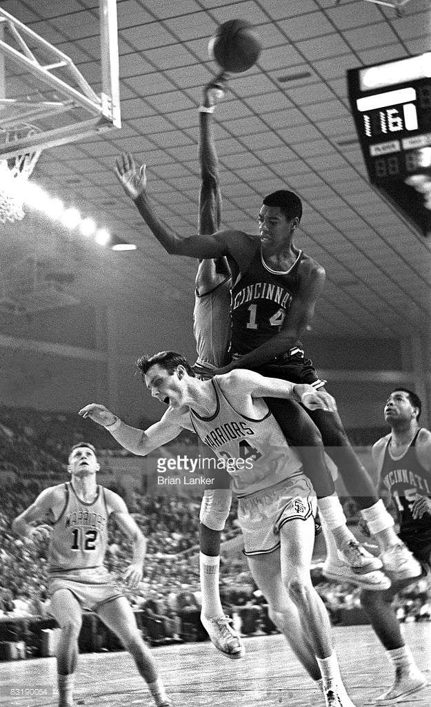
I wasn't sure where to put all of these, so I figured I'd start a new thread of small little finds I found while browsing the 'net -- and specifically, right now -- Getty Images. Most of these are small oddities, difficult finds and what not. I was going to open this up to stuff I found in other sports, but basketball and NBA history in the 70s and 80s has recently captured my attention. Anyways ... some of my finds: GORGEOUS Color vs. Color in Baltimore against the Bullets and Warriors (also note it's Ladies Night!) Royals vs. Warriors game in Phoenix's Arizona Veterans Memorial Coliseum. The caption says it was a 1967 pre-season game. Note Rick Barry in the old-style Warriors' jersey. He never wore these in the regular season as 'The City' jerseys were introduced on Opening Night 1967. Larry Nance wearing #6 in the half season right after he was traded to Cleveland from Phoenix. Similarly, Kevin Johnson wore #11 in Phoenix for the half season after he was traded from Cleveland to Phoenix. Interesting font and styling of Tom McMillen's name on this Hawks' jersey. Not sure why the underline? Notice the name on the back of Dave Stallworth of the Bullets. The name was pretty long so the "st" of Stallworth is white to not clash with the blue stripe.
- 378 replies
-
- 15
-
-
- nba
- basketball
- (and 4 more)
-
 When I was in my early teens, my parents bought me NCAA Football 98 for the computer. I really enjoyed the game, and it was very well-designed for the most part: 100+ schools; full-season play with rankings, major bowl games, and major awards; school fight songs; decent playbooks; something approximating logos on the helmets. It was a very good game for the late 1990s---not as good as the Football Pro series overall, but distinctly collegiate and lots of fun. Anyway, despite the overall quality, there were two details that I have since learned were wrong. One, LSU by default wears yellow jerseys over white pants at home in that game. Two, Missouri's colors are green and gold in the game instead of black and gold. (Come to think of it, I think the latter was also the case in that college hoops game for the Super Nintendo even earlier.) I was wondering: have you guys and gals noticed any similar errors in other games? (Incidentally, Football Pro 98 has the Eagles wearing kelly-green-and-gray even though they were in their second season with their current and inferior color scheme.)
 -
I searched through threads for the past year and couldn't find anything like this, so I figured I would post it. The idea behind this thread is to post interesting facts or statistics that a lot of people don't know. It'll essentially be the answers to trivia questions. I've got two interesting ones to start this thread off. The Minnesota Vikings were the first team to kick an extra point from the 15-yard line. Tom Brady has played two games at University of Phoenix Stadium, but he has never played the Cardinals there. The Pats have played two Super Bowls there, but only played the Cardinals at home since the stadium was built.